
This article analyzes 9 Spanish-language publishers – La Vanguardia, El Expansion, El Universal, El Confidencial, elDiario.es, El Espectador, El Mundo, El Pais and El Nuevo Dia – their paywalls, pricing and premium products.
Premium product visibility on the home page
As Lars K. Jensen discussed in his article on The Audiencers, deciding which icon to use to mark premium content is a question posed by many digital publisher. You need to consider the visibility of your premium content (i.e. getting readers to move through the funnel towards the paywall) and illustrate the quantity of subscriber-only content that a user could have access to whilst not turning non-subscribers away before they can even click-through to an article.
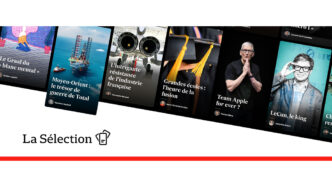
These 9 publishers use icons to mark their subscriber-only content.

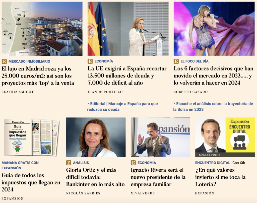
Out of all publishers, Expansión seems to have the most premium articles visible on the home page, something that isn’t surprising for a business and economics focused title. As data from Poool’s Conversion Funnel Benchmark Report revealed, B2B and niche titles tend to have smaller but more highly engaged audiences meaning the publication can be more restrictive with their premium strategies, blocking more content and moving the paywall further up the article.
> Recommended read: Paywall visibility rate, the essential KPI you should be tracking
Premium product visibility elsewhere
el Diario has a model similar to that of The Guardian where they talk about “socios” (members) and membership rather than subscription. The “socios” can access Opinion articles (the only ones that are exclusive to them), they can browse without advertising and get advanced access to some articles (all non-members can read those articles the next morning), amongst other advantages.
They also choose to increase engagement before presenting the wall to ensure a reader understands their value and has a higher propensity to convert when they do get blocked.
For instance, modules at the side of articles promote their various newsletters, allowing a reader to select the “boletines” that interest them and share their email address without leaving the page.
And, towards the end of articles, a text box integrated into the text (rather than blocking it) shares how the title is independent thanks to us, their readers. “It will take you less than a minute and you can do it here today from just €1 a month.”

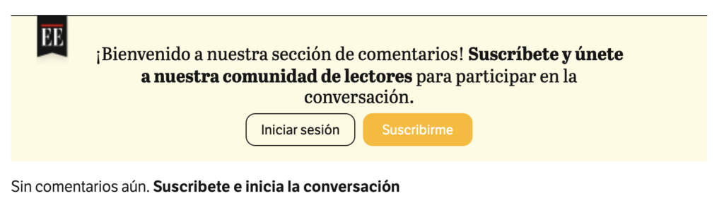
Increasingly more publishers are also now building a community and blocking this for non-subscribers. This community brings together readers with a shared interest, increasing engagement (particularly frequency of visit and time on page) as well as supporting high retention and lifetime value. One such example of this is a comment section at the end of content.
Both elDiario and El Espectador reserve this for subscribers.
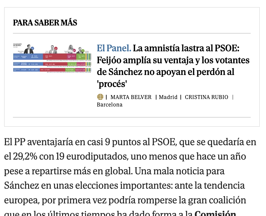
For those with a freemium strategy (where articles are divided into free vs subscriber-only), it’s also important to increase visibility of the premium offer on free content.
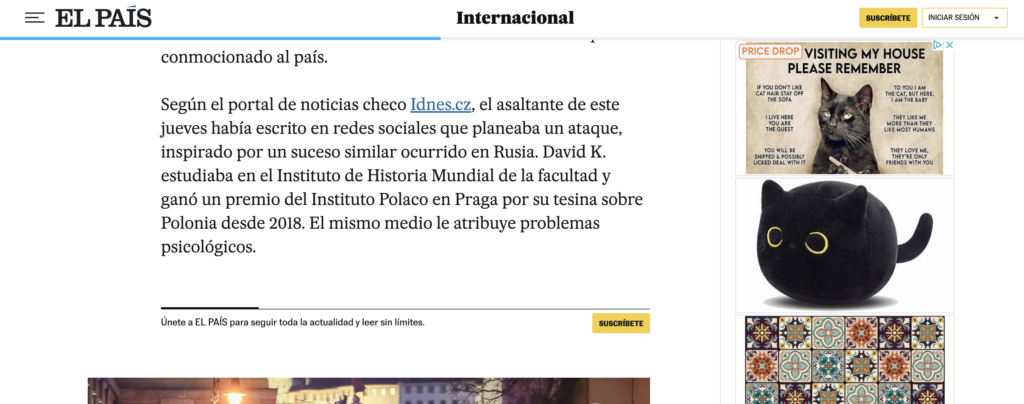
El Pais, for instance, inserts a small banner mid-article with a CTA button in the same format as that in the page header.
…Which brings up another best practice – ensuring you have a sticky header that moves with the scroll. In this way the “Subscribe” button is always visible and accessible to your reader.
On El Mundo, premium articles are promoted inside free content to encourage recirculation to paywalled articles.
Paywall
How do these 9 publishers block content to encourage conversion to subscription?
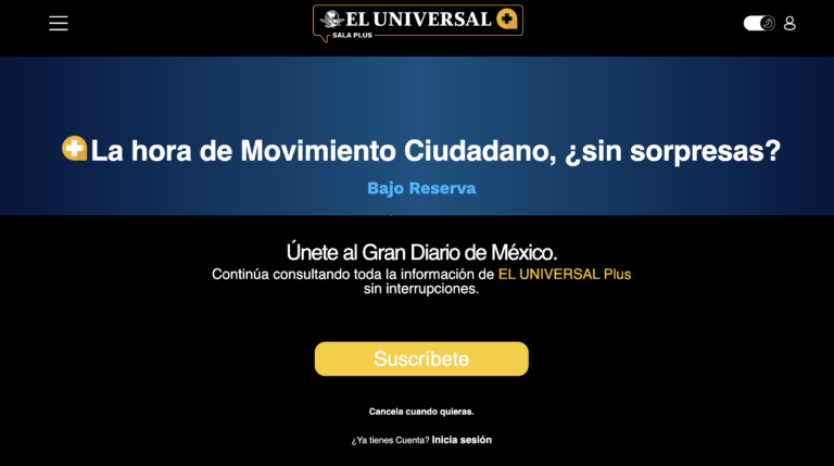
El Universal
A full-page wall ensures 100% visibility but leaves no text for us to discover their value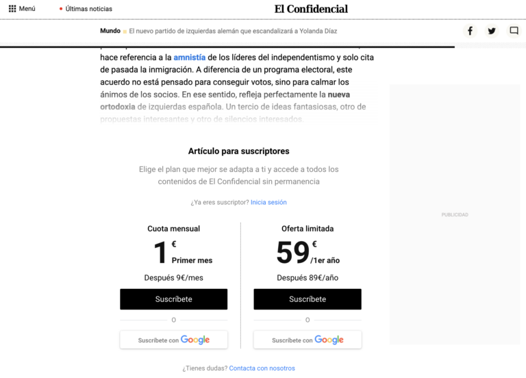
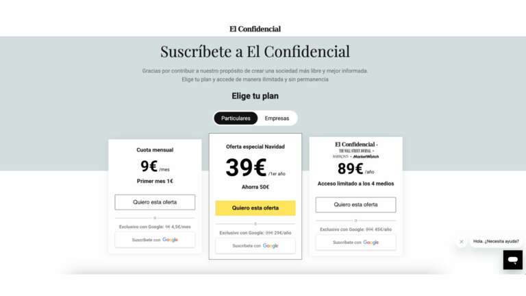
El Confidencial
Offers integrated into the wall reduce a step in the conversion funnel, thus making it simpler to convert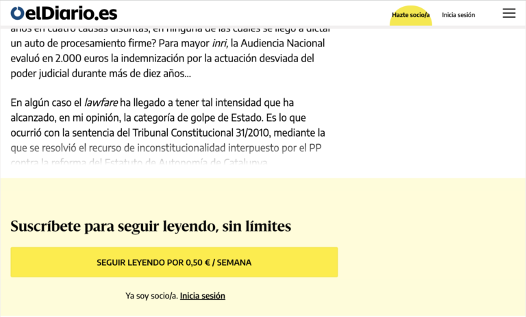
El Diario
A very basic wall but one that highlights the low-cost subscription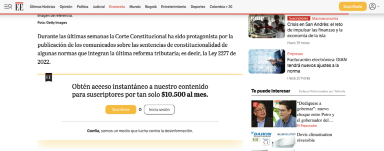
El Espectador
“instant access to all subscriber-only content”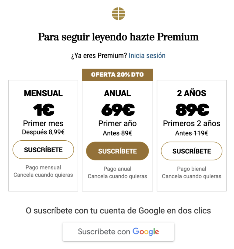
El Mundo
Subscription offers integrated into the wall, with the annual offer promoted over others (better for retention)
El Nuevo Dia
A simple wall that shares some of the content-based benefits of subscription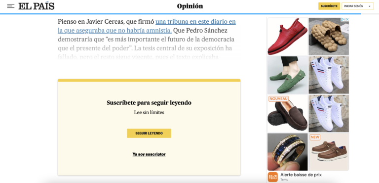
El Pais
Basic wall sharing that we can read “without limits” by subscribing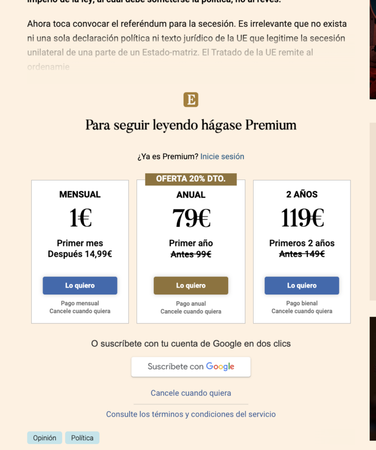
Expansión
3 offers integrated into the wall plus the option to susbcribe with Google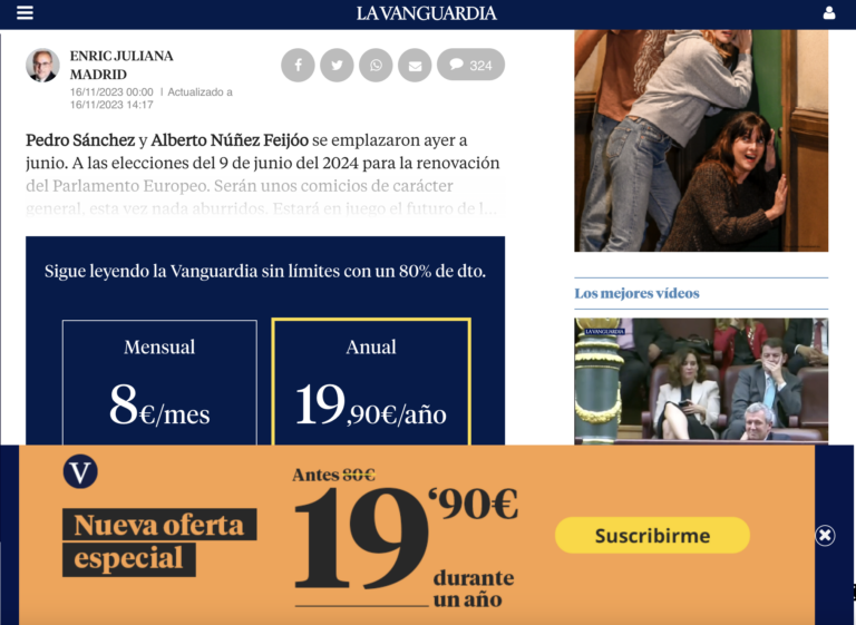
La Vanguardia
A paywall and subscription banner ensuring 100% visibility
One thing that was surprising here was the lack of attractive value proposition on the paywall amongst these titles. The text at the top of the paywall plays an important role in telling a reader why they should subscribe: What will you help them achieve? What pain points will you solve? Some best-in-class examples can be found in our benchmarking article.
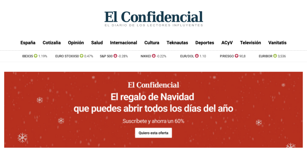
The value propositions used elsewhere on the site, however, are very strong. This just needs to be replicated on the paywall. For instance, El Confidencial’s homepage promotion for Christmas: “The Christmas gift that you can open every day of the year.”
Best practices to take away:
- Test the balance between frustration and engagement, ensuring you achieve high conversion rates but also leave enough text open for readers to see your quality content and be convinced to subscribe to continue reading. Ideally, your strategy should be different for each reader based on their propensity to subscribe. For instance, a more engaged ‘fan’ reader could be blocked with a full-page wall, whilst less engaged readers could have access to the first paragraph before being blocked
- Consider integrating other steps in the funnel into the wall, such as the subscription offers, reducing friction
- Ensure all subscription marketing uses the same design and colors. You’ll notice here that the “Subscribe” button is the same on the paywall and in the header for each title
Premium products & pricing
Once clicking on the “Subscribe” button, we’re taken to the landing page promoting each premium offer.
A special Christmas offer is placed in the center and larger than others. Note how this is an annual subscription offer
We’re also offered a discount by subscribing with Google which is likely better for retention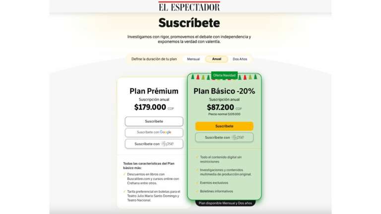
A special Christamas offer is in green and forefronted.
Benefits of subscription are included in the wall
To keep this page tidy, there are foldable pages for different offer durations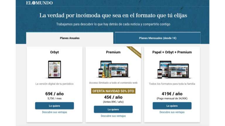
Strong value proposition – The truth, no matter how uncomfortable it may be, in the format you choose
Christmas offer with supporting image and promotional banner used across the site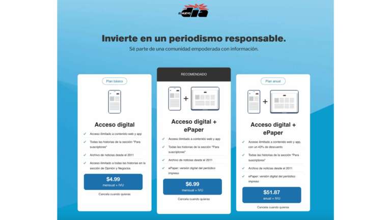
More of a “support journalism” approach here, inviting the reader to “Be part of a community empowered with information.”
A single offer is recommended above the others
No reduced trial offer or discounts for Christmas/New Yea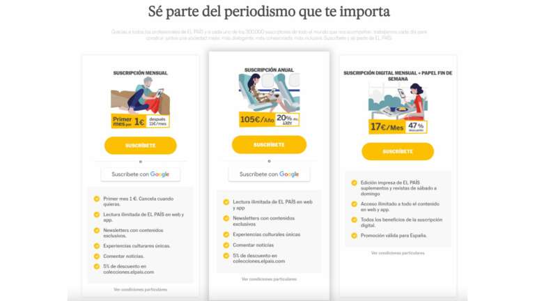
“Be part of the journalism that matters to you”, plus a strong phrase below that includes social proof (300,000 subscribers), highlights the work done by El Pais and invites the reader to be a part of this community
Each offer explains the cost per month and discount compared to other options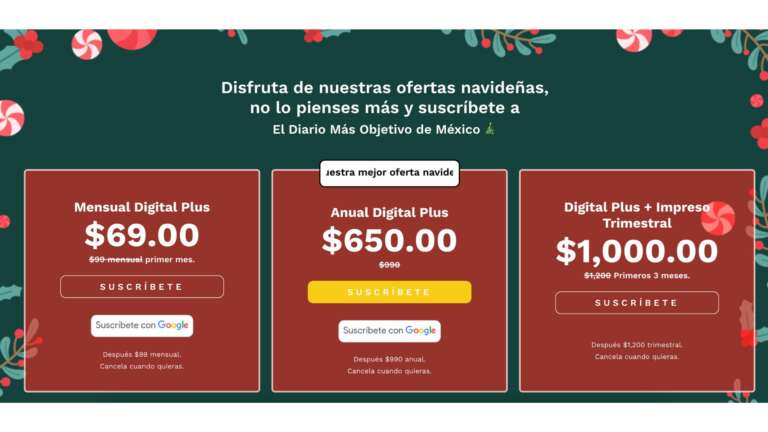
A whole page taken over with their Christmas offer, El Universal has gone all out for this campaign
The most attractive offer in the center, with a different colored CTA button and additional text
Each offer shows the amount saved with this subscription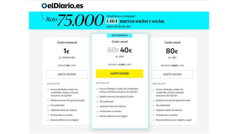
A real-time countdown shows how many subscribers are needed for el diario to reach their end of year target, a unique strategy to support that ‘final push’ to convert
Listed benefits for each offer and transparency in price per month
The CTA button says “become a member” rather than using the word subscriber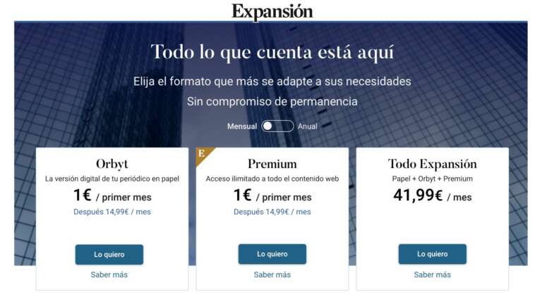
“Everything that counts is here”
€1 for the first month reduces friction to convert and allows subscribers to discover the value of subscription
Fully digital or ‘Orbyt’ offer which is simply a digital version of the newspaper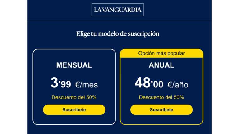
A very simple subscription offers page
The annual offer is highlighted as the most popular, and a discount of 50% is clearly labelled on the offers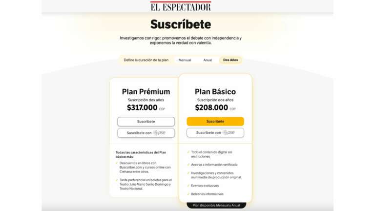
…there’s even the option of purchasing a 2-year subscription
Interestingly, this isn’t any cheaper for the basic offer, only the premium one, and even here they haven’t highlighted the amount
saved by subscribing to 2 years instead of 1
What do these examples have in common?
- A maximum of 3 options
- The discount is almost always on the annual offer, the product that best supports high retention and LTV
- One offer is always highlighted as the “most popular” or “recommended” offer, supporting decision making
- Most have a €1 month trial offer
- The best examples have a strong value proposition above the offers rather than simply “subscribe” or “choose your offer”
- For those with 3 options for both annual and monthly, the page is split into two ‘tabs’ to not over crowd the page, and monthly subscriptions are the ones we see upon arriving on the page