

We’re all aware by now of the value of registration for collecting first-party data, boosting engagement and personalizing the user experience, not to mention supporting both ad and subscription revenue streams. And one of the most effective ways of converting anonymous visitors into logged members is through a registration wall. Content is blocked and a reader is asked to create an account in exchange for access to the article and other benefits.
What’s often overlooked, however, is the user conversion journey and their first few minutes as a new member. Just like subscription, this is your moment to:
- Collect data but not too much to cause friction
- Make sure a reader is aware of the value gained from registering
- Offer a variety of account creation options (e.g. sign in with Google or email)
- Personalize the user experience (e.g. choose content topics to personalize their home page)
- Increase engagement (e.g. form a habit through newsletters)
- Promote subscription to increase reader revenue
- Provide value from the moment the account has been created
To give you some inspiration, here are 5 benchmark examples of each step in the registration wall journey:
South China Morning Post
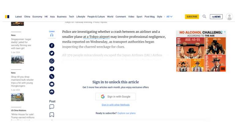
The registration wall informs us that creating an account gains us access to 3 more articles per month
We have the option of signing in easily with Google, and there’s a link to subscribe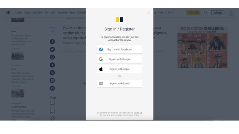
A variety of registration options 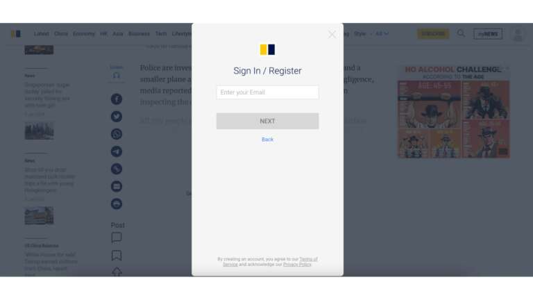
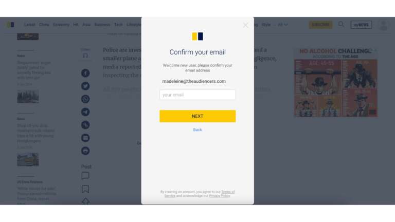
Email confirmation – useful for the publisher but could cause friction. Other publishers tend to do this via email after registration 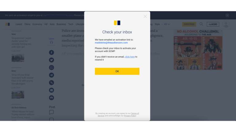
Second confirmation step 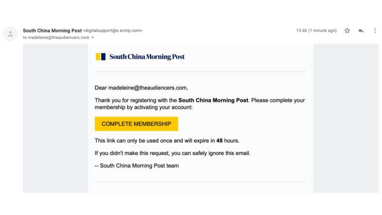
Email received to confirm address 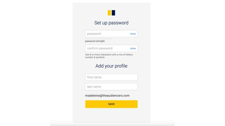
Password creation 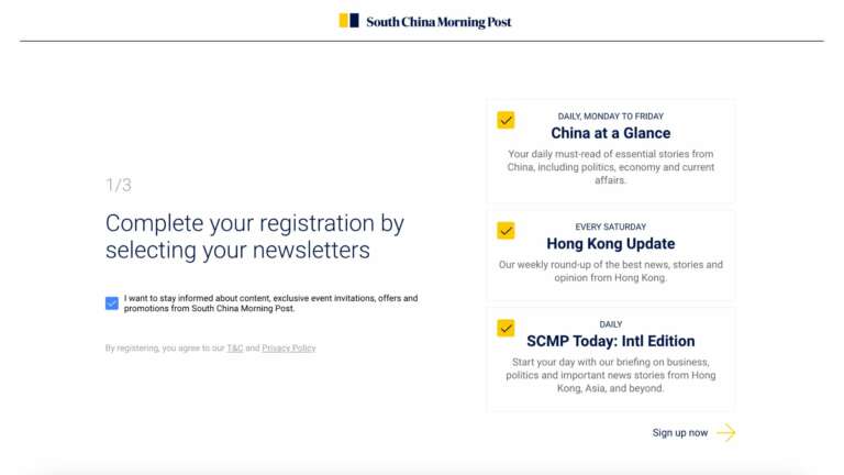
Registration onboarding step 1: newsletters
Clear value proposition for each newsletter plus how frequently it’s sent
Sign up requires just a single click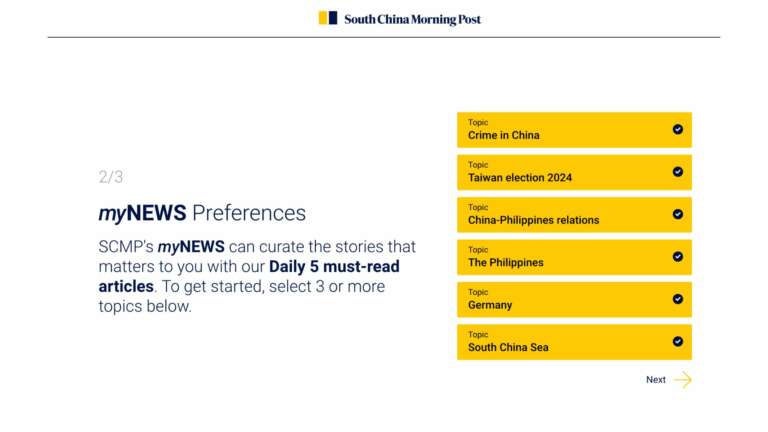
Registration onboarding 2: personalization
This means content is adapted to our interests from day 1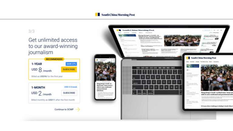
Registration onboarding step 3: promoting their premium offer
Even if the reader isn’t ready to subscribe, they’re now aware of
What we like in particular with this journey: the onboarding journey which includes personalization features and a step promoting subscription.
You’ll also like: How launching a registration wall led to higher LTV amongst subscribers at Alternatives Economiques.
Bloomberg
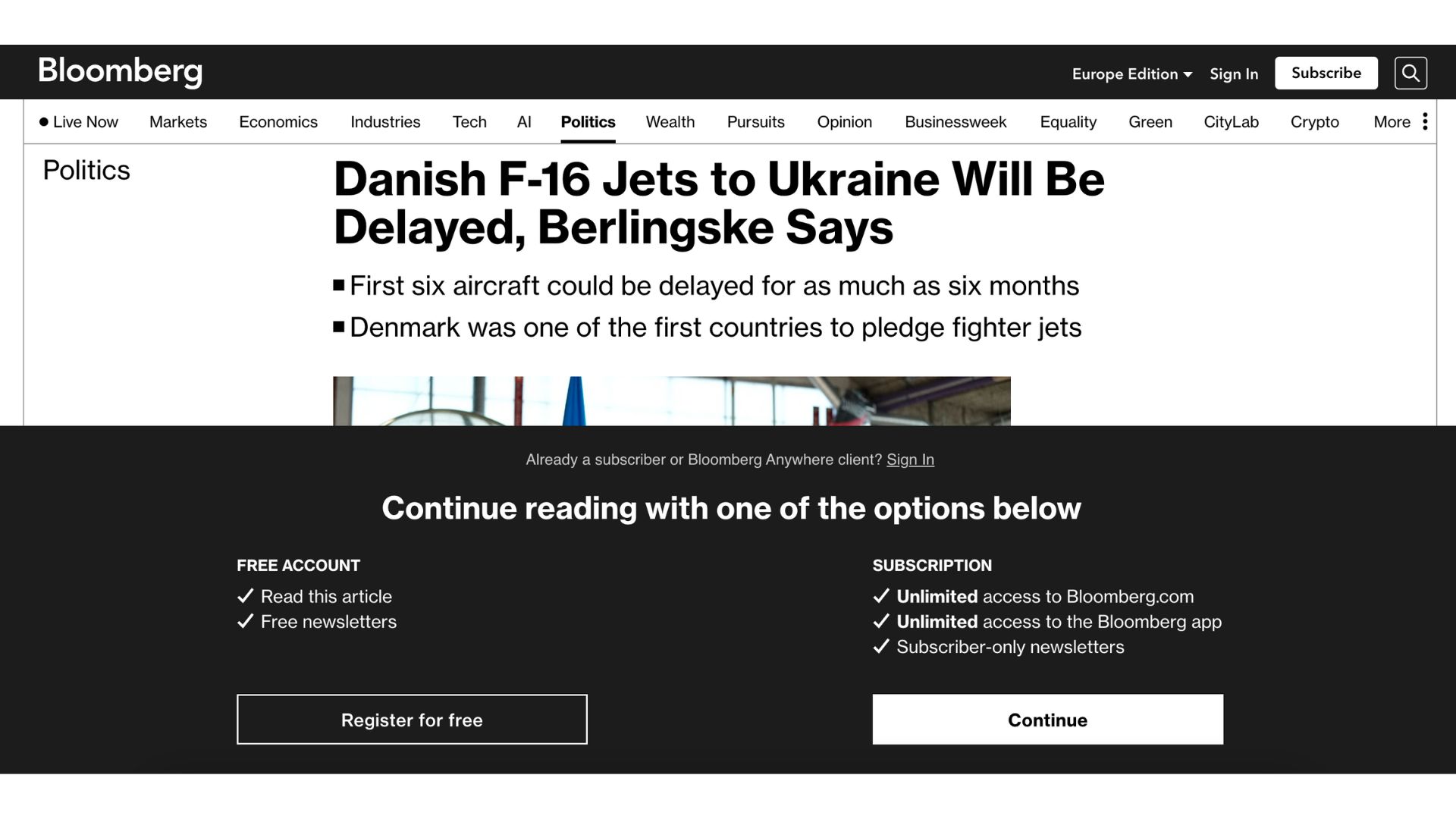
What we’ve named the “double-edged wall” that offers subscription or registration
Even if a reader isn’t likely to subscribe, the juxtoposition of the two options proves the value of the paid product, and educates the reader on this option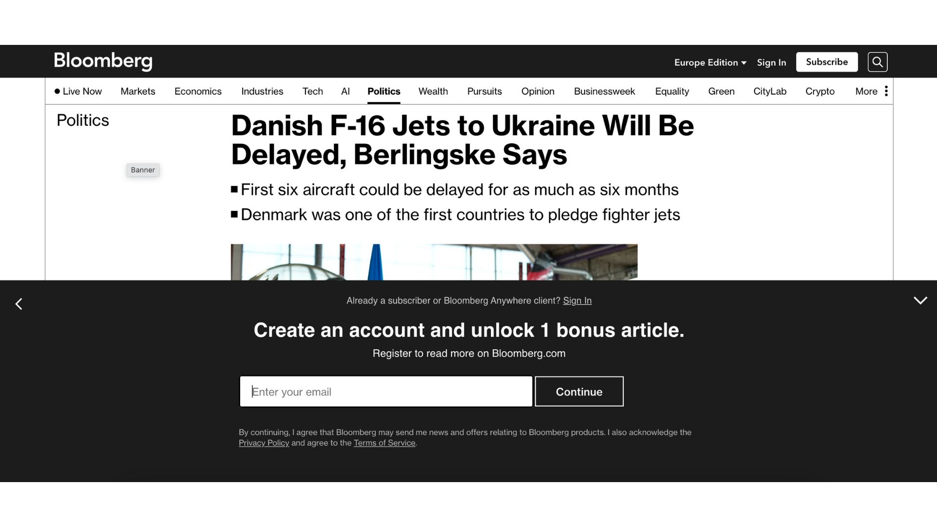
Very clear value proposition that keeps things simple
Only a single form field and it’s integrated into the wall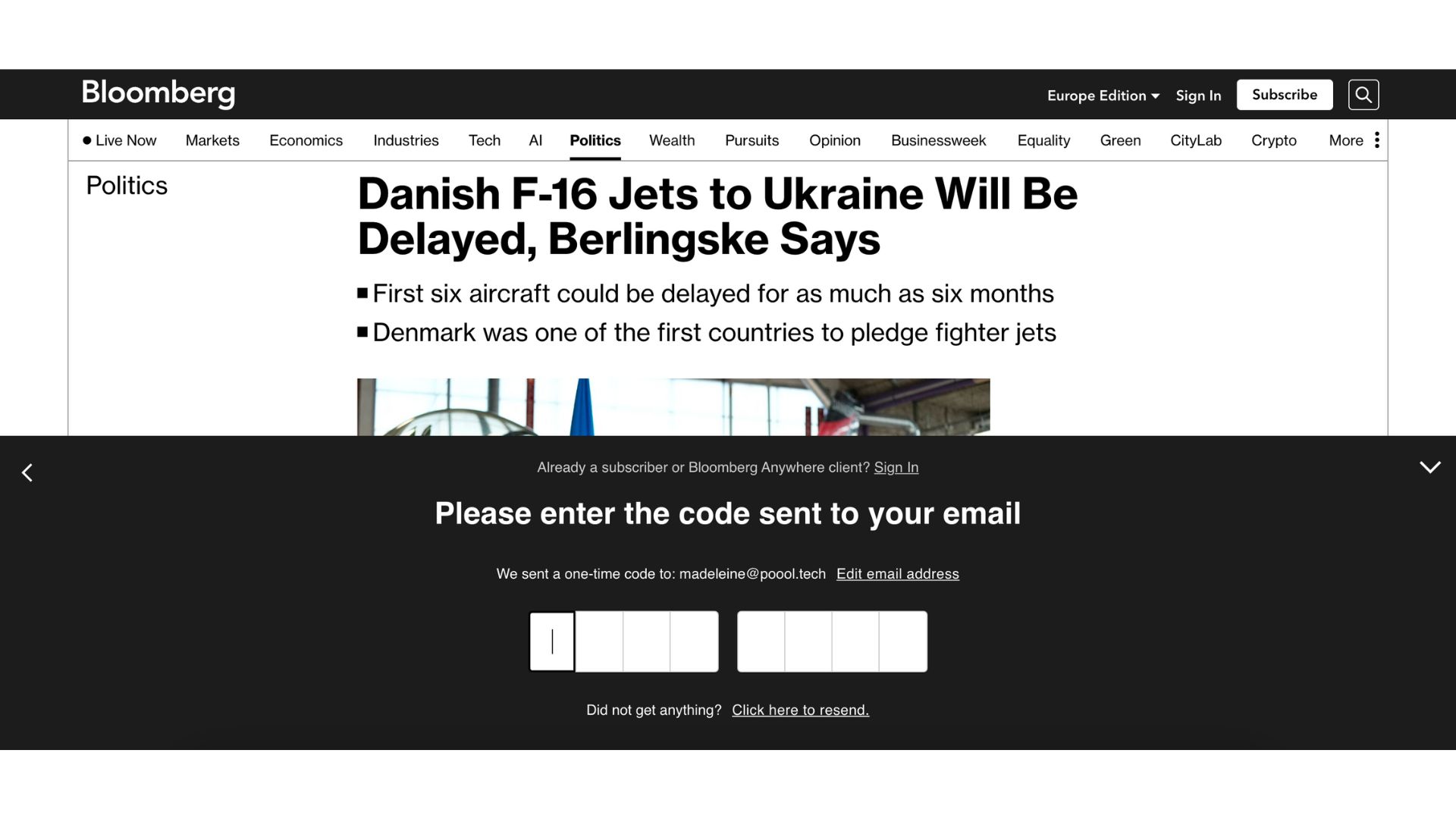
Email confirmation on the same page 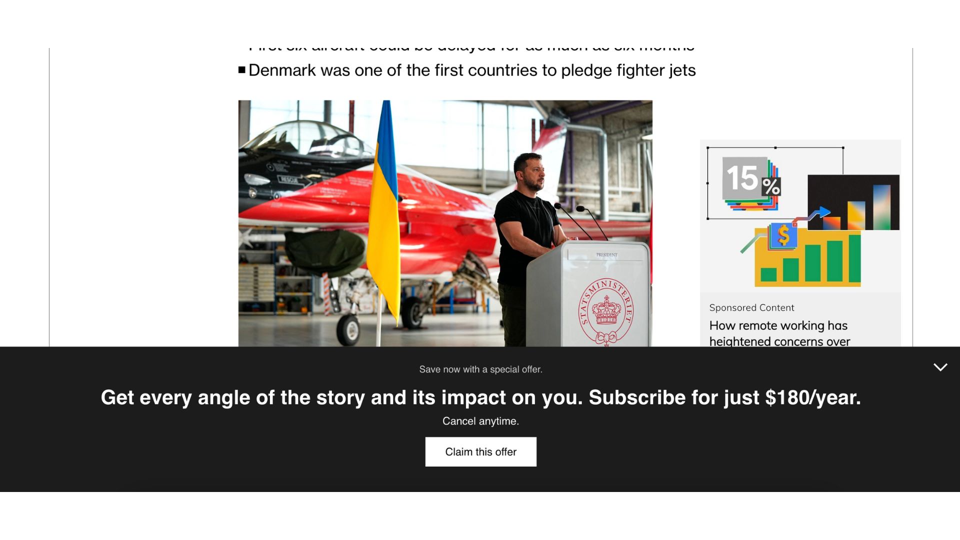
What we like in particular with this journey: we’re never redirected – everything is completed on the article we were hoping to read. Plus we’re offered a special subscription offer immediately after registering
The Economist

Another ‘double-edged wall” but what is great here is that subscription is promoted above registration, with a tempting value proposition and free trial offer 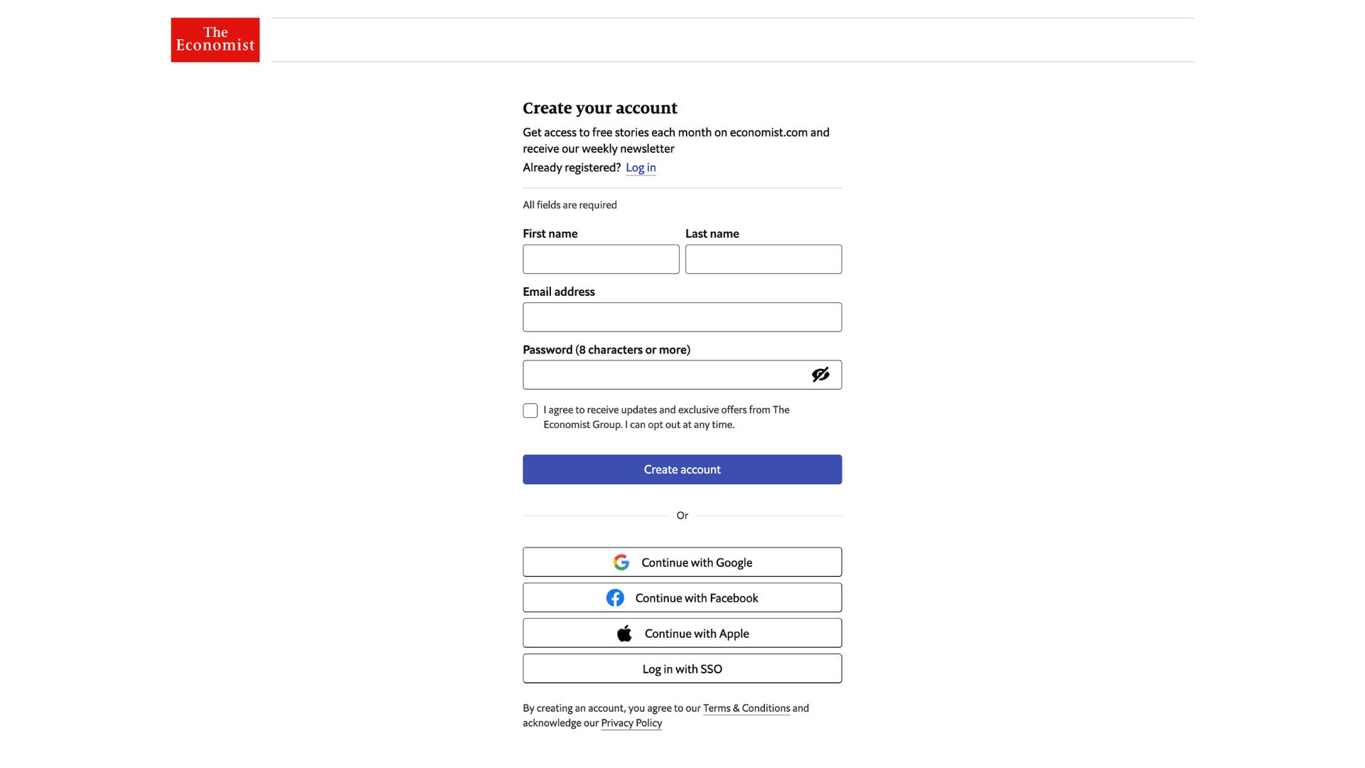
Simple registration with the option of using an existing social account 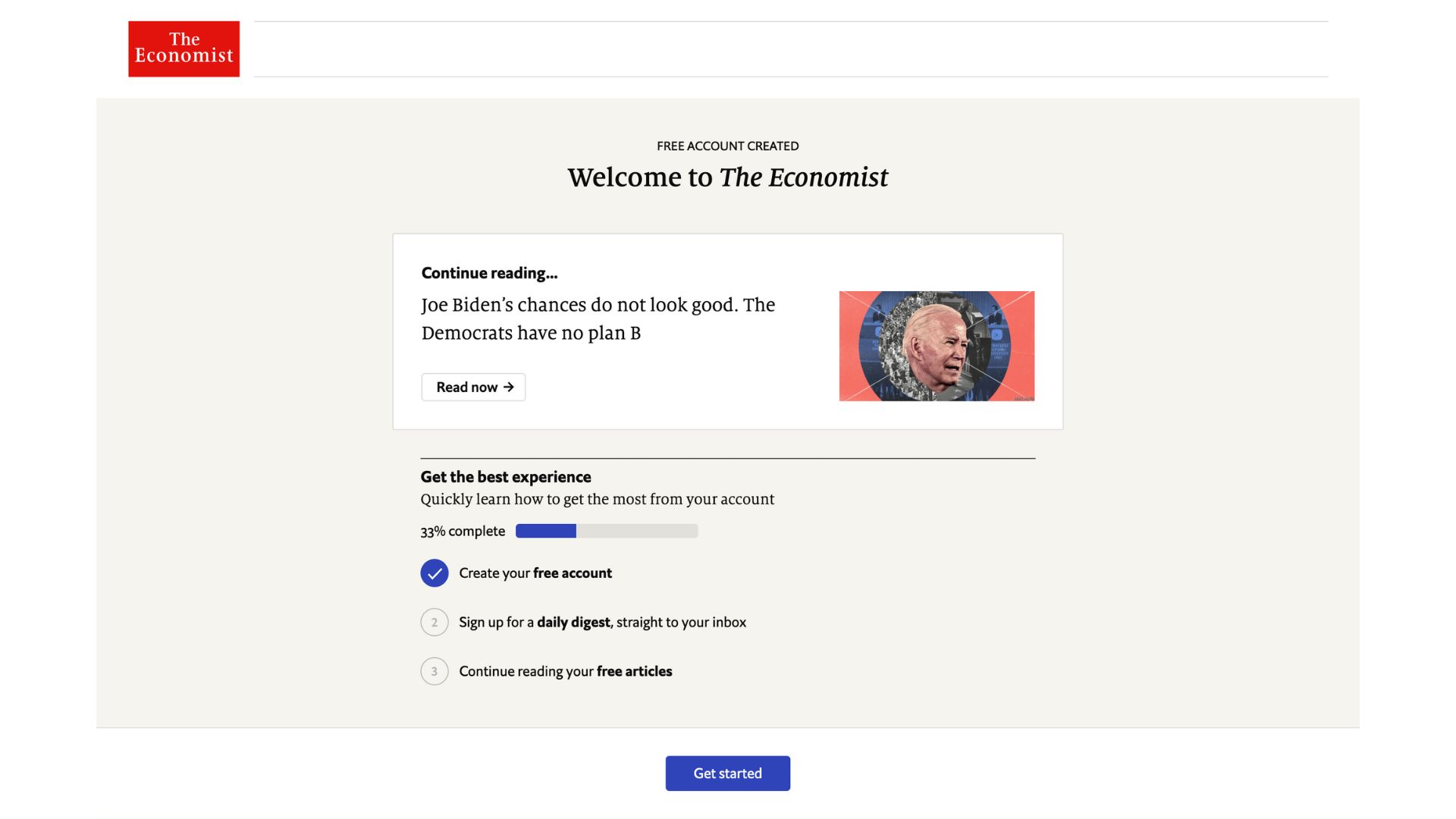
We’re directed to an onboarding journey, but with the option to skip these steps and go straight to the article we were trying to access 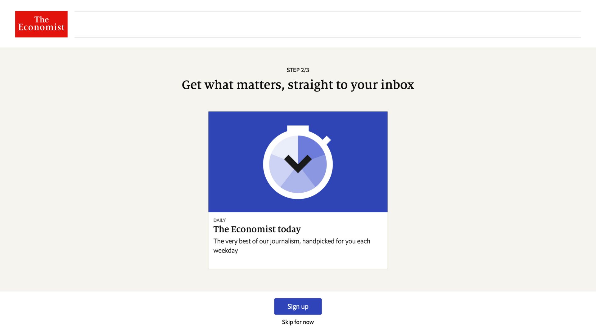
Likely their most habit-forming newsletter for the first onboarding step 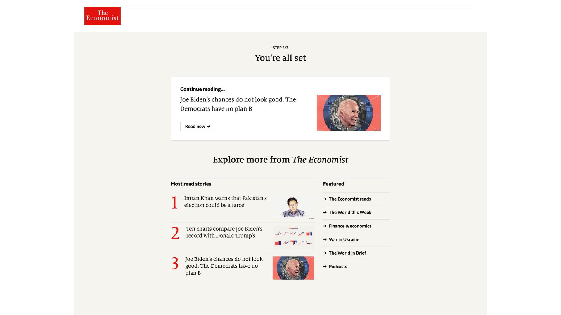
It was surprising to find that this was the end of onboarding. It felt like there was only one real step (the daily newsletter) but with 2 additional, unnecessary steps before and after.
What we like in particular with this journey: the double wall (paywall and registration) plus a very simple onboarding but one that always gives us the option of going back to the article we were hoping to read before being blocked
20minutes
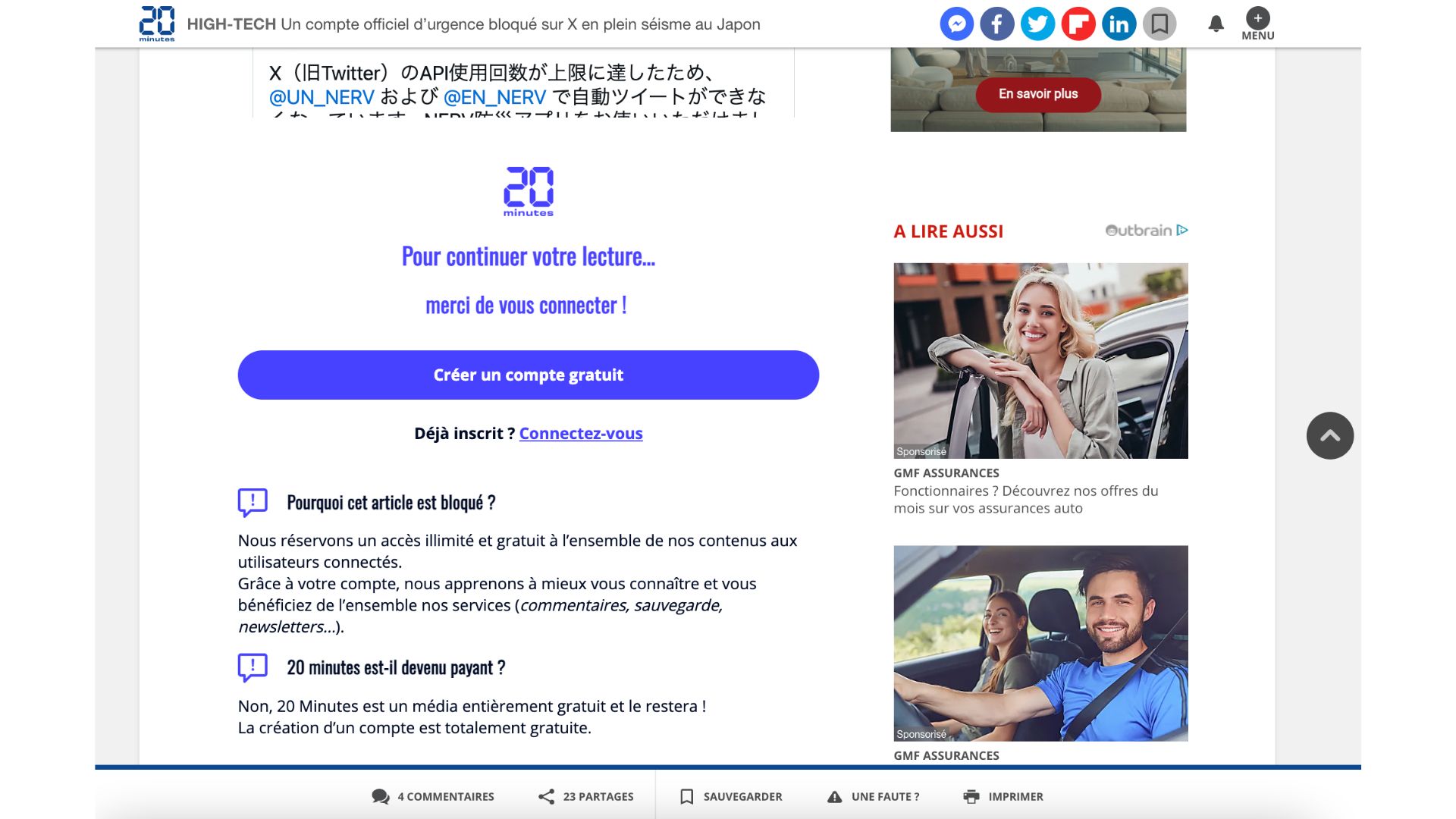
“Continue reading by creating an account” registration wall 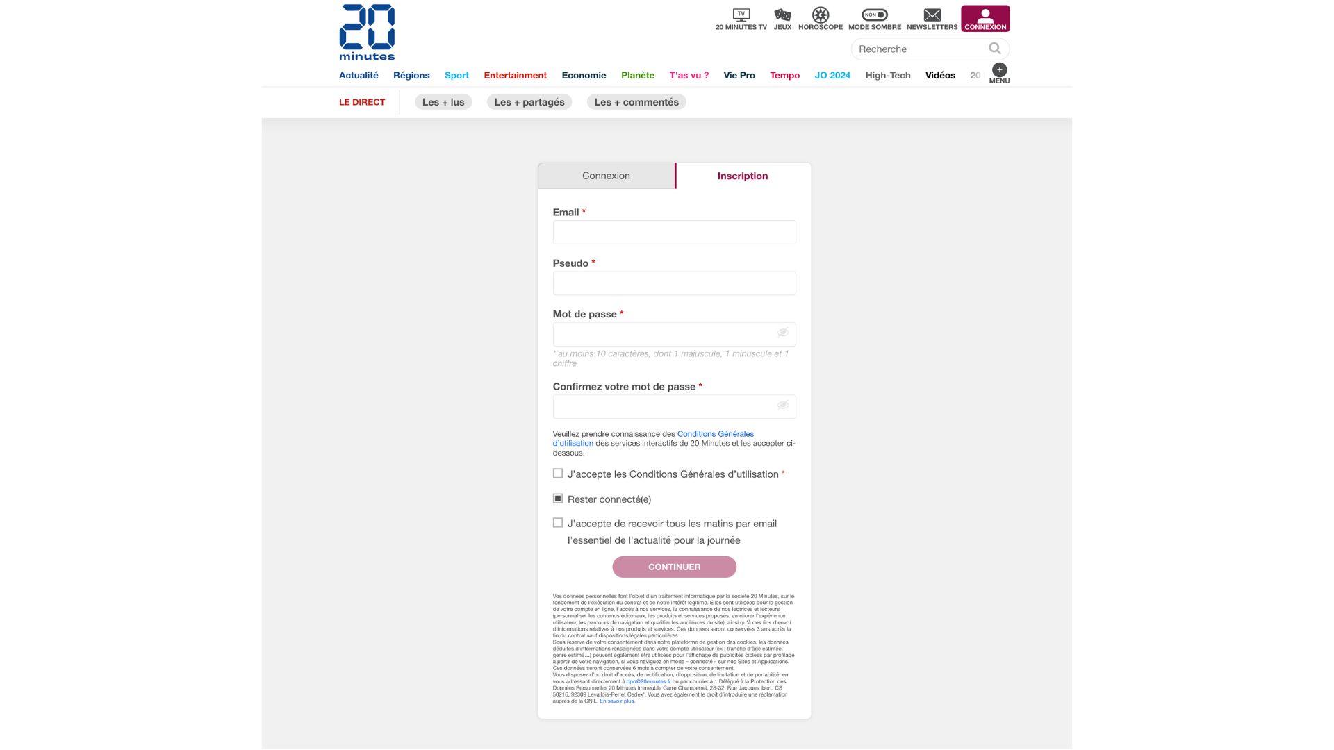
Email, name and password is all that’s needed 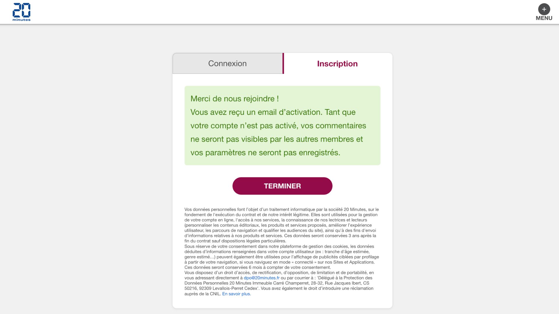
An email confirmation is sent to the reader 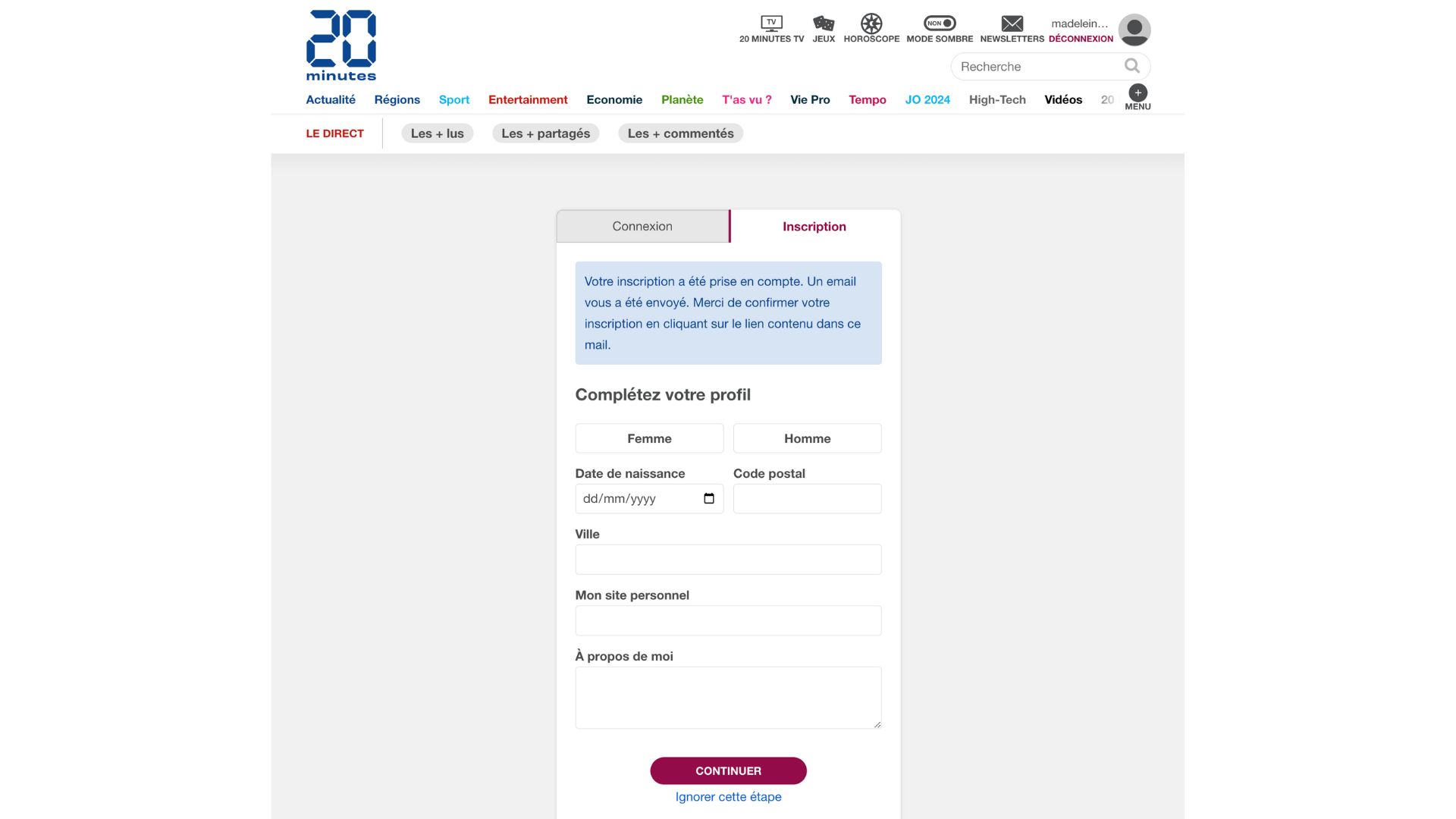
Additional data collection happens in the next step, when a reader has already created their account so there’s no risk of missing-out on the reader’s email address. There’s the option to “skip this step” 
We’re led back to the same article we were trying to access originally, however there aren’t any additional onboarding steps to increase engagement. As this publisher doesn’t have a subscription model, this is a key opportunity to promote their app, newsletters and welcome a new member
What we like in particular with this journey: we’re redirected straight back to the article we were originally accessing
The Washington Post
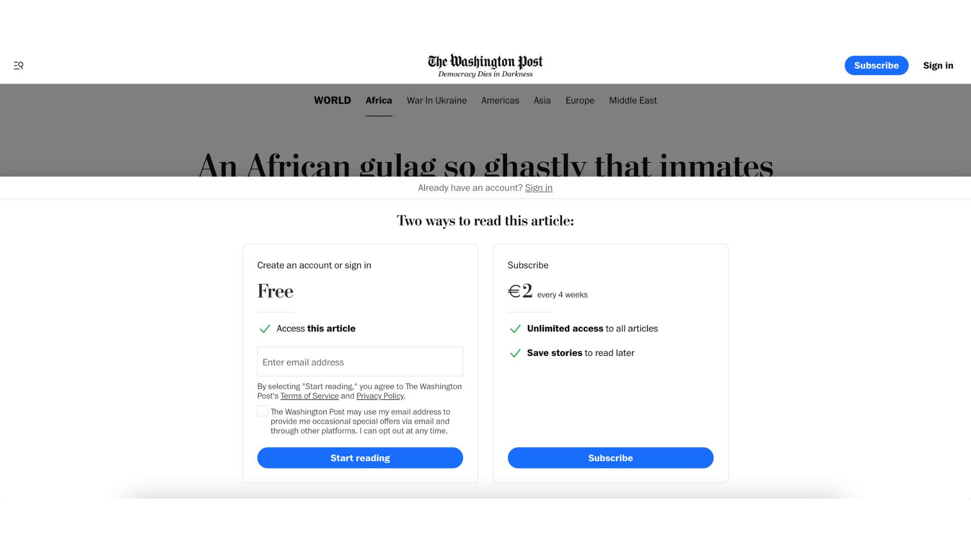
Another double-edged wall, this time with the subscription cost integrated into the wall.
For the registration option, email collection is done directly in this wall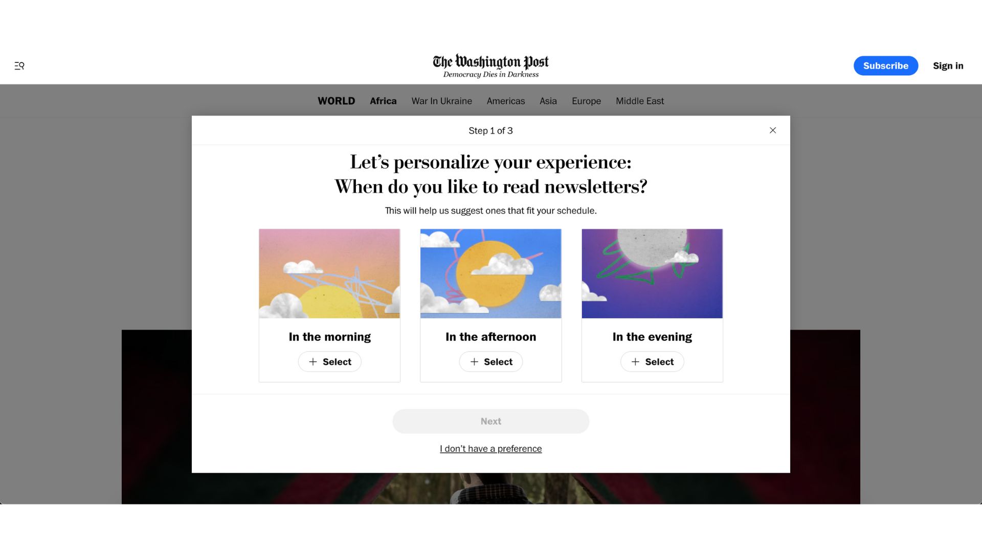
Onboarding takes place without any redirection and a single click is all that’s needed to select one of these options.
This is a clever step to support habit forming based on a reader’s existing daily routine, rather than trying to start a new habit.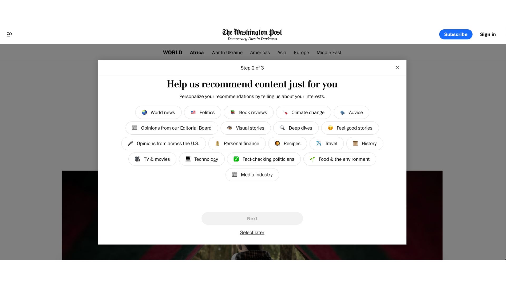
The emojis make it easy for a reader to understand each “interest” by simply scanning the page, making this step less frustrating despite the wide variety of options.
Note that we can skip any of these steps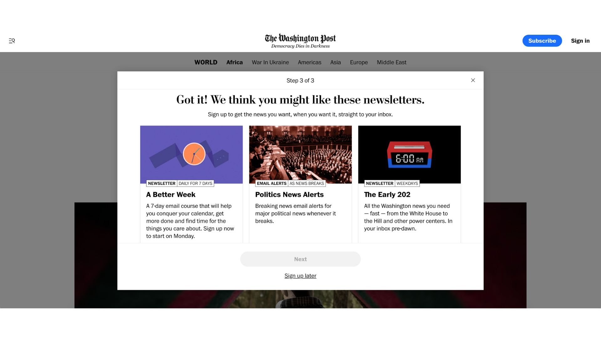
The final step is personalized according to our reply to the previous two steps 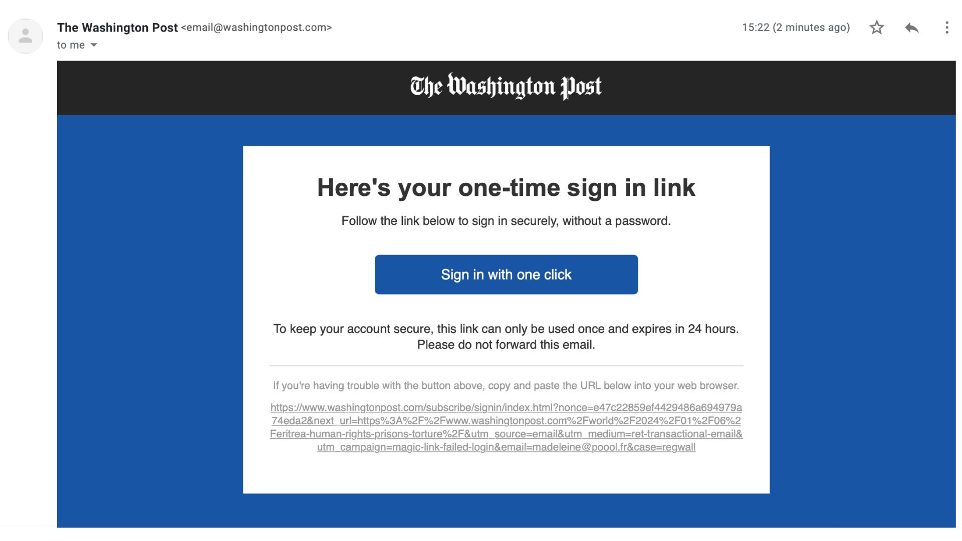
The email to confirm our account 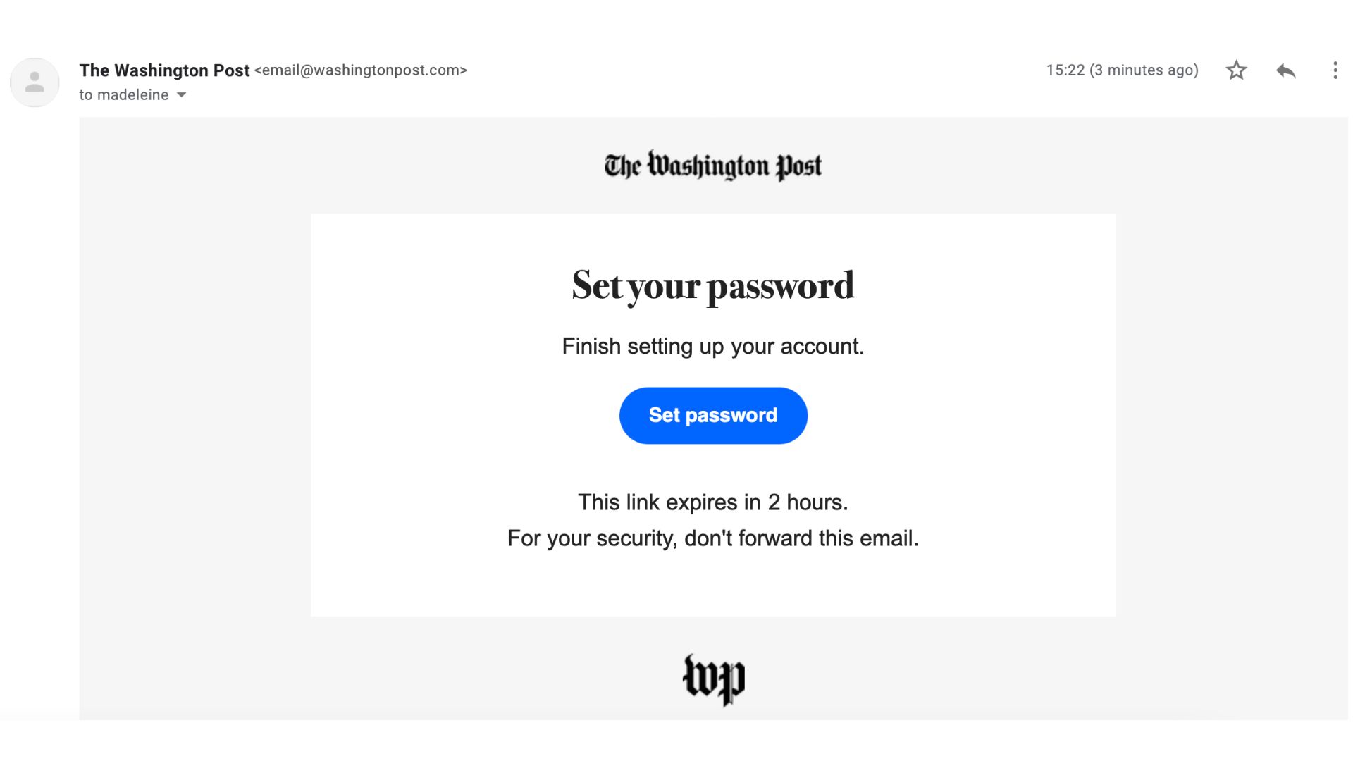
Password creation happens after registration, which may well be valuable for reducing frustration in the account creation process, but seeing as the “link expires in 2 hours” they may well have some readers who never finish setting up their account 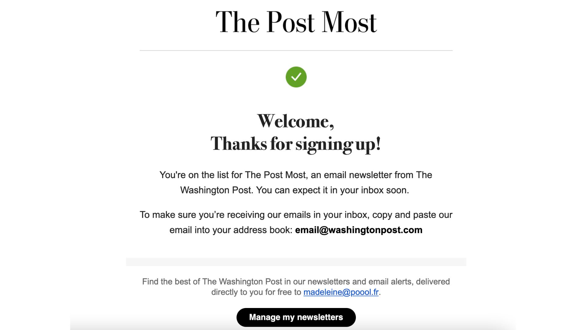
As a new registered member, we’re automatically signed up to “The Post Most” newsletter
What we like in particular with this journey: personalizing in the onboarding journey impacts the newsletters presented in step 3, meaning content is immediately adapted to our interests, supporting engagement
Registration wall journey best practices:
- Onboard newly registered users just as you would subscribers, considering which engagement actions often lead to high LTV
- Make sure to connect registration with subscription, if you employ a premium model
- Bring the reader back to the article they were hoping to access in the first place
- Offer real value in exchange for registration, making sure to emphasize this value at each step in the journey – find 10 ideas here
- Reduce friction and only ask for the information you need
- Welcome the reader, either onsite or via email
- Consider offering the option to register with an existing social account, such as Google, Facebook or Apple
- Don’t forget about the registration experience on mobile, perhaps offing app download as one of the onboarding steps