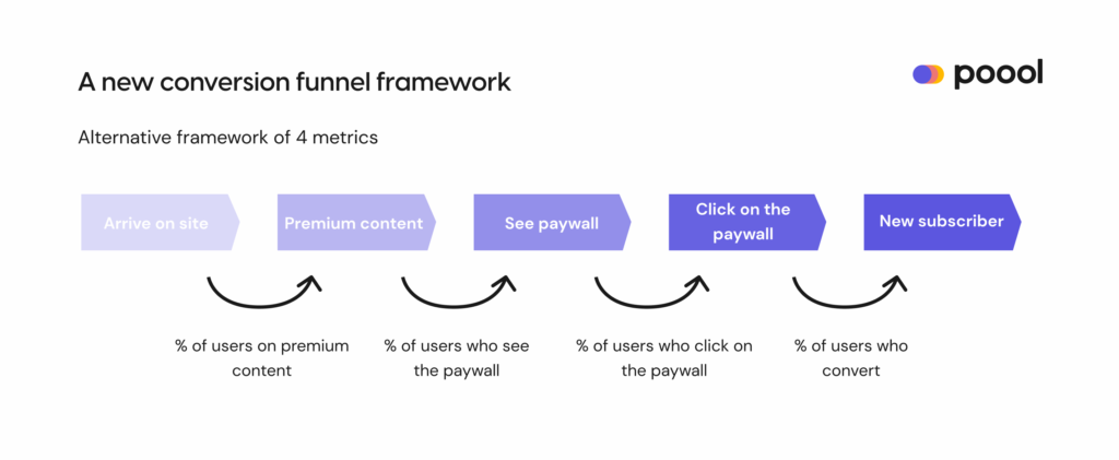
As with our previous reports, this edition shared benchmark data for 4 KPIs to improve the single conversion rate metric. Specifically, this framework:
- Takes into account the user engagement journey prior to the paywall, understanding that a user’s decision to convert doesn’t just happen at the point of the paywall
- Allows you to pinpoint exactly where you’re losing traffic to make very targeted corrective action
- Helps you to compare yourself to others in the market by reducing the number of factors at play
To access the report in full, with all takeaways and best practices to accompany each KPI, it’s here.
Step 1. Percentage of traffic on premium content
Def: out of total traffic on your website, how many users visit premium content vs free, unblocked content?
Overall average: 68%
Range: 1%-100%

The average traffic on premium content in Q3 (68%) is significantly higher than Q2 (56%), reflecting a tightening of digital subscription models, likely due to a growing level of maturity amongst these publishers and the continued fall in ad and print revenue streams.
Specialist media lie at the top of this scale with a very high average of 92%, the first time that a publisher-type has been above 80%. This reflects 2 key trends that are developing in the industry:
- The increasing focus on subscription models over advertising or print
- The nichization of the industry as publishers realize the benefits of specializing their value proposition to secure a smaller but more highly engaged audience who have a greater propensity to subscribe.
The takeaway: even if you aren’t a specialized media, you can build thematic sections, and use audience segmentation to benefit from each ‘niche’ within your wider title.
As for traditional news publishers, the average is at 66%. This figure has continued to increase year-on-year (21.3% in 2019 for instance) as publishers tighten their subscription model, not only placing increasingly more content behind a wall but also promoting these premium articles more widely.
We can compare this to lifestyle publishers who lie at the other end of the scale, with an average of 16.49% of traffic on premium content. These titles often publish a wide range of content and tend to have a very large, more volatile audience who are less likely to subscribe.
The advice in this case would be to maximize on soft conversion strategies, such as newsletter sign up or registration, to increase engagement and collect first-party data. This will not only positively impact propensity to subscribe but also allow you to increase ad revenue through targeting, personalize the user experience and gather data for us in AI and dynamic conversion strategies. Even if the reader never subscribes, you’ll still be able to benefit from their engagement in other ways.
In the full report:
- How to optimize this metric
- Balancing frustration and engagement
- Why and how to integrate registration into the user journey prior to the paywall
Step 2. Paywall visibility rate
Def: the percentage of users on premium content who see the paywall.
Overall average: 55.48%
Range: 1.60%-86.00%

Note, this metric shouldn’t be considered as a question of how much content you’re blocking. Rather, how many potential subscribers are being lost at this stage because they never actually see the paywall? It’s not only a question of paywall ‘height’ but also of content and engagement.
Since 2020, the interquartile range has shifted up a whole 10% (from 30-60% to 46.66-70.73%), and we can even see a difference since Q2, where the average was lower than Q3, at 54.72%. This reflects the increasingly tighter paywall strategies being employed by publishers as both them and the market becomes more mature. However, we’d also add that many are finally realizing how many readers are lost at this stage in the funnel, and the negative impact of a wall that readers on premium content never see.
One publisher in the benchmark, for example, tested increasing the paywall height by 10% and saw a more than 100% increase in click-through rates (the next KPI in the funnel towards subscription).
In the full report:
- How to optimize this metric
- Improving conversion rates on mobile and apps
Step 3. Click-through rate (CTR)
Def: how many of these users who saw the paywall actually click on the “Subscribe” button?
Overall average: 1.07%
Range: 0.04%-11.90%
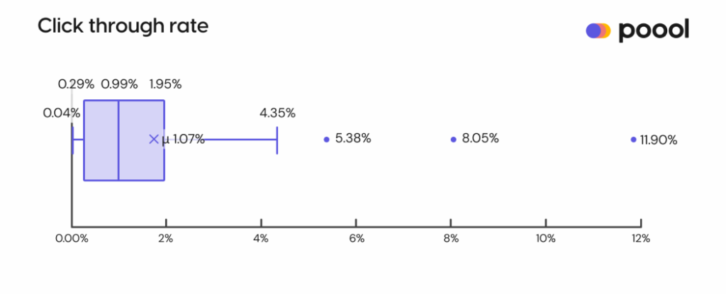
This graph successfully sums up the results that we’re finding for this stage in the funnel… There’s a lot of variation!
To help make these results more valuable, the market average is around 0.2%, whilst the average CTR amongst Poool clients (who regularly update their wall, build dynamic walls for each audience segment and run A/B tests on wording, design & scenario) has been between 1.07-2.56% average over the 2023 reports.
Unsurprisingly, given their niche focus and so higher levels of engagement, B2B, specialist media and finance publishers are the best performing in this metric.
In the full report:
- A/B testing to optimize CTR
- “Keep readers on their toes” – the simplest strategy to put in place to reduce paywall blindness
Step 4. Conversion rate out of total clicks
Def: how many users who click-through your paywall end up paying to become a subscriber?
Overall average: 2.45%
Range: 0.61% – 6.61%

Note that these benchmarks are not representative of overall conversion rates but rather how many users who clicked on the paywall ended up converting into a subscriber?
For comparison, Piano’s 2021 benchmark found a conversion rate of 0.22% for anonymous users who make up, on average, more than 90% of a publisher’s audience.
These conversion rates are gradually increasing each quarter as clients are improving performance at each of the previous steps in the funnel towards subscription.
In the full report:
- How can you optimize this metric?
- How can you be dynamic with the Poool Dashboard? – audience segmentation based on location, content type, source of traffic and readers who nearly subscribed but didn’t
Bringing the conversion steps together
Turning back to the new framework as a whole we can place our benchmark averages into each of the 4 steps:
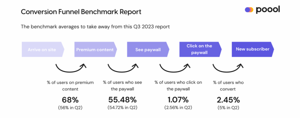
Thanks to this broken-down conversion funnel, you can calculate and compare performance at each of the 4 steps, understanding exactly where you need to focus optimization efforts.
For instance, you may spend time and resources on optimizing paywall design, but in fact you’re losing the majority of your traffic at the first step – i.e. users are never actually moving through to a premium article where they have the chance to be exposed to the paywall. What’s the point in building a well-designed paywall if no one even sees it?
What you’ll also find is that even small improvements to each step will culminate into significant improvements to your overall user-to-subscriber conversion rates as increasing performance at one step naturally impacts the performance in the steps that follow.
Also in the report – What about unsubscription? We look at how making it easier to leave has convinced more people to stay in Norway.
Download the client-exclusive Report in full to discover the optimization strategies to put in place with the goal of improving each KPI in the funnel towards subscription.