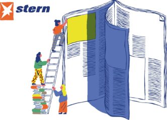

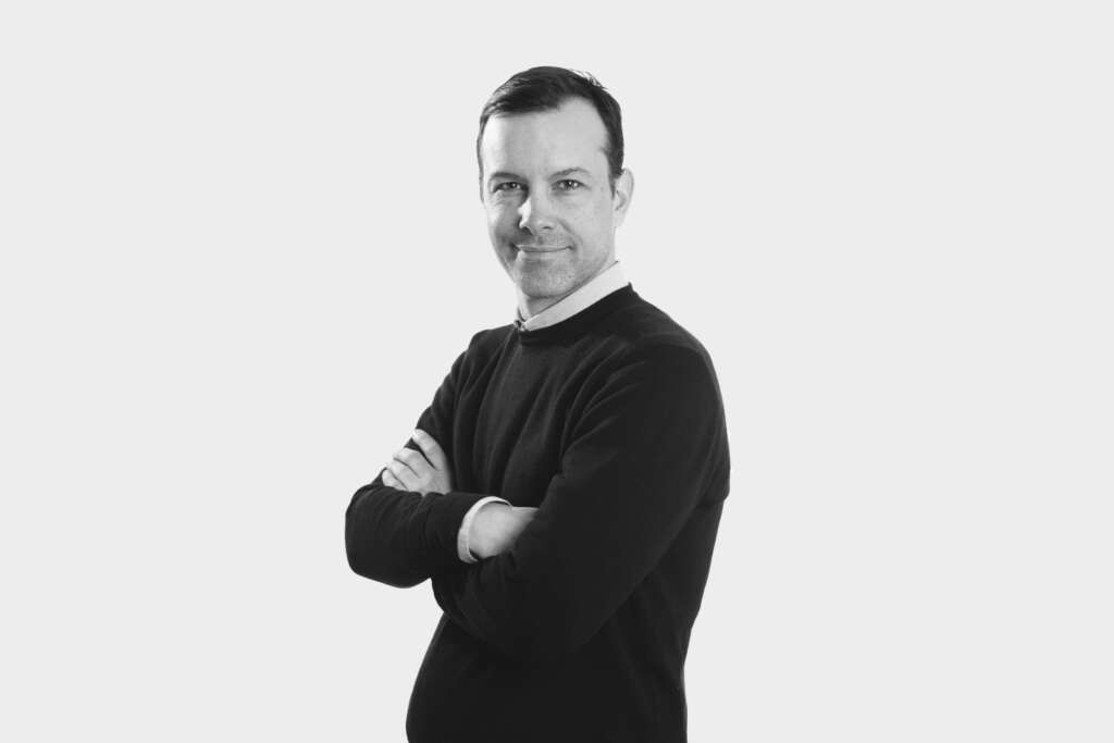
In early February 2023, the homepage of Le Parisien.fr was given a new look. 40 additional articles per day, a new navigation bar, matching web & app, optimized photo placement, layout changes based on the news stories and interchangeable slices... A whole host of new features with one clear goal - to increase entry rate to this essential, crossroad page, to double the click-through rate, and encourage readers to recirculate between articles.

We met with Vincent Briot, Chief Product Officer, who told us about this homepage project, a page which receives 15 million visits per month.
Hello Vincent! So, you recently redesigned leparisien.fr’s homepage. Why did you do this? Did the previous one have any problems?
Lots of problems!
First of all, because of its monolithic structure, our editorial team felt that the homepage just wasn’t suited to cover all our editorial needs. In the event of a major event or special news item, they had to get a specific developer involved to forefront this news story. This meant that there was a real lack of emphasis on ‘hot’ news, which was hardly distinguishable from the other content.
On top of that, from an organizational point of view, we had a different logic for desktop vs apps, something that was complex to manage on a daily basis. As soon as we wanted to change the order of the various sections (the horizontal blocks), it was hell.
Other problems we had to deal with concerned photo quality, duplications and our homepage’s anti-chronological display. Because we wanted to be very high performing in terms of webperfs, we reduced the weight of visuals as much as possible, but this really reduced their quality. We couldn’t let that happen – we have 15 in-house photographers, so we had to put the photo quality first!
Another source of difficulty was that we didn’t always have clear rules on which promotional blocks should be put where – such as the newsletter promotion, advertising, subscription, etc. So we’d often end up with alternating blocks that just didn’t look very professional, nor were they very effective.
And, finally, the width of our site wasn’t the standard, which meant that our advertising arch format wasn’t standard either, yet another complication for the advertising agency.
Did you define key performance indicators to improve with this redesign?
The first one was the homepage (HP) entry rate. We wanted to make sure that people visited and came back. It was 14% on the website before, it’s 17% now! We’ve also seen improvements on the app – 5% before, 7% now.
The second is the click rate on the HP: do people click on our articles? After one month, we’re already at 15% increase in click-through rate.
Finally, we are obviously trying to increase the overall number of pages viewed per visit. We’ve worked on navigation, changing the nav bar on the web and app, even if it’s not yet in production on the apps. In the next version, we will have swipe navigation. We have a dev team dedicated 100% to us, they are very good.
We don’t necessarily follow the scroll depth, we just look at it from time to time.
When and how did the project start?
We’ve been talking about it since I arrived, for over two years! At first we said we would change for the 2022 presidential election, then the legislative elections, but it was too ambitious to manage the event and the redesign. So we sequenced it.
We did a lot of user research, accompanied by the Usabilis agency, which was great. The method was :
- Present what we wanted the readers to do
- Determine the navigation scenarios
- List the points where we absolutely wanted feedback.
For example, we wanted to ask people: is this a specific feature of Le Parisien that stands out? Another example: the word “Subscribers” was transformed into a small yellow square with our initial “P”. We wanted to test people’s understanding of this little icon that was changing.
We provided the agency with our HTML prototypes, which are more usable than fixed models, and they put together focus groups.
In concrete terms, we created panels of people – 12 user tests with 6 subscribers and 6 non-subscribers, mixing desktop and mobile, each time over 2 days. These are very rewarding days, but they’re very intense! We’re all in a room with a one-way glass window. The questioner runs the session. The sessions are filmed so that we can replay them. Everyone takes notes. Between each user, we exchange notes and see if we understood the same thing. At the end, we write a report.
Behind the glass were our Product Managers, our Product Owners, our designers and our Editor-in-chief, it was really great!
So with these focus groups, you test a first version of the new home…
Yes, at the beginning we thought we’d do a “flow” home page with stacked articles, that was our V1. The feedback from user tests was positive, but people didn’t find their way around very well, it wasn’t going to work.
So we went back to a more classic version, with thematic sections. And did a second session of user tests with 12 new people (re-sourcing, re-booking of the room, new protocol, the same scenario…).
The feedback was better this time round. We no longer had users saying “I’m a bit lost, I don’t really know what section I’m in”. Even if we know that the flow works! On social networks, readers are familiar with this mode of consumption.
After this second test session, we were rather serene, and felt that we could launch without any risks. We’re off to the races. We have the pressure, we go for it. But, at the same time, we wanted to review the layout of the print media, especially the front page of the newspaper. Their layout had been redone in November/December, so we had to release the digital media more or less at the same time.
In concrete terms, what has changed in this new version?
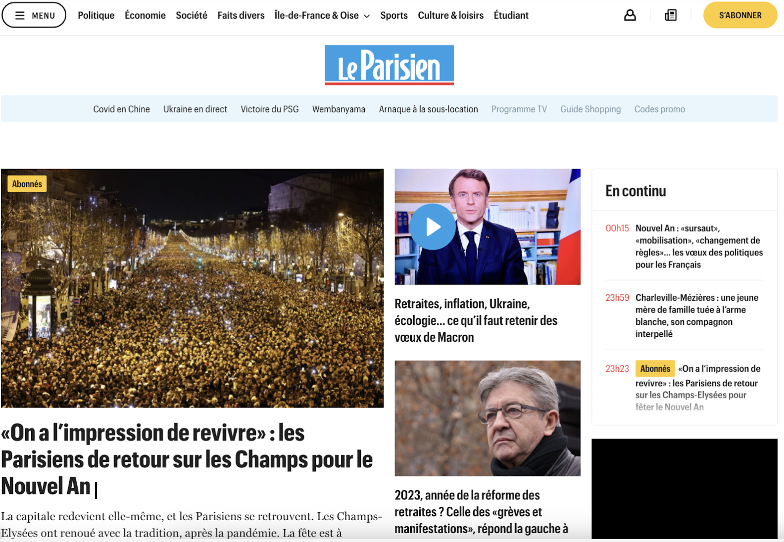
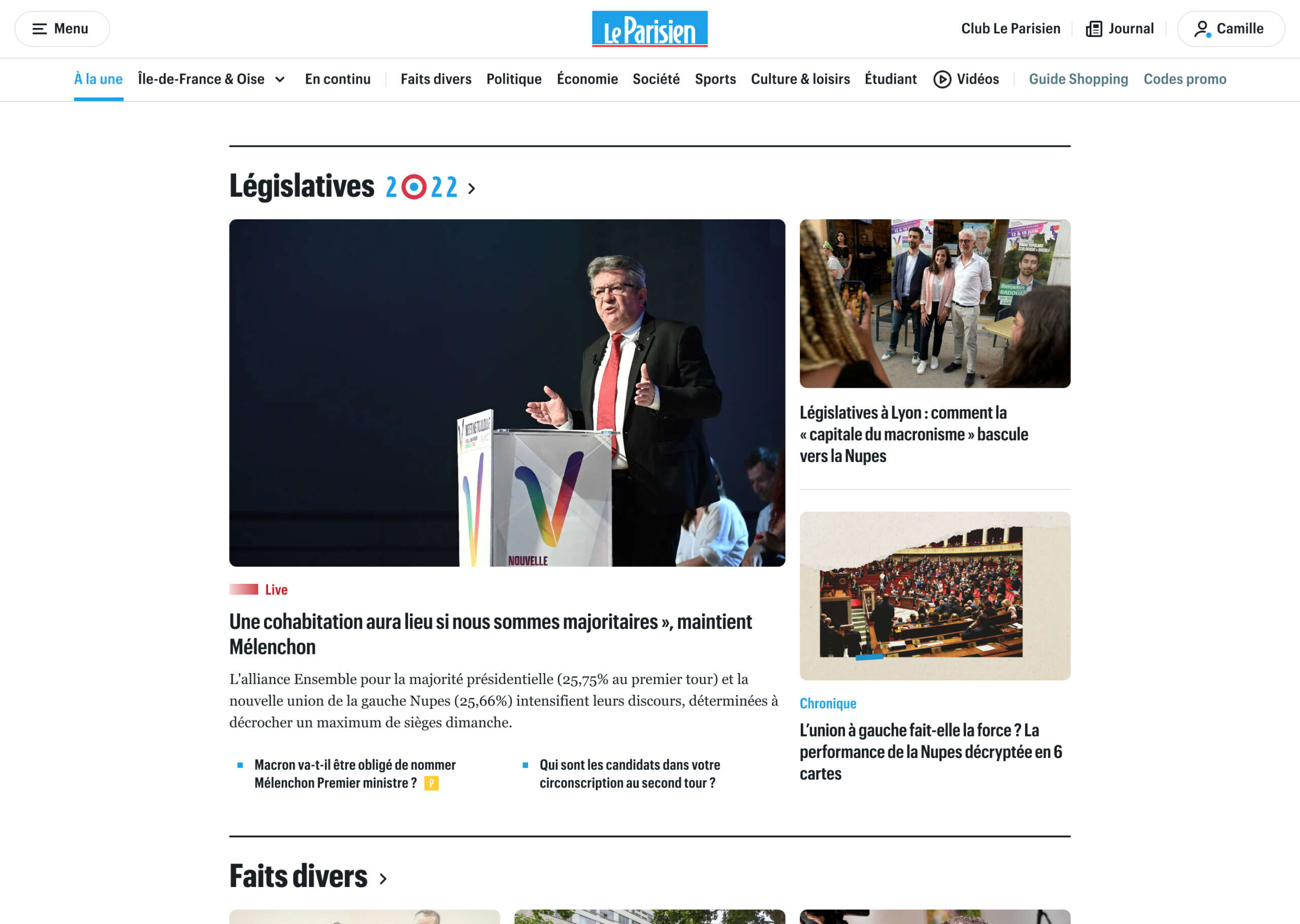
Firstly, the navigation, via the classic horizontal nav bar, and the side menu to better highlight local news. It’s now easier to access the sections for each region of France, search for content based on your city, and all this is now displayed on the article pages, which was not the case before!
In terms of size, we had to narrow the width of the HP to be able to use standard ad formats and display programmatic arches. The HP is therefore less wide, but in the end this doesn’t interfere with reading.
On the first article, which we call the “leader”, we have planned 2 versions:
- a classic leader
- an event leader in the event of a major news item. In this case, the image is larger
And we have given the editors the possibility to add bounces in the form of non-illustrated links at the bottom of each block. And soon: a “superhero” home format, I’ll let you guess what it will look like…
After the leader, we show more ‘hot’ entries. We’ve added 4 to make it to 13, with or without a photo.
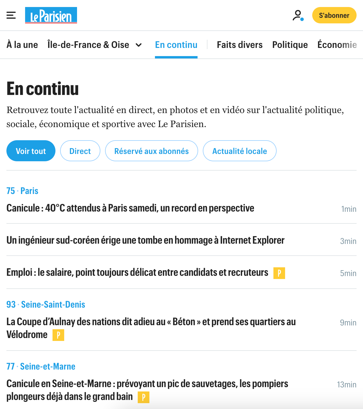
Our “Ongoing” block – which lists all the articles published in anti-chronological order and which gets a lot of clicks (we knew that by looking at our heatmaps!) – has also been reworked: we’ve made it longer, and we’ve added a “Ongoing” page that’s super important for SEO.
Content block side:
- 40 additional entries on the HP. We publish 200 articles a day, we needed at least that!
- Adding back in the local section
- Better highlighting our verticals: Le Parisien Étudiant (for students) / Guide d’achat (buying guide)
- On some articles, we insist on particular formats (live, survey…) and that this is easily recognizable to readers thanks to labels
On the advertising side, we have rationalized both advertising and promotional formats:
- The ad comes back at regular intervals (every 2 slots). These rules are the same for web and apps. Previously, we had ads that came “from time to time”, but this new rule allows us to be more consistent.
- A new format for special operations: before, this content didn’t appear on the app, but now it does. We’re trying to serve everyone!
As for the design, there are a few new features:
- The corners of images are now rounded. This gives Le Parisien something of an identity (they don’t have it in print – but we had it on the apps. I thought it looked a bit like an “entertainment” media but in fact it gives it a unique look)
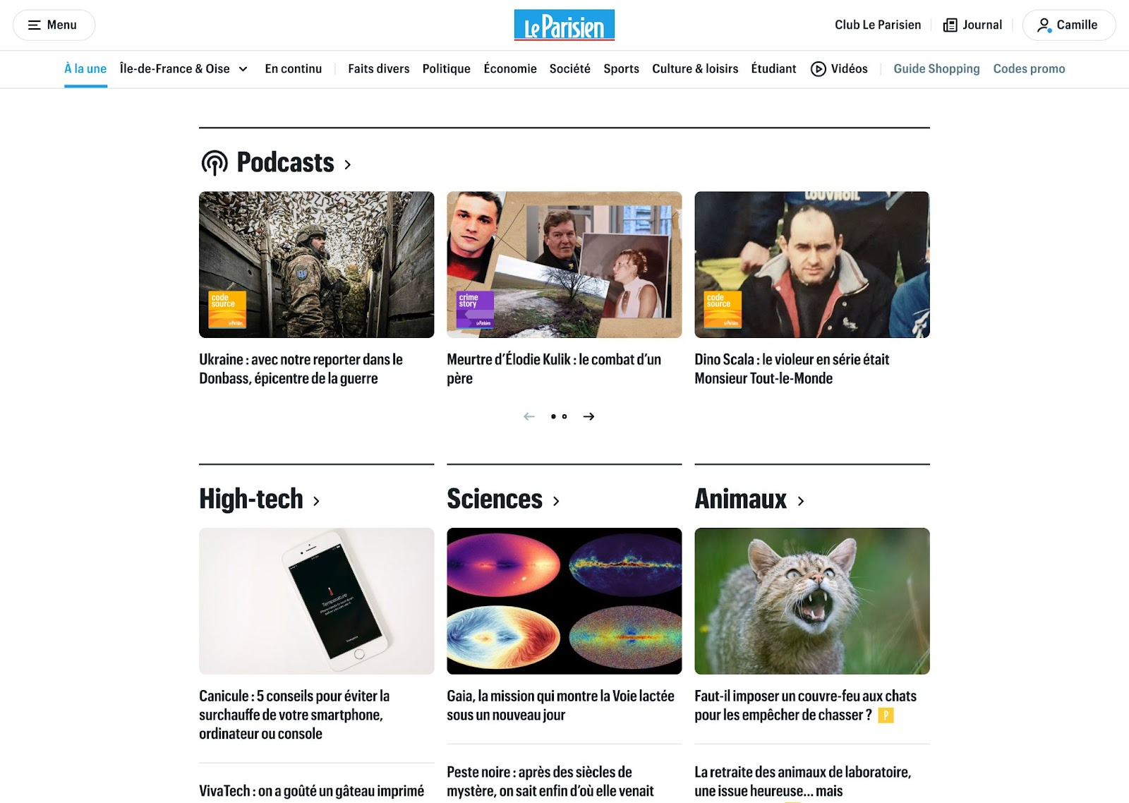
- We personalized the podcast section, adding a layer of visual identity to differentiate it from the rest
- Our icons are animated, they move!
How did it go on the tech side?
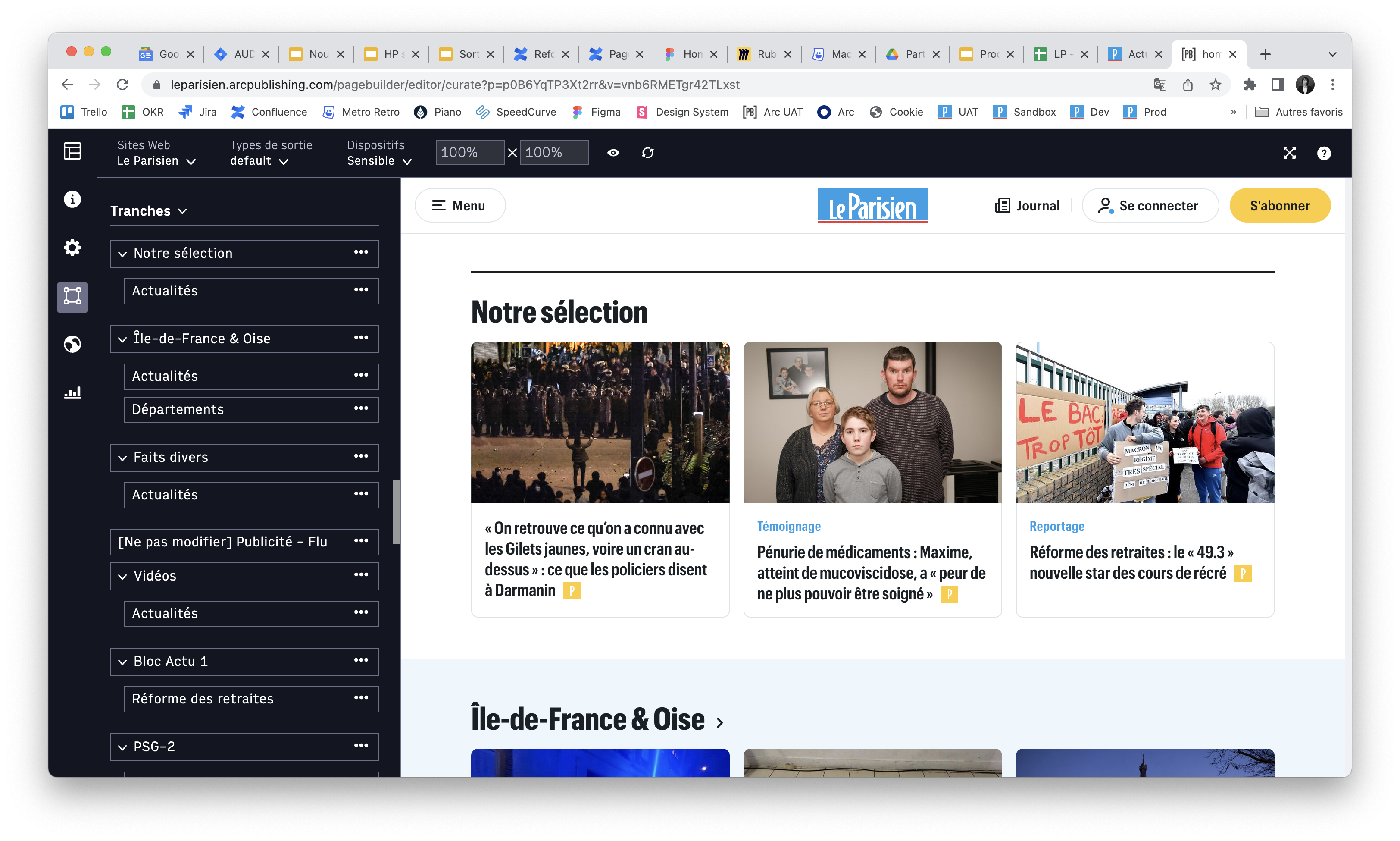
Our CMS is Arc XP, and behind the front end is their “Page Builder” feature. Luckily, we have a partnership with other publishers using Arc XP, including Libération and L’Éxpress, to help each other out with these kinds of big projects.
A very important point for us was to harmonize the website and app. Our editor has other things to do than think about what to put on the home on desktop and the home on app. So we’re obliged to have the same number of entries on both homes, in order to respect the editorial hierarchy and take into account the editor’s time constraints.
Unfortunately, we still have one tool for the desk and another for the app. It’s still a “Page Builder” but with a different template. The content flows are the same, but if you want to change the structure or the choice of sections, you have to do it in both places. For example: on the evening of a PSG match, you need to be able to pull up the PSG slice, and then perhaps the next day create a “Pension Reform” slice. Of course, we thought about merging the two tools, but it was too complex. We had to keep it simple so that as many people as possible could use the back office.
What was the hardest part of this project?
Clearly, the hardest thing was all the possible options we had at the beginning of the project. For example, we had to drop the user customization options. Today, there is zero customization, but it’s a subject we’re not going to drop. We have left it aside to deal with it better another time! Managing editorial hierarchy and personalization linked to the reader is an exciting but complicated question!
Second challenge: integrating a design system! Before this project, we didn’t really have one. We wanted to integrate this design system for the apps beforehand. A front-end developer, Antoine Vinial, joined us, working with Léo Durand and Nicolas Bussière, they are the ones who translated what we wanted to do, a very strong team.
This design system was therefore ready at the model level, but it is only for this project that we integrated it with Arc XP. In the future, it will allow us to be more agile. It saves a lot of time in design, almost no more responsive work to do, and no more graphic recipe! It’s a crazy comfort, very soothing for our teams.
Another thing that seemed important to me was to make sure that we kept the necessary time to let things rest. We worked in a clean way, and took a lot of SEO into account in the whole project.
Is there anything you haven’t had time to do yet?
In terms of the blocks, we’re going to work on highlighting TV programmes, games and promotional codes.
We’re also planning to set up a dynamic footer that will push content that we don’t already show. We’ll have a different footer for each section, which is important for recirculation and SEO.
Finally, we’re going to work on different formats for leading articles (the first one at the top), something that is being eagerly awaited for by the editorial staff.
What about AMP? Are you still on it?
Yes, we are still on AMP. We’re analyzing the impact it would have to get off it, which is what we want. So we’re yet to redesign this page format…
Overall, what have you gained from this redesign?
5 major points:
- The navigation has been redesigned and is now present on articles and optimized for SEO
- A homepage that is less automatic, more edited, more alive
- Improved ad sales on the homepage
- Local content is highlighted and forefronted
- Journalists are equipped with a tool that is as simple as possible, so that they have complete autonomy and can be used across the editorial offices
… and the design system that is a credit to our digital teams! It was so smooth at the end of the project, a really great collaboration between the designers and the front-end developers.
The Audiencers’ newsletter: from professionals to professionals
Sign up to our newsletter – real-life examples, expert points of view and inspirations from publishers around the world to help you do your job better. Sent every two weeks.