

Here’s an awkward truth about running Audiencers: we spend all year analysing, deconstructing, and benchmarking other publishers’ registration walls, paywalls, and onboarding journeys. Which means every time someone lands on our site, they’re quietly judging our own reader journey. And quite rightly so.
But, over time, our walls had gathered digital dust. They didn’t reflect our latest research, our messaging asked for commitment without proving value, and there was definitely room for some innovation.
So, I decided to open the bonnet and rebuild the entire Audiencers reader journey from scratch.
Our current tech stack:
- CMS: wordpress
- ID/login: Auth0
- Subscription management: Hubspot (not my fave for this task)
- Payment: Stripe
- On-site journeys: Poool
A quick disclosure before we dive in: Audiencers was created by the team behind Poool, and our on-site reader journey runs on Poool. I’m not going to pretend otherwise. But this piece isn’t a canned product brochure; it’s an honest, operational teardown of our funnel mechanics, why we structured our access rules the way we did, and what happened when I used Poool’s MCP to rebuild our touchpoints based on what already converts for publishers. The Poool journey is what I’ve optimised so far, the Hubspot and Auth0 UX is definitely next on my list!
1. The strategy: the value of the archive
Before designing a single button, you have to establish an unambiguous access model. We settled on a 4-tier matrix centred around one publishing reality: content published today needs reach, but archived evergreen insights hold genuine commercial value.
| Audience Segment | Content <14 Days Old | Archived Content (>14 Days) | Benchmarks & Decoded Pages |
|---|---|---|---|
| Anonymous Visitors | Registration Wall | Registration Wall | Paywall (Closed) |
| Logged Free Members | Open | Paywall (Closed) | Paywall (Closed) |
| Paying Subscribers | Open | Open | Open |
| Poool Clients | Open | Open | Open |
Why 14 days of free access?
When we publish a deep dive on how to optimise your paywall, you might not be actively reworking your paywalls that week. But, in three months, when your team is tasked with overhauling your paywall, you will look for reliable benchmarks. At that exact moment, our archive solves an immediate, operational problem. That is the moment a free member (hopefully) converts into an annual subscriber.
Meanwhile, putting up a hard paywall immediately would kill discovery, peer sharing, and habit formation. Not to mention remove the important registration step for data collection, newsletter sign up and thus engagement. As we’ve seen time and time again, newsletters are a key step in convincing readers to subscribe.
2. The audit: what wasn’t working
When I audited our existing funnel against our own published benchmarks, the flaws were obvious:
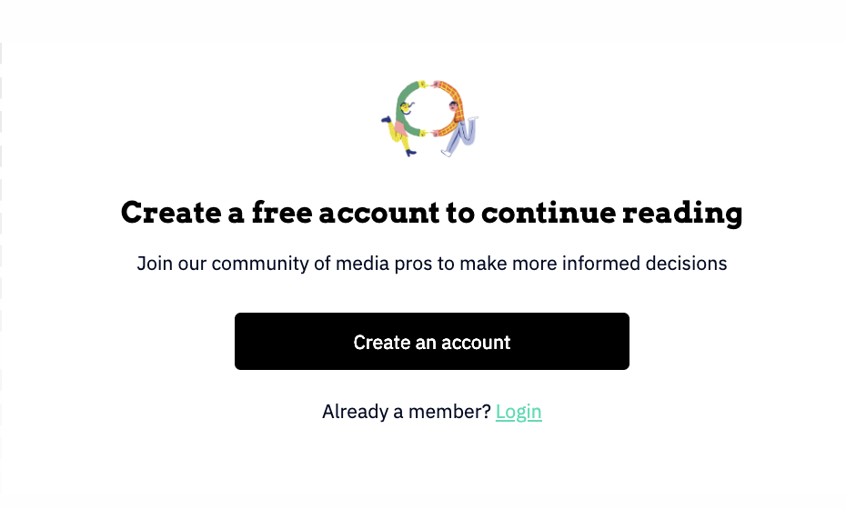
- The registration wall asked for friction without showing return: the headline was a standard demand: “Create a free account to continue reading.” It framed registration as a hurdle rather than a valuable membership.
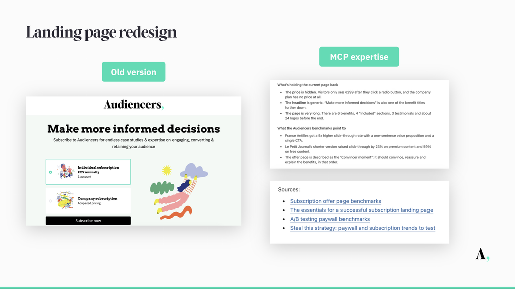
- The subscription landing page buried the price: visitors had to click a radio button just to see the €299 rate, while company plans showed no baseline figure at all.
- The offer page copy was repetitive and bloated: the headline “Make more informed decisions” appeared twice on the same page, and didn’t apply many of the best practices we see on the market today.
- Walls hadn’t been updated in a while: not to mention the fact that we talk (a lot) about needing to continuously change the design and messaging to increase conversion rates, but we hadn’t done this in a while.
3. The rebuild: applying “what works” via Poool’s MCP
Normally, rebuilding an entire reader journey, including registration walls, paywalls, onboarding tours, and offer pages, means weeks of friction: product briefs, Jira tickets, waiting for frontend developers, and endless design review cycles.
As a lean team of one on Audiencers, I don’t have weeks. And I definitely don’t have the tech knowledge (ask ANYONE who’s worked with me). So I connected Claude to our Poool dashboard using Poool’s new MCP.
Many generative AI tools build whatever you ask for, starting from a blank canvas. But Poool’s MCP builds what works. Every journey step it creates draws from two distinct sources of built-in expertise: 10 years of experience at Poool with 250+ publishers, and Audiencers’ analysis of 1,000+ more. Instead of guessing copy or starting with a blank template, it filters requests through proven layouts, structures, and messaging patterns, building the optimised version directly in your dashboard while teams retain full approval control.
So here I am, optimising Audiencers’ reader revenue strategy using our own content, inception. 🙃

Here is how that workflow redesigned our funnel touchpoints:
A. The registration wall: from passive form to dynamic playbook
I prompted the assistant to inspect our current wall and cross-reference it with our benchmarking analyses:
“Using Audiencers content, especially the benchmarking articles and strategic recommendations
on messaging, redesign the current registration wall in access.”
In its first pass, the assistant pulled our research and adjusted the copy:
- Before: “Create a free account to continue reading”
- V1: “This article is free. You just need an account to read it.”
It replaced a demand with reassurance, explicitly addressing the primary reader concern at a registration gate. Then we pushed it further with a follow-up prompt:
“Be innovative, using Audiencers’ benchmarks and adapting to our customer profiles and their goals.”
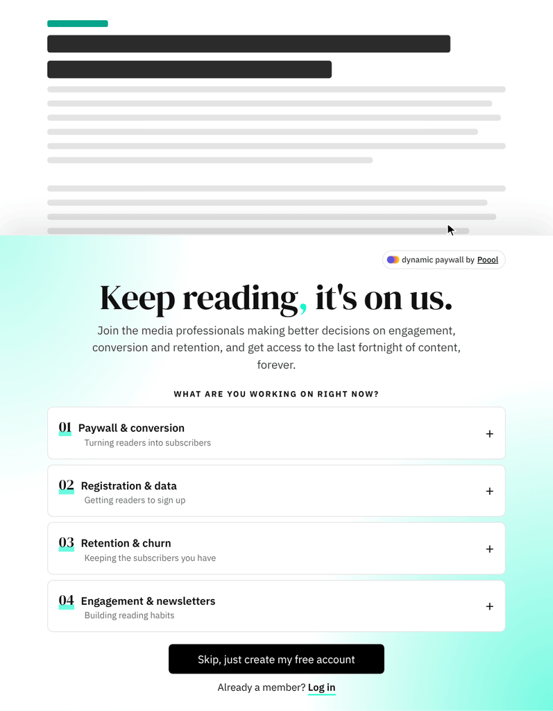
Five minutes and three prompts later, the MCP built an interactive diagnostic wall directly inside our dashboard:
- The question: “What are you working on right now?”
- The dynamic options: Readers select their current focus—Paywall & conversion, Registration & data, Retention & churn, or Engagement & newsletters.
- The playbook: Selecting a topic dynamically updates the wall to display an editor-curated reading list for that specific challenge (e.g., clicking Registration & data surfaces Radio-Canada’s registration case study and 50+ annotated benchmarks).
- The action: The primary CTA changes to “Unlock my registration playbook,” with a discreet “Skip, just create my free account” fallback underneath.
Before:
After:
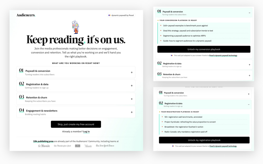
Play around with the wall here.
The wall no longer acts as a gatekeeper, it functions like an on-demand consulting intake.
B. The subscription offer page: translating industry benchmarks into high conversion
Our main subscription offer page was overdue for a complete rethink.
“Be innovative and try to build a high converting page inspired by benchmarks, especially Audiencers’ Subscription offer page benchmarks, whilst still maintaining the light, fun look of Audiencers”
Running this brief through Claude and the Poool MCP generated a full redesign directly inside our dashboard. Instead of guessing what might work, the build borrowed structural wins from top-performing publisher benchmarks:
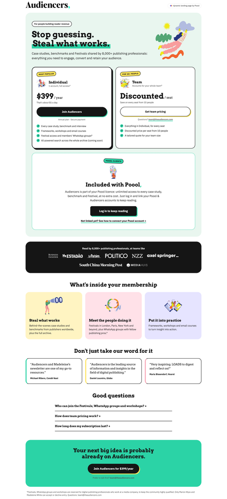
- Plans side-by-side above the fold: Benchmark data shows that leading offer pages present comparative options immediately above the fold. The redesign surfaces the Individual plan and Team plan side-by-side on screen one, featuring the Individual plan prominently with a playful, tilted yellow “Most popular” sticker.
- Unapologetic price transparency: The hidden radio button is gone. The rate is displayed front and centre alongside a relatable anchor: “less than £1 a day” (or €1 / $1 depending on geography)—followed by an immediate CTA button and a clean checklist of core membership perks.
- Sharper, action-oriented messaging: Out went “Make more informed decisions”. In came “Stop guessing. Steal what works.” a direct nod to our popular Steal this strategy series, accented with Audiencers’ signature teal highlight.
- Credibility without visual drag: Rather than burying readers in 24 dispersed logos, the layout condenses social proof into a single, high-contrast dark band featuring 8 key industry logos (including Politico, NZZ, Axel Springer, Estadão, and South China Morning Post).
- Bite-sized benefits and social quotes: The core value proposition is distilled into three pastel benefit cards using our recognisable editorial illustrations (Steal what works, Meet the people doing it, Put it into practice), paired with quick quotes from peers across Condé Nast, Globo, and Hearst, providing social proof spotted as a trend on benchmarked landing pages.
- Friction-reducing accordion FAQ: An interactive 4-part toggle addresses real buying objections right above the final checkout banner: Festival ticket eligibility, Poool client entitlement, group team volume discounts, and subscription duration terms.
- Protecting the brand identity: Crucially, the page didn’t end up looking like a stiff enterprise SaaS template. It retained the warm, distinctive Audiencers tone.
After:
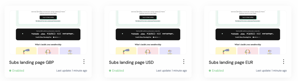
With 3 targeted currencies
The page is live here. (p.s. of course, please feel to subscribe if you like what we do;)
C. The archive paywall: selling the library
When readers land on articles older than two weeks, they’re hunting for reference blueprints.
The new paywall opens with “Unlock the reader revenue library,” instantly cataloguing the inventory: 200+ case studies, 160+ step-by-step guides, 75+ benchmarks, and 160+ decoded paywalls.
Directly below, it presents three clear options side by side:
- Individual Plan (£299/year)
- Team Plan (multi-seat access for newsrooms)
- Poool Client Fast-Track (a dedicated pathway with a 3-step guide detailing how dashboard users link their existing account for immediate access)
As with the other use cases, this paywall was built in a few minutes. The prompt I’m liking in particular at the moment: “Be innovative using Audiencers’ trends”.
Before:
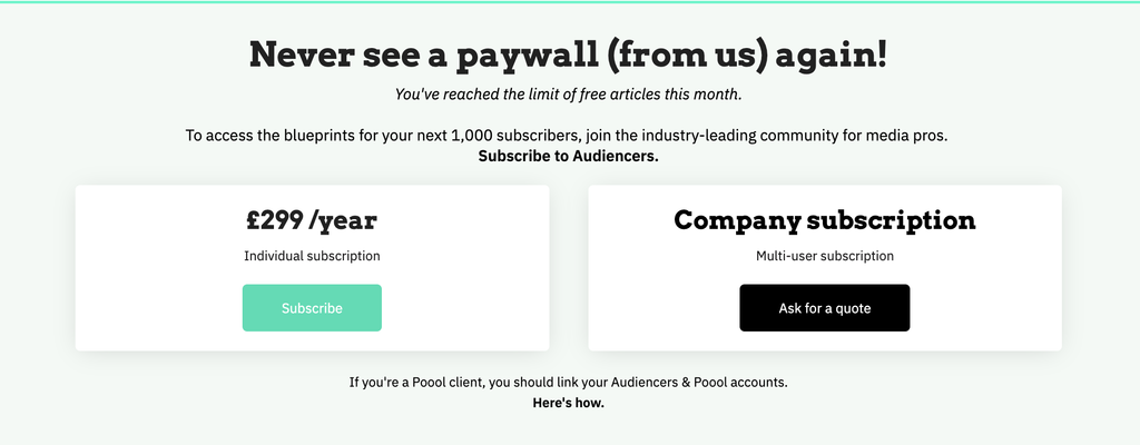
After:
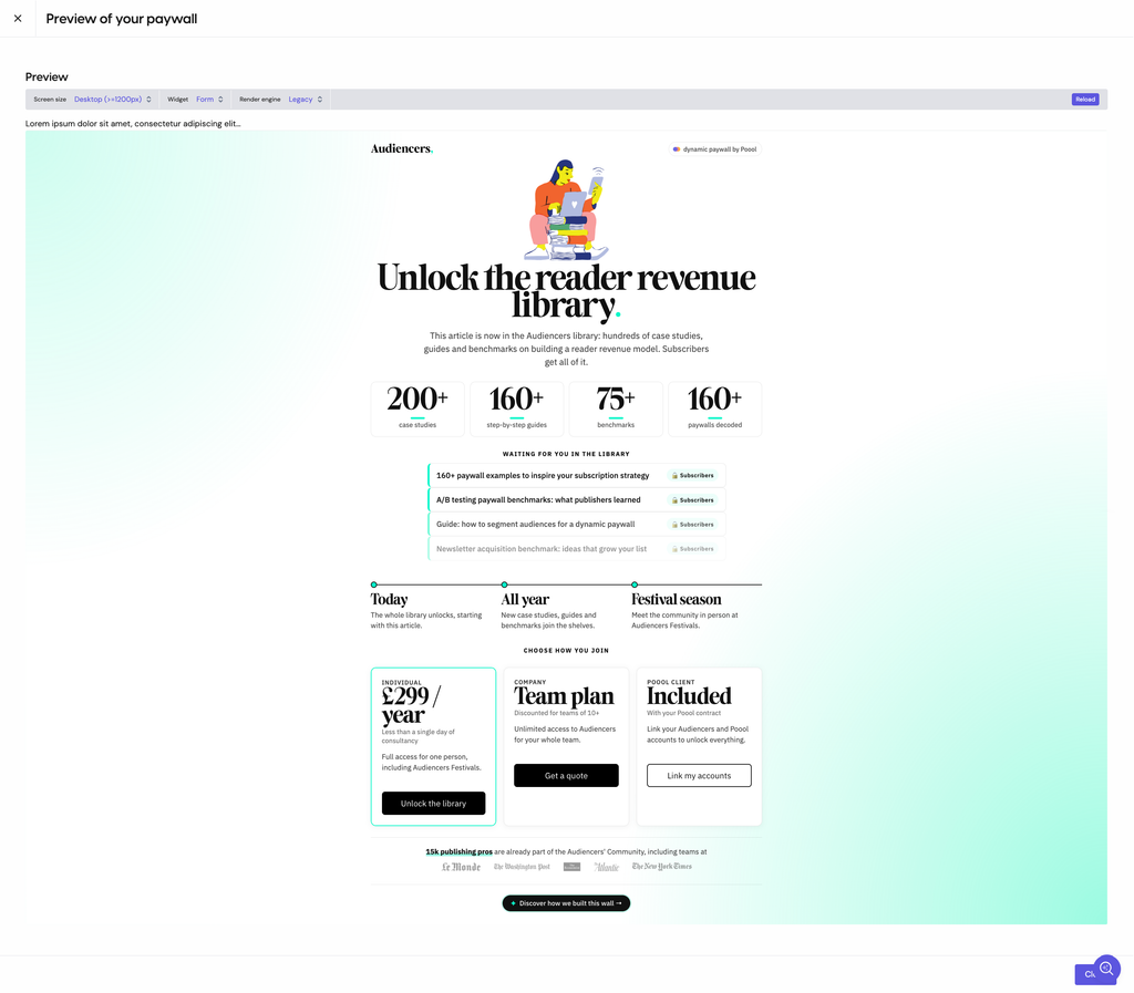
Play around with the paywall here.
D. Onboarding new registered members: the 30-second tour
A registration model only succeeds if readers return, and for a while I’ve been very keen on implementing a product tour to show new free members around our media and community.
Drawing from our onboarding benchmarks, the assistant analysed patterns from publishers like The Washington Post and The Irish News:
- A separate welcome screen introducing the tour before launching into steps.
- Centred modals with one clear headline, one supporting line, one visual, and one button.
- A quiet “Maybe later” text link under the button to eliminate frustration.
The result was an on-site, 3-step onboarding flow highlighting Case Studies (with direct jumps to SFGATE and DER SPIEGEL), Directories (50 tools, 148 industry consultants), and Festivals (community passes for London, Paris, and Berlin).
Before:
Nothing 😅
After:
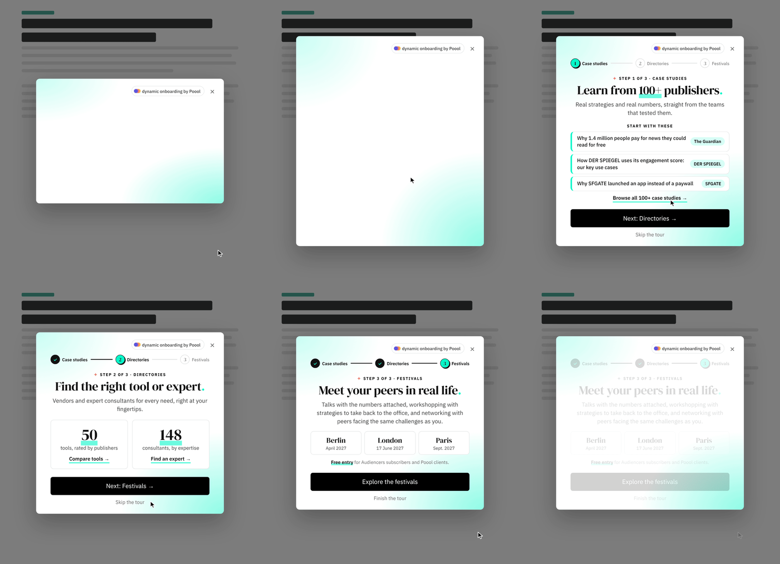
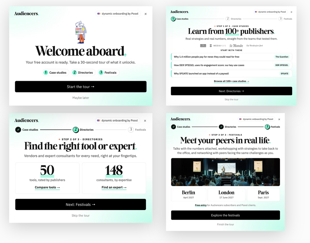
If you’ve got a free account on Audiencers, you’ll see this journey next time you log in! Or play around with the onboarding journey directly here.
The display conditions mean that each users sees this only once, that it’s not shown to subscribers or Poool clients and not on certain pages, such as the subscription offers page.
4. Operational takeaways
Whether you configure journeys manually or leverage an AI assistant, the MCP provided a few key takeaways to apply to your reader journey, based off Audiencers expertise:
- Assign one job per wall. Our previous registration wall tried to pitch our newsletter, promote live events, and explain our company all at once. One step, one goal.
- Turn barriers into personalised utility. Letting readers select what they’re working on turns an administrative gate into a personalised diagnostic and adapted reason for converting. When set up properly it can also give you rich first-party intent data from day one.
- Lead with transparent pricing and clear anchors. Hiding annual rates behind radio buttons or burying team plans behind vague forms creates friction. Put the price front and centre, anchor it to something easily comparable (“less than £1 a day”), and display individual, team, and partner licences side by side. But of course, testing and adapting to the reader’s profile and context is essential.
- AI builds the steps, but your team retains the steering wheel. The MCP generated functional, styled, dynamic modules in minutes, but human editorial judgement remains essential. When Claude initially proposed heavy bullet lists on the registration module, we trimmed them to protect visual focus.
Test it out for yourself!
The updated reader journey is live across Audiencers today. You can test the interactive playbook on our latest articles, examine the newly streamlined offer page, browse the archive library paywall, or take the onboarding tour.
For existing Poool clients, Poool’s MCP is already available in your plan at no extra cost, connecting your preferred AI assistant directly to your dashboard to turn ideas, URLs, or Figma files into optimised journeys based on 10 years experience with 250+ media brands and Audiencers’ analysis of 1,000 more.