Given that traffic on mobiles is significantly higher than on desktop (78.2% according to research), apps play an important role in publisher’s digital strategy. However, when it comes to reader revenue models on mobile, this same research showed that conversion rates are lower on mobiles than on desktop…
There’s a variety of reasons for this – likely linked to the context of reading content on mobiles – but a paywall that isn’t adapted to the smaller screen and device-type certainly has a part to play. Hence why our latest benchmark shares examples and best practices of paywalls on apps!
Note: these screenshots were taken on an Iphone 11, with an app downloaded on Apple’s App Store in France. All apps were free to download.
WELT A classic paywall similar to that on desktop, with the text fading out 3 key benefits of subscription are integrated into the wall as well as a CTA button to subscribe or login
TheWashingtonPost Both a pop-up upon arriving on the app, and a paywall when trying to access content or use a premium feature (here, saving a story for later) 2 offers are integrated into the wall, with a free trial only being available for the more expensive offer
TheWallStreetJournal A full page wall with a snappy value proposition and a reduced 4 week offer Images suggest the content platforms we have access to by subscribing The CTA button follows the same subscription colors used across app
TheTimesofIndia A paywall that looks similar to that on desktop, but with a scroll that lists 11+ benefits of subscribing, a unique strategy that gives readers the chance to discover all the possibilities of TOI’s premium offer
LeParisien A double paywall: a banner that pops up upon arriving on the page and blocking text mid-way through the article, both with a CTA button Together with the header, there are 3 “subscribe” buttons on a single page, all in the same color
TheNewYorkTimes As on desktop, we’re first blocked by a registration wall before the paywall after reading a single article Registration is simple, with the email field in the wall and the option to create an account with Google, Facebook or Apple
TheAtlantic A pop-up paywall with an automatic free trial, and the option to pay per month or per year A short text explains the immediate benefit of subscribing, but no value proposition, simply “Subscribe today.”
TheNewYorker A personalized paywall based on the content we’re trying to access and a note letting us know that the app is exclusive to subscribers A bold CTA button in the color of subscription across the app & an automatic free trial
TheEconomist A paywall blocks all content, with a list of benefits, free trial, clarity in how much we pay and when as well as a clear CTA button Interestingly, we can subscribe with iTunes, a payment method adapted to mobiles
TheIndependent Upon arriving on the app, we’re immediately presented with a registration form If we don’t register at this point, we’re offered 10 free articles, with a banner at the top keeping us informed of the metered model before a paywall blocks content
TheTelegraph A full page wall with a slidable text at the top, sharing various benefits of subscription A free 3-month trial is applied automatically, and the CTA button asks us to “Claim offer”
LeMonde A short, concise wall with a “see more” option to display the benefits of subscription Although the paywall displays at the end of the lead-in, blocking the end of the article, a subscribe button is always accessible in the footer, with the same colors as the paywall
HarvardBusinessReview Like on their website, HBR has a metered registration wall followed by a paywall The wall is simple, without a value proposition but with a form integrated into the registration wall, reducing a step in the funnel, and offering the option to login with Facebook or Apple
TheGlobeandMail A registration wall pops up when trying to access certain features, whilst the paywall displays when trying to access subscriber-only content Both walls contain key benefits and a CTA button, plus a link to login, however there’s no value proposition
FinancialTimes A snappy value proposition with the benefit of subscribing (unlock access), the USP of FT (leading journalism) and the low cost (€1 – note the currency is adapted to my location) CTA to claim this trial offer and another to see other options
Figaro A special introductory offer is promoted in the CTA button, but aside from knowing we can access all articles, there’s no other benefits integrated into the wall There is however an easy link for existing subscribers to login
CourrierInternational Adapted to the smaller screen on mobiles, this paywall fits perfectly into the publisher’s house style with a clear title, illustration, subscription benefits and CTA button Note the banner at the bottom of the screen that ensures the “Subscribe” button is always accessible
CorrieredellaSera A pop-up, full page paywall with the option of paying per month, with an introductory offer, or per year As is recommended with paywalls including multiple offers, one offer is highlighted as the most popular
Bild Just like a regular paywall, the text fades out and wall appears, with a bold CTA button and short value proposition text adapted to the smaller screen
Best practices to take away:
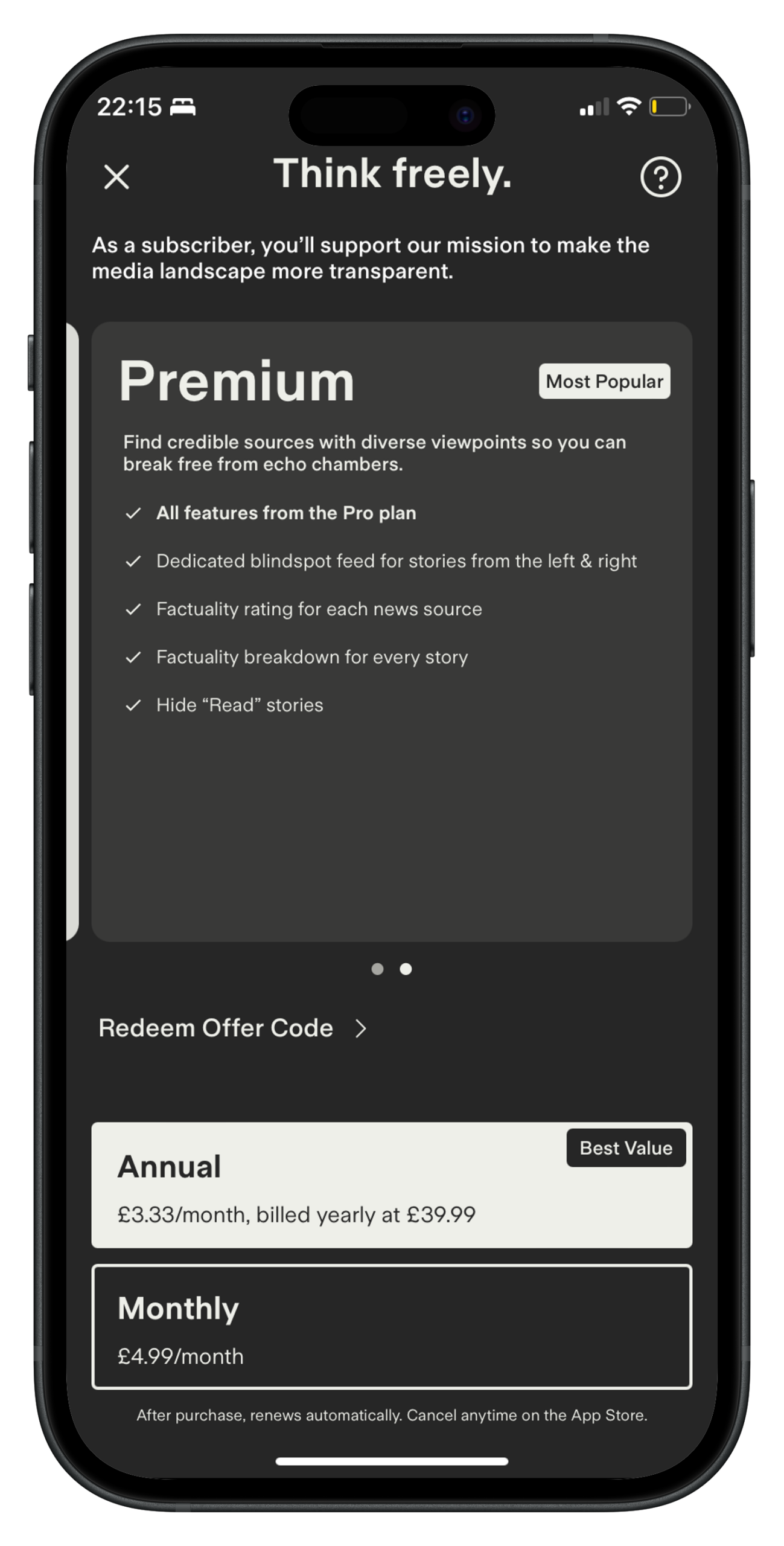
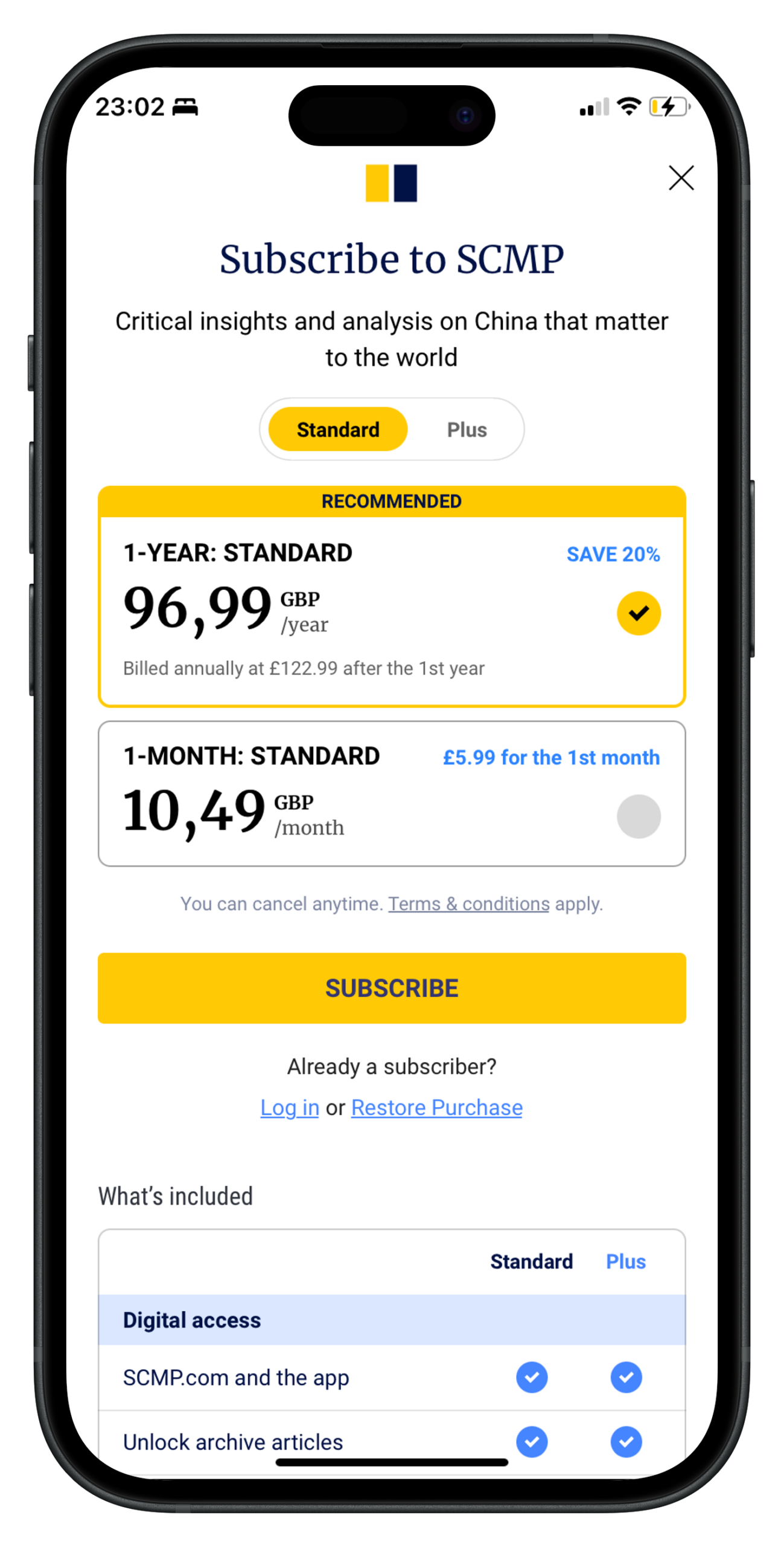
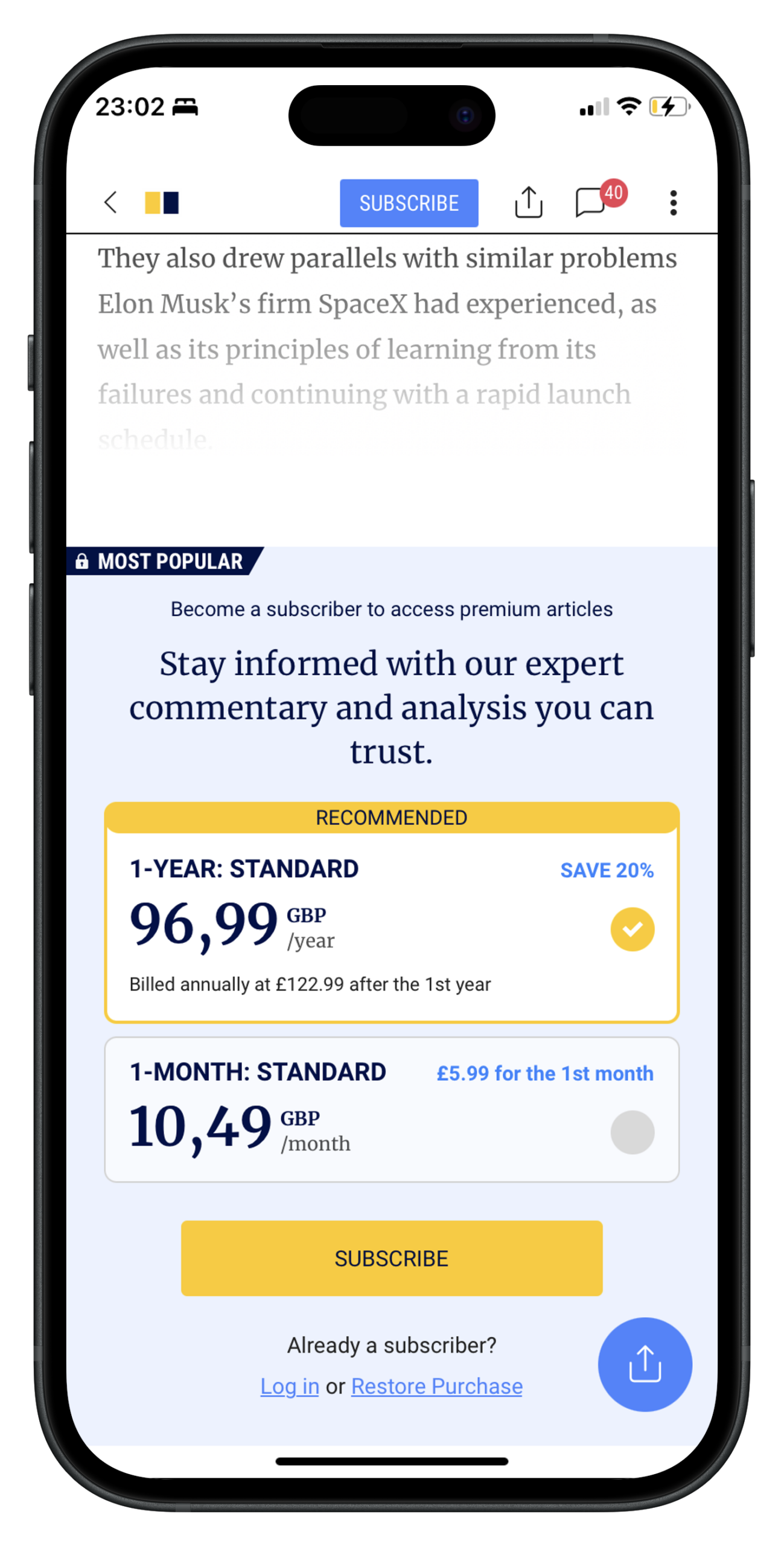
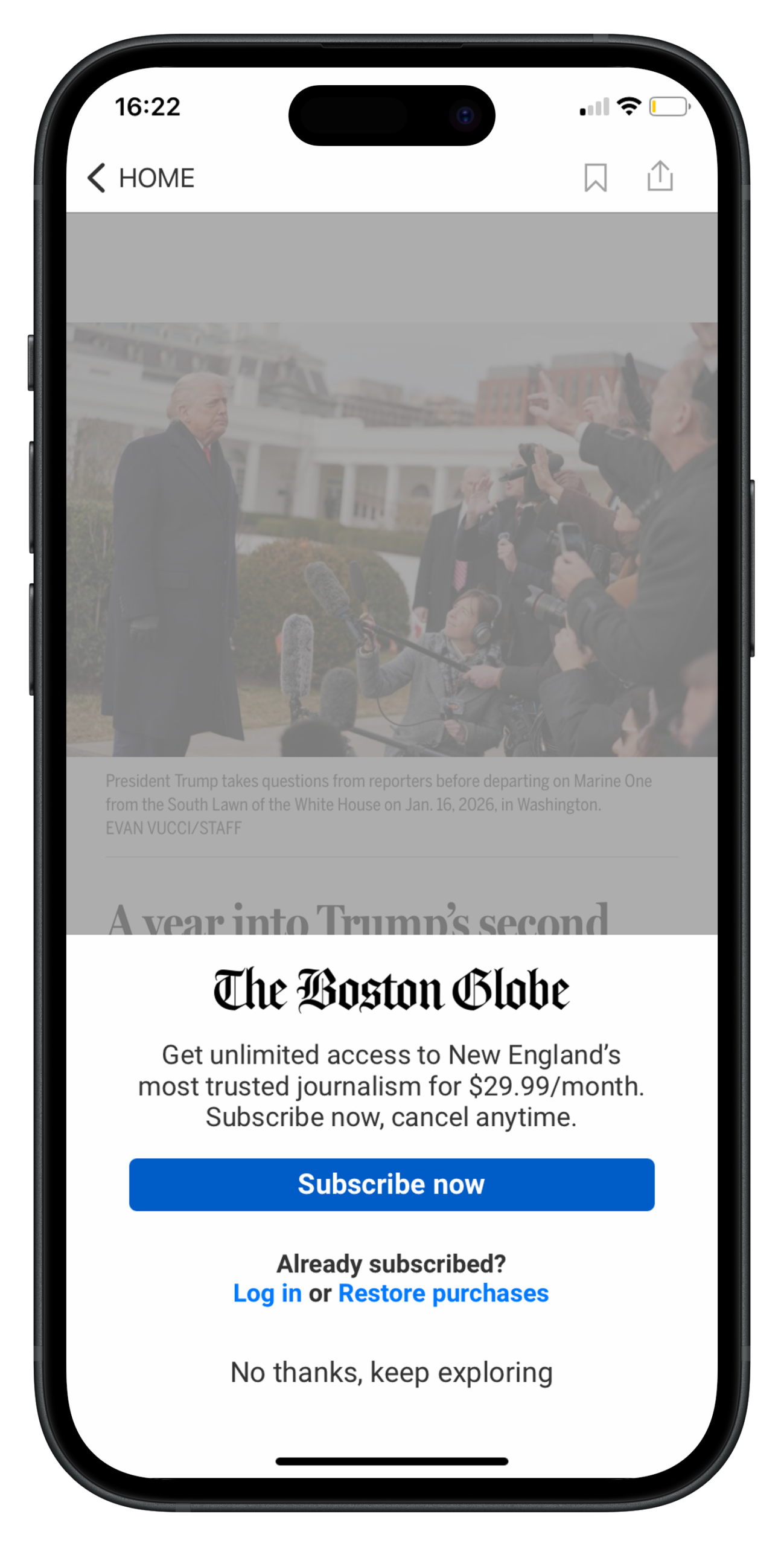
Just because you have a smaller screen, doesn’t mean you should forget about the all-important value proposition!
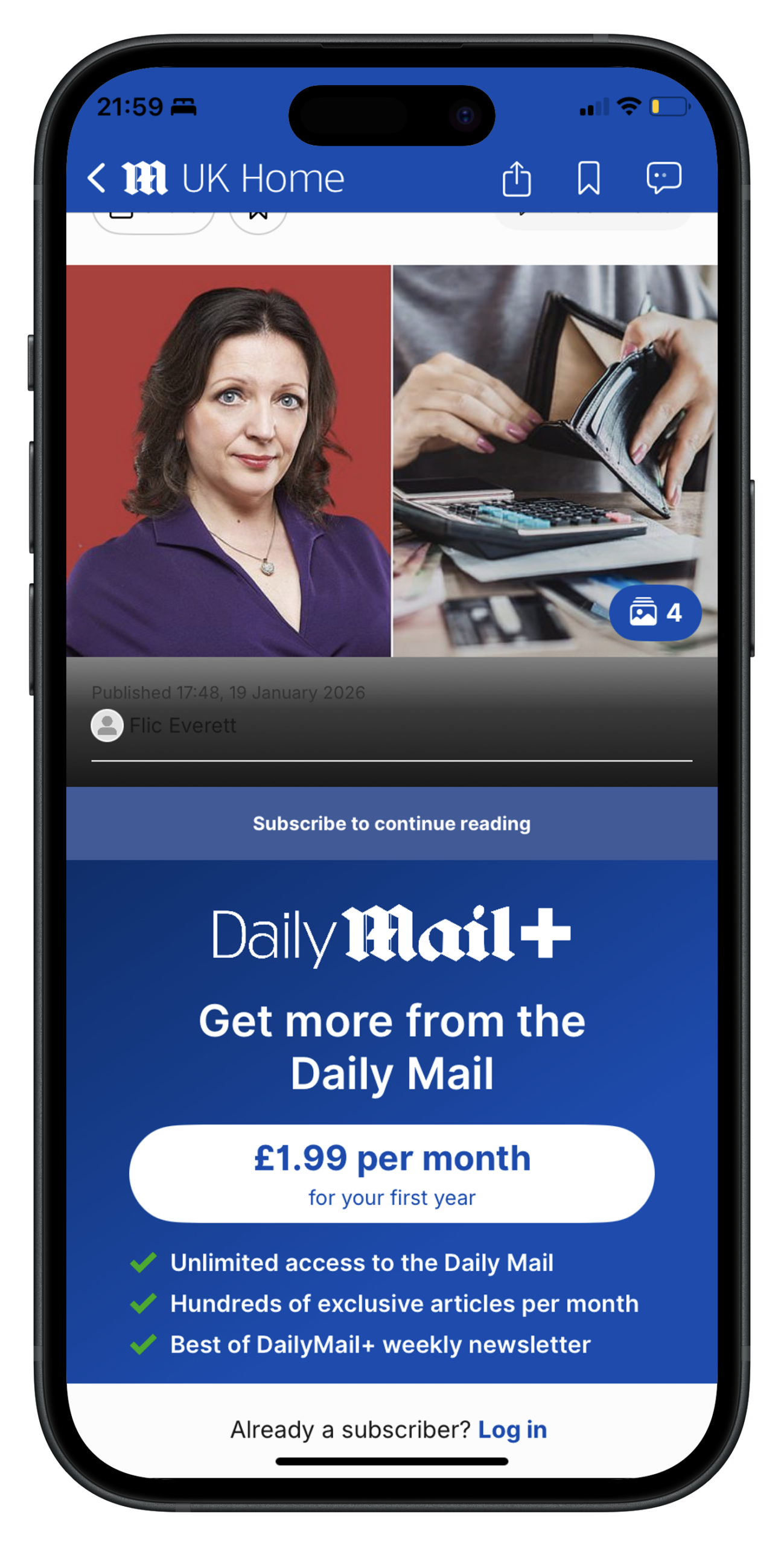
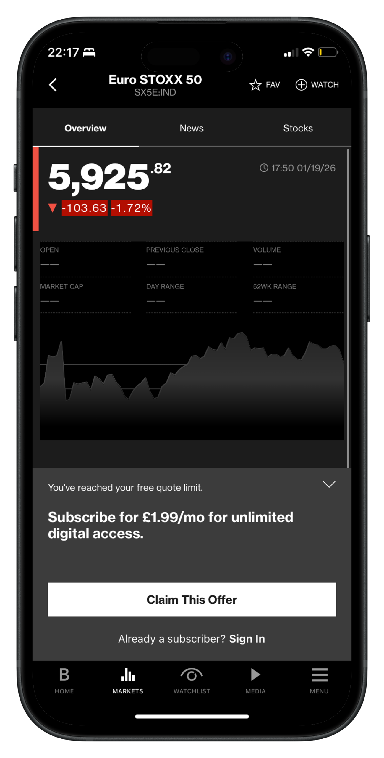
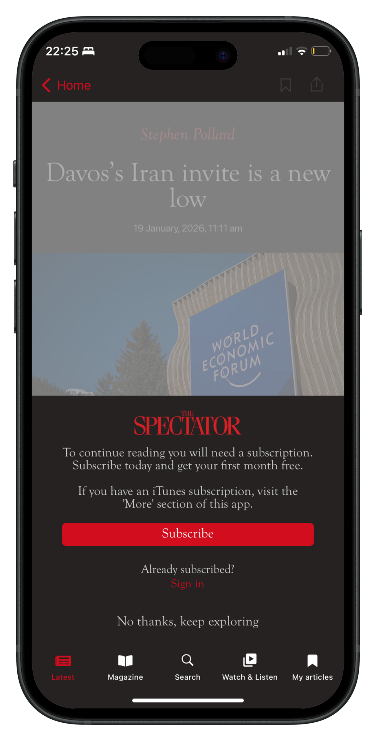
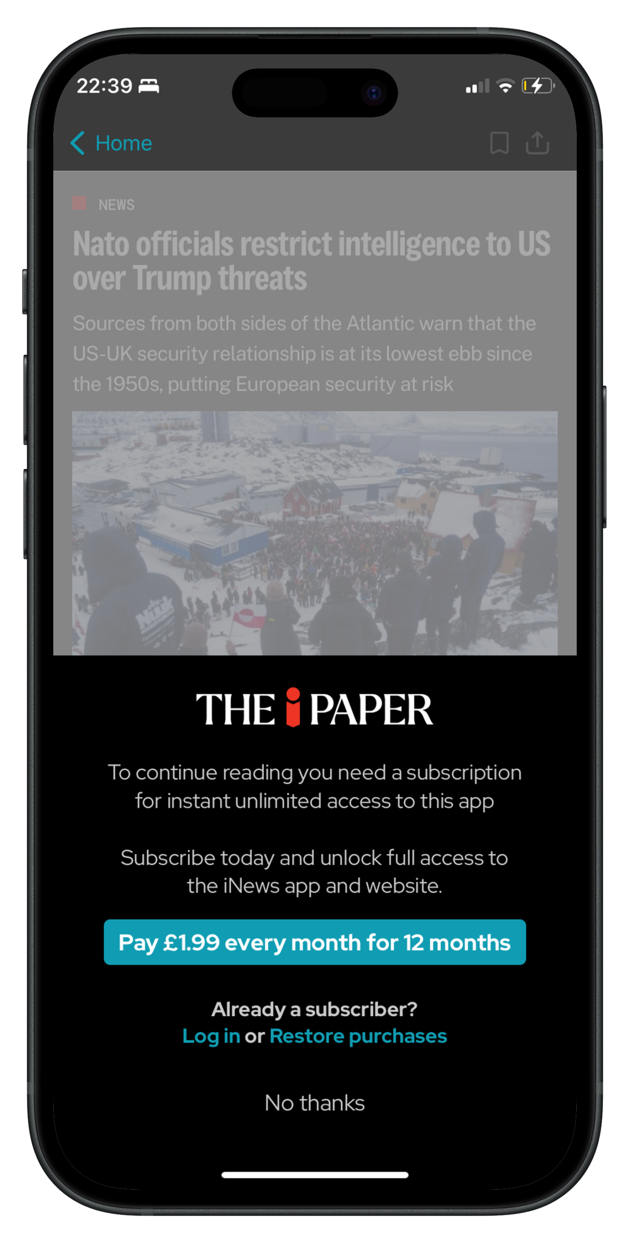
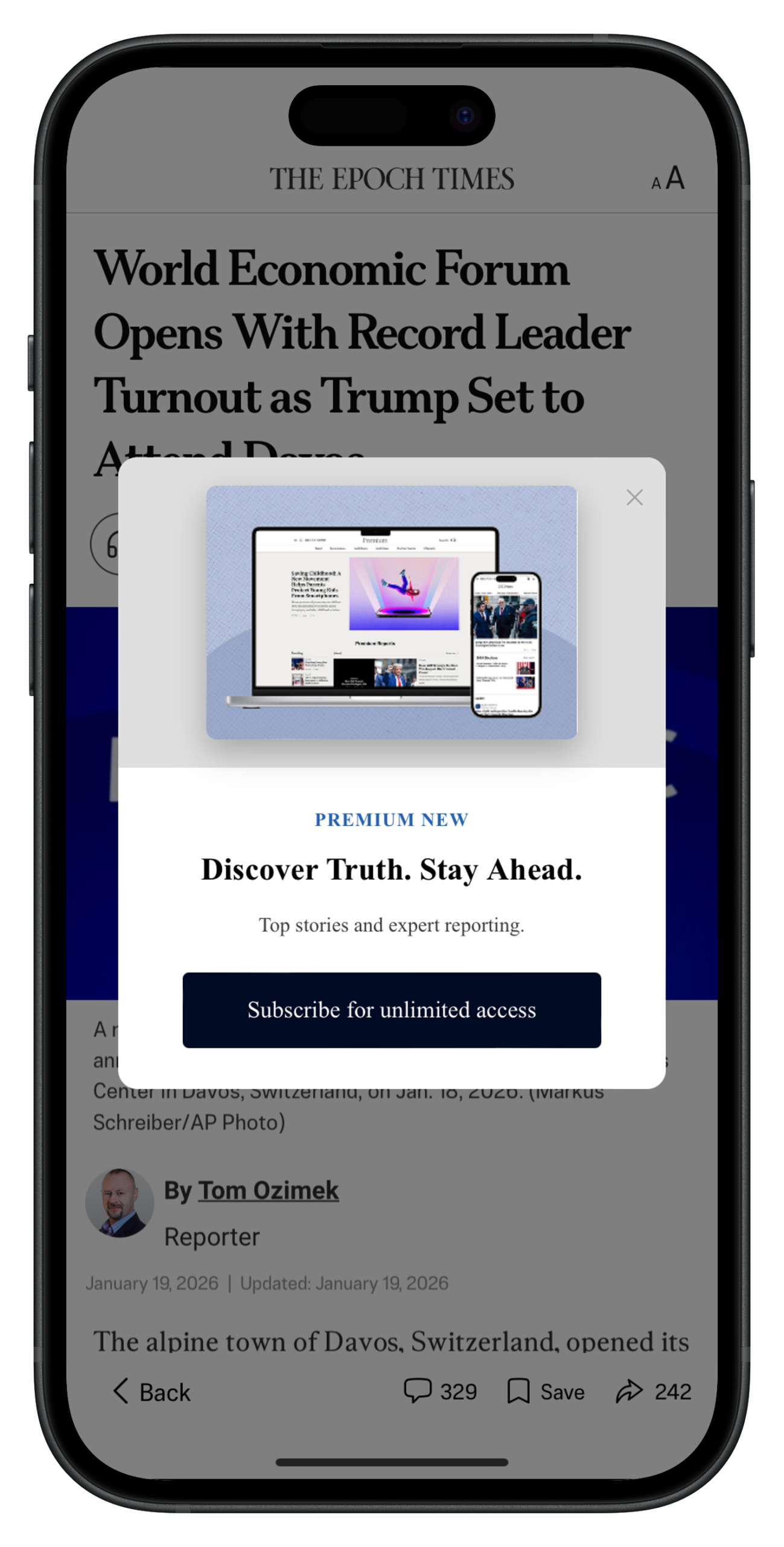
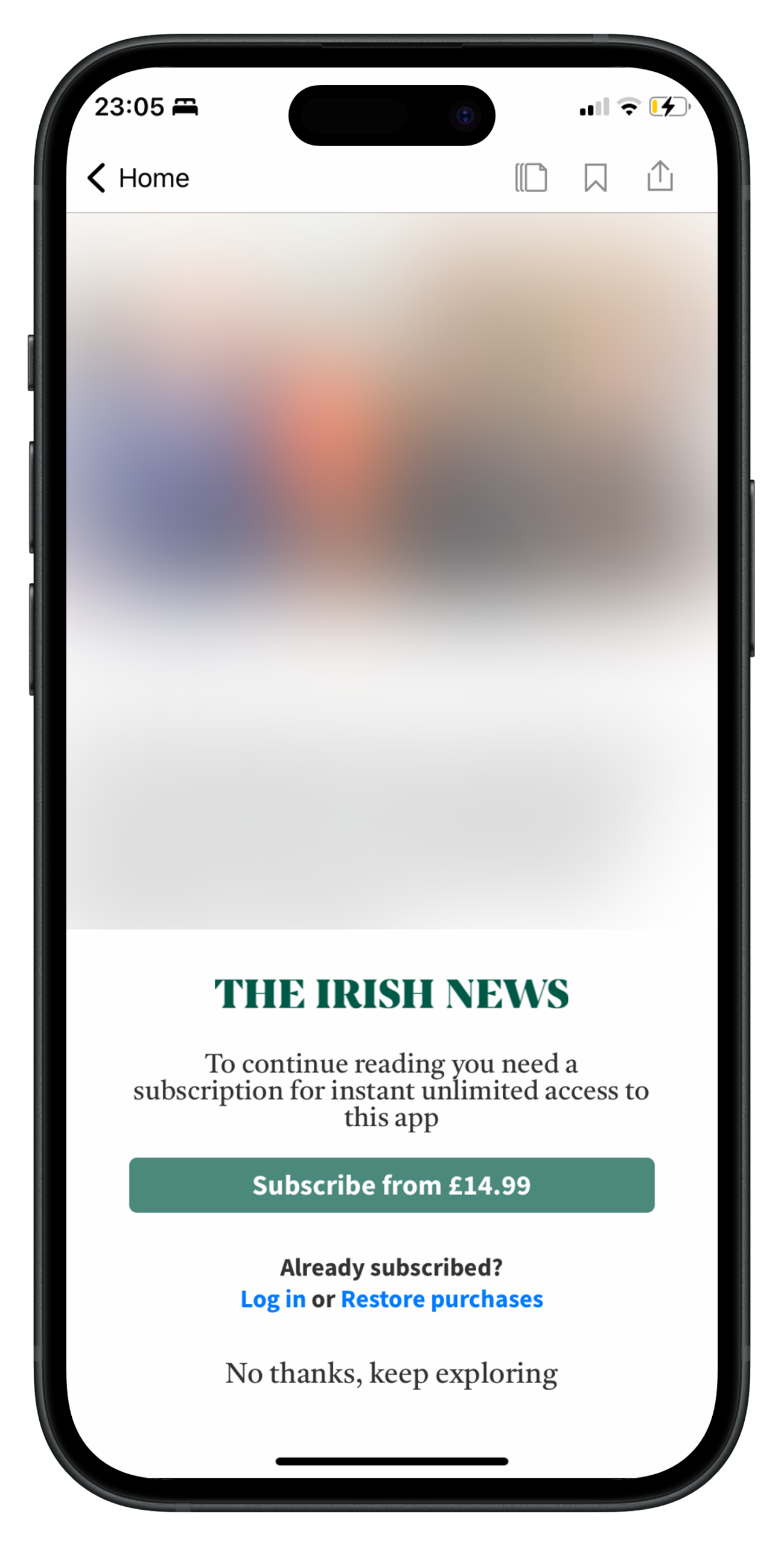
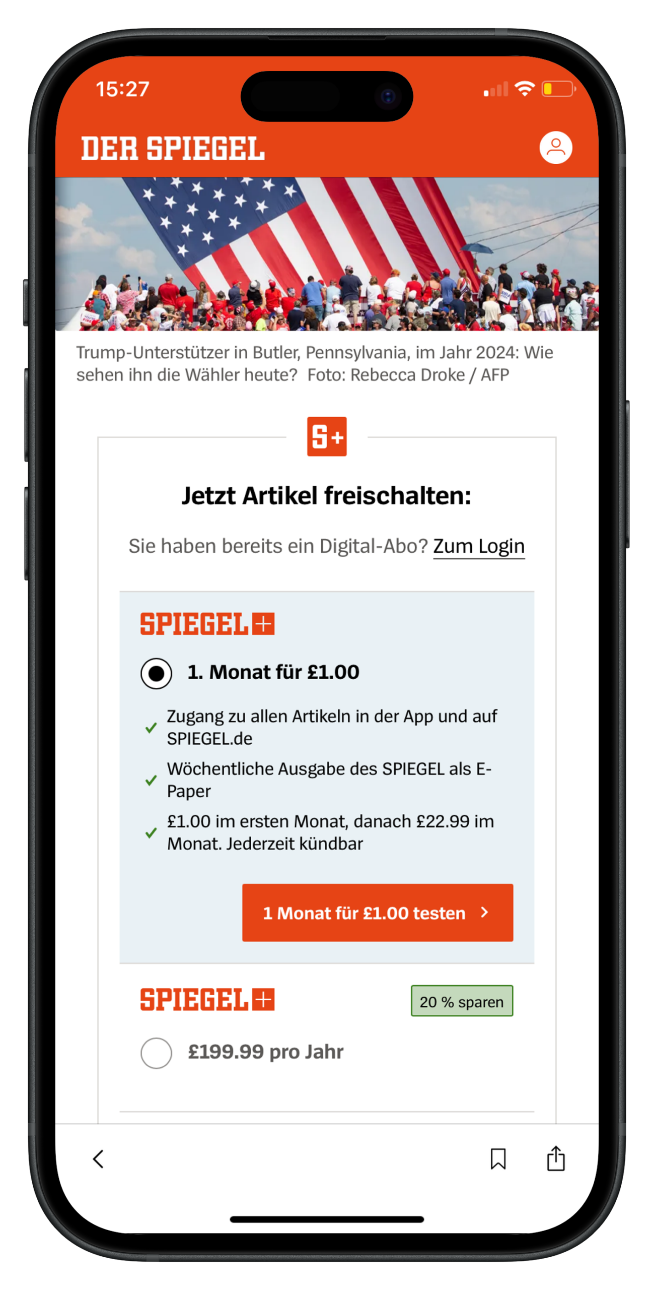
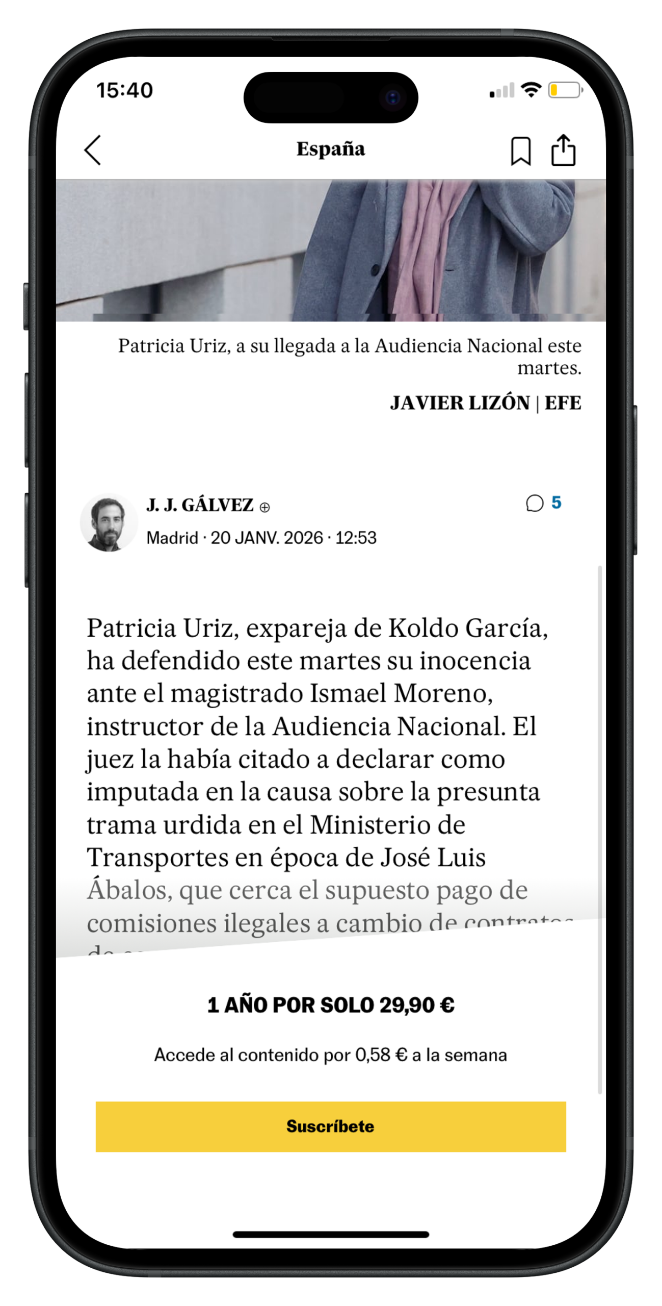
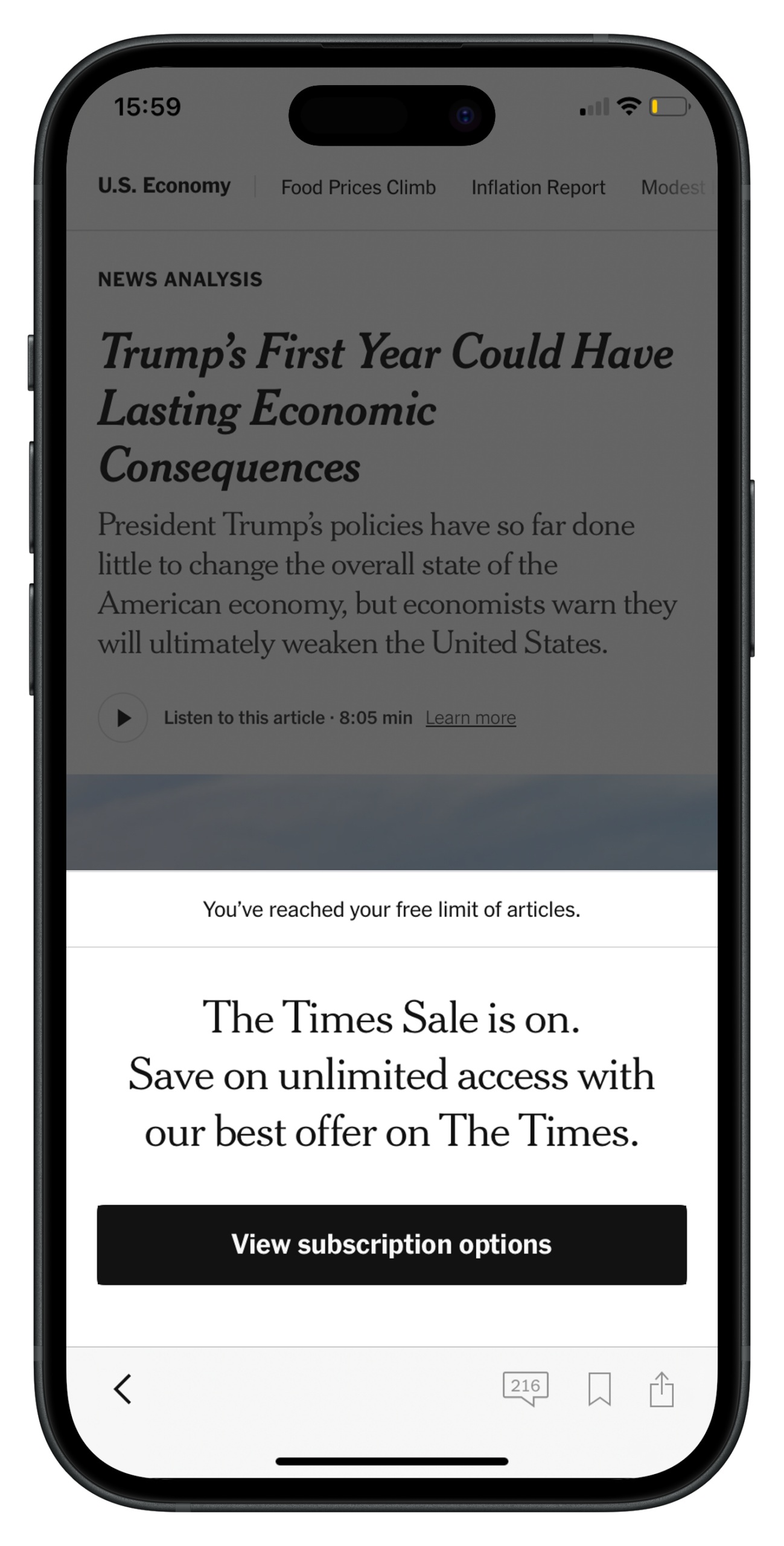
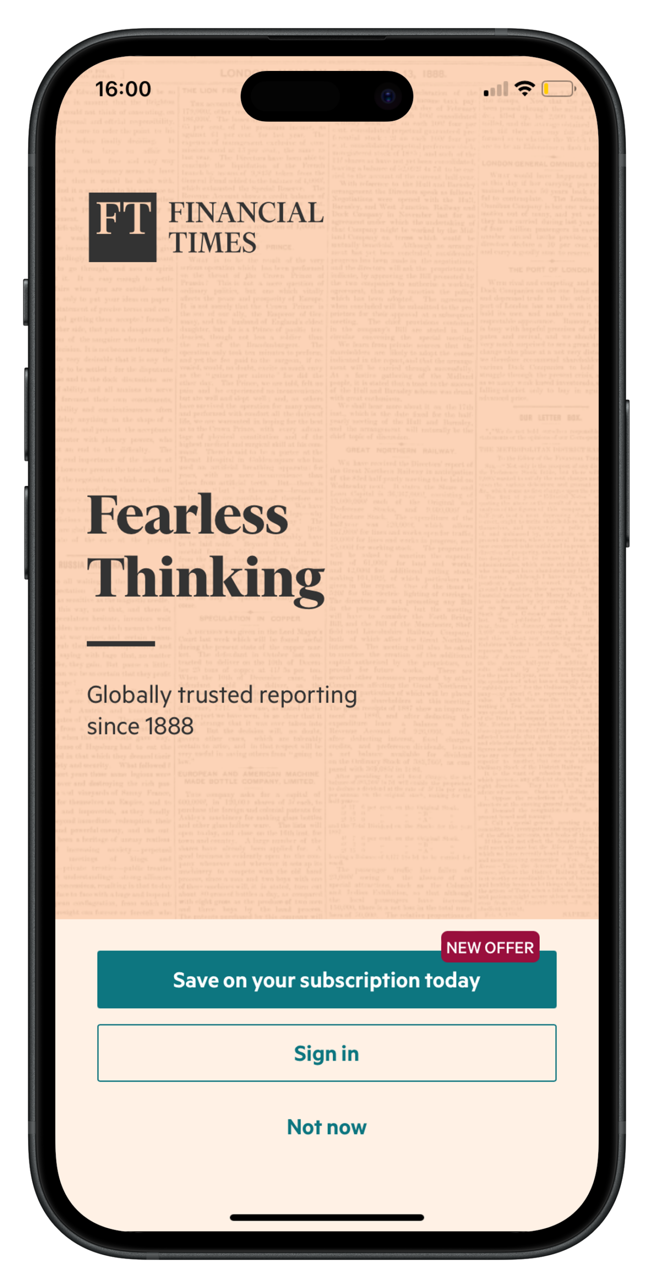
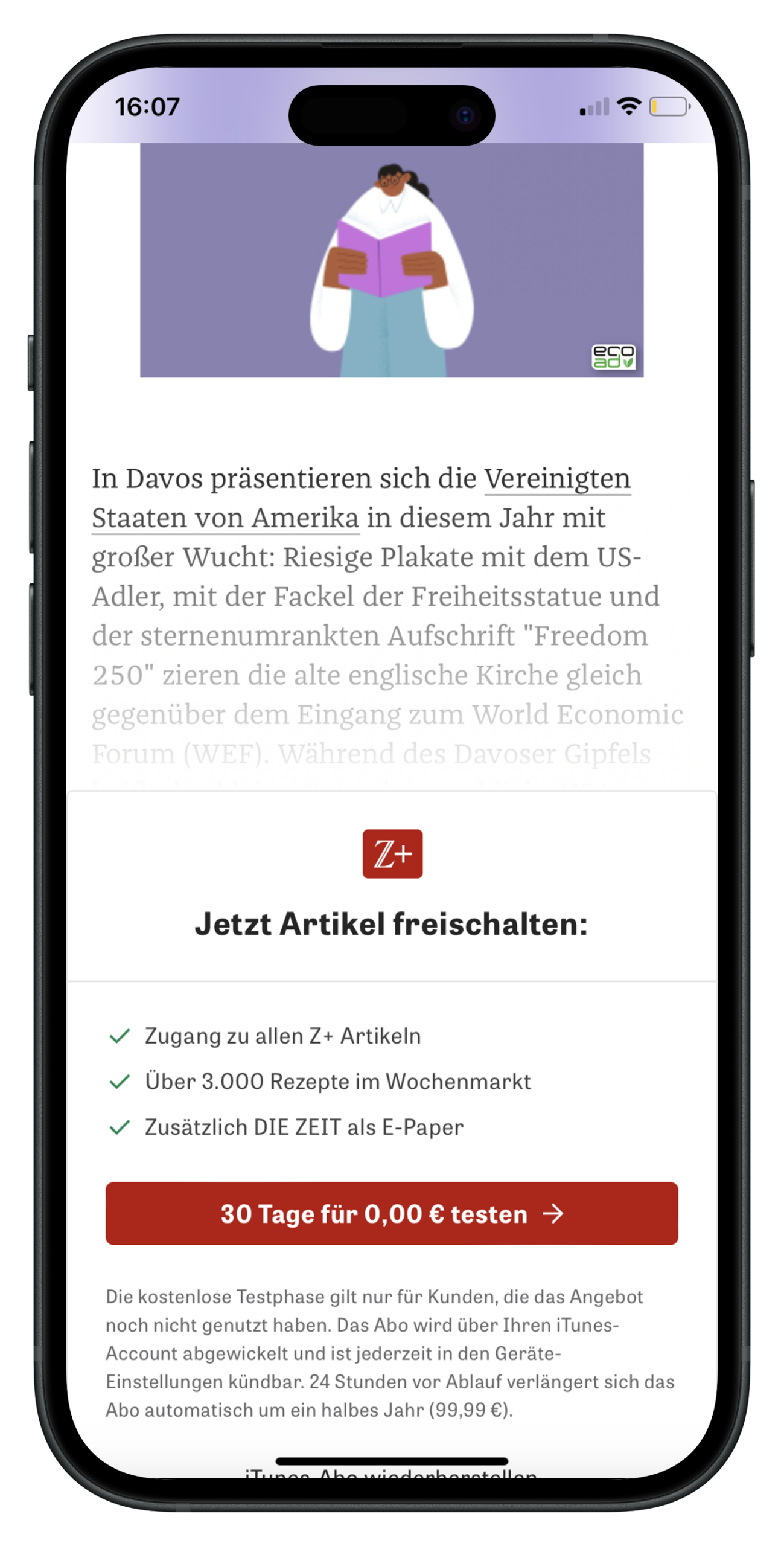
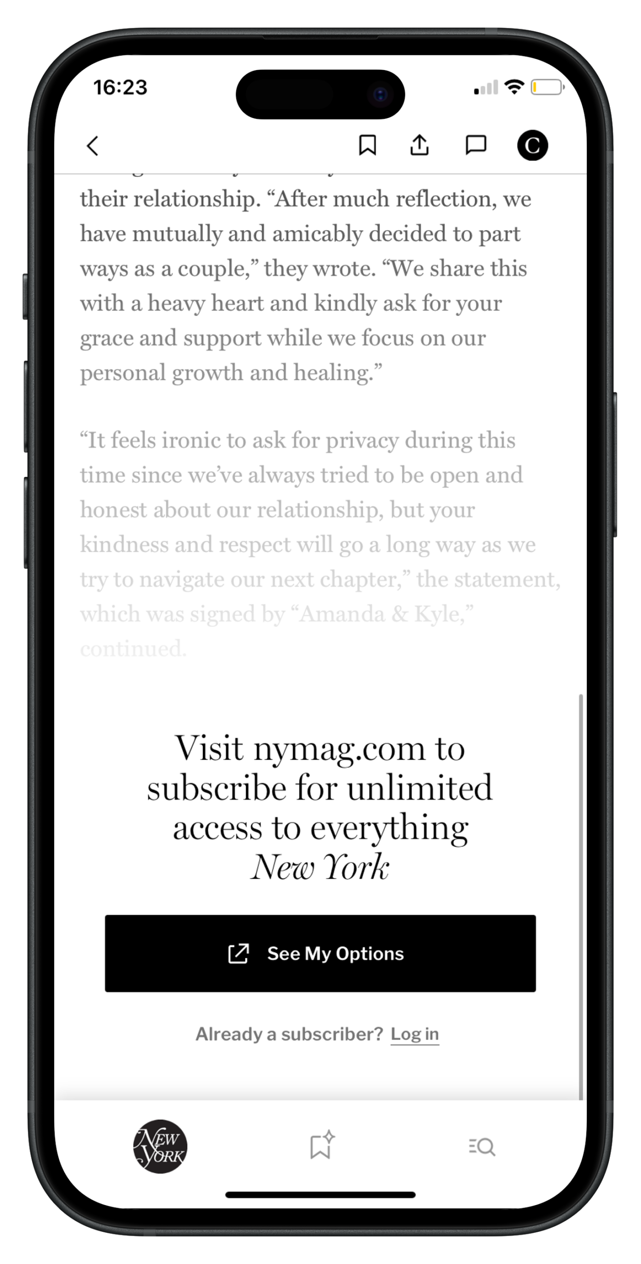
Too many publishers in this benchmark didn’t give a unique reason to subscribe, other than to gain access to content. This is perhaps why we see so many full-page walls on mobile – to allow for more space for the value proposition, CTA button and subscription offers simultaneously.
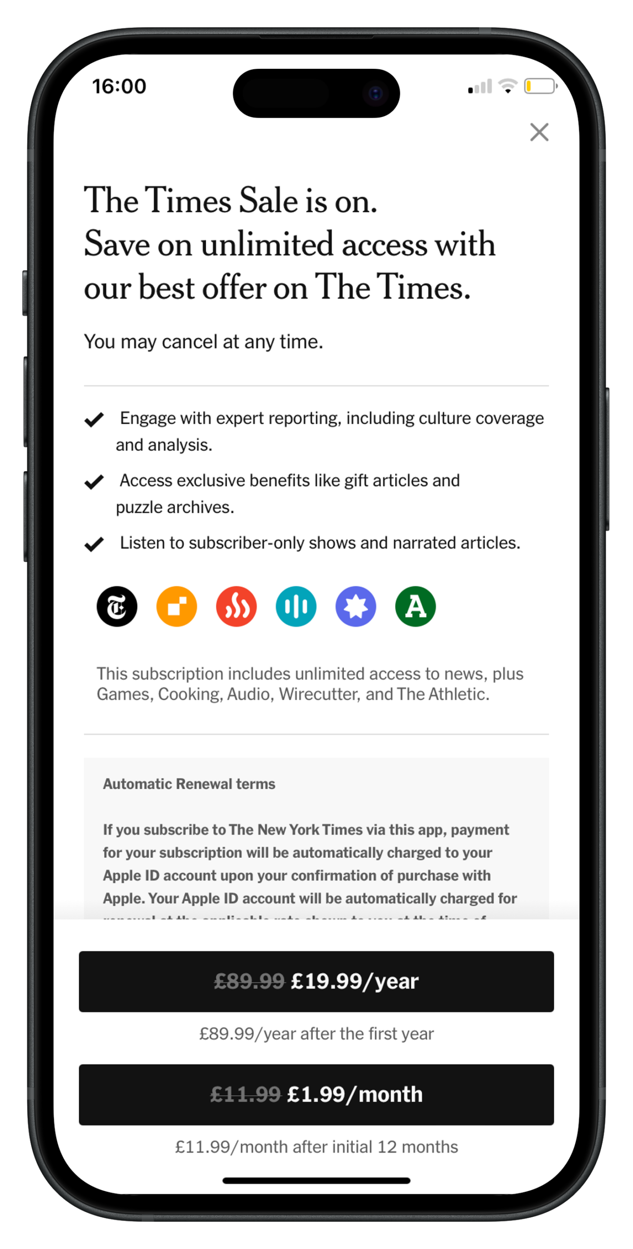
I’d argue that the value proposition is more important than having 2 offers on the wall, and that clearly communicating what you stand for, what value you’ll provide and what jobs you’ll help your reader achieve is the most important aspect of the paywall.
In just 7 words, FT successfully tells us what we’ll have access to, what makes them different to other publishers, and the value we have to give in exchange for this
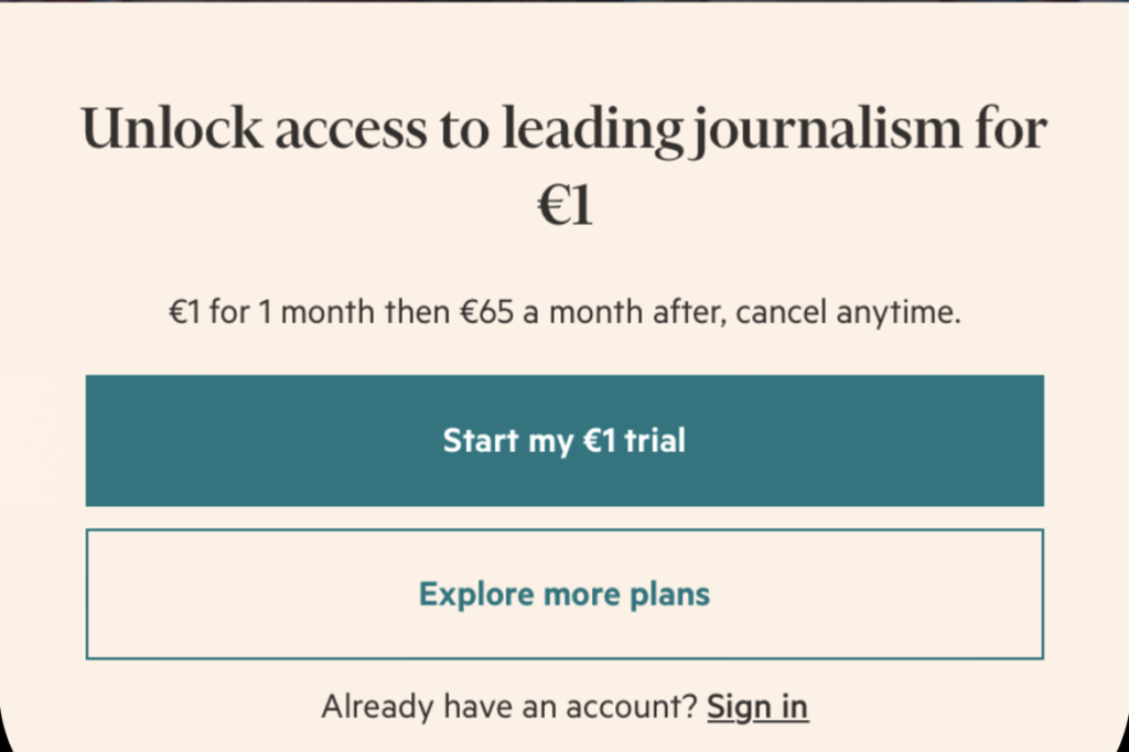
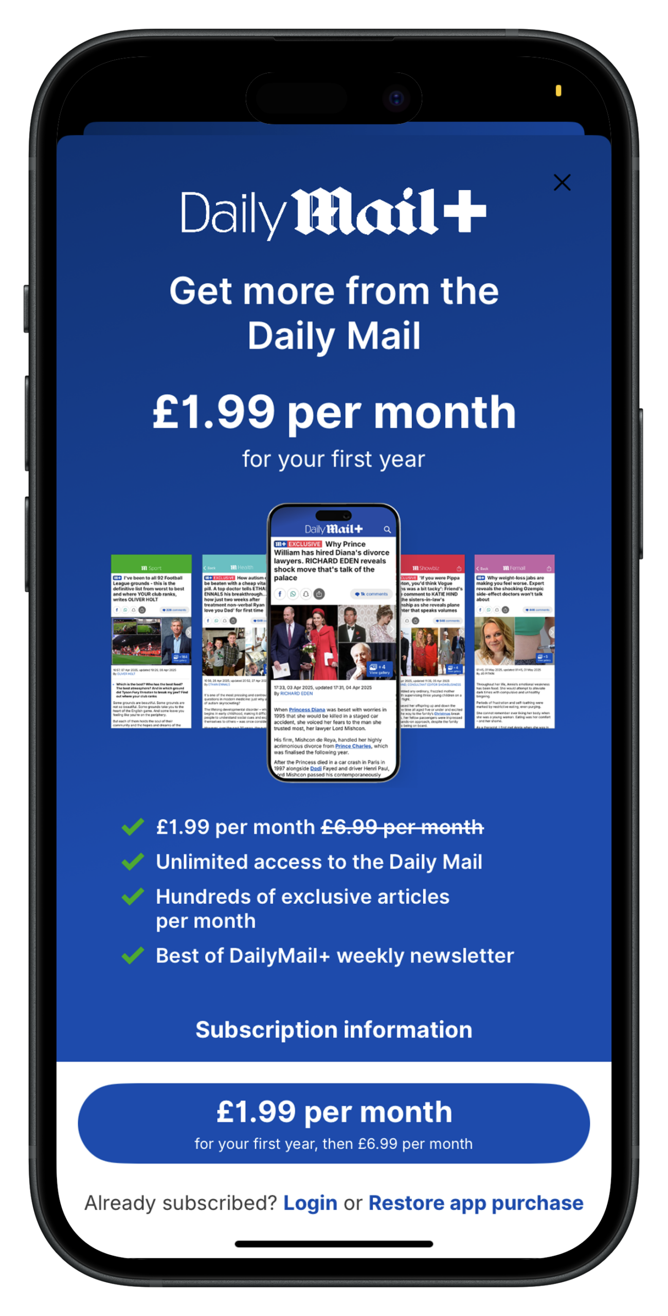
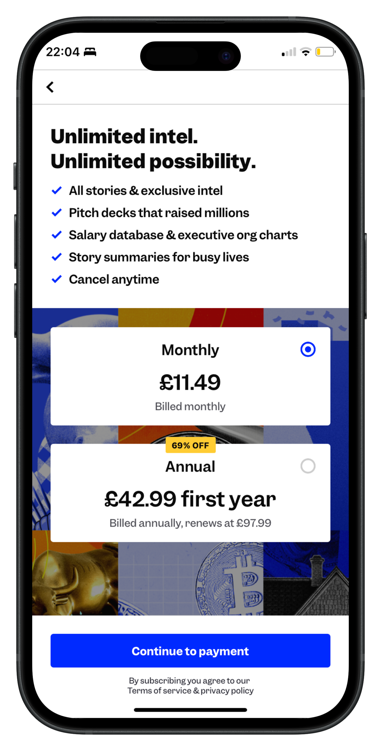
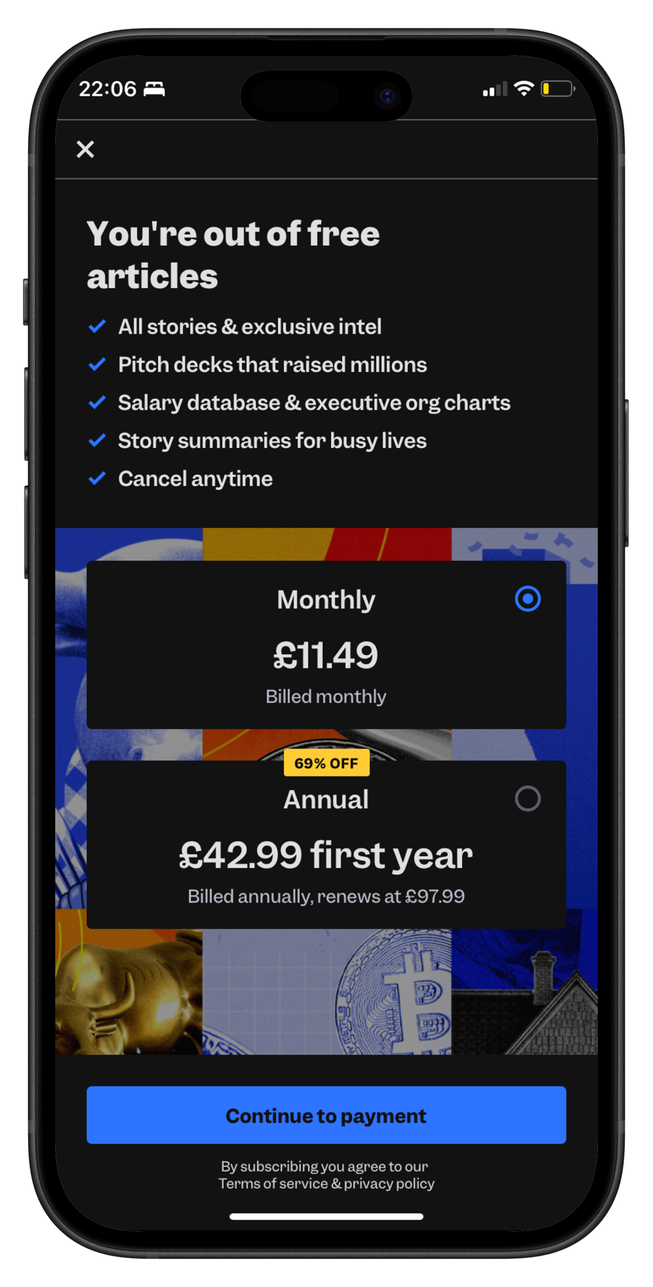
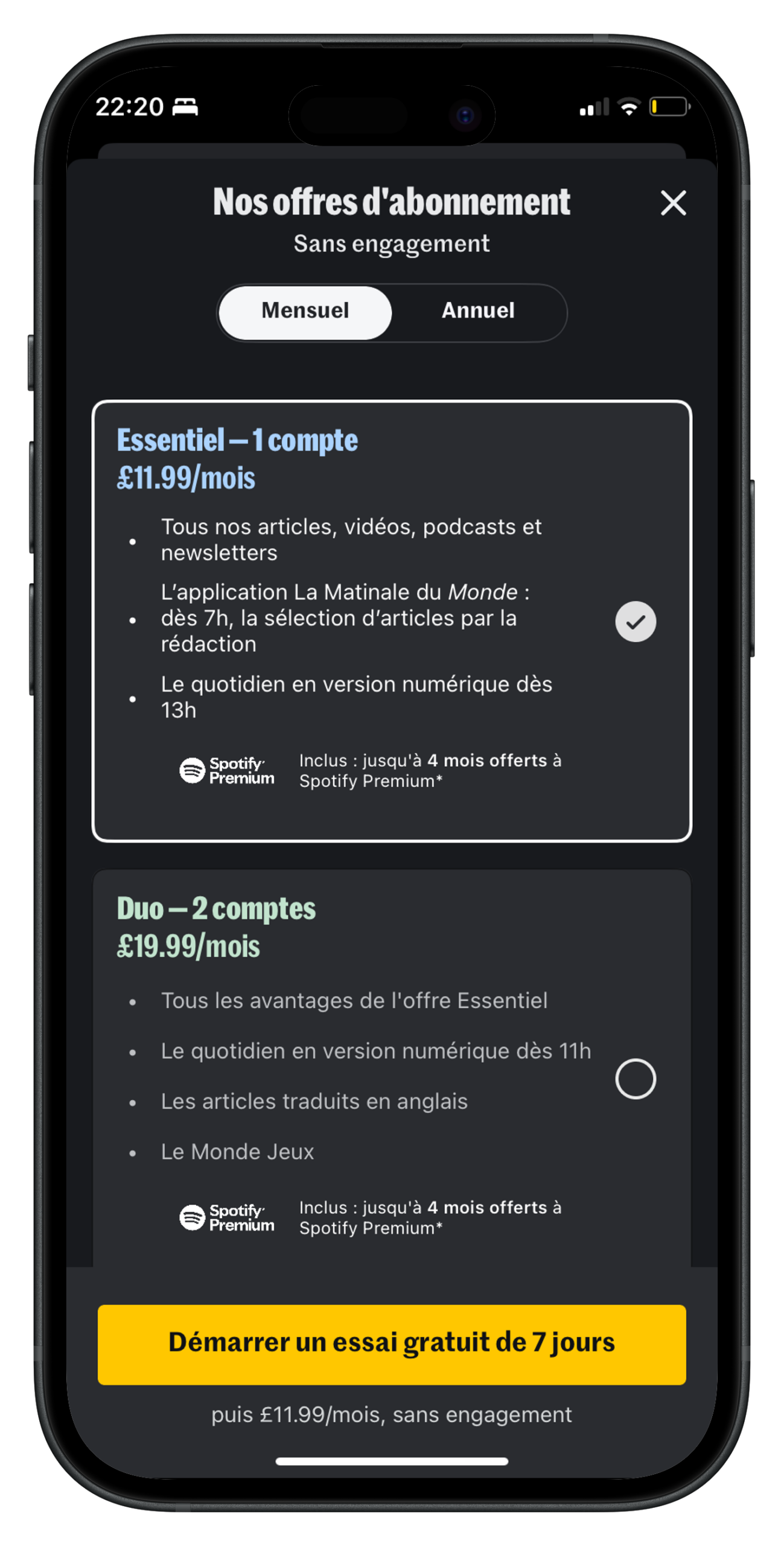
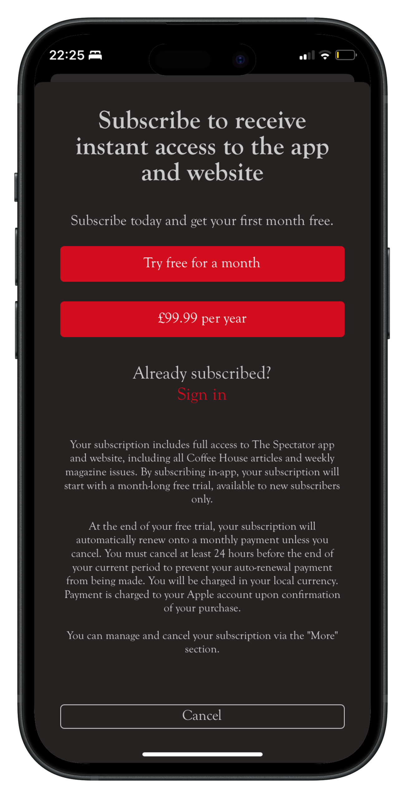
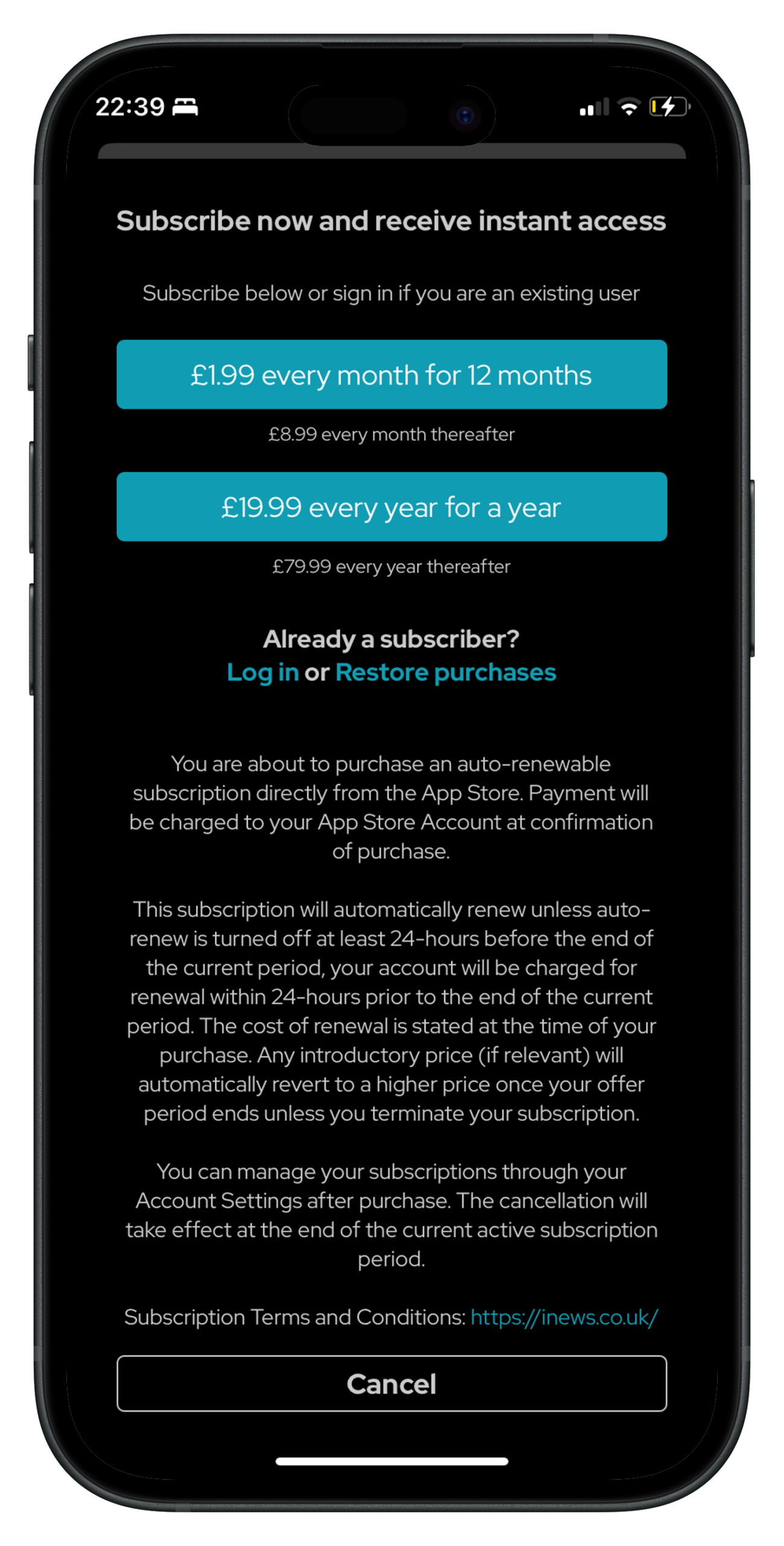
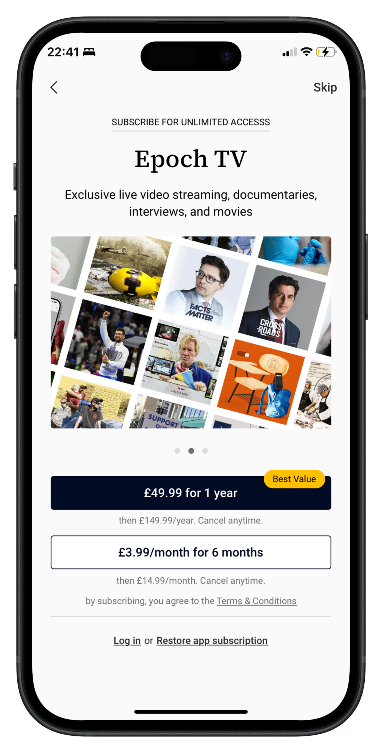
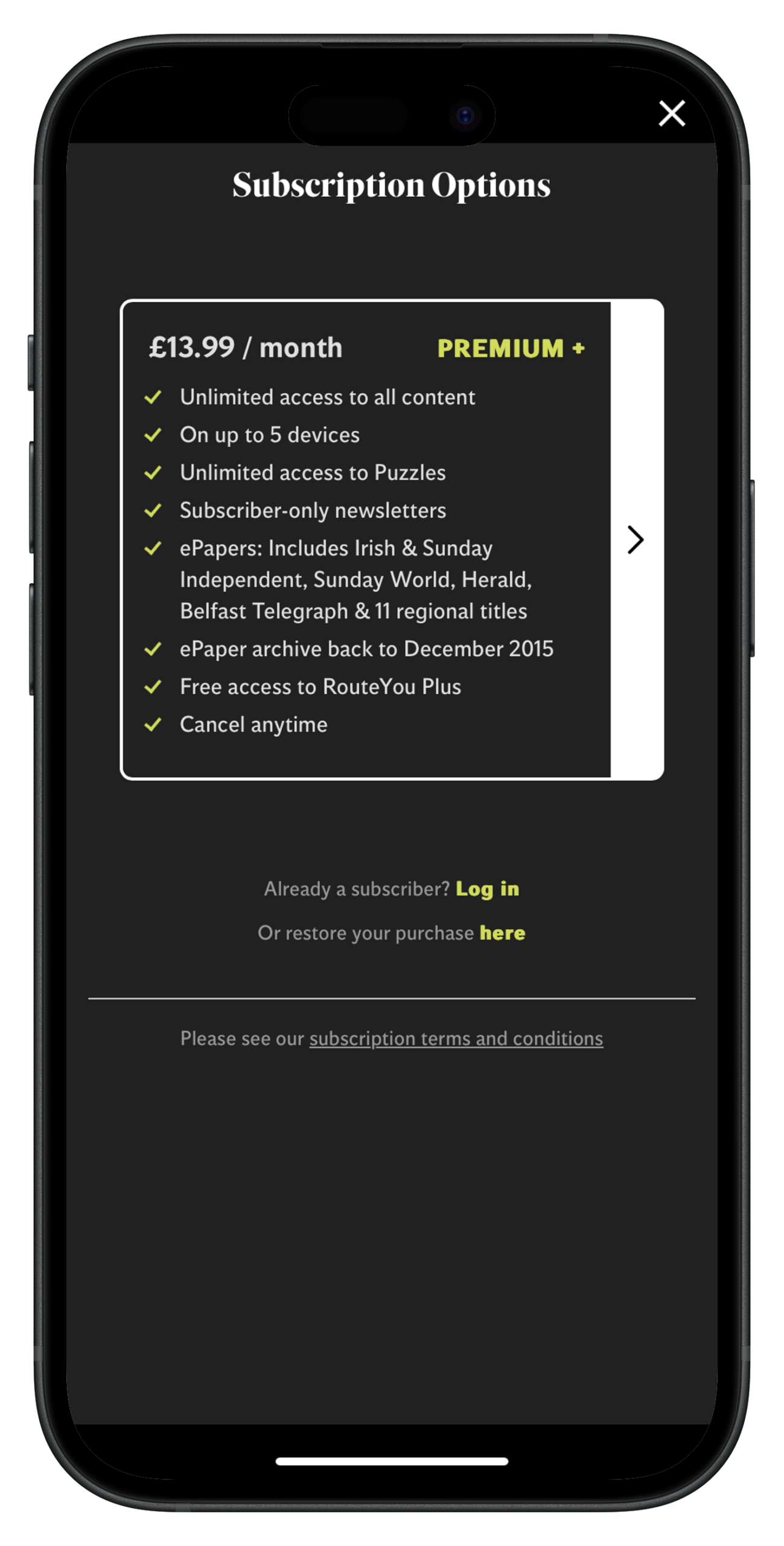
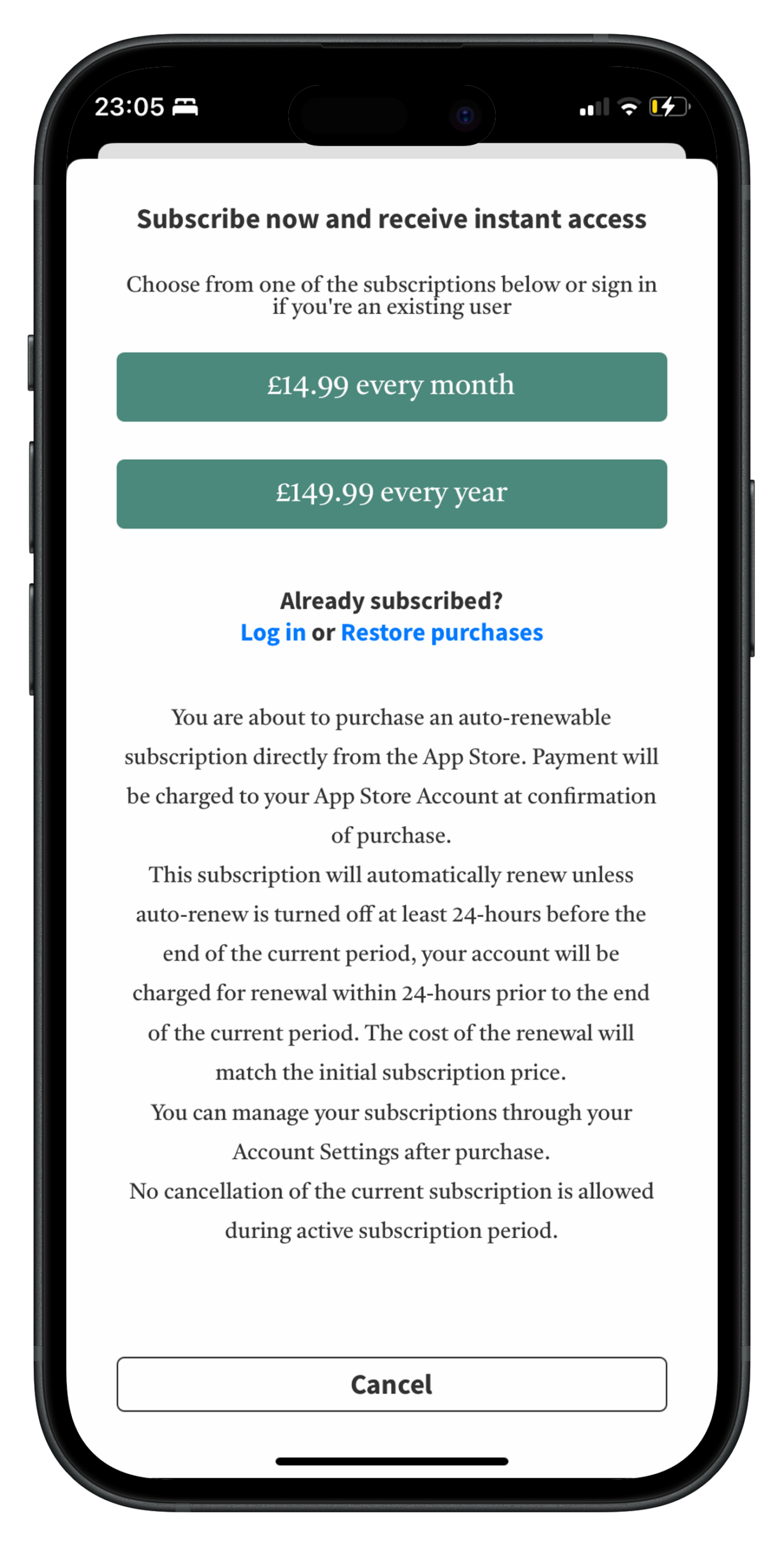
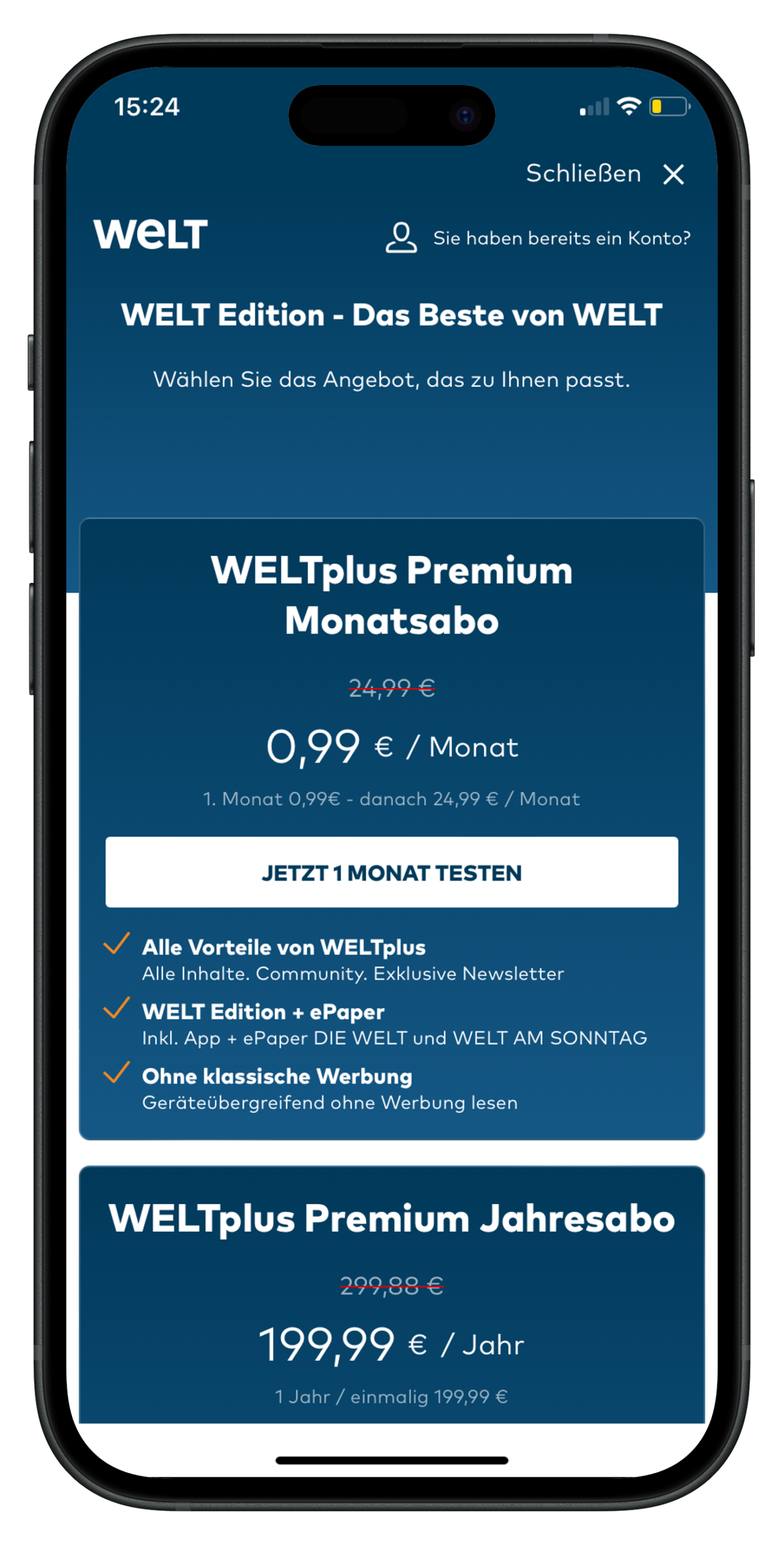
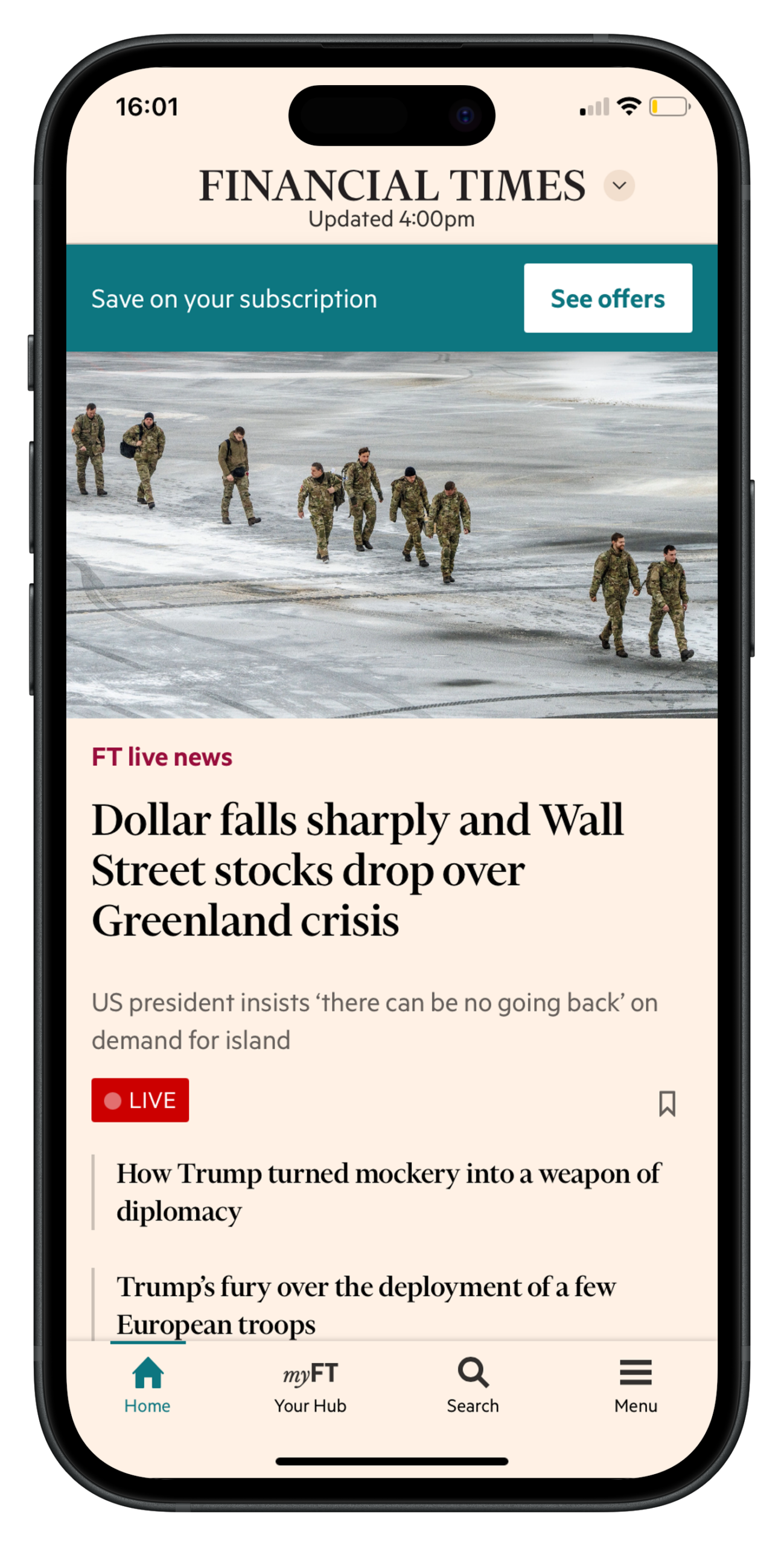
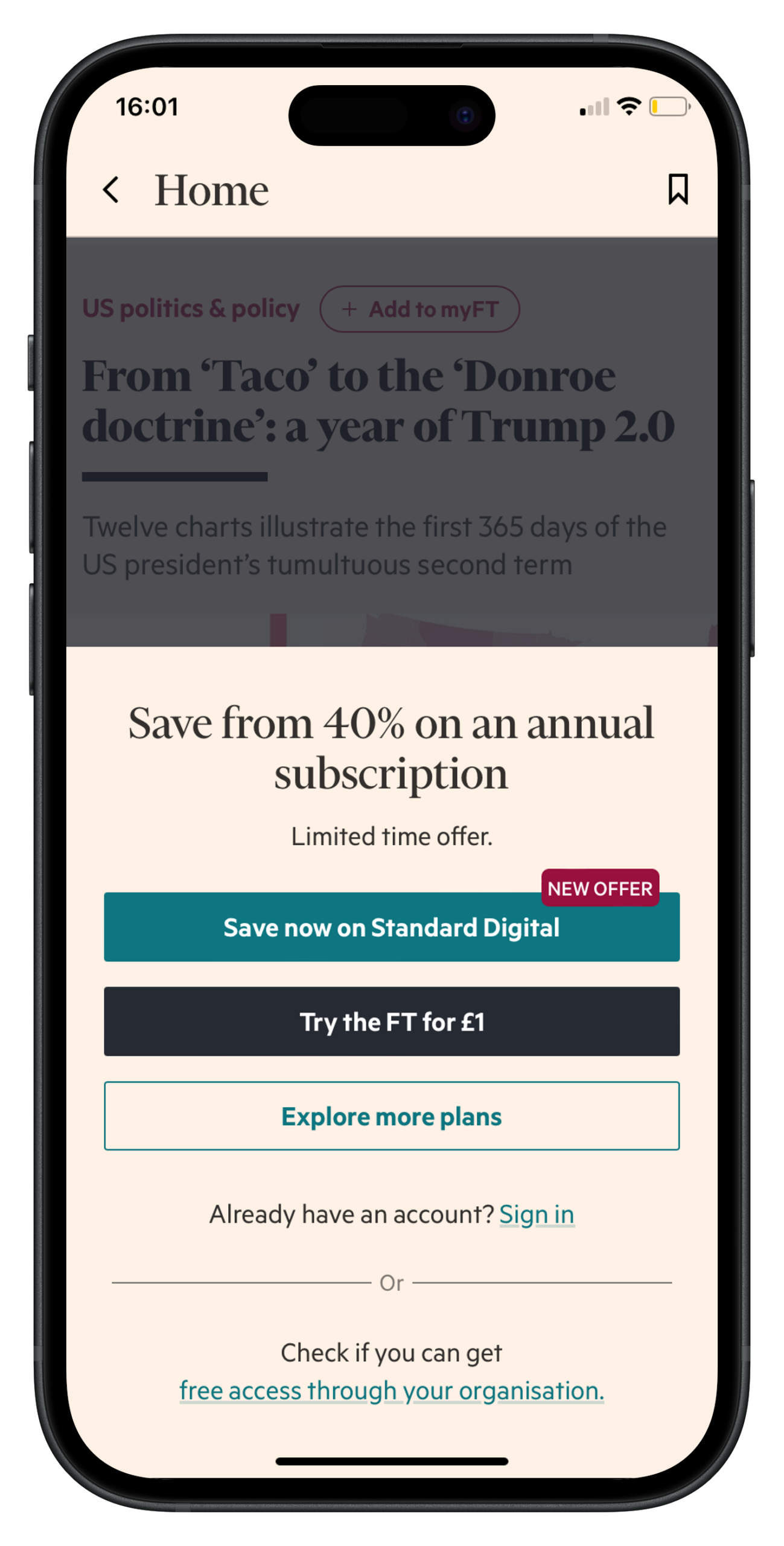
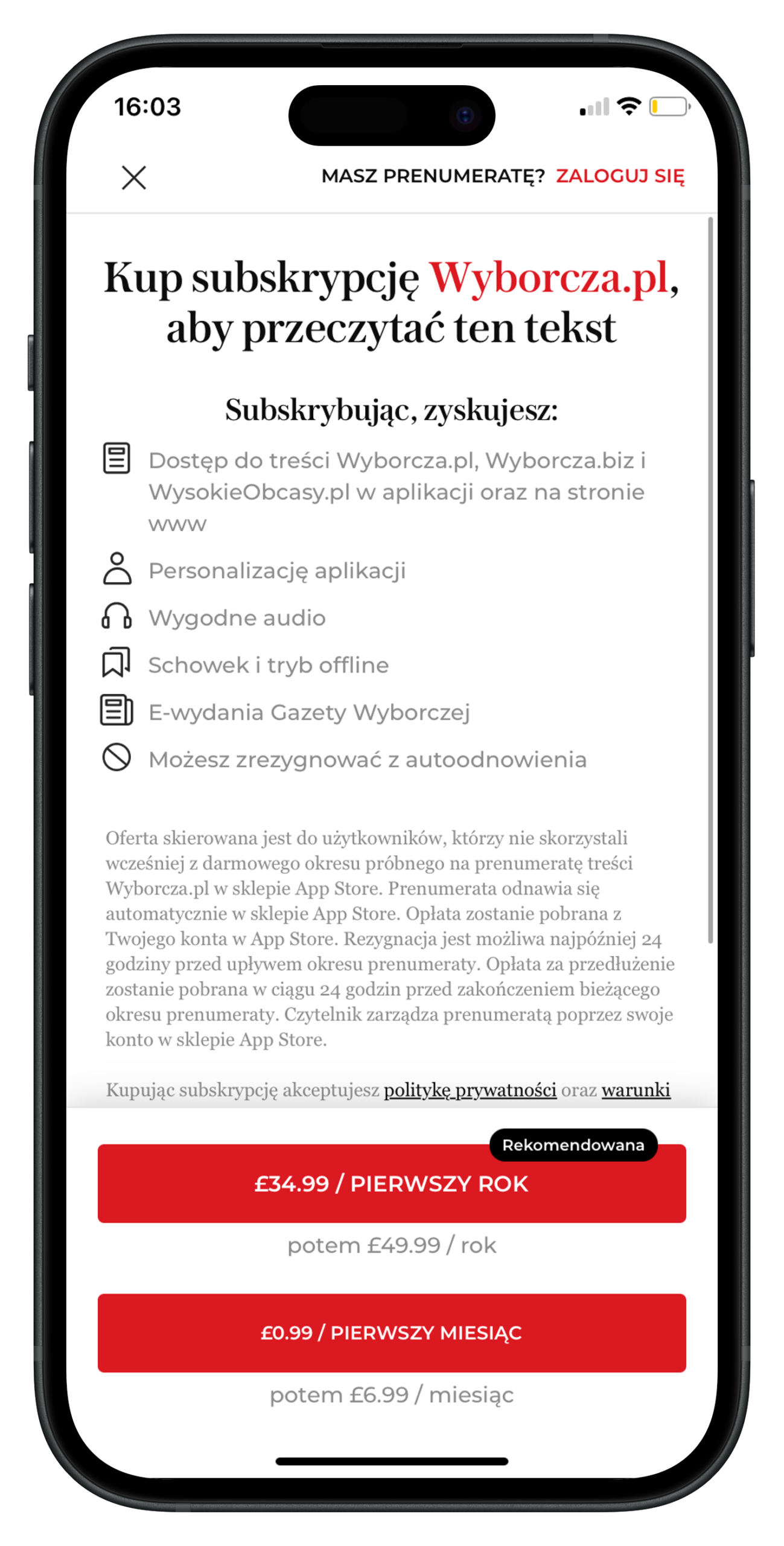
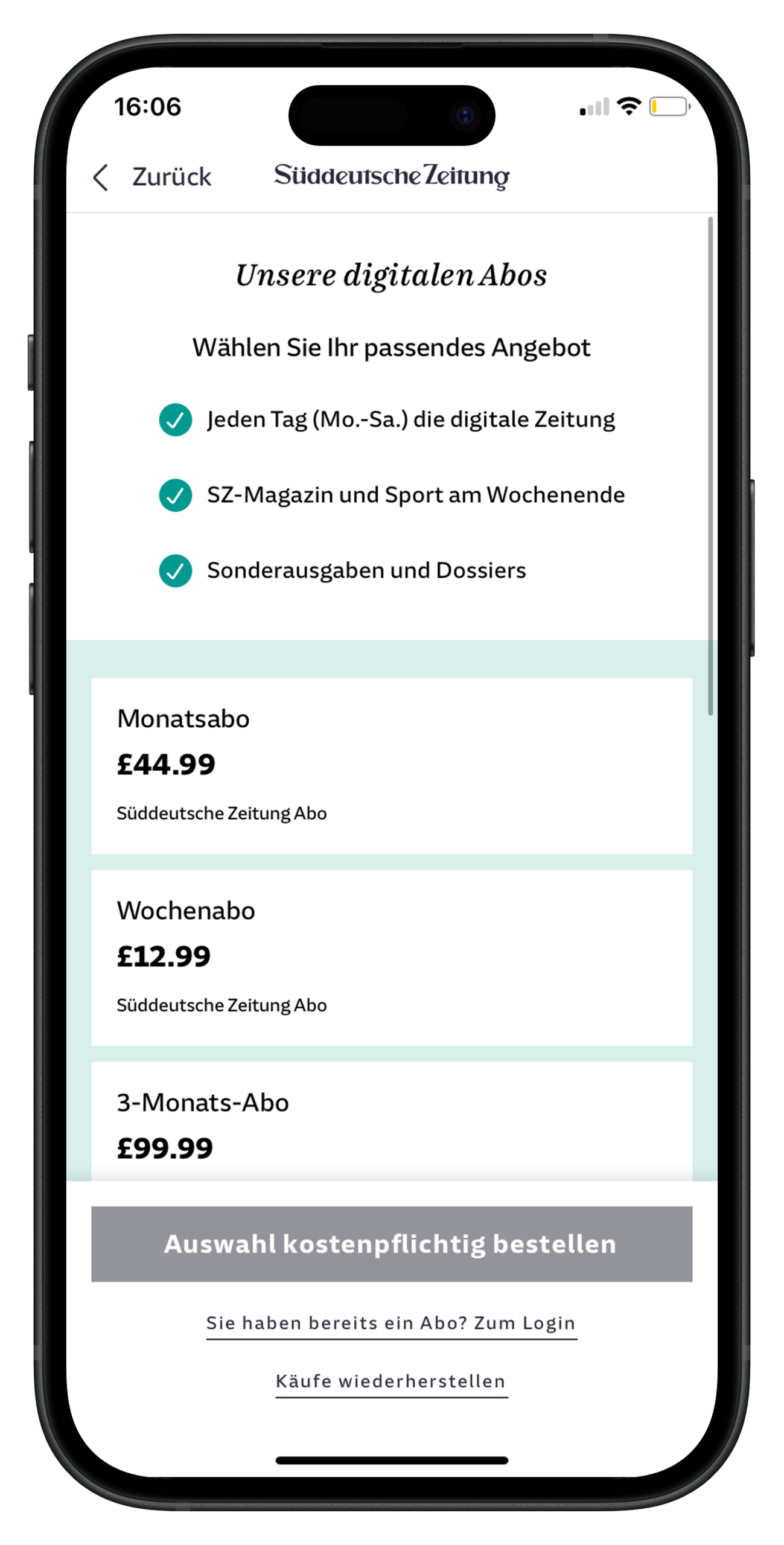
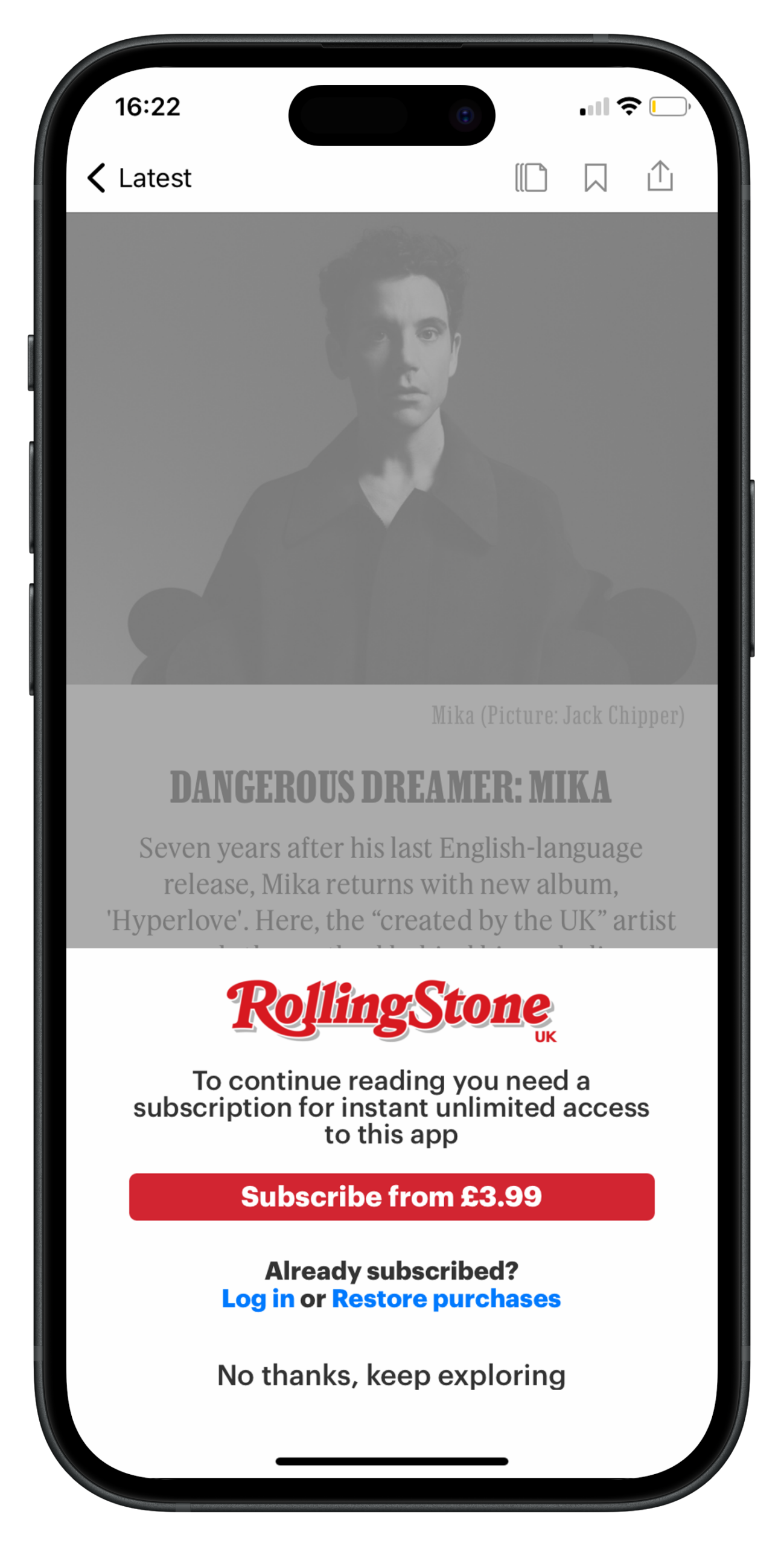
One or two offers maximum, often integrated into the paywall to reduce steps in the funnel
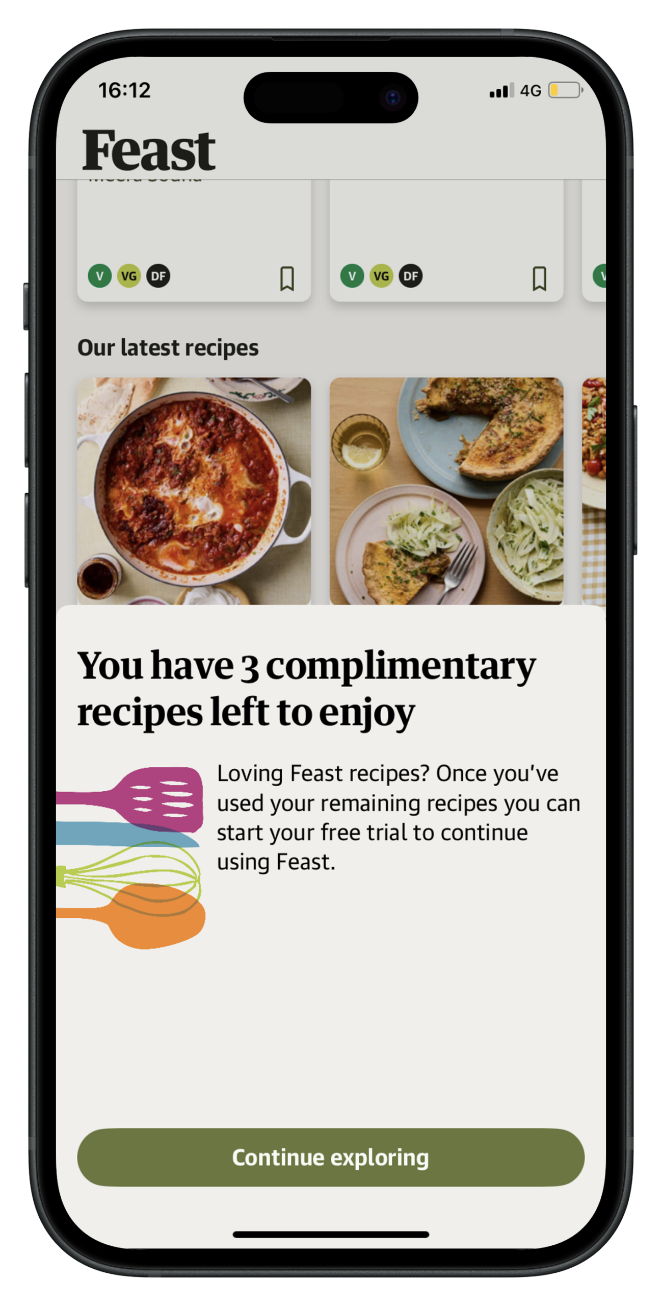
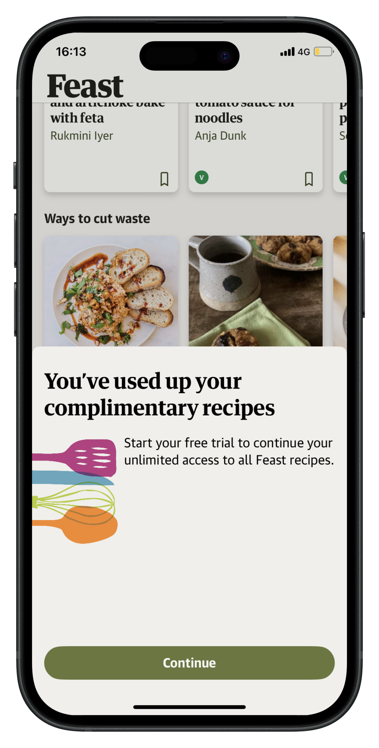
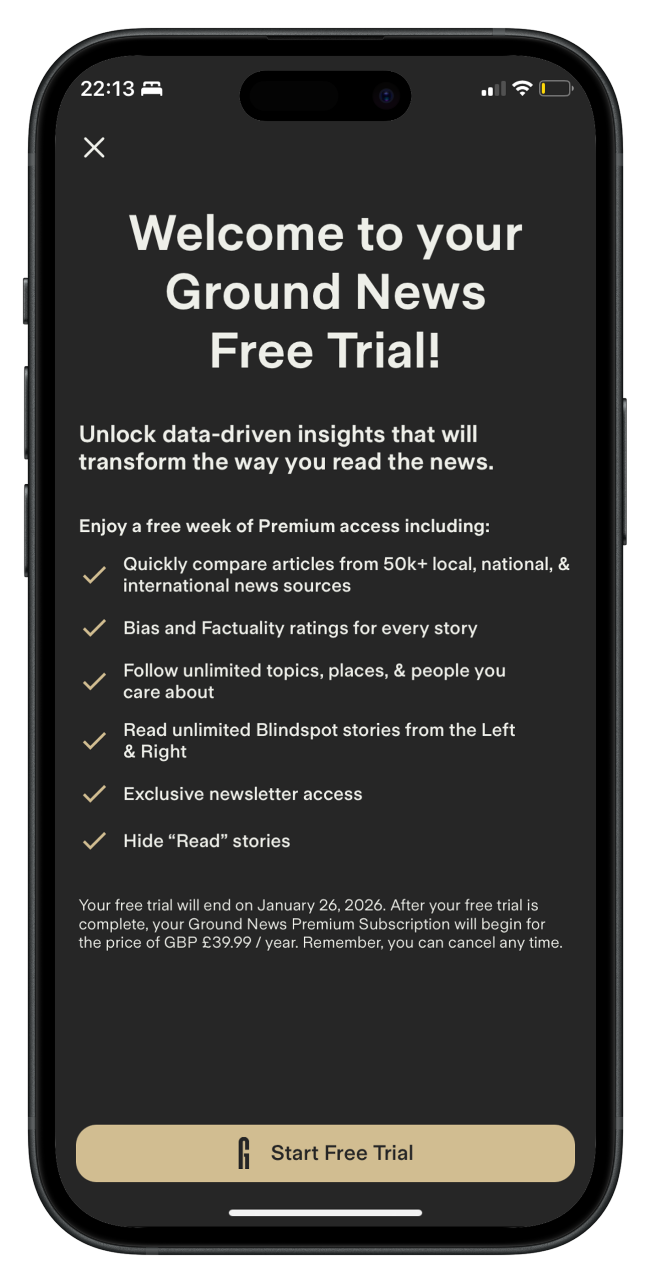
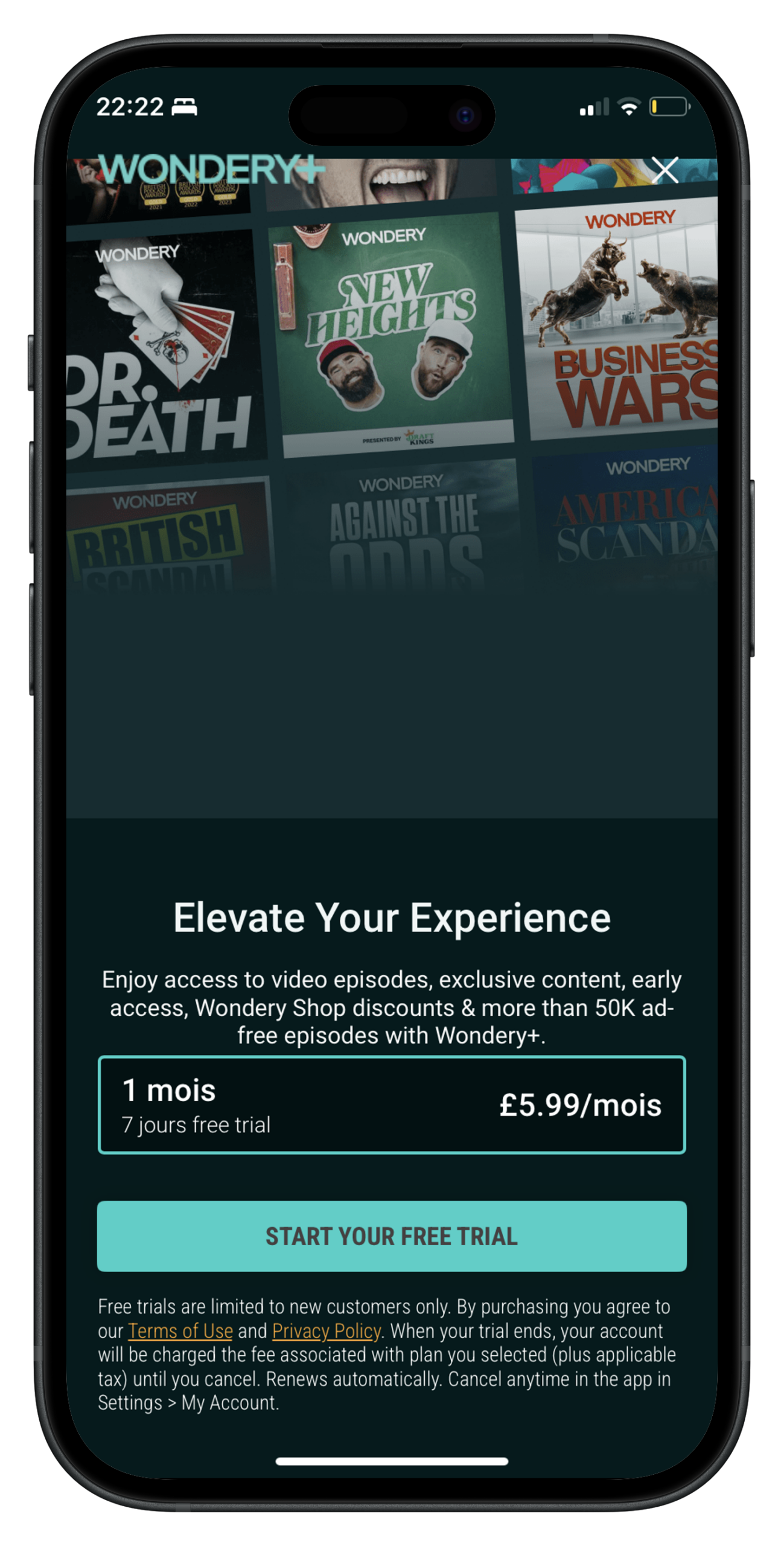
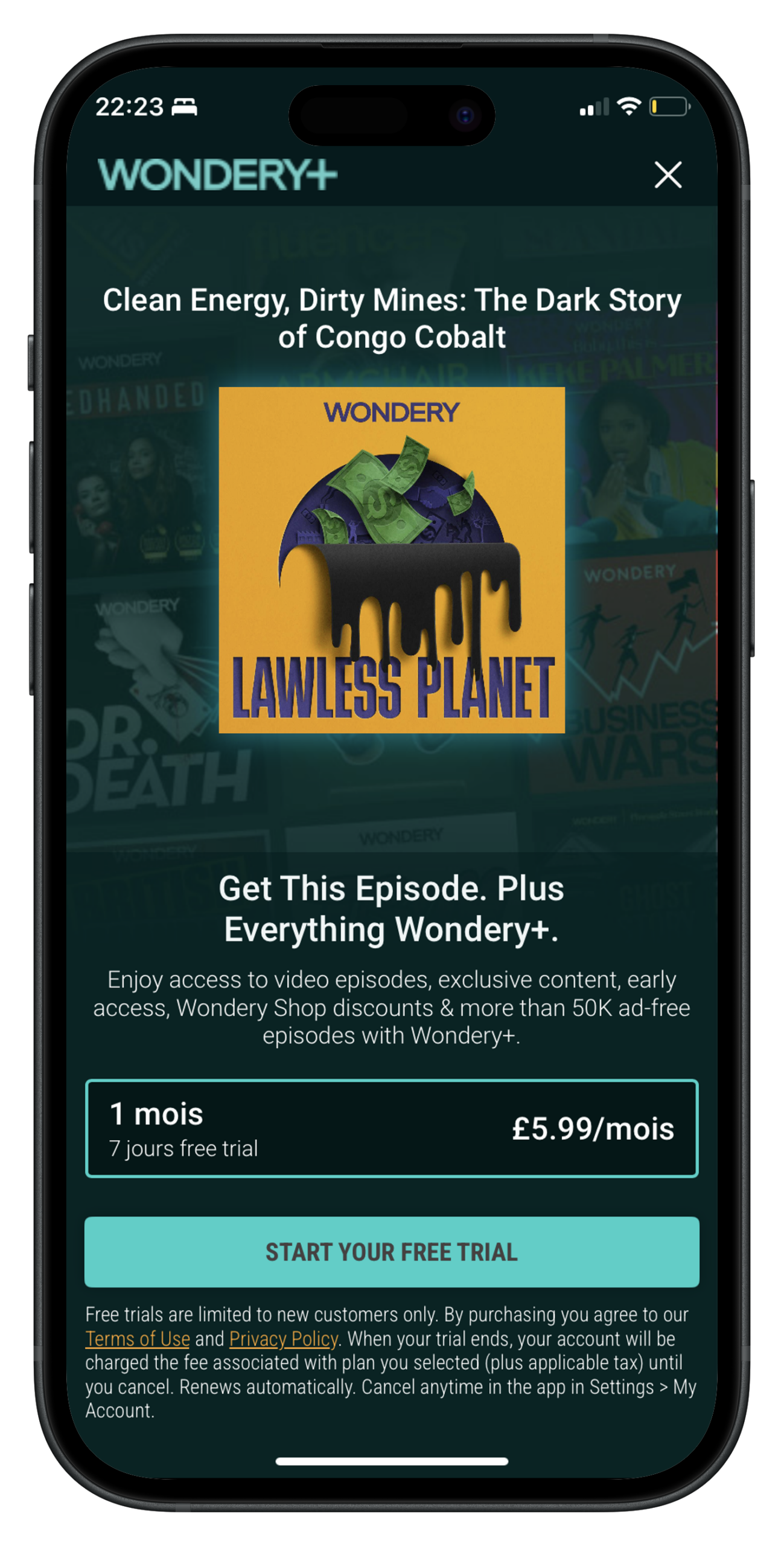
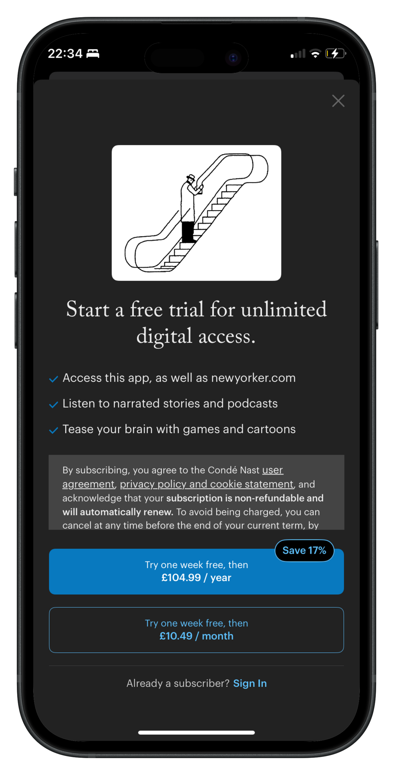
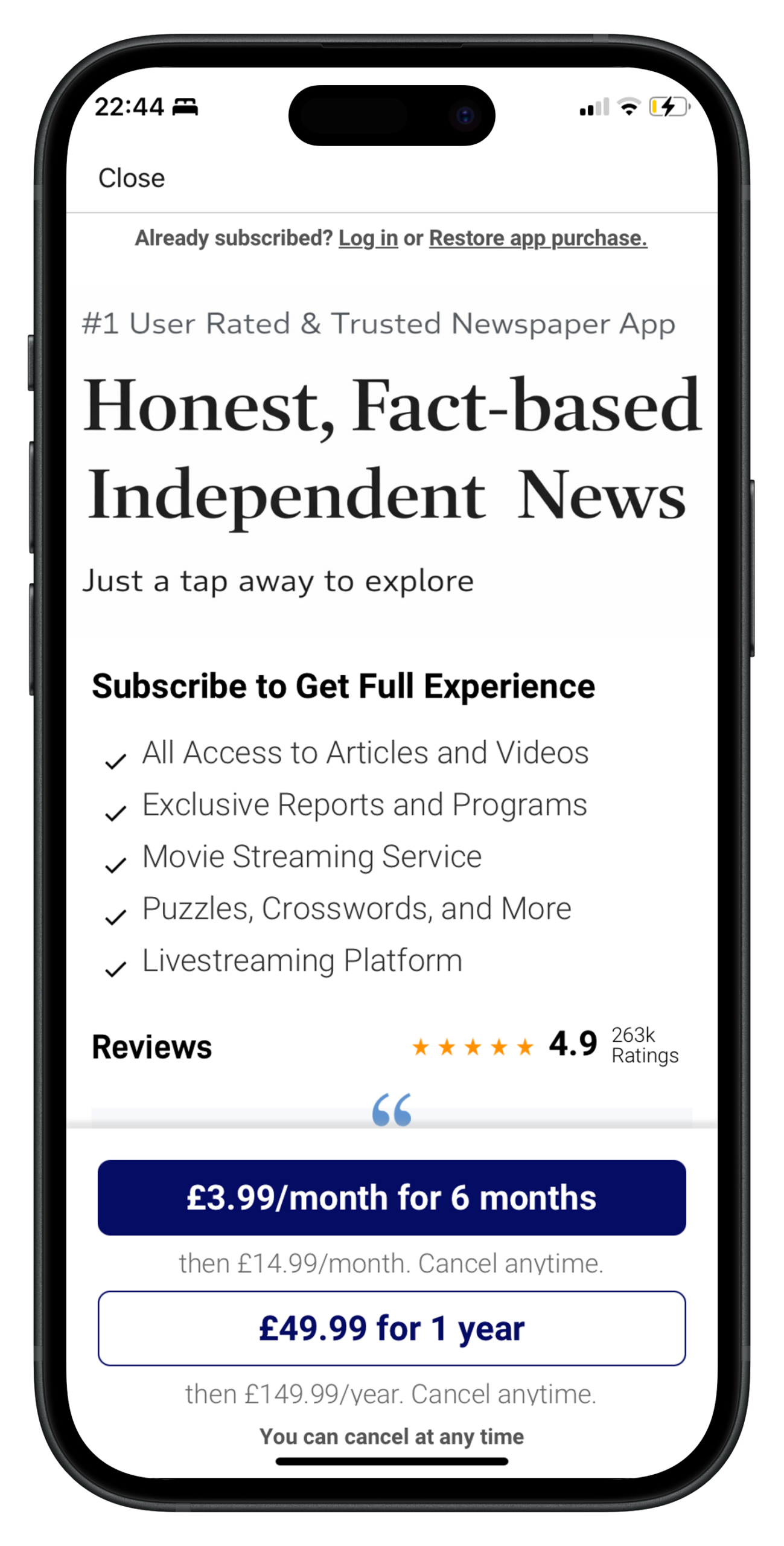
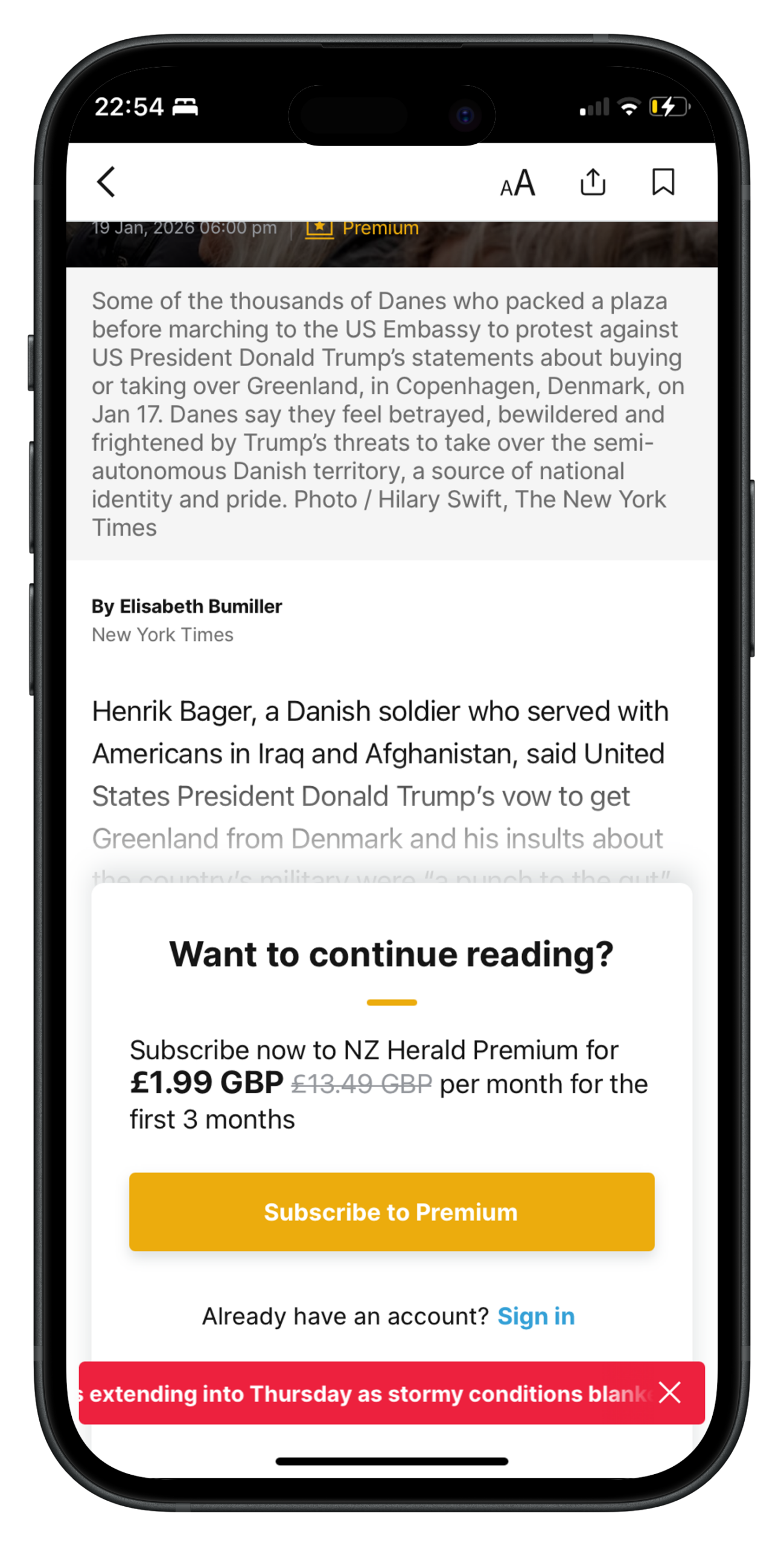
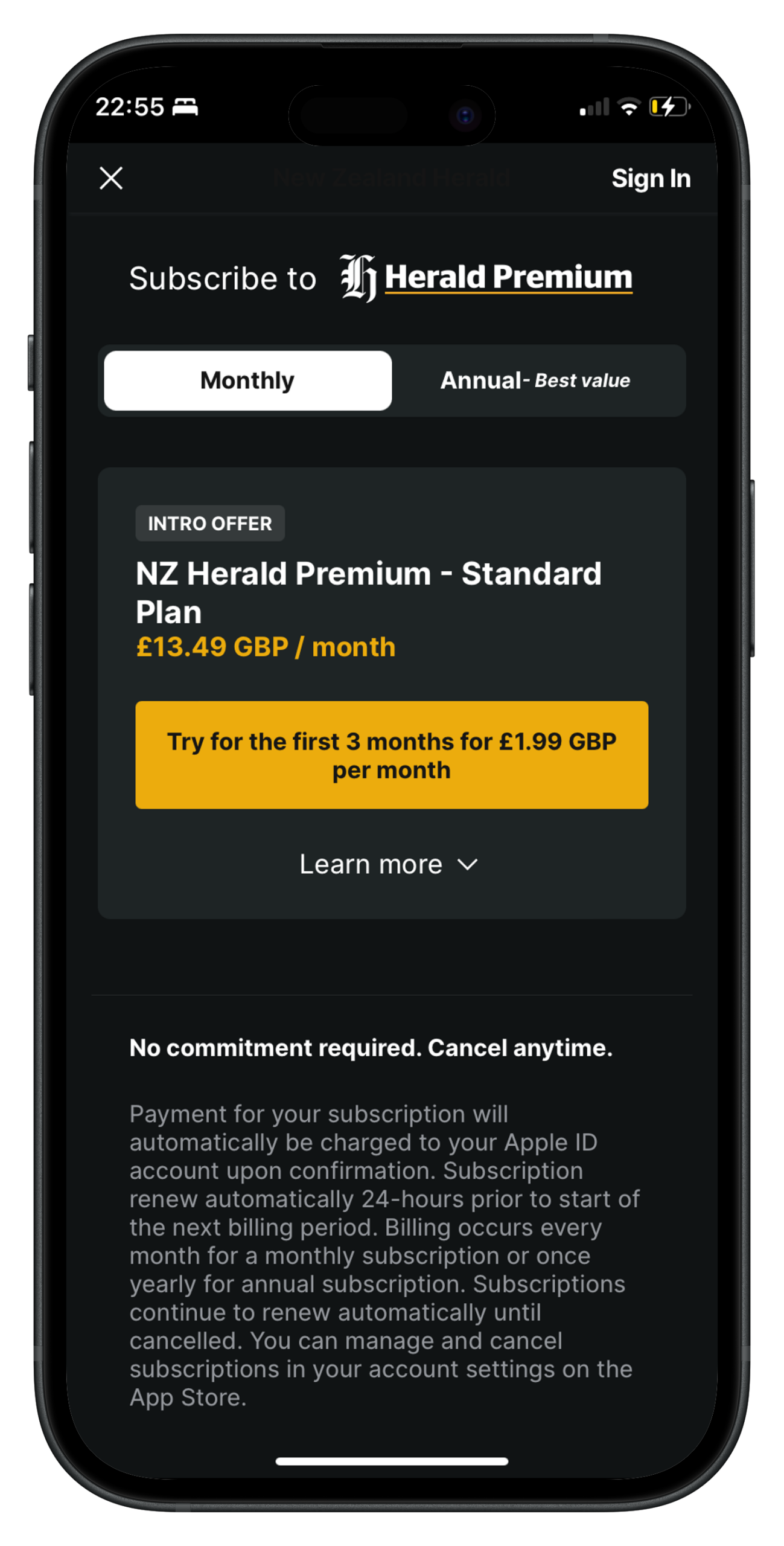
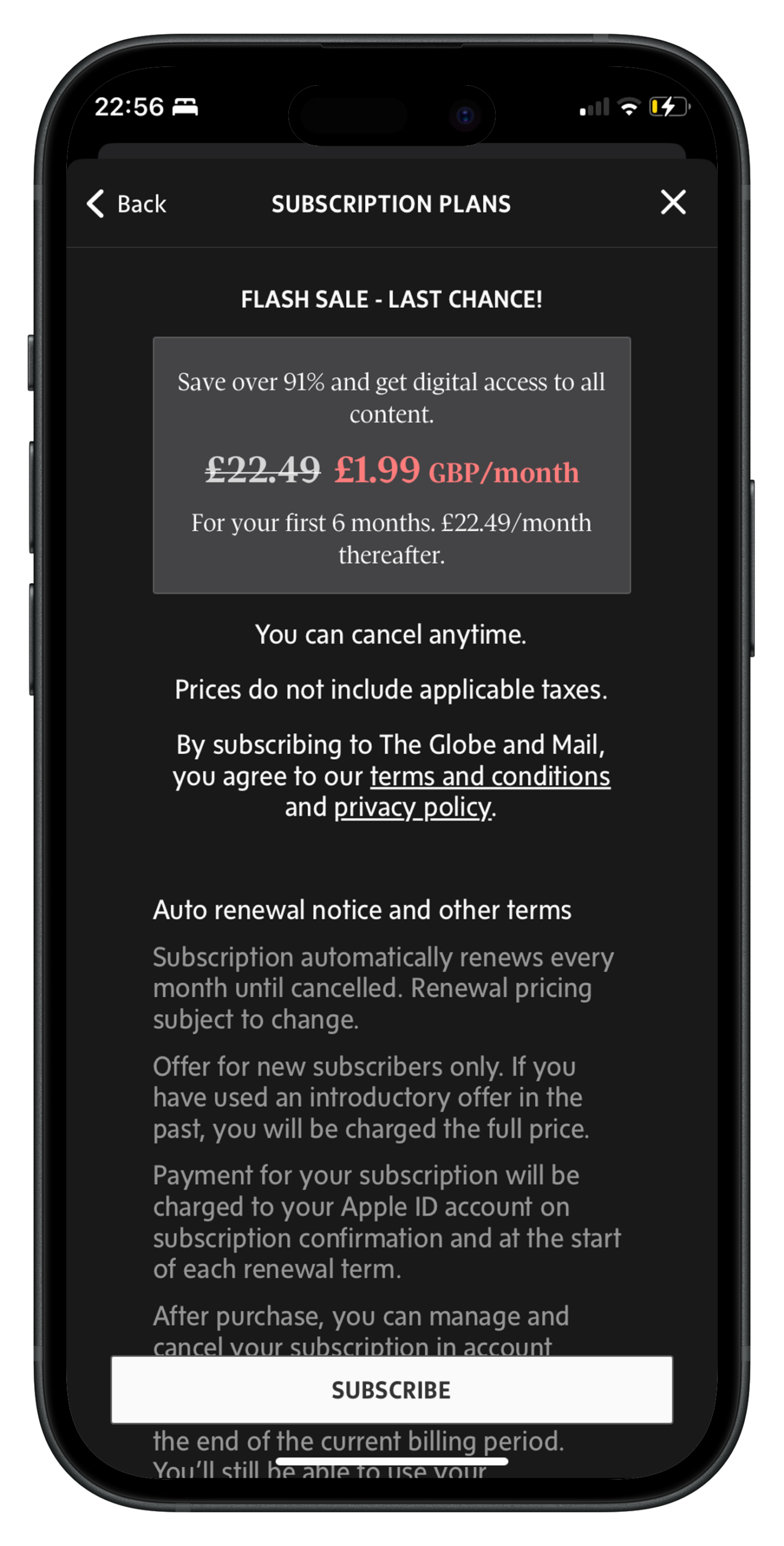
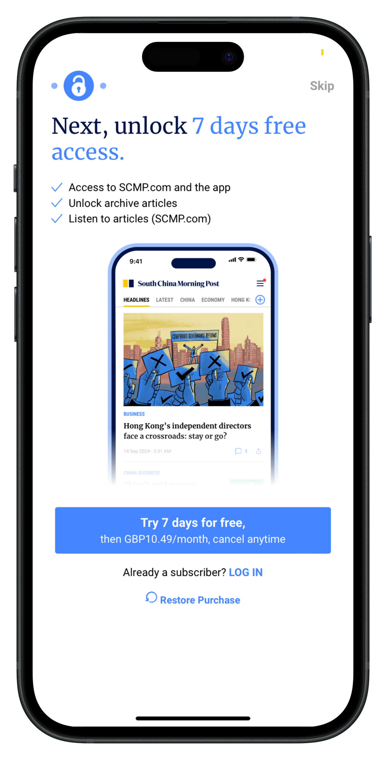
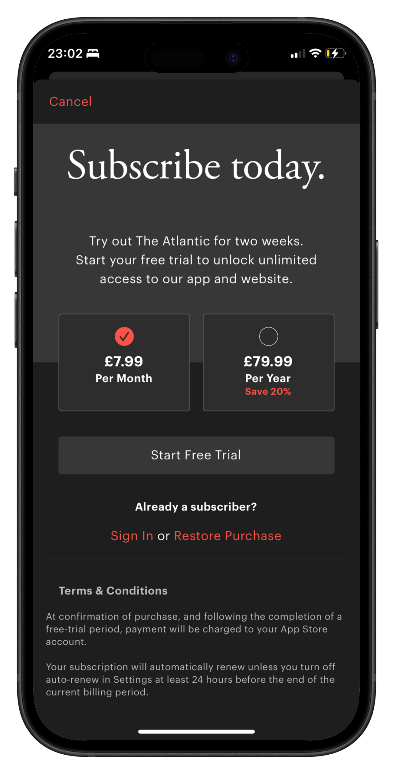
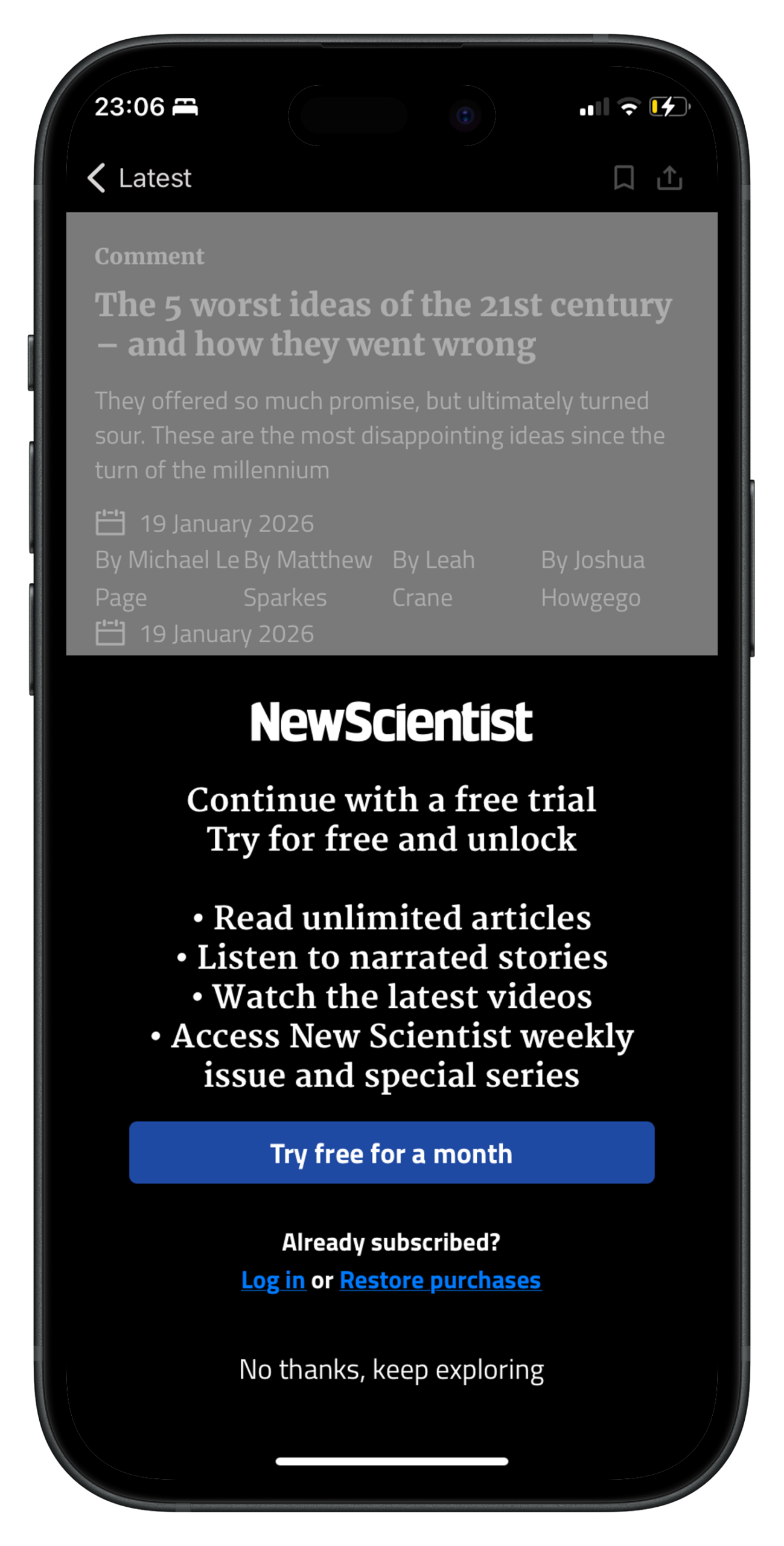
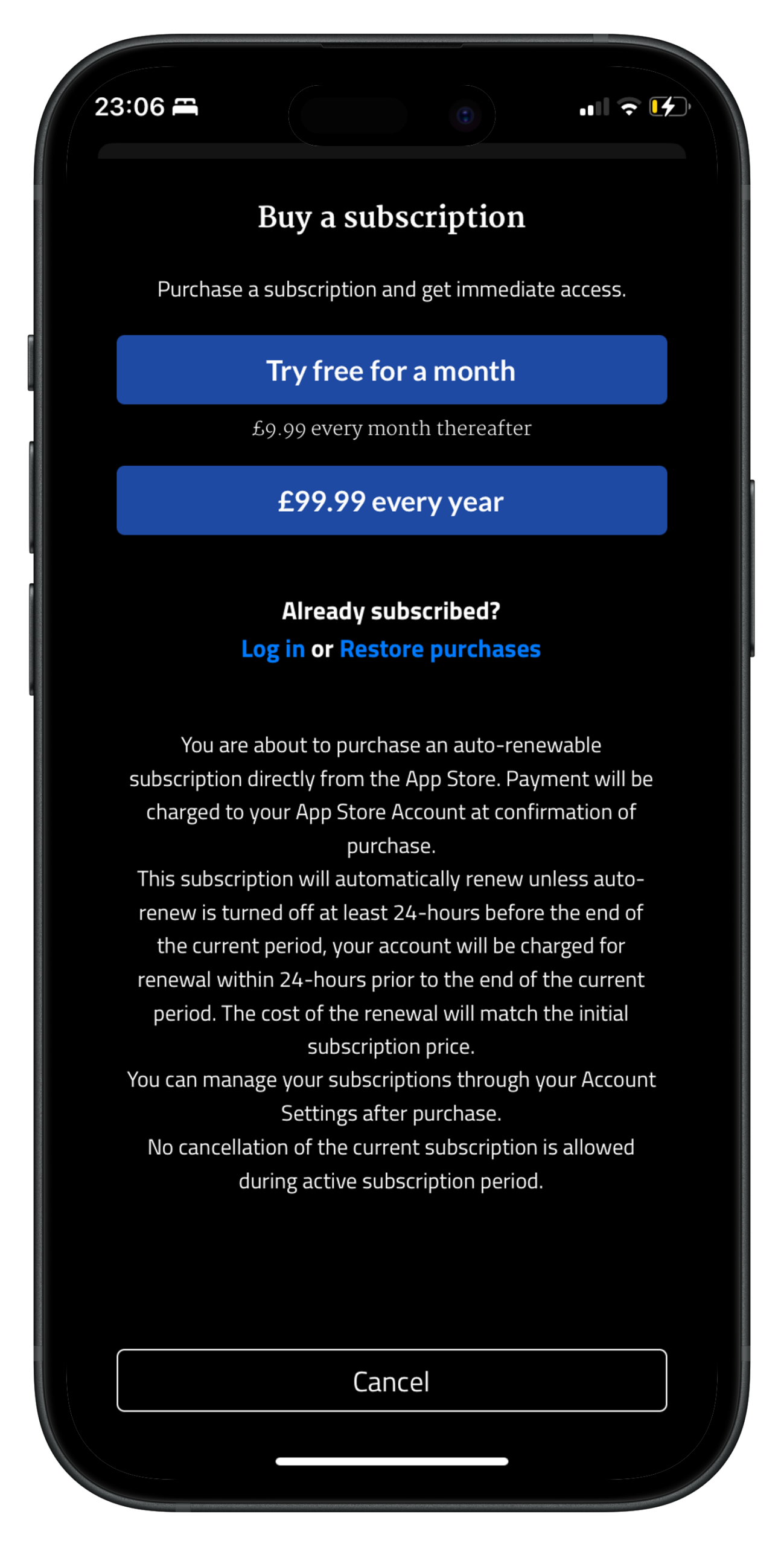
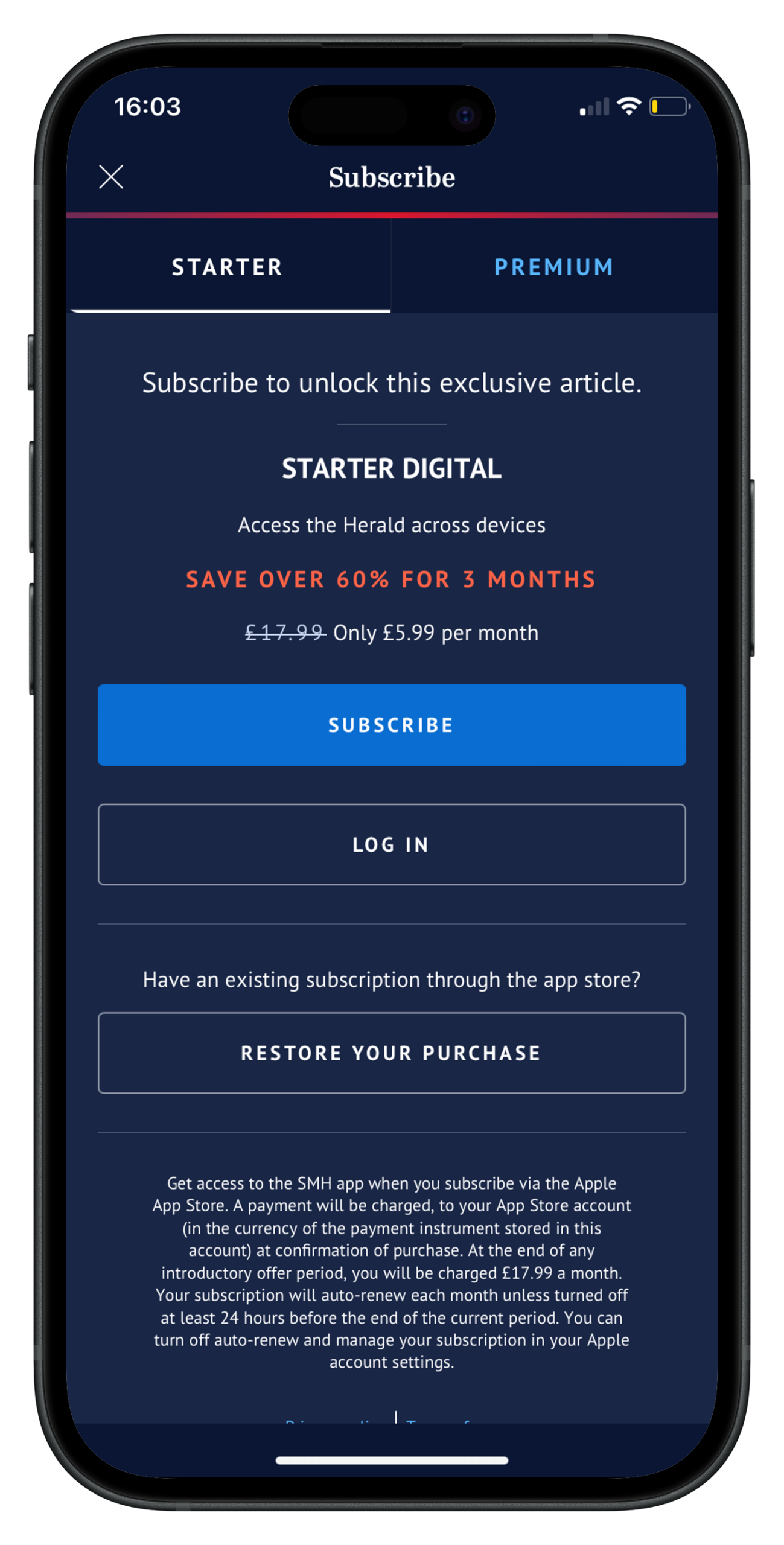
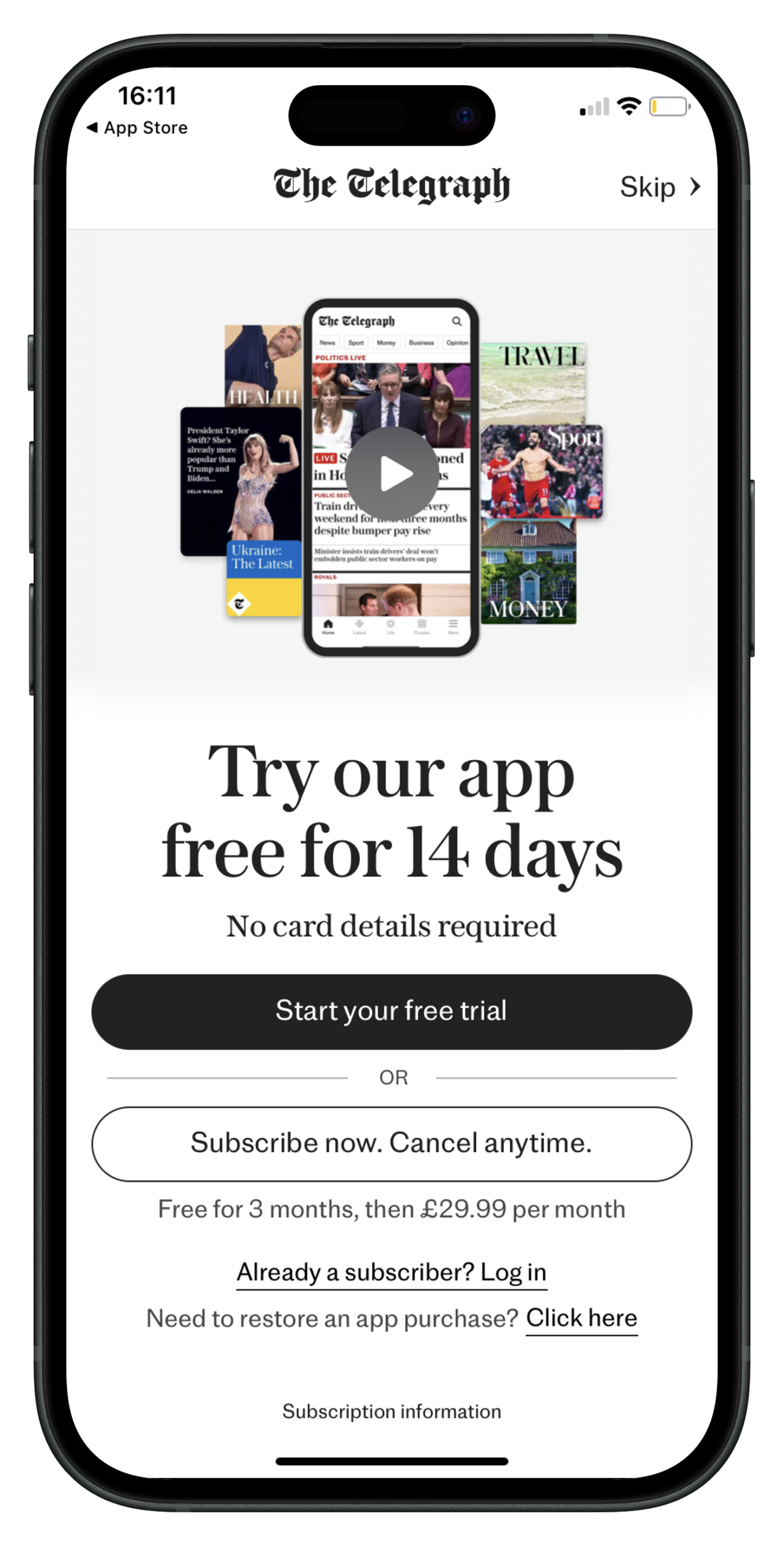
A free or reduced trial offer (something that we see more on mobile than on desktop)
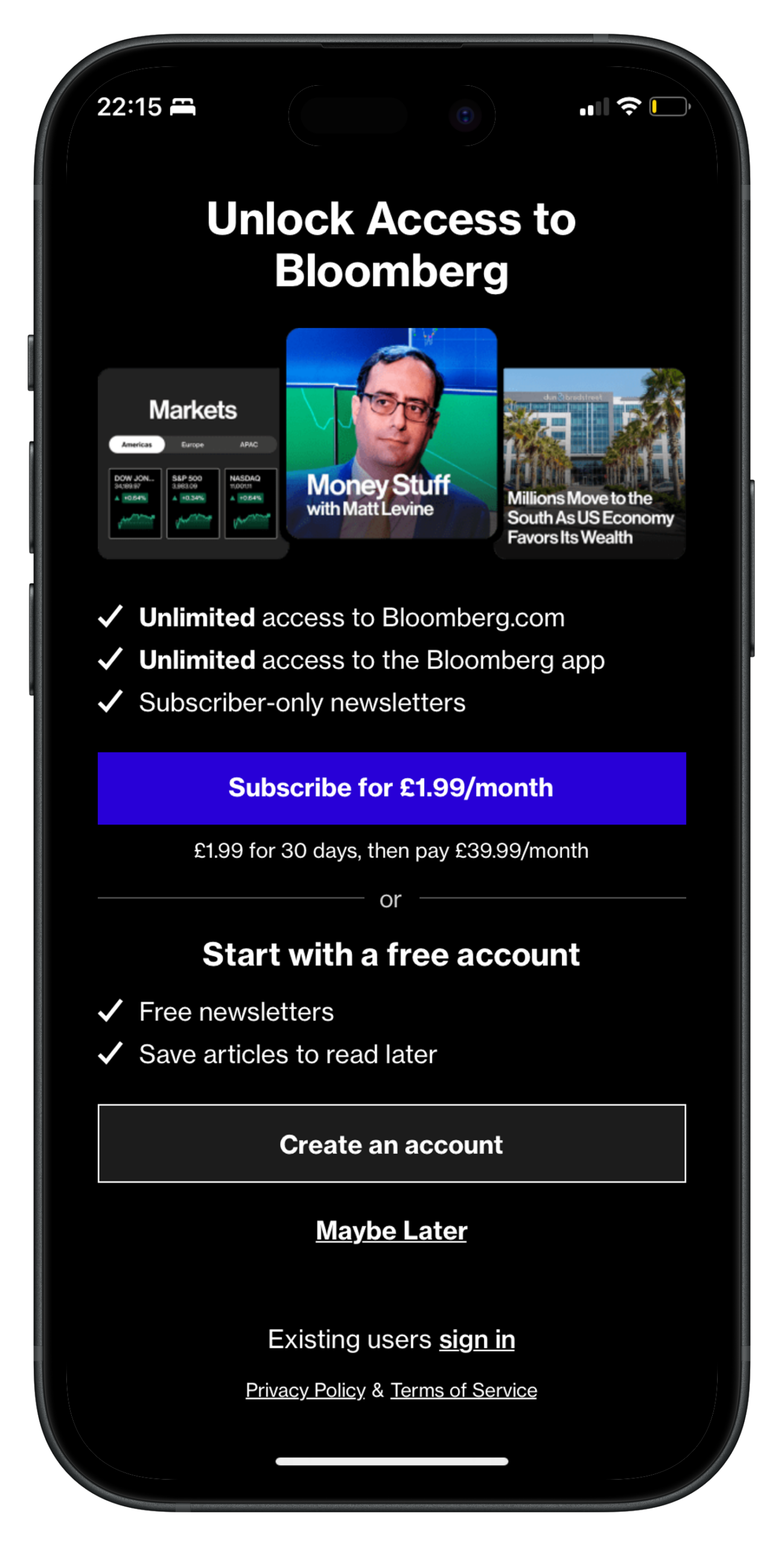
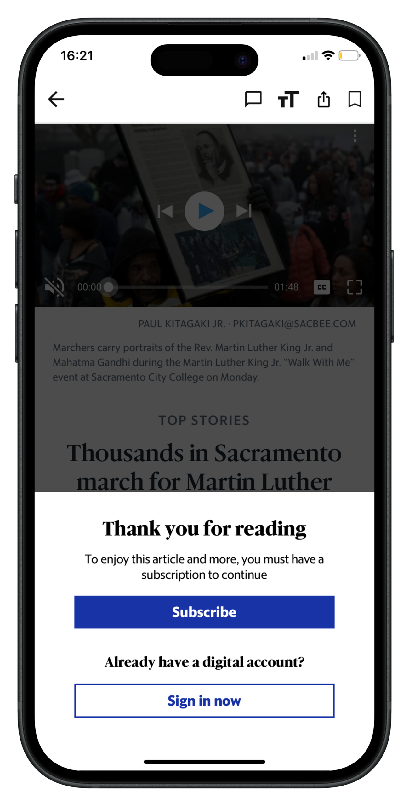
In the majority of these examples, a free or reduced trial offer is promoted, which isn’t always the case on desktop. Why? Likely because conversion rates across the industry are significantly lower on mobile than on desktop (for a variety of reasons, some of which I discuss here). For this reason, the goal of these publishers is to increase engagement on app, forming habits and encouraging the reader to activate notifications amongst other UX features that keep bringing them back to read more. After having completed the free trial and onboarding, they’re highly more likely to continue their subscription.
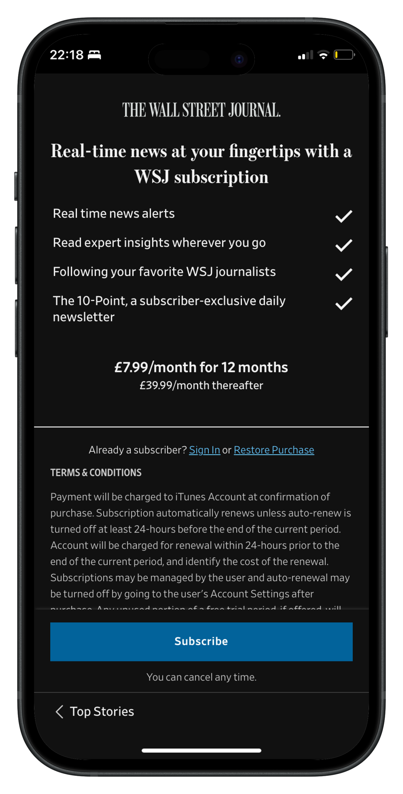
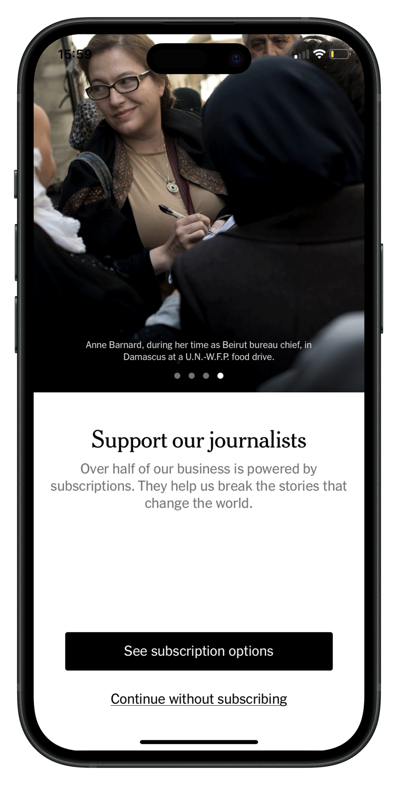
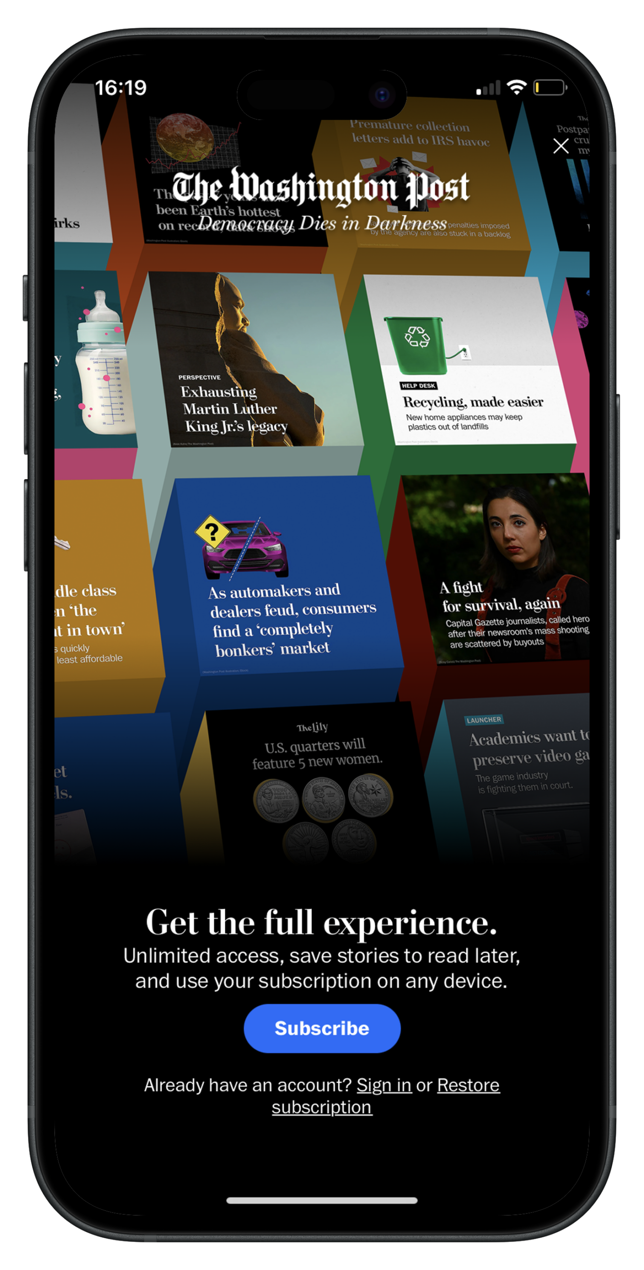
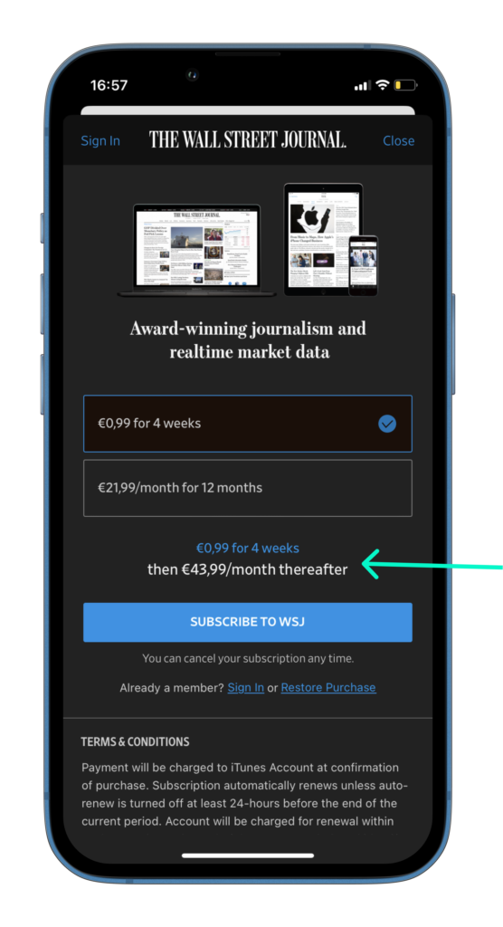
Cleverly, The Washington Post’s free trial is for their more complete, and expensive, subscription offer.
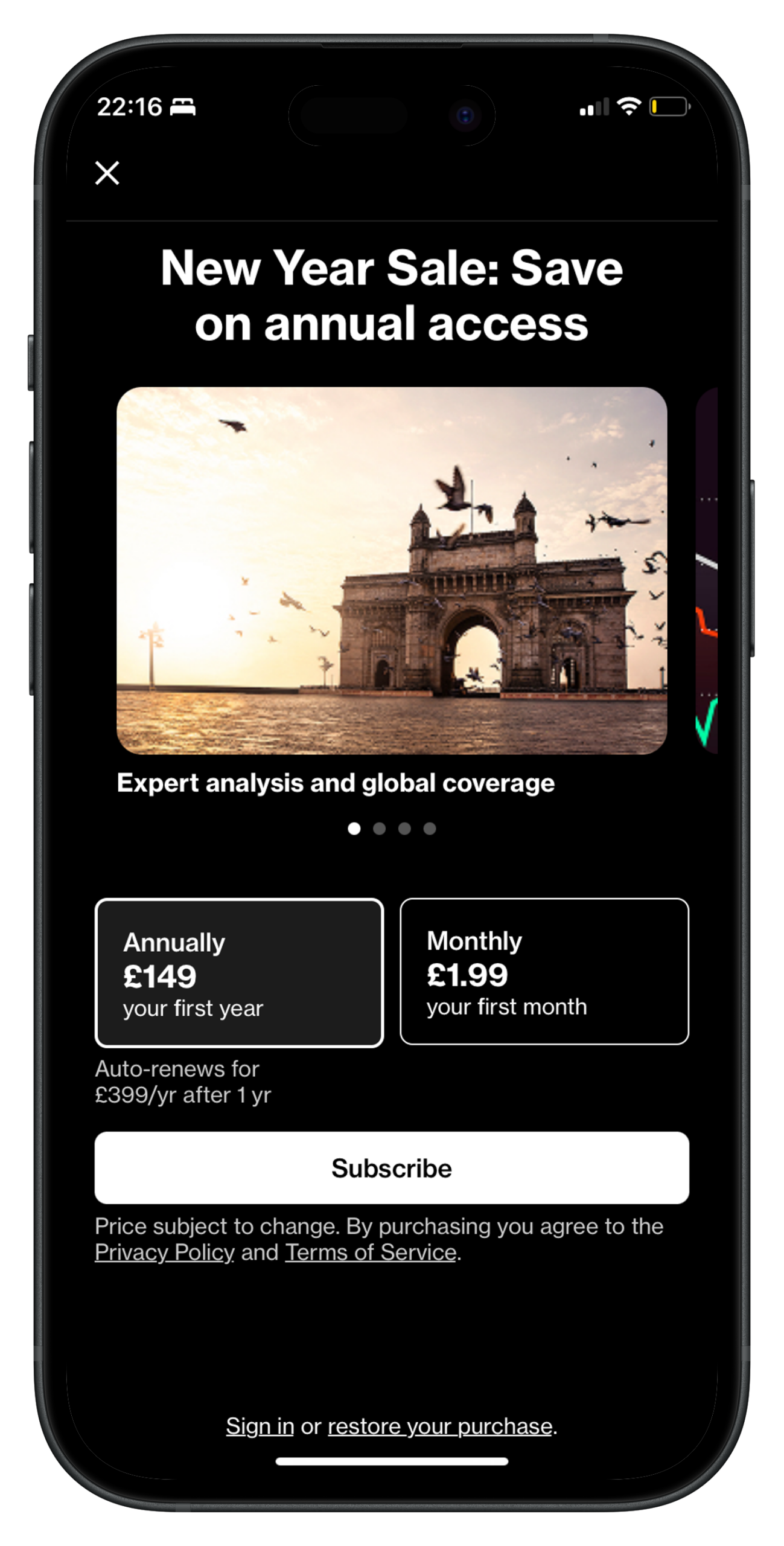
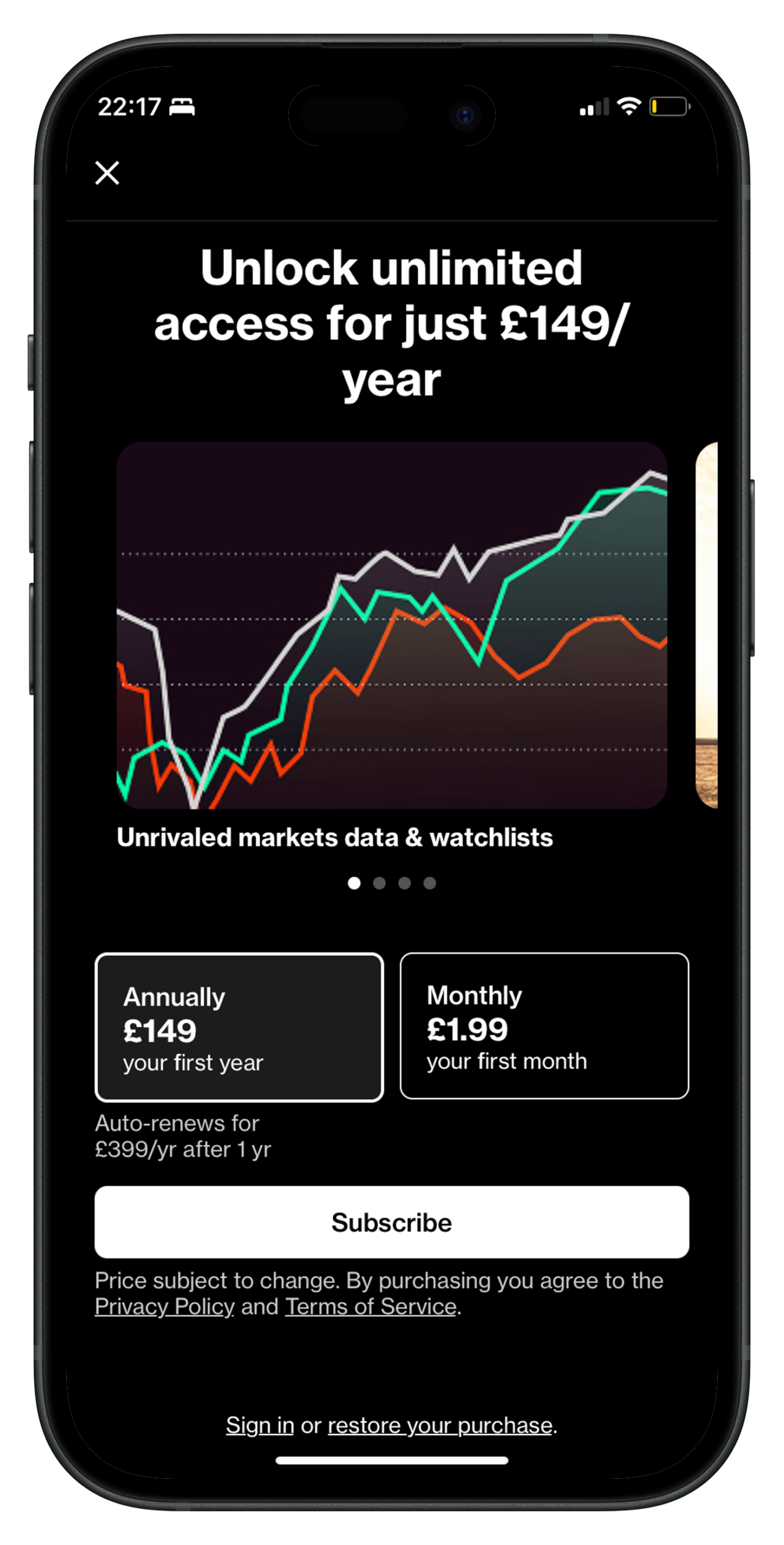
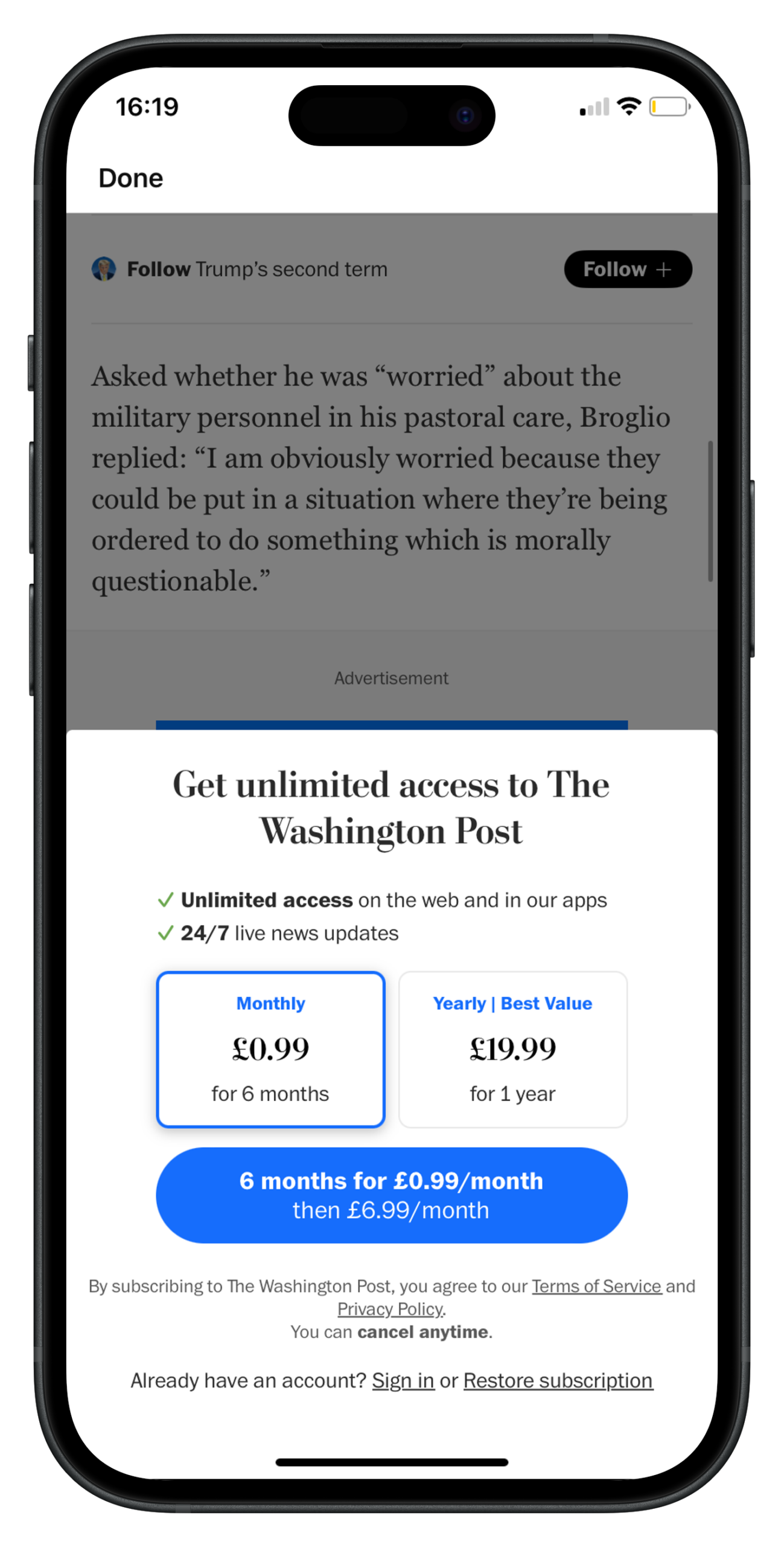
Trial reminder toggle – be transparent about the price of subscription and when they’ll be charged more after a free or reduced trial offer
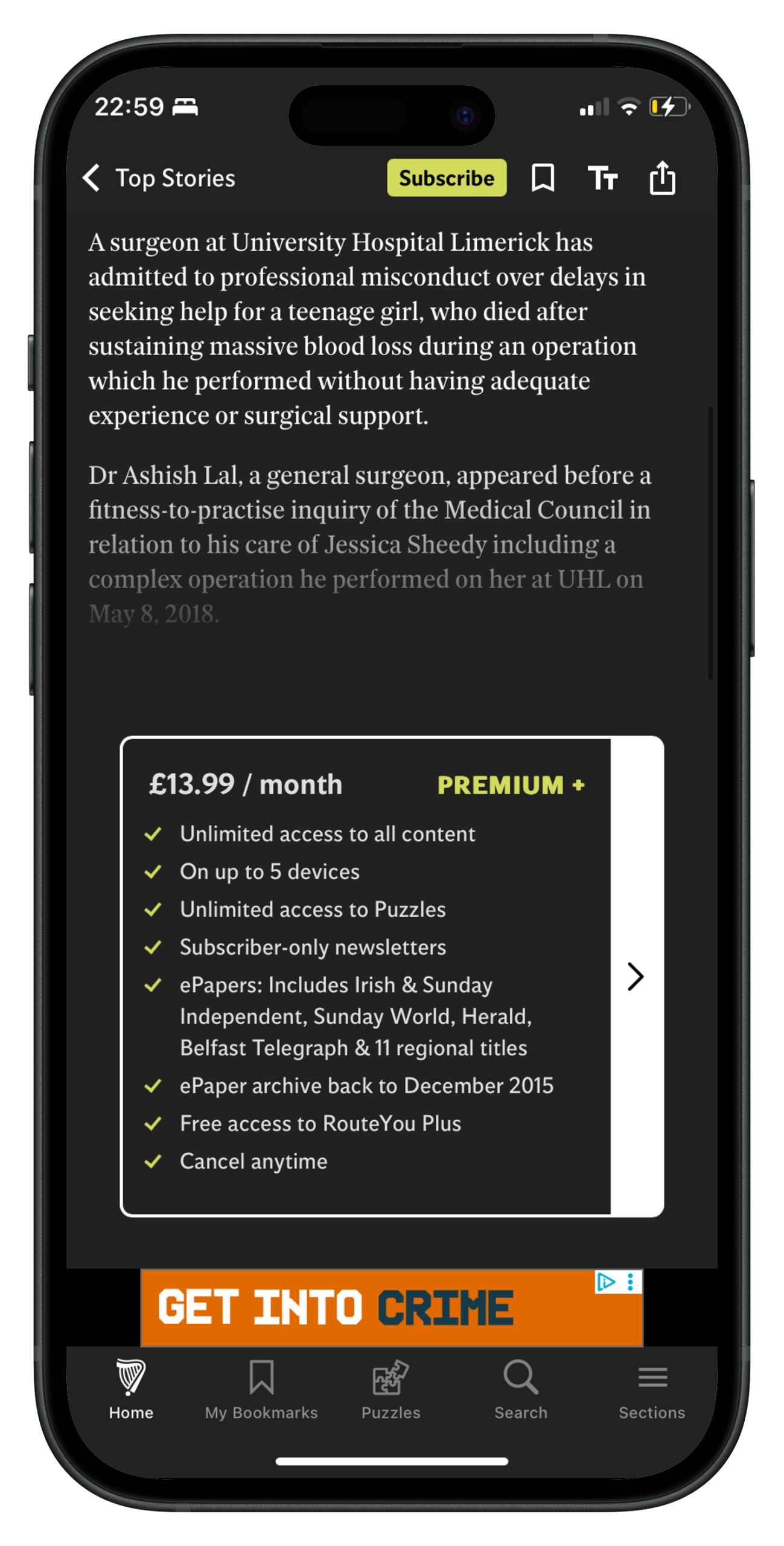
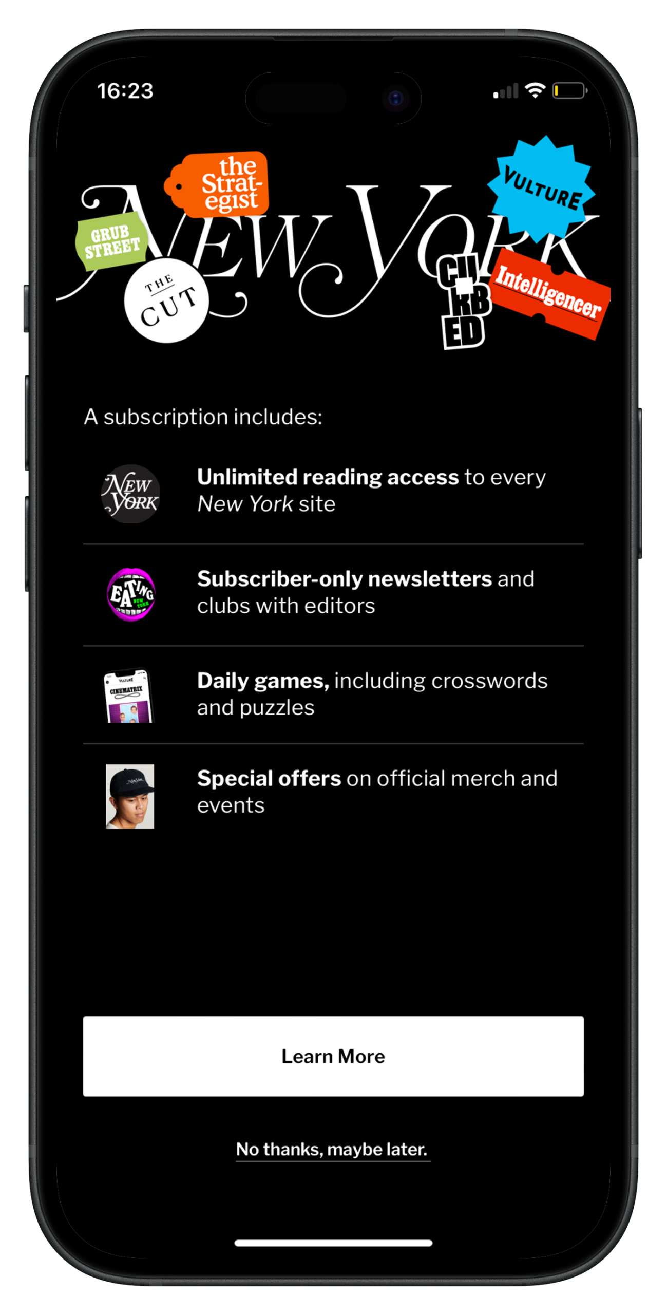
Increase the visibility of your premium offer by adding a “Subscribe” button into the header or footer, making sure to use a single color across all marketing campaigns
Consider the context of the reader – the smaller screen, the fact that they can use Apple Pay, iTunes or Paypal to subscribe in a click, the information that their phone could fill in automatically (such as name and email)
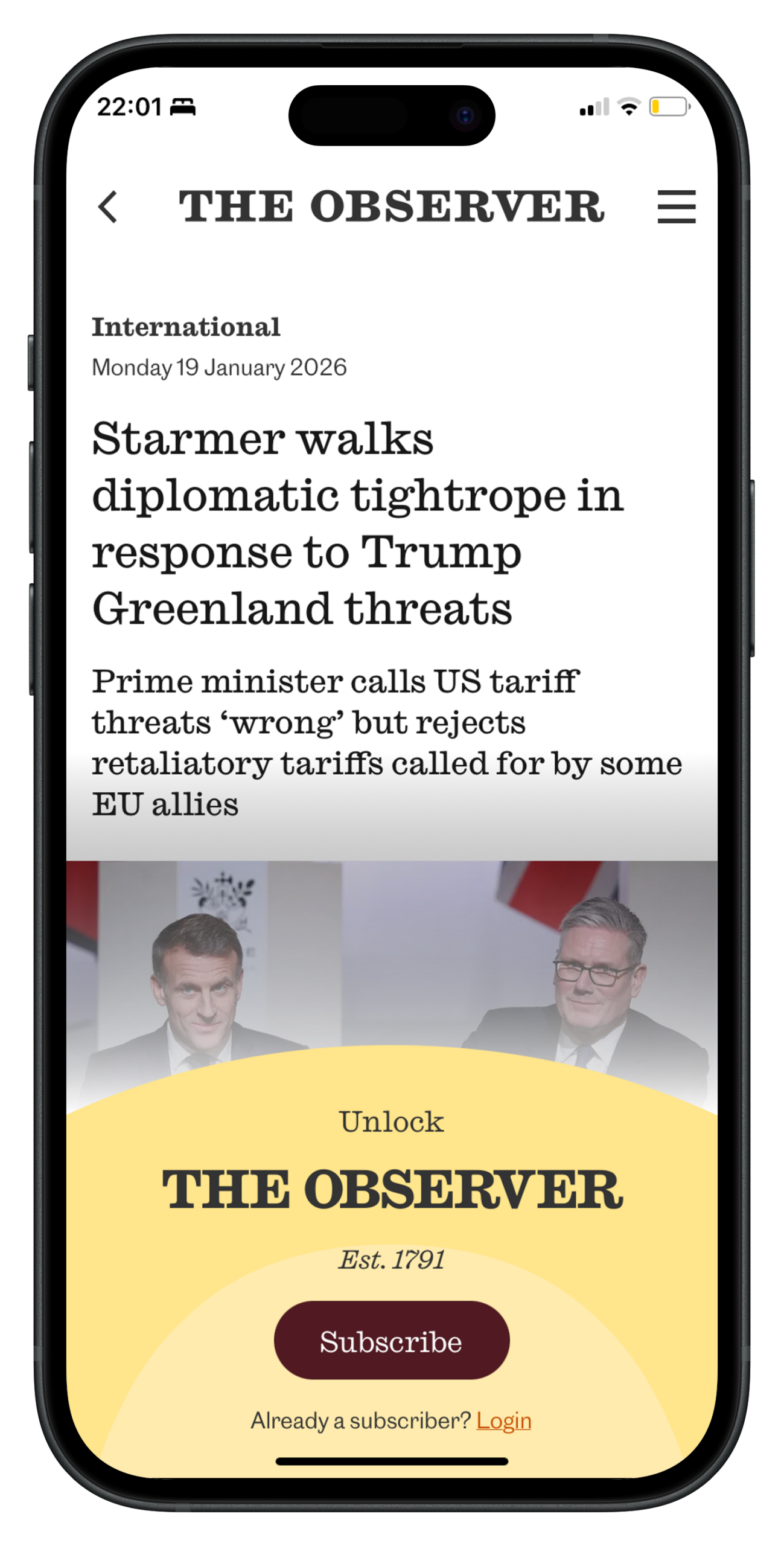
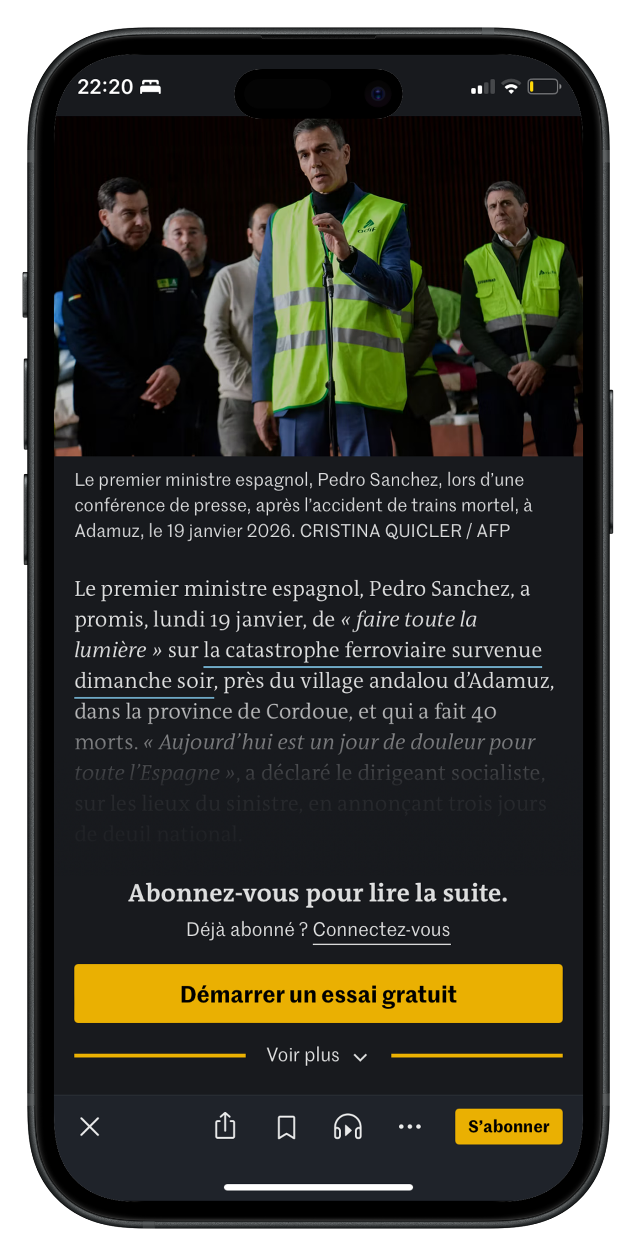
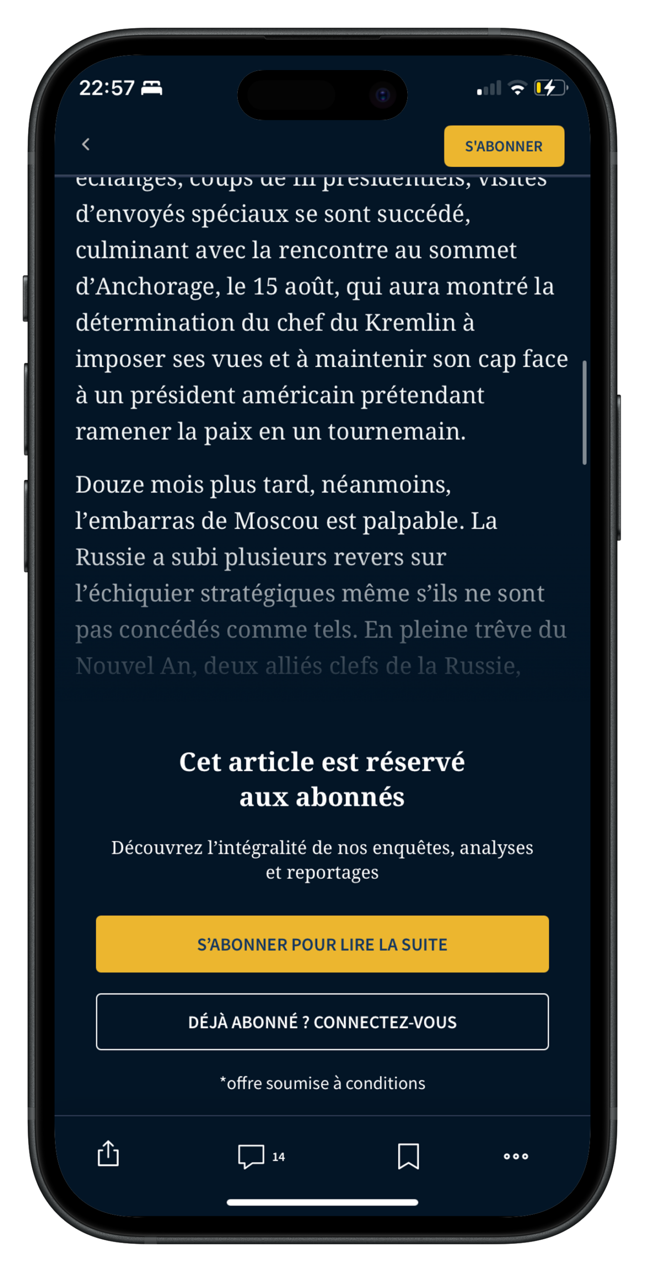
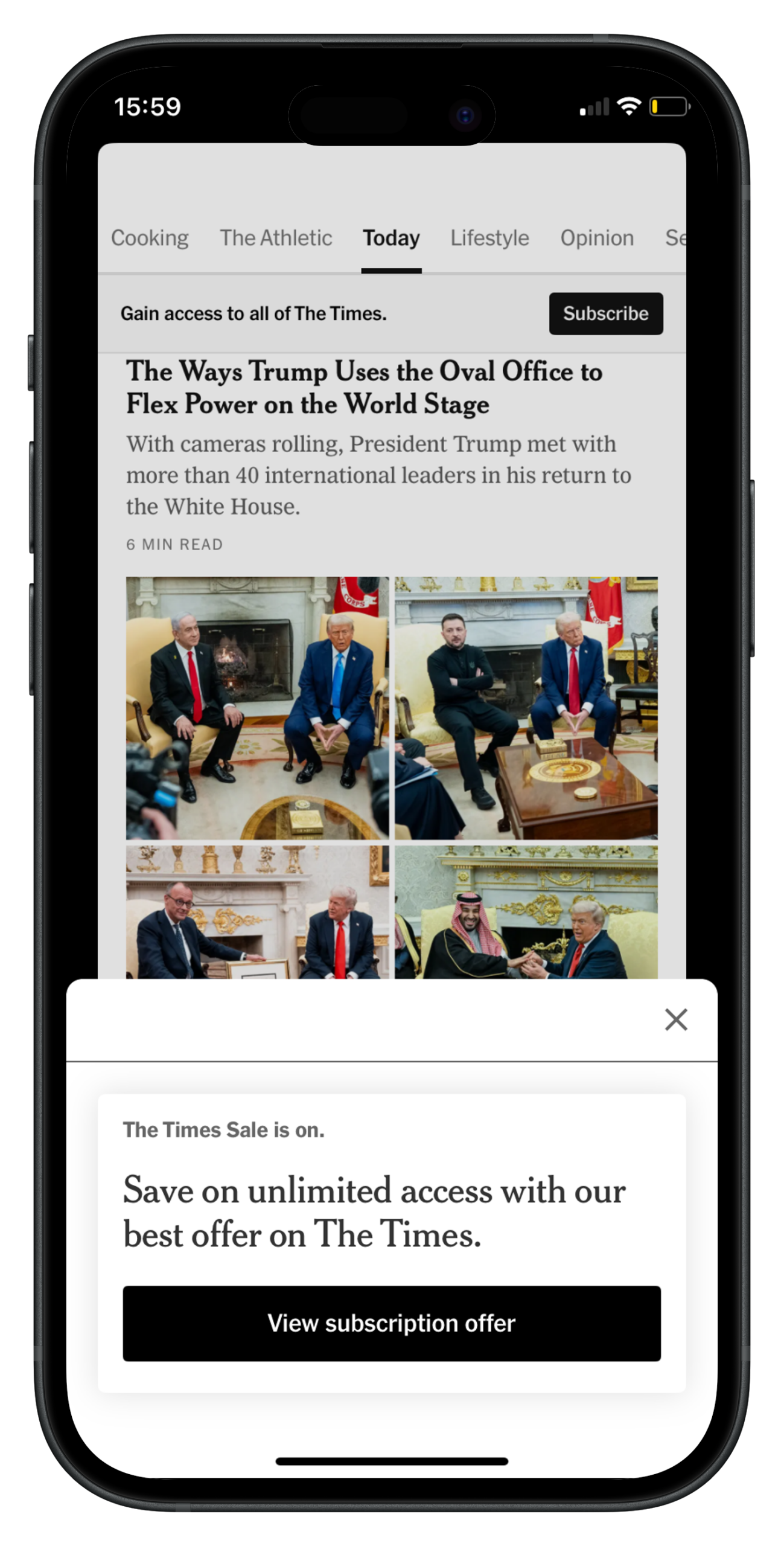
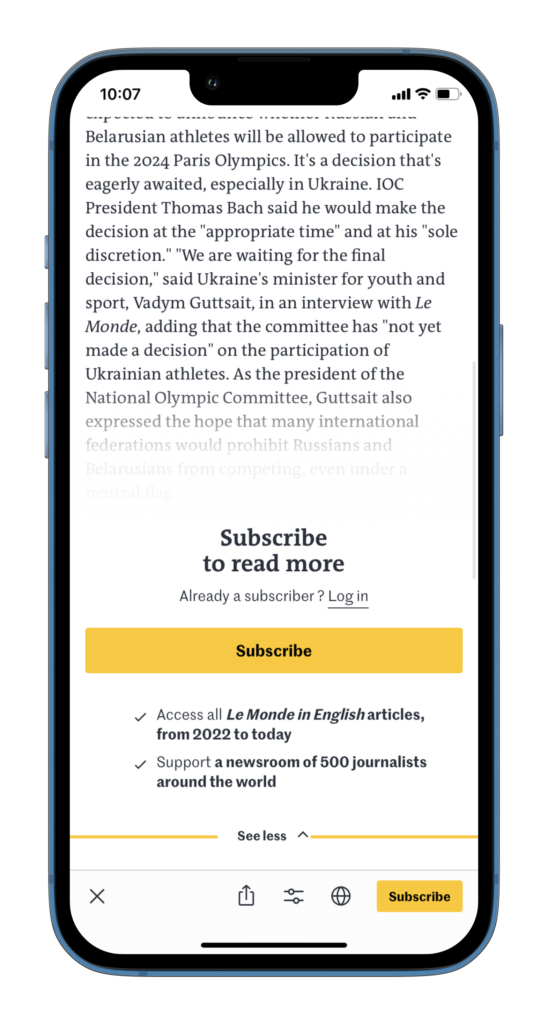
Le Monde has a unique technique of hiding half of the paywall, allowing readers to reveal the subscription benefits by clicking on the arrow.
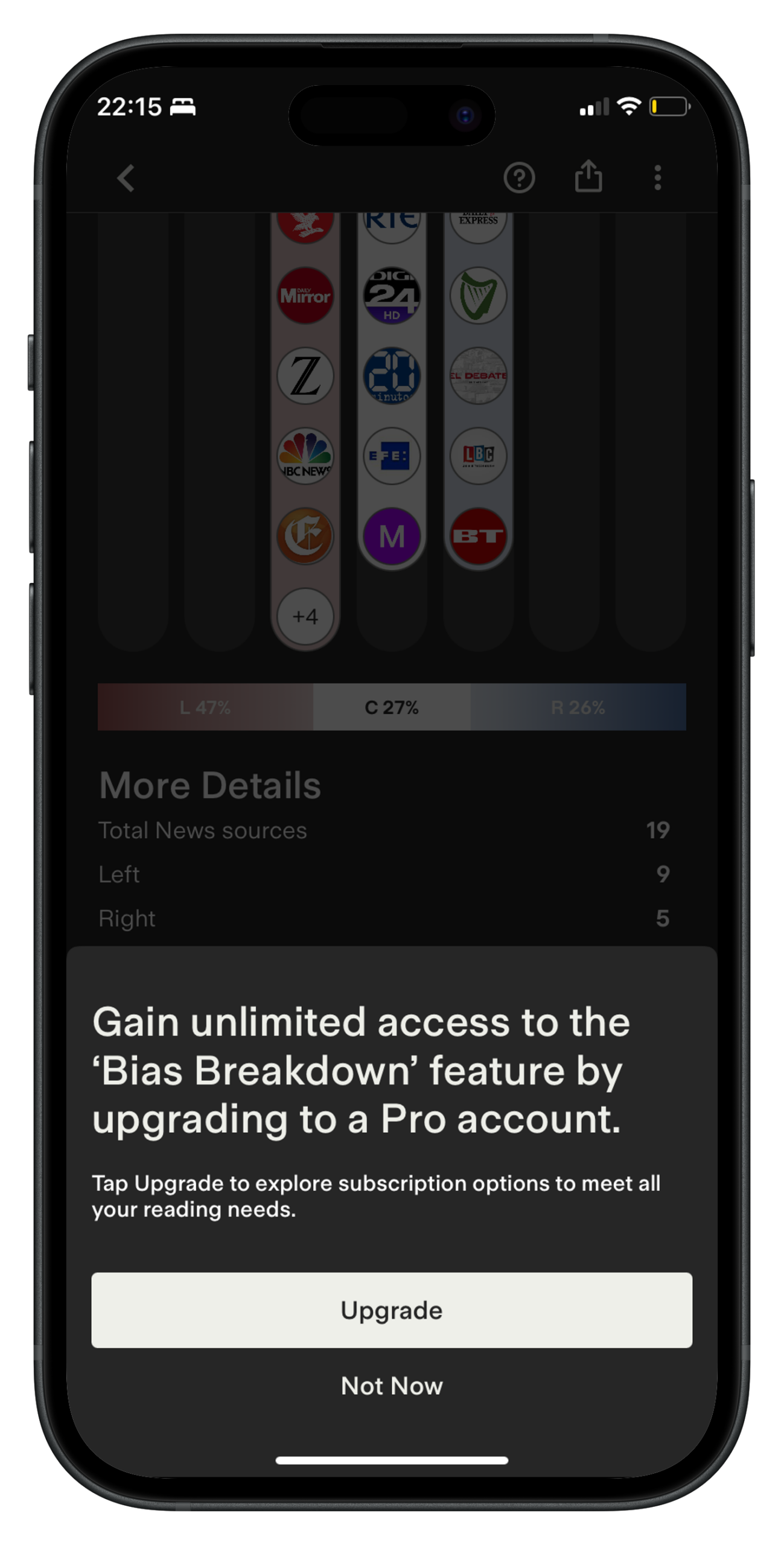
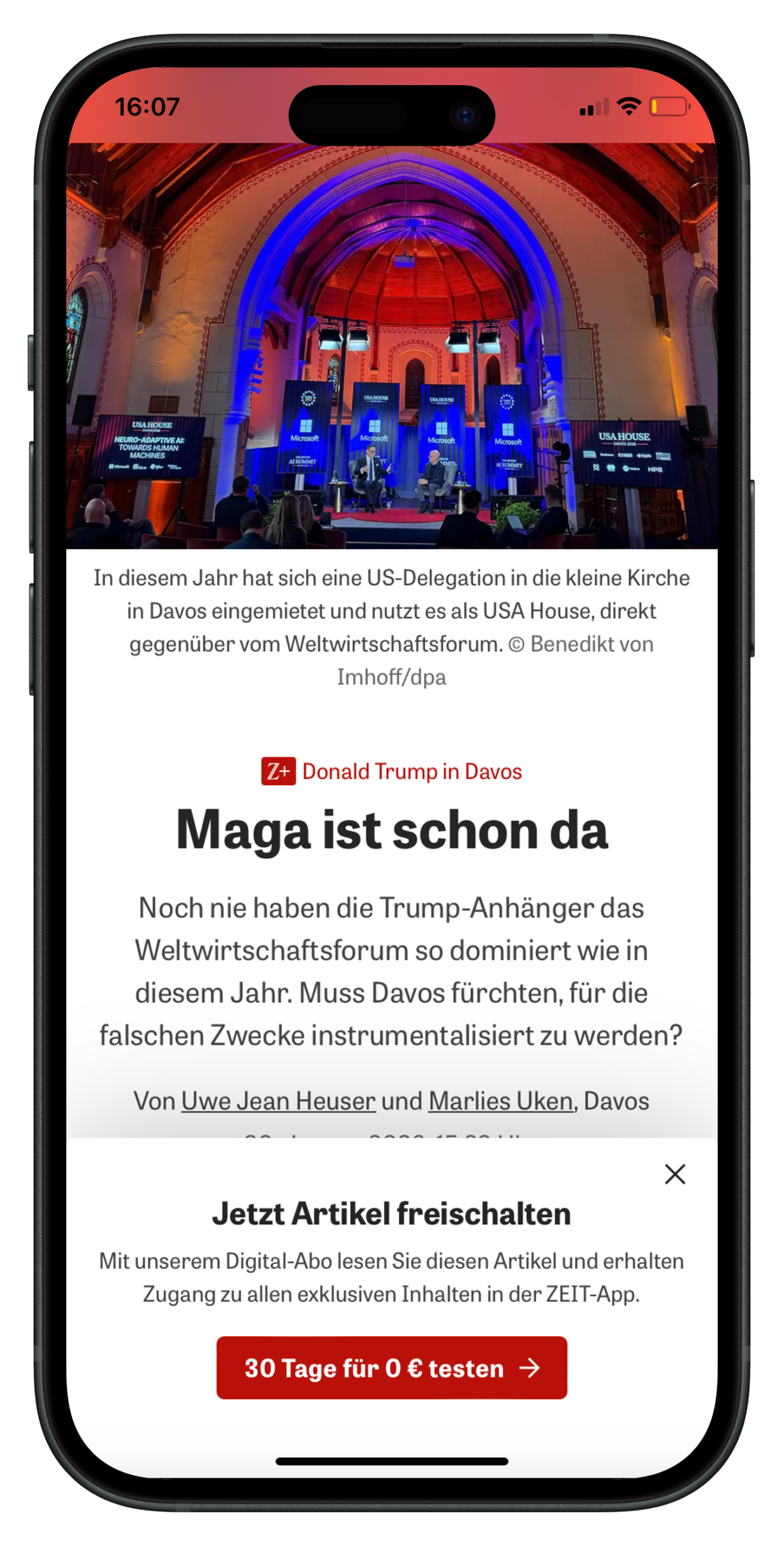
Instead of blocking all content, consider the value of push notifications and other engagement strategies that could help to form habits and reduce frustration when you do show the paywall
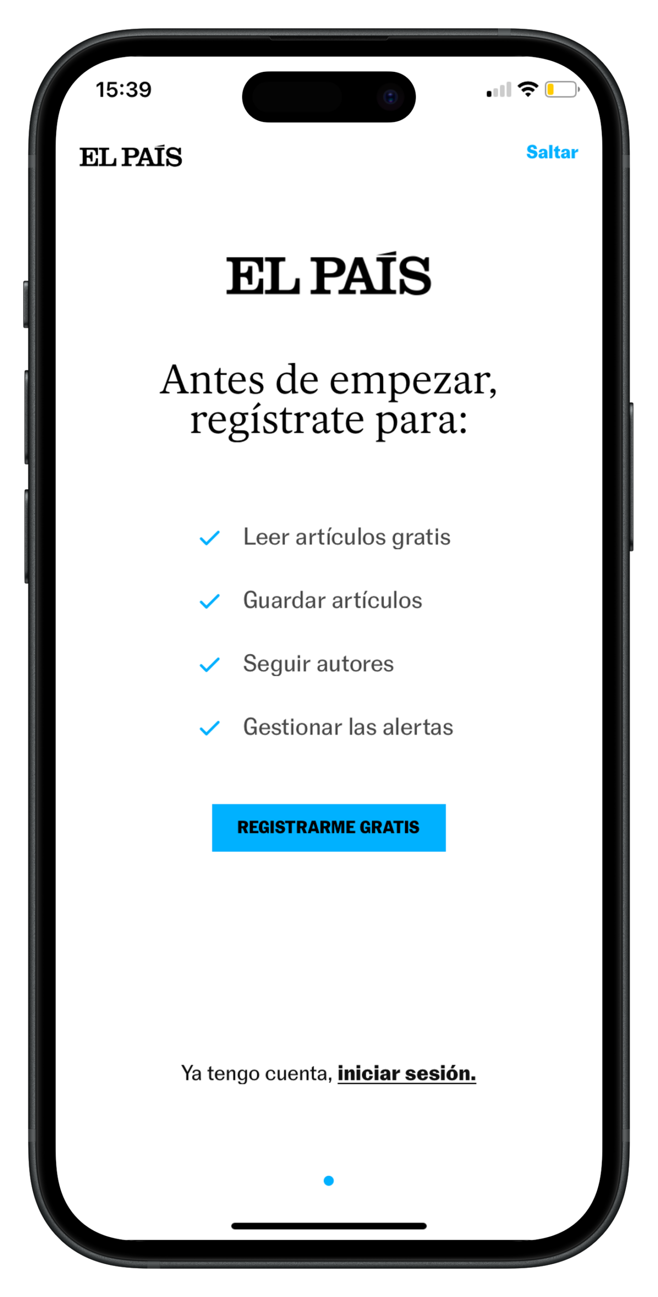
A registration wall model is a great idea here – you can de-anonymize your reader, collecting key data points, as well as onboard them to the app, encourage them to activate notification, sign up to your newsletter and personalize their feed in order to increase engagement.
The Audiencers’ newsletter: from professionals to professionals
Sign up to our newsletter – real-life examples, expert points of view and inspirations from publishers around the world to help you do your job better. Sent every two weeks.