

You're reading The Audiencers' newsletter #7, sent out on February 8th, 2023. To receive future newsletters straight to your inbox every two weeks, sign up here.
“Re-invest in quality journalism, because only journalism will save journalism”
This week’s overheard is from Juan Señor, President at Innovation Media Consulting, who hits the nail on the head here, coming back to the real reason why audiences come to your site in the first place, why they continue to visit on a regular basis and why they choose to subscribe.
And studies have supported this. Albeit being a bit dated now, Rosenstiel and Mitchell’s 2004 study found that investing more in quality journalism overtime appears to have a more powerful association to growing revenues than investing in advertising or circulation.
In The Audiencers’ Newsletter #7:
- Operations: How the customer centre at Bonnier News became a source of insight – and the tools we used to achieve this
- Inspirations: Increase engagement with these on-article UX features from Pink News, the LA Times & others
- Decisions: Exclusive data demonstrating how to increase conversion rates by +46% with a new framework for tracking & optimizing
- Recommendations to add to your reading list: from The Audiencers and friends
Operations
Charlotte Lundqvist, communications specialist & brand developer at Bonnier News, shares how they’ve turned their customer care center into a source of insight.
What would your boss say if you suggested a customer survey with a few thousand respondents who were given a month to talk freely about what was on their minds? Too resource-intensive? Impossible?
Not if you start with the daily contact that you already have with customers.
In recent months, the customer center at the Nordics’ largest media company, Bonnier News, has started to build a growing knowledge base that includes both reading behavior and suggestions for concrete changes. The starting point is the thousands of phone calls employees receive every month and a simple set up in Slack Workspace.
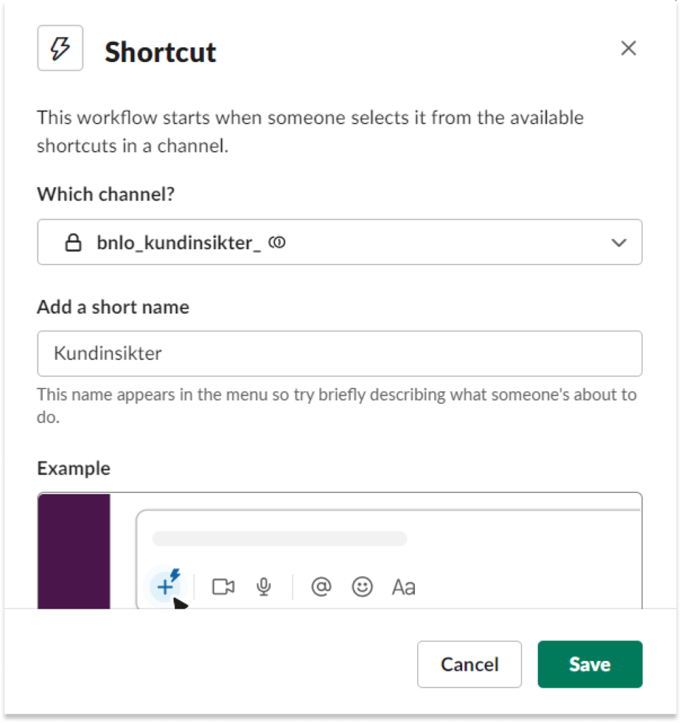
- The first step was to create a ‘customer insights’ slack channel
- By clicking on the lightning bolt, employees can open a form to record customer comments, adding in the subscriber’s age & subscription package
- Comments are also transferred to a Google Spreadsheet to make it easier to draw conclusions from the comments
- Once a month, as a communicator, Charlotte summarize the flow of comments in a What are customers saying? report with a list of topics that have been that most discussed
- They’ve also added an action list where reader suggestions are prioritized based on the effort required to implement them and their potential impact on customer satisfaction
For Bonnier’s customer center staff, this means that they can tell callers “I’ll take your comments on board” and know that there is someone out there in the organization who is really listening.
Whilst for product and revenue teams, this feedback helps to better understand the customer and deliver what will really make a difference.
Find Charlotte’s full article here.
Inspirations
Increase engagement with on-article UX features
Half-way between product and tech, the features you offer readers are crucial to increase engagement, frequency of visits and facilitate content consumption.
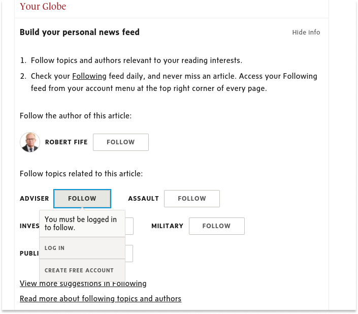
- Follow topics/authors
The Globe and Mail is my personal favorite example here, being one of the first to encourage visitors to follow authors and topics related to the article they’re currently reading, building their ‘personal news feed’. Of course, in order to benefit from this feature, you have to create a free account:
- Vote or debate on something
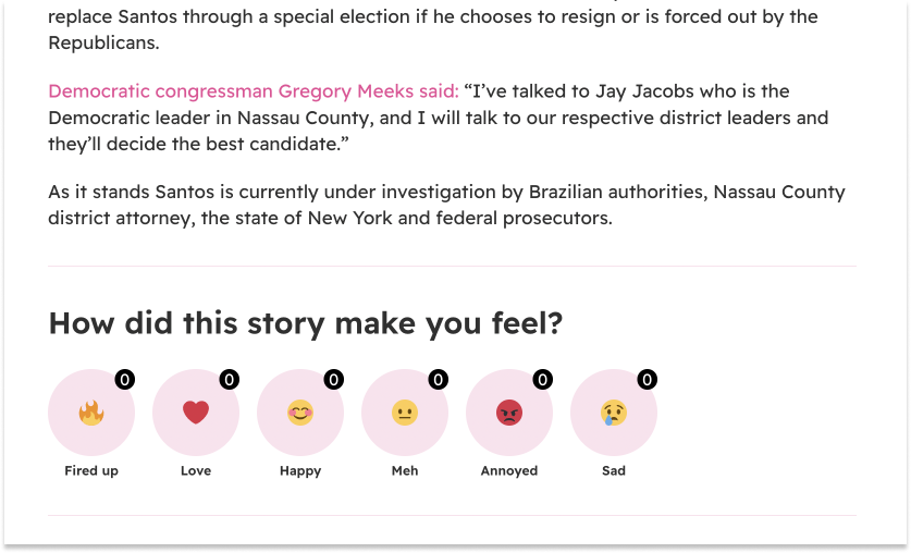
A unique strategy to get readers involved in the story and make them feel part of a community of others who are also voting.
Pink News ask “How did this story make you feel” with emoji icons pulling us in to click:
Whilst Le Drench asks readers to vote before and after reading an article:

- Make your content interactive
The LA Times has built a brilliant crossover between an article and Google maps, allowing us to look through the descriptions of the best LA restaurants whilst also seeing where they are in the city thanks to the map that moves with our scroll:

Or, more simply, integrate a quiz or test into the article (making sure it’s relevant to the topic being discussed) like Men’s Journal:
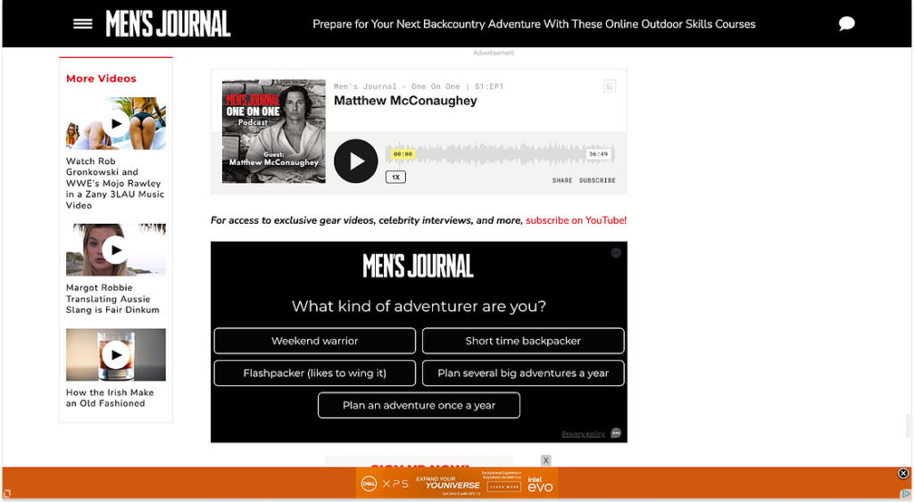
Added bonus: this strategy also allows you to collect valuable data points to inform your strategy and personalize the user experience.
Find more inspiration to increase frequency of visits in our guide.
How to increase conversion rates by more than 46%
As presented in our article, Poool’s consultancy team has devised a replacement for the traditional conversion rate metric.
In fact, ‘conversion rate’ as a single metric was originally designed for the e-commerce industry, where the buying process is a lot more impulsive.
For publishers, however, the reader needs to be engaged over time, gradually being made aware of subscription and the value that this offers.
To reflect this, we split the single metric into 4 smaller conversion steps. The idea is that lots of small optimizations will culminate into significant improvements to your overall user-to-subscriber conversion rates.
To put this conversion framework into context, below is some benchmark data from a regional press group:
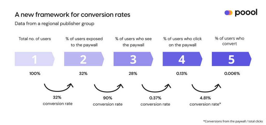
- Step 1 is your total audience (100%)
- Step 2 refers to the amount of traffic on premium content – content where a user has the possibility to be blocked by the wall (32% of total traffic in this example)
- Step 3 is the % of users who visit premium content and actually see the paywall (28%) – note that conversion rate between step 2 & 3 is at 90%, meaning the paywall is high up on the page. Some publishers such as WP and Financial Times have 100% here thanks to a pop-up or full page wall, although this isn’t always optimal
- Step 4 is the paywall CTR (0.13%)
- And step 5 is your overall conversion rate (0.006%)
The key here is to track and optimize each of the 4 conversion rates between these 5 steps.
For instance, if we employ some of the techniques detailed in our article and successfully improve each step by just 10%, then we’ll increase CTRs by 33% and overall conversion rates by 46%. I.e. conversion rates would increase to 0.00876%.
It also gives you the chance to really dissect conversion on your site, discovering which steps are performing the most successfully and where needs work. You might, for example, have high CTRs but realize that you’re limiting yourself by not leading enough of your traffic onto premium content where they’ll have the possibility to click-though.
Dive deeper into this important topic and how you can optimize each conversion step in our article on The Audiencers.
In-house content to read…
- Benchmarking Digital Subscriptions: An improved framework based on subscriptions per 1,000 visits
- How to reduce the risks of launching a subscription strategy
- Newsletter walls: how a French publisher is innovating to increase its subscriber base
…and recommendations from elsewhere
- Publishers: steal these member and subscriber onboarding ideas
- WAN-IFRA’s Table Stakes Europe Report free download – Building and engaging specific audiences
- Focus on value instead of reach – ideas for metrics to use in your newsroom
The Audiencers’ newsletter: from professionals to professionals
Sign up to our newsletter – real-life examples, expert points of view and inspirations from publishers around the world to help you do your job better. Sent every two weeks.


