
When it comes to continuously optimizing performance, there's nothing more valuable than A/B testing. But EBRA media, France's biggest regional press group, have gone a step further to develop a culture of experimentation across their 9 brands, testing out user experiences, journeys and paywall design to maximize conversion rates.
Goal: Increase the number of digital subscribers across EBRA’s 9 brands
Solution: Continuously test to validate hypotheses, analyze results and apply these learnings to their reader revenue strategies, discovering exactly what factors are needed to successfully convert users into subscribers.
Examples of experimentation at EBRA:
- Soft conversion steps
- Hybrid paywall
- Temporary wall designs
- A/B testing
- Subscription offers in the paywall
Soft conversion steps
Goal: increase engagement prior to the paywall to boost conversion rates
Solution: test out soft conversion steps
- Data wall
- Registration wall
A Poool study recently found that, on average, over 80% of a publisher’s audience are volatile, unengaged users who only visit about once a month.
So, whilst a hard paywall might convert a small percentage of very engaged fan users, the large majority of audiences are going to be frustrated by the paywall, perhaps even leaving the site to find content elsewhere.
To solve this, publishers should employ a dynamic strategy whereby conversion journeys are adapted to the reader’s profile or context with the goal of increasing engagement and maximizing ARPU.
EBRA understood this and decided to try out a data wall, offering users access to the premium article in exchange for their email address as a key data point for marketing campaigns.
The team also tested a registration strategy, asking users to create a free account in exchange for access to premium content for 24 hours.
What happened after these soft conversion steps?
Adapted journeys were built for users who passed through these soft conversion walls, presenting paywalls with personalized messaging.
Results: these strategies were hugely valuable for soft conversion uptake and building a strong foundation of an engaged audience – in fact, Autumn 2021 saw a large increase in users in the engaged segments: +236% occasional readers, +182% regulars and +98% fan users.
Hybrid paywall
Goal: increase conversion rates and engagement simultaneously
Solution: combine soft conversion with a hard paywall to increase the visibility of their premium offer whilst also forming a habit through the newsletter.
Top half of the wall: newsletter sign-up with a select field to choose which newsletter to sign up to
Bottom half of the wall: “Fancy discovering the subscription experience? Sign up from $1 for the first month, cancel anytime.” – promoting subscription to either convert or educate users on the idea of paying for access to quality content
Temporary walls
Goal: Reduce habituation and avoid ‘paywall blindness’ to reignite conversion rates and maximize on special offers
Solution: build walls for different national holidays, French elections or sales periods, analyzing whether this has an impact on click-through and conversion rates.
Results: This Christmas paywall led to an increase in click-through rates across all audience segments:
- +58% globally
- +75% volatiles
- +146% occasionals
- +149% regulars
- +65% fans
⭐ Best practice: analyze results globally but also for different audience segments as data will likely differ, giving you insights into how you can better personalize the reader journey to their profile or context.
A/B testing
Goal: continuously optimize click-through and conversion rates
Solution: the EBRA team carried out a variety of tests on paywall design and wording with Anthony Ribeiro, Poool’s Consultancy Lead.
For instance, they tested out a few value proposition texts on their paywall:
- Version A – shorter text where the focus is on the publisher accompanying its reader in their daily habit of taking a morning coffee whilst reading the news.
- Version B – focus is on the benefits of subscription, such as unlimited access and the cost of their offer.
Results: Interestingly, paywall A achieved 2 times more clicks globally than B, suggesting that shorter text and framing messaging as ‘accompanying’ the user’s existing habit is beneficial for CTRs in this context.
“It’s essential to maximize A/B testing to find the best strategy, the right messaging and the perfect offer to display to our audience. Poool ‘s solution allows us to set up all the engagement and conversion scenarios we can imagine with our teams, in complete flexibility and autonomy. This allows us to better understand our audience and personalize messaging as much as possible with the goal of maximizing conversion rates.”
Emilie Courmont, Acquisition Project Manager
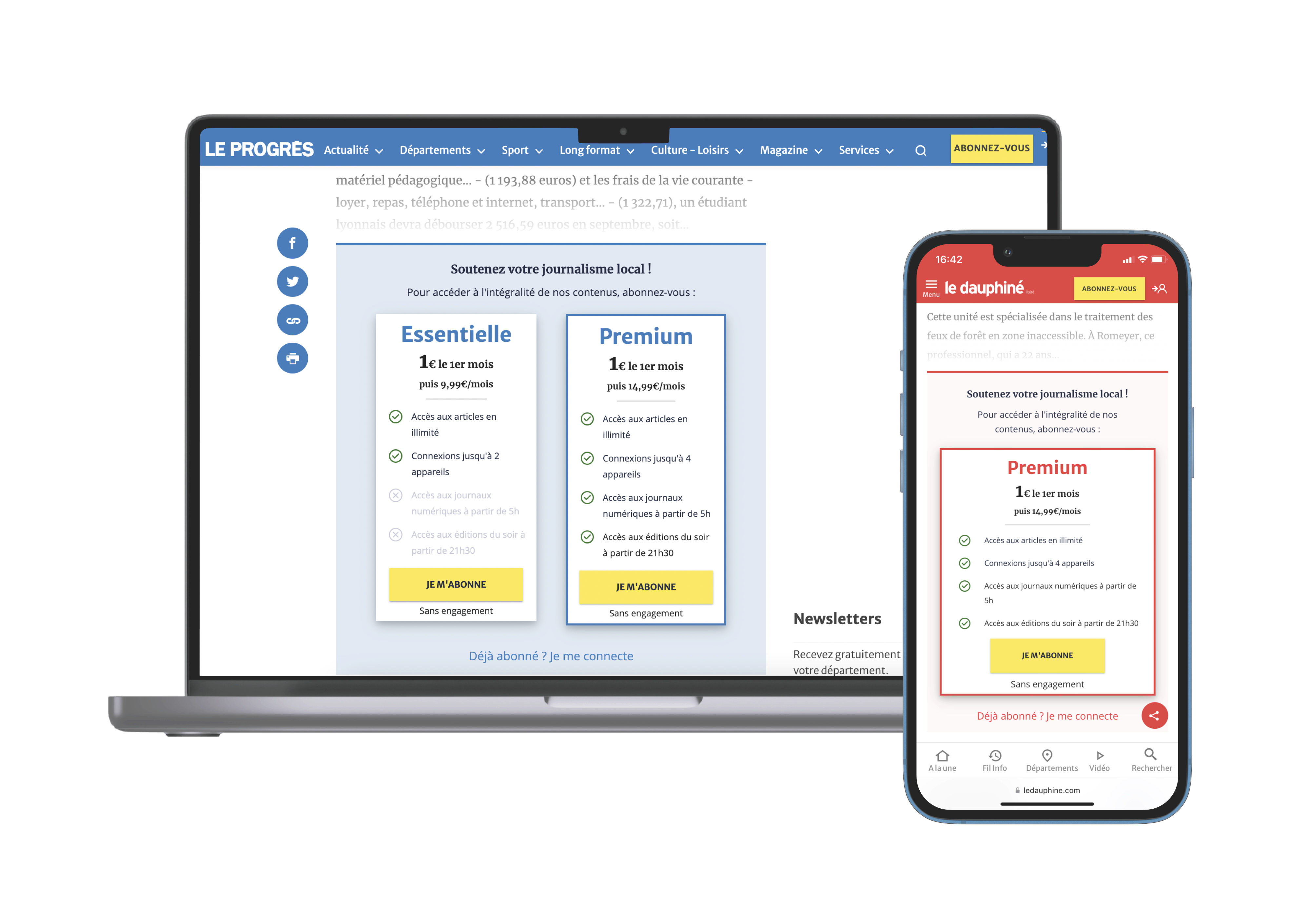
Integrating subscription offers into the wall
Goal: increase conversion rates by reducing friction in the funnel
Solution: remove a step in the conversion funnel, with the CTA button leading straight to payment
Results: after testing this wall on one of their brands, the results were clear: click-through rates increased by 97% and conversion rates by 37%, leading to the group deploying this offer wall across all 9 of their brands.
⭐ Best practice: don’t forget to build a mobile-friendly wall to improve the user experience on smaller screens. EBRA, for instance, only features one offer on the wall on mobile devices.
The Audiencers’ newsletter: from professionals to professionals
Sign up to our newsletter – real-life examples, expert points of view and inspirations from publishers around the world to help you do your job better. Sent every two weeks.


