
Nearly 150 years after it first launched as a news publication, The Washington Post is one of the top news brands in the world. And, since its sale to Jeff Bezos, the title has invested massively in digitization, reaching nearly 3 million digital subscribers today.
Of course, there’s a lot that goes into this success – including consistently publishing quality content – but their attention to detail in their products also has a significant role to play.
Here are 12 features to copy from their model:
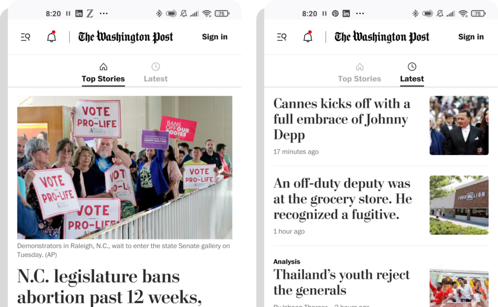
1. Top Stories vs Latest Headlines
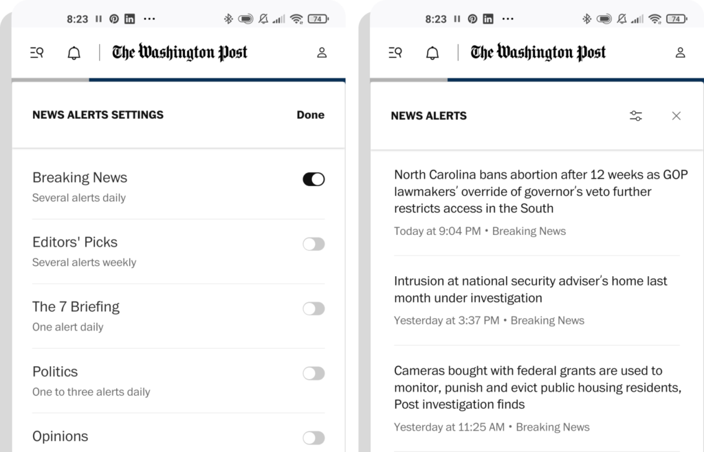
2. Customizable News Alerts
The more you know about your users, the more you can adapt your website and content to suit their needs. Of course, this can be done by collecting data and presenting personalized news feeds. But a far simpler strategy is to simply allow readers to personalize their news alerts themselves, supporting high engagement rates and bringing the reader back to your app and content that interests them.
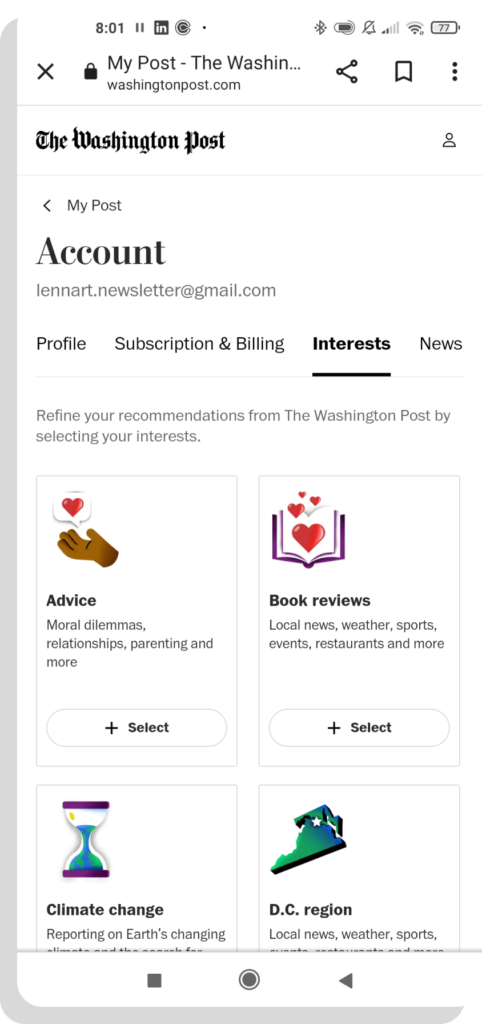
3. Save Interests In A Reader’s Account
In addition to news alerts, you can also store a reader’s interests in their account space for more refined recommendations.
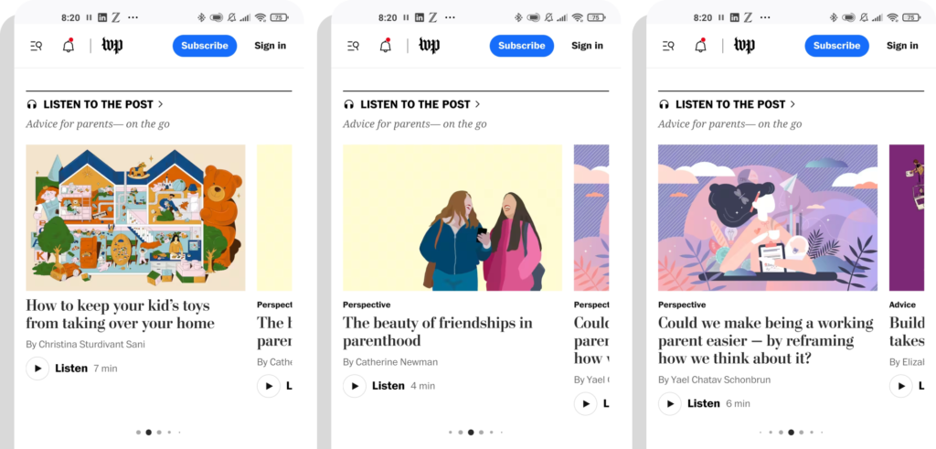
4. Curated Podcast Playlists
Widgets are shown on the home page to recommend curated podcast playlists on various topics. Here, for example, podcasts providing advice for parents. This also gives evergreen content a place alongside new releases, underpining expertise in certain topics.
5. Telling Stories Through Slideshows
Galleries, interactive stories, and slideshows are a popular format to break text down into more digestible, lighter pieces, taking a page out of social media’s books to increase engagement & keep readers on-site. If you include them on the home page, they can be a powerful teaser for longer texts.

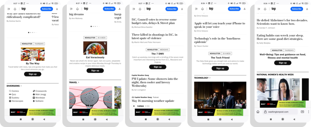
6. Newsletter Widgets On The Home Page
We’re immediately encouraged to share our email address and sign up to a newsletter to form a habit of consuming WP’s content. A total of 5 newsletters are displayed on the home – some with a picture, others are more discreetly mixed in with stories.
7. Registration Banner
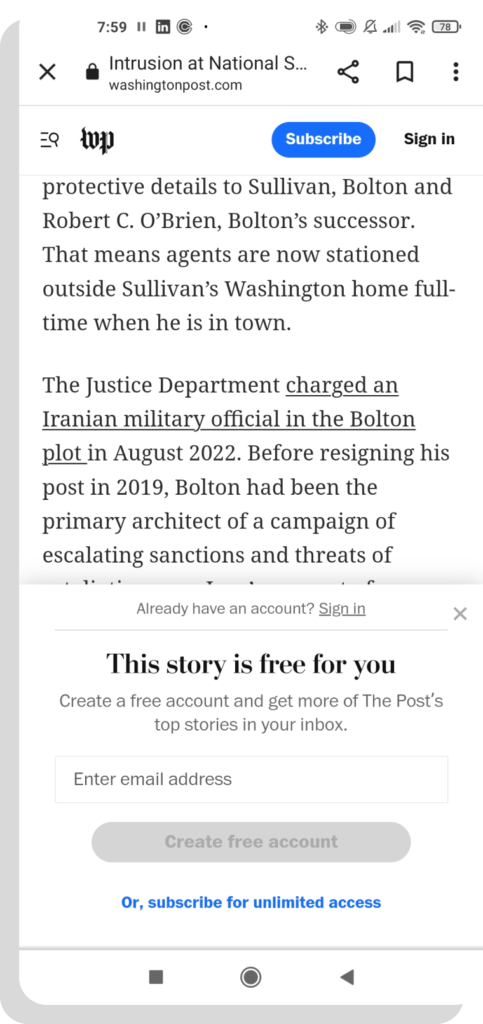
As you’re likely well-aware by now, registration allows you to collect first-party data, personalize user journeys, increase ad revenue and propensity to subscribe. Which is why it’s valuable to encourage registration even for free articles.
The best way to do this is with a registration wall, including a form field in the wall itself and a variety of login/registration options to reduce frustration.
8. Multiple Login Options
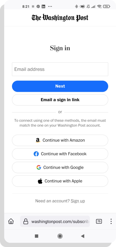
Make registration easy. If users can login via a sign-in link or through existing social accounts, you make it simple to create an account in minutes and reduce frustration.
9. Link Accounts
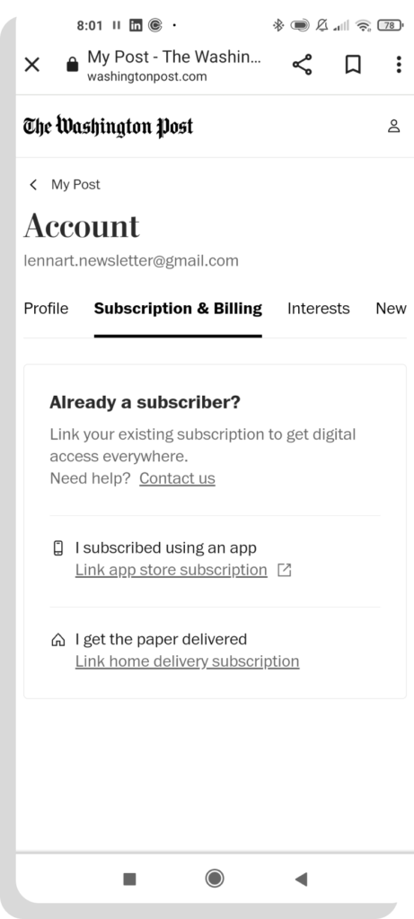
Users sometimes have multiple accounts, for instance as no email address was entered for the print subscription or because subscription was purchased via the app store.
WP makes it easy for users to merge accounts and thus obtain a uniform data set.
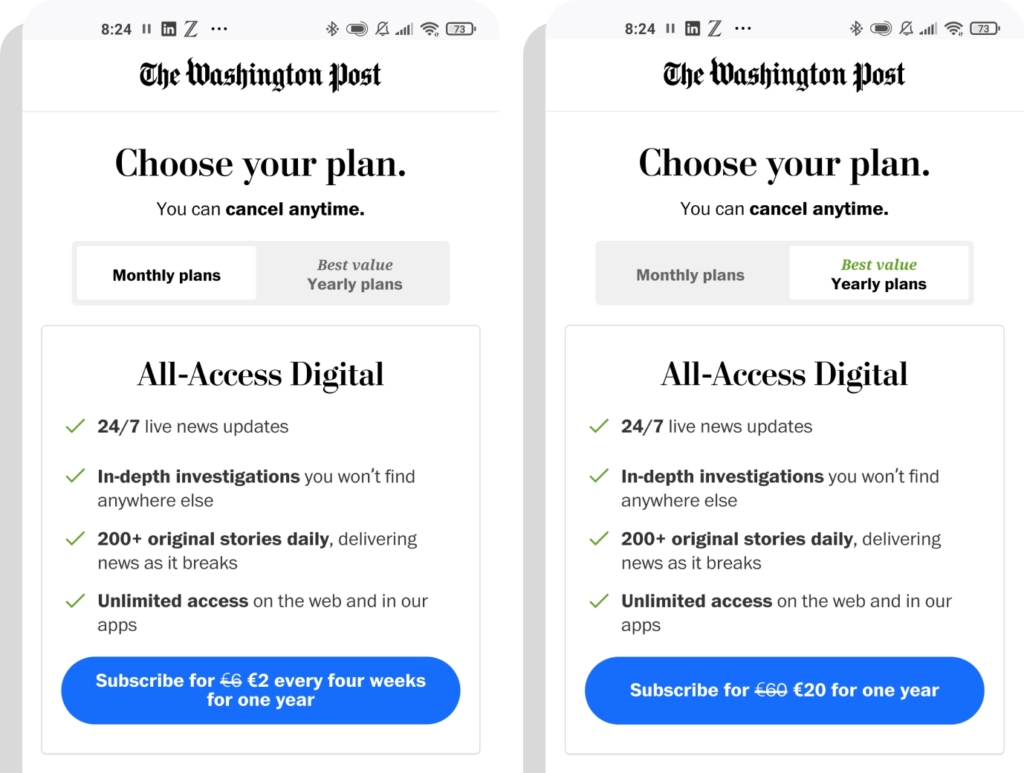
10. Reward Long High Retention Rates
If you commit for to a year of subscription, you get two months for free. This pricing structure is now standard among software providers because it sets the right incentives, rewarding customers who commit for a longer offer.
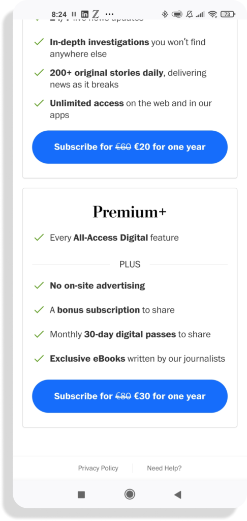
11. An Upgrade For Super Fans
Some readers can be considered as super fans and would be willing to pay more for a subscription (in exchange for more value, of course). They’re also your brand ambassadors and are happy to recommend you to others.
Give them the chance to do this and reward them with additional content (e-books), sharing options (gift subscription), access to events or even the chance to speak with some of your team.
12. Entertain With Gamification
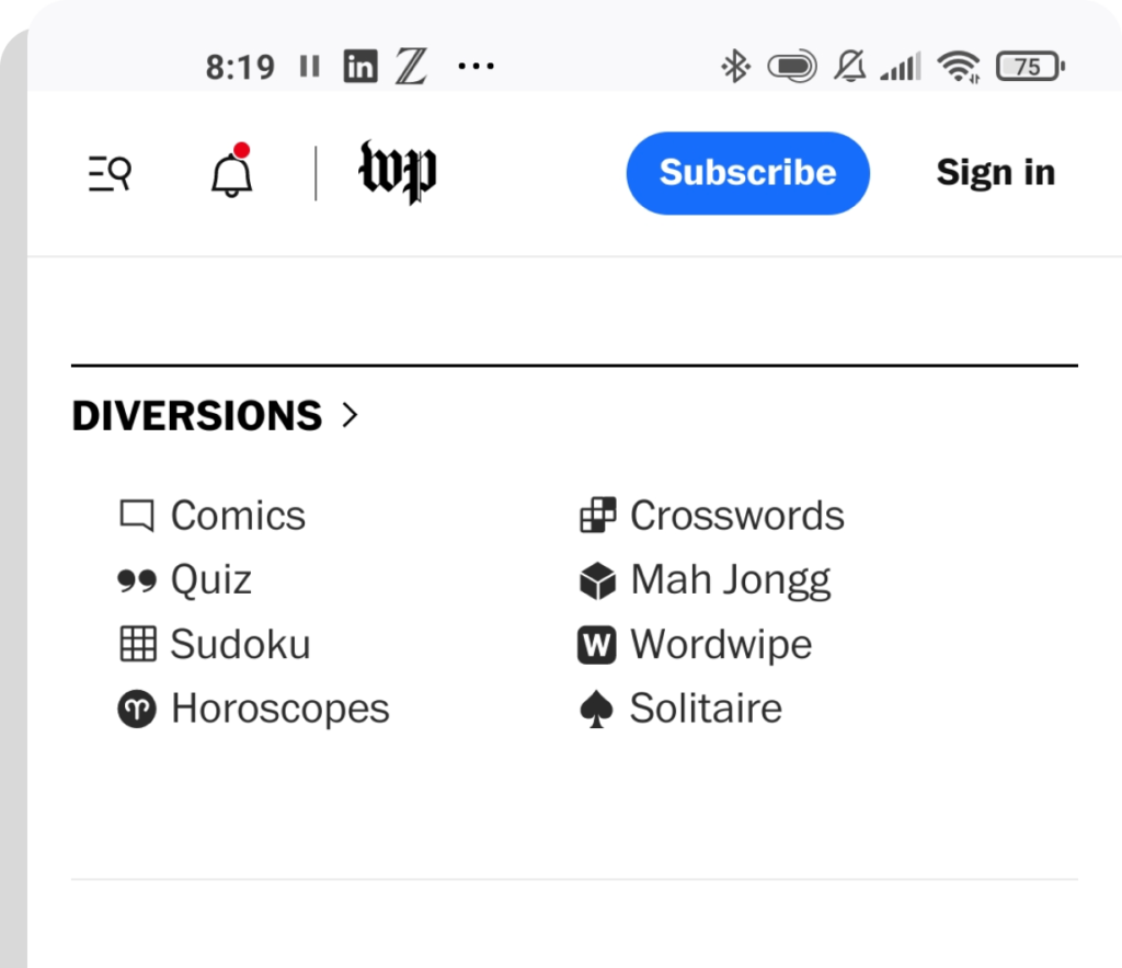
Those who have worked their way through the news deserve a bit of interactive entertainment, which also helps to build habits and increase recency, frequence and volume of visit. That’s why the home page ends with various games – just like the newspaper used to have cartoons and crossword puzzles. This is also valuable for engagement and habit forming.
