
The context
Educating subscribers about their entitlements is critical for successful onboarding. One effective method is to send subscribers a targeted email welcome series. However, inboxes are becoming more crowded and email engagement such as click and open rates are declining. Additionally, the average subscriber at The Economist is older and affluent, so we saw an opportunity to test sending a physical welcome pack—opening an additional channel and creating a premium and tangible experience.
The solution
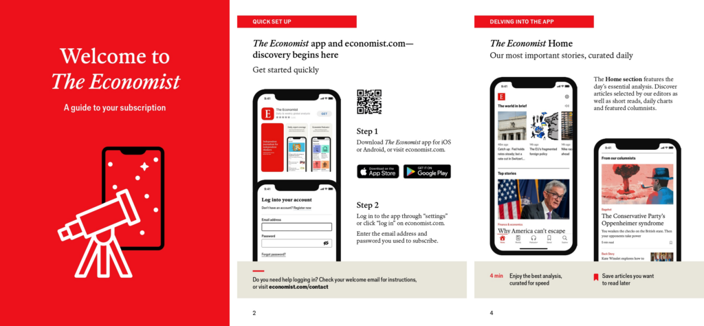
Working with our creative team, we designed a booklet that introduces subscribers to all of their benefits. It also enables them to quickly get started, explore our journalism and establish a reading habit. The booklet complements our existing email welcomes series by guiding new subscribers on using our app—a key retention-driving action—and managing their subscription, which gives them confidence in their purchase.
We also address pain points raised in customer surveys such as understanding the breadth of our newsletter coverage. Additionally, the pack includes a letter from our editor-in-chief, Zanny Minton Beddoes, to provide a personal touch and to welcome them into our community.

To measure the impact of the pack, we worked with our Data Insights team to determine test design and KPI. Rather than rolling the pack out to everyone, we conducted an A/B test with 50% of new subscribers receiving a pack and a 50% control group receiving nothing.
The KPI was to determine if the pack increased subscriber engagement as we know this has a direct correlation with retention rates. Engagement at The Economist is defined by the number of pieces of content consumed within a month. This can range from articles read to newsletter opens, and is something we are continuously optimizing towards.
> To read next: NZZ: How do you inspire people in the first 100 days?
Results and next steps
The test had a statistically significant impact with the test group showing an observed engagement uplift of 3.5%. Interestingly, some regional differences were observed, but these could also be due to the start mixes—further testing is required to reach statistical significance.
We are planning our next test to further optimize the pack and see if we can increase the engagement uplift—watch this space!
Advice for others
If I were to advise other businesses on introducing a physical welcome pack I would recommend analyzing whether the cost of mailing a pack is justified and the relevance of a pack to your audience and product offering. For example, at The Economist we know we offer a premium product therefore want to reflect this in the customer experience. Additionally, although our proportion of bundle subscribers (print and digital) is declining, a welcome pack complements this cohort particularly well. However, perhaps for something like a streaming service where the audience is likely to be younger, is a purely digital offering and has a low CLTV; it may not be the best fit.
When designing a welcome pack, I would suggest selecting the key actions you want new customers to take within their first few weeks and work with your creative team to effectively translate this into print. QR codes and vanity URLs are also great ways to seamlessly direct customers online. To keep your welcome pack concise, be discerning about which benefits you include and which actions you’d like subscribers to take—information should be easily absorbed and the pack should not be a chore to read.
And finally, I would always advise testing rather than rolling out 100%. Direct mail campaigns are expensive and may not resonate with your audience—they may even drive churn in trialists by serving as a reminder.


