Lars K Jensen is a former journalist who has been working with digital development, analyses and journalism in the media industry for several years. He's currently in charge of Audience, Data and Journalism at Berlingske Media but also publishes content on his blog, Products in Publishing.
As publishers either implement or revisit their paywalls, a question always arises: How should we label or illustrate our premium content? (The content behind the paywall, that is.)
What is the best icon for marking paywalled content?
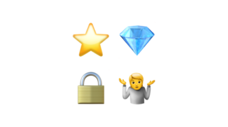
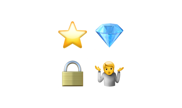
A common symbol is the lock (🔒) as it very clearly communicates that the content is locked and you need a key (subscription) to access it.
But the lock isn’t actually a very good icon since it’s very excluding. It seems to say “here is some content, but you can’t access it – so go away”. As locks usually do.
So… what else can you do?
Oh my stars
⭐️ Back in 2017 Medium changed its lock icon to a star – which I wrote about back then (in Danish). The star makes so much more sense, since it’s telling the user that this content is something else; it has value.
It might, though, be confused with a bookmark feature, since stars are traditionally used by a lot of browsers for bookmarks.
💎 In October 2021, Nieman Lab told us how Finnish publisher Helsingin Sanomat are using diamonds – I also wrote about that (also in Danish).
The lock symbol had become a worldwide way of portraying the paywall,’ [editor-in-chief Kaius] Niemi said. ‘We felt that the lock does not signal the added value of quality journalism and advanced digital storytelling. Rather, it had a risk of creating a negative connotation by closing the gate in front of a potential subscriber. Diamonds also illustrate the hard work behind the stories.
The diamond is also a great icon, although I’m not sure a lot of the readers will make the connection about the hard work behind the stories.
A lot of publishers (especially here in Denmark) are using plusses and are talking about their premium content as plus content.
This makes sense, since the + indicates that this is something else, and more than “just” the free content. And when something is a good thing we sometimes say that it’s “a plus”.
No icon?
In May I was visiting a series of Swedish news publishers as part of a course on digital innovation in the Nordic media landscape, which I was co-hosting.
One of the visits were at Dagens Nyheter which has great success with their subscription business:
- Webinar takeaways: How Dagens Nyheter has added thousands of digital subs during COVID-19 (WAN-IFRA, April 2020)
- How Swedish newspaper Dagens Nyheter halved subscriber churn in 2 years (Digiday, May 2019)
There we learned – among many other things – that they have another take on premium icons. They are not using any icon, label or illustration on their premium content to display to users who aren’t logged in with a subscription.
👉 That’s right: They are not showing free or not-logged-in users what pieces of content are only for paying customers. No locks, no stars, no diamonds.
It’s something I have noticed that a number of news publishers have started using – at least here in Scandinavia. It certainly looks like some of the major Danish news websites aren’t using premium icons.
Look at the top story at Jyllands-Posten (jp.dk) as I’m writing this:
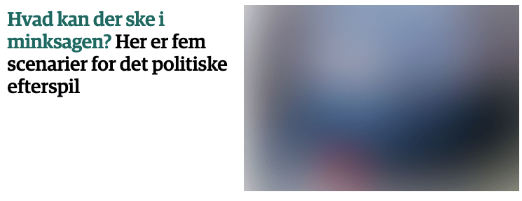
That article is only for subscribers even though there is no icon or label telling us that:
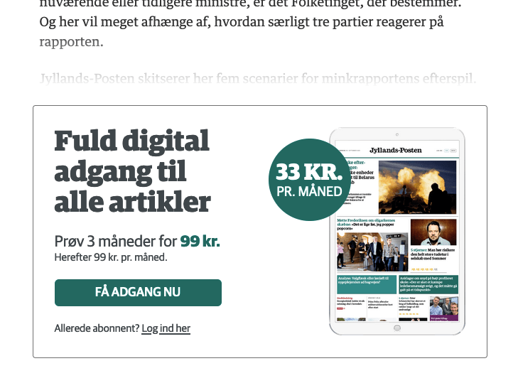
That’s interesting – and so is the probable reasoning behind that approach. It’s all about where and when you tell the user that a subscription is required to access a given piece of content.
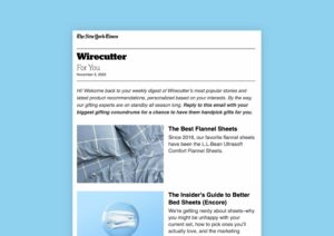
Take a newsletter, for instance, which links to both free and premium content on a newspaper website.
To help the users (and remind them that you have awesome premium content) you label your premium articles with perhaps an icon or some text that says something along the lines of “This content is only for subscribers”.
Because… that makes sense, right?
Well, it might – but you just might be shooting yourself in the foot and severely limiting your chances of success and conversions.
The user journey
I have done a lot of analysis on newsletters done like this and the results are usually the same: very few people click on the premium links in newsletters.
The free users don’t because it costs money. And some of the paying subscribers might not even click as well, if they have to remember their email and password (my theory).
What you are trying to do is to put the conversion (from free user to paying subscriber) into the user journey as soon as possible. Because that’s what you want.
But it’s hard for the users to make that kind of decision in their email application.
Just opening an email rarely places the users in a position where they can decide to purchase a subscription – and the same goes for the frontpage of your website.
You probably already have a place where those conversions usually happen and which is finetuned for just that: Your paywall and/or sign up page.
This works because of an important dynamic: The users have already seen the content and deemed it interesting enough to at least look into what a subscription is, what it costs and so on.
By having a nice “beware, premium content ahead” icon (or, should we say warning) in your newsletter, you are short circuiting that thought process and user journey. Conversions need to happen based on the article on your website, not how you market it in a newsletter.
At Dagens Nyheter they appear to have taken this one step further, but the reasoning is the same: The idea is that if a user knows which content is free vs premium just by looking at the frontpage (which is actually a marketing platform for the content being linked to) then they won’t click on premium articles, and the number of conversions will be cut.
Turn it around
Dagens Nyheter are doing something clever. They do have a label on premium content – but you have to be logged in as a paying subscriber to see it:
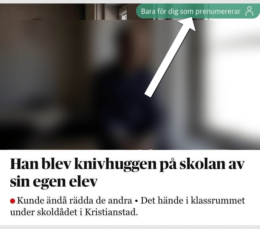
I have just discovered (through testing) that Danish newspaper Politiken is doing the very same thing. (Others – like Jyllands-Posten – might too, but I haven’t been able to test that.)
Here’s one of Politiken’s top stories when you are not logged in:
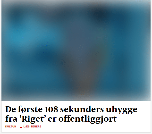
…and here’s how it looks if you are logged in with a subscription (illustrated by an ugly arrow):
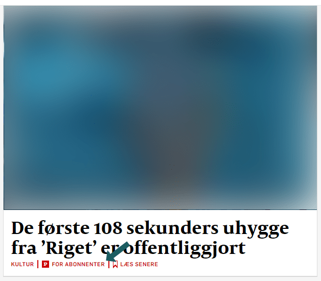
👉 So, some publishers have begun flipping the logic on its head: Instead of telling people what premium content they don’t have access to by not subscribing, they are instead telling the premium users what premium content they have access to and which the free visitors don’t.
It makes sense, because you play your website, its architecture and your content to its strengths.
Telling the recipients of your newsletter or people scrolling your frontpage that a given article is only for paying subscribers might be a nice service to the readers and spare some of them a visit to a site where they don’t have access.
But it isn’t going to get you a lot of new subscribers, I would argue.
So stop excusing for yourself and your content and think about how you want to market your premium content on your website and channels.
This article was originally published on Lars’ “Products in Publishing” website. You can also find him on LinkedIn or Twitter.


