I recently took to the stage at FIPP’s World Media Conference with Matthieu Atlani, Product, UX & Premium Development Manager at CMI Media, to discuss how the fashion magazine ELLE not only launched a dynamic paywall model but is continuously optimizing their strategy to improve conversion rates. Here’s what we shared.
The context of ELLE Magazine
With brands like ELLE, Version Femina and Télé 7 jours, CMI France is aimed at women of all ages, aiming to work alongside them at every stage of their lives through content, services and events.
CMI France defends a committed, independent press that shines on all of its media: print, digital, social networks, events, services, training.
- 17 brands
- More than 700 employees
- 50/50 male/female board of directors
Launching ELLE Premium
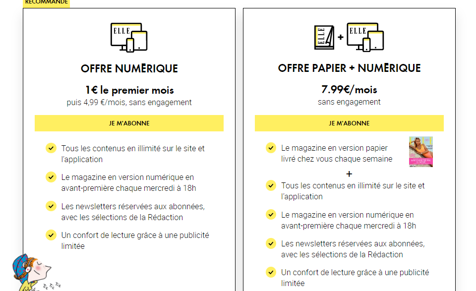
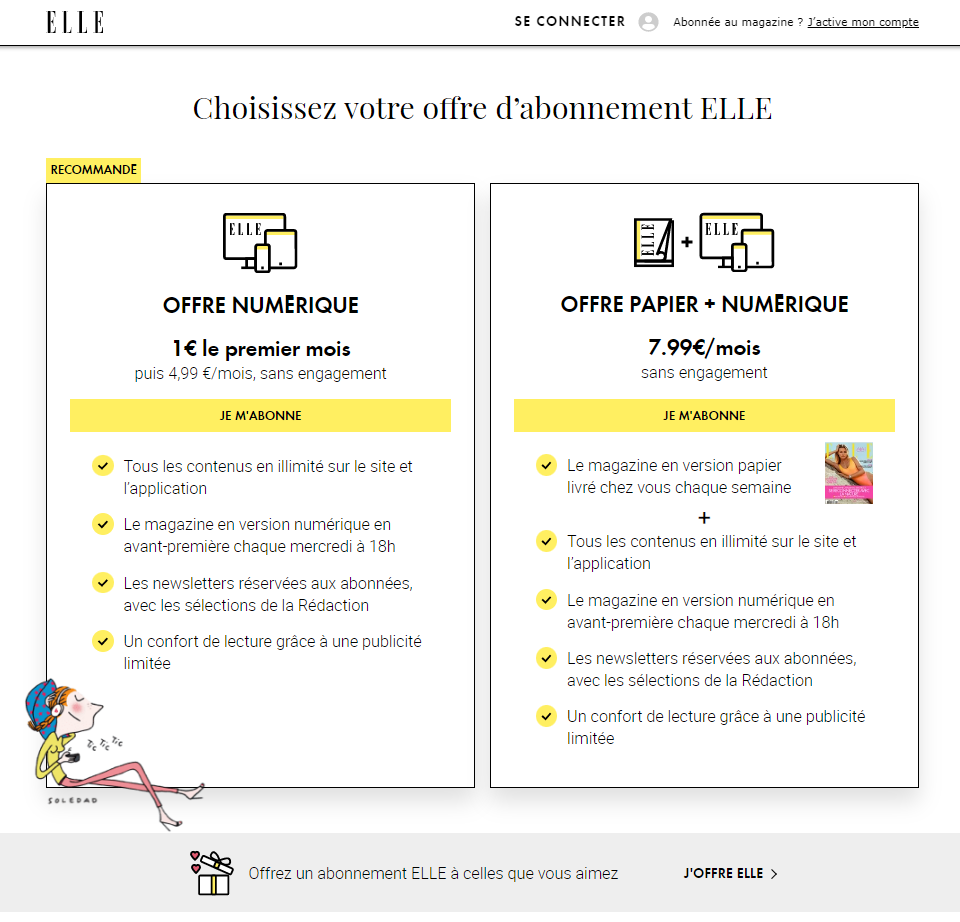
ELLE magazine launched their premium model in November 2020 with a 100% digital offer price of €1 for the 1st month, then €4.99/month, no commitment.
Subscriber benefits include:
- Unlimited access to all content on site and app
- Digital magazine every Wednesday at 6pm
- Subscriber-only newsletters, with editorial selections
- Reading comfort thanks to limited advertising
The 3 strategic challenges for ELLE premium
- Diversifying revenue streams
> Free from advertising pressure and unpredictable revenue streams
>Anticipate regulations on e-privacy and cookie usage
“>Monetize content directly through readers via subscription
- Widening audiences
>Propose a 100% digital editorial offer for digital natives
>Enrich content with long, interactive formats and surveys
>Recruit a younger audience
- Control the distribution circuit
>Develop an alternative to paper distribution
>Take back control of digital distribution
>Better understand our audience (including through testing)
The goals of ELLE Premium
Like many digital products, ELLE’s subscription is made up of 3 pillars.
- Editorial
> Engaging journalistic production in line with ELLE’s premium offer
> Content to develop loyalty
> Visible and valued premium content
- User experience
> A fluid and unified customer journeys on all channels and devices
> SSO that can be use across all brands
> Have an APP- / mobile-first approach
- Data driven
> Track and analyze reader, lead and subscriber behavior
> Systematize AB tests
> Integrate decision support data tools for writing and marketing
How ELLE have continuously optimized their conversion funnel
ELLE have been working with Poool since the launch of their premium model, not only benefiting from their tools – specifically their Audience Conversion Platform – but also their expertise.
For example, ELLE have used Poool’s new conversion funnel framework to better understand exactly where they’re losing readers in the journey towards subscription.
Specifically, instead of tracking conversion rate as a single metric, the framework breaks the metric down into 5 steps.
Why?
- Well, the result is a single, slightly depressing metric that has far too many zeros before it
- It’s just not very useful in telling you exactly what you need to improve, or identify the specific areas that are causing friction
- You can’t compare yourself to other publishers with this metric – there are too many different factors at play
Instead, the framework proposes an alternative and more effective way to analyze and optimize conversion rates, one that’s adapted to digital publishers and takes into account the steps prior to the paywall.
And it’s this that ELLE have been using to ensure continuous optimization…
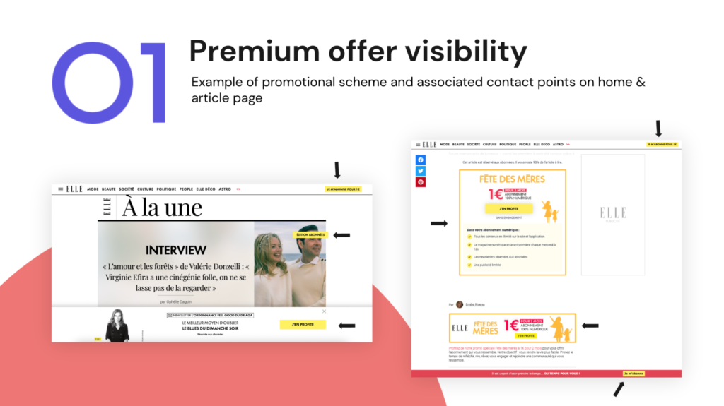
Step one: premium offer visibility
How many users on your website visit premium content (vs free, unblocked content), where they have the potential of being exposed to the paywall?
To increase the number of visitors moving through to premium content, they’ve worked on establishing a variety of promotional placements across the home and article pages, making sure a reader always has access to the subscribe button.
Step two: Paywall visibility
How many users who visit premium content actually see the paywall?
Poool’s conversion funnel benchmark report revealed that an average of 54.72% of visitors are lost at this step in the funnel! What’s the point of having a well-designed paywall and running tests on the CTA and wording if half of your readers don’t actually see it on the article?
ELLE therefore tested moving the paywall from leaving 20% of content visible to only 10%.
The KPIs:
- 1: Increase the visibility of premium content
- 2: Increase paywall exposure
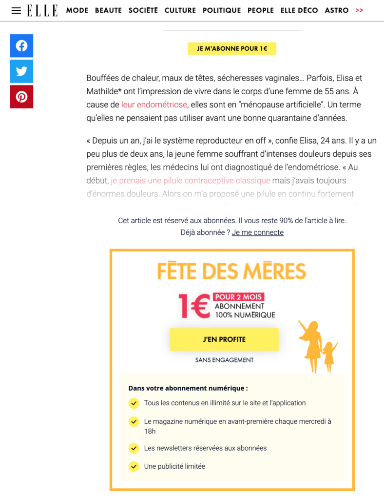
Step three: percentage of users who click on the paywall
How many readers who see the paywall actually click on the CTA button?
How have ELLE been optimizing this metric?
- A/B testing design, wording and the CTA button
- Continuously modifying wall design and messaging – i.e. learning from the advertising industry to reduce paywall blindness. ELLE, for example, adapt the paywall design to national holidays, sales and seasons, including Christmas, Black Friday and Summer
- Adapting the wall to a user’s profile or context, such as whether they’re on mobile or desktop, their location, the content they’re accessing or their level of engagement
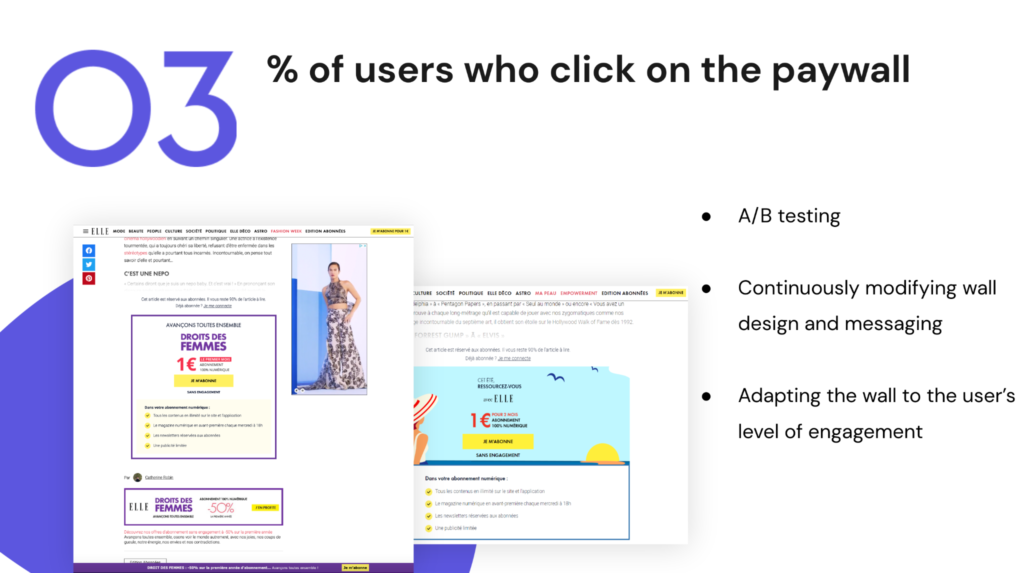
One example of this is ELLE’s Random Paywall Project:
The goal was to increase click-through and conversion rates by randomly presenting readers with 5 different paywall variations across 2 months.
They focus on their most engaged audience segments, those who are more likely to subscribe:
- Occasionals: 2-5V / Month
- Regulars: 6-10V / Month
- Fans: < 10V / Month
Testing was divided into 2 rounds:
- Round 1: different messaging
- Round 2: different designs
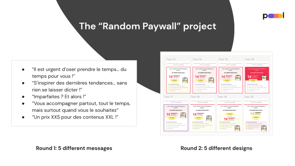
The random paywall project results:
- Divided the average no. of paywalls shown to a user before converting by 3
- Increase in click-through & conversion rates (although hard to measure conversion rates due to other factors at play)
- Insights into the messaging & design that best convert users into subscribers. E.g. forefronting price worked better than forefronting the advantages of subscription
Step four: percentage of users who convert
How many readers who click on the paywall actually end up converting?
ELLE have been working on this KPI from a variety of angles, particularly through A/B testing funnel steps.
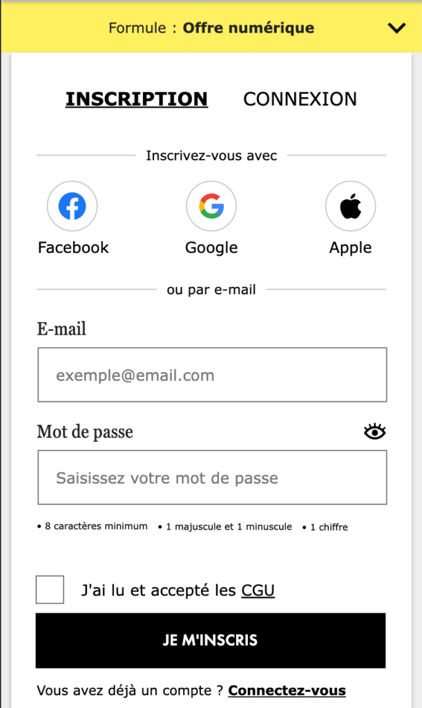
For instance, they tested reducing the space between each form field to move the registration button up the page, making it easier for the reader to convert.
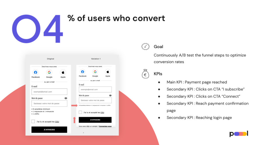
They’ve also worked to increase the number of free registered members who have been proven to be up to 40x more likely to subscribe. To achieve this, the team have facilitated account creation with simple UX changes, such as by putting the sign up link in bold and adding ‘tabs’ to allow someone to register or login without having to be redirected to a new page.
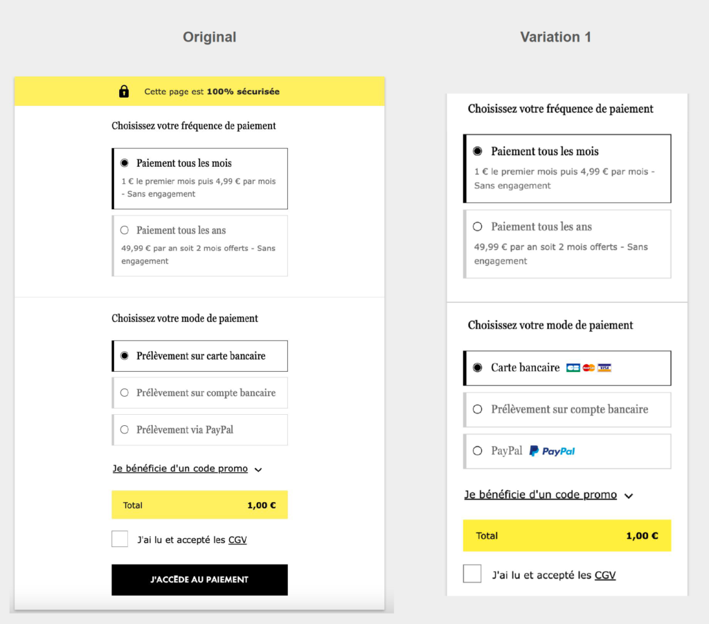
Finally, on the payment page (arguably the most important step in the funnel), ELLE has worked to facilitate payment via direct debits for higher retention rates, reduce distractions, offer options and reassure.
For example, with more direct messaging for each type of payment and by adding icons for easy identification of trusted, secure payment methods.
So, what’s next for ELLE?
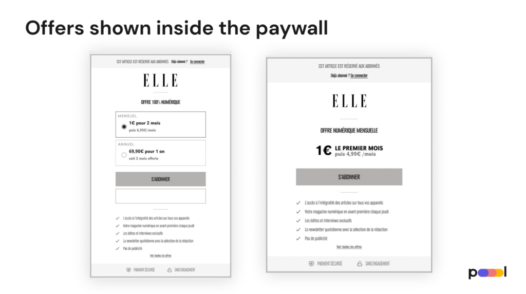
> Integrating offers into the paywall
After hearing of other Poool client’s success with this strategy – increasing click-through rates by 97% and conversion rates by 37% – ELLE is planning to test integrating their subscription offers into the wall, reducing a step in the conversion funnel.
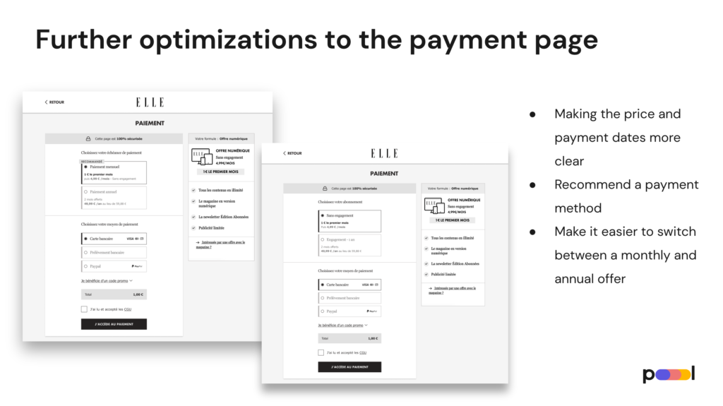
> Further optimizations to the payment page
For example:
- Making the price and payment dates more clear
- Recommend a payment method to reduce the decision-making needed to subscribe
- Make it easier to switch between a monthly and annual offer
Find out more about the ELLE success story with Poool here.


