
The goal: Reduce frustration, increase engagement and conversions.
To wrap it up:
- Work on increasing engagement prior to the moment that you present your paywall
- Segment audiences to adapt to the user and present walls that are less likely to frustrate
- Forefront your value proposition onsite and on your wall
- Catch user’s attention: be brief, avoid distractions, use bold CTAs and focus on benefits over functionalities
- Optimize your wall for mobile access
But the secret lies in finding the perfect balance between engagement and frustration – enough engagement that they see the value in your product and want to have access to more, whilst still creating just the right amount of frustration to encourage conversion and monetize your content.
So, how do you find this balance?
This article will cover 6 key areas to work on to reduce paywall frustration:
- Choose the right paywall model
- Soft conversion engagement steps
- Paywall visibility rate
- Transparency
- Effective wall copy
- Mobile optimization
1. Choose the right paywall model
There are 4 central paywall models:
- Hard paywall: all content is considered premium and blocked by a paywall. This model is associated with high levels of frustration as users aren’t able to ‘test’ your content before being asked to subscribe – i.e. engagement is low, frustration is high
- Freemium paywall: content is divided into free (no paywall) and premium (blocked by a paywall). Readers therefore have the chance to discover the value in your content before being blocked. However, the content behind a paywall is often of a higher quality/more valuable (hence why it’s reserved for subscribers) meaning that the user doesn’t get a full premium experience before being blocked
- Metered model: readers are offered a quota of content for free per week or month, allowing them to get a taste of your premium product before being blocked. This is a great strategy for increasing engagement whilst also frustrating your more engaged users (who reach the quota limit) to encourage subscription
- Dynamic model: this paywall adapts to the user based on their profile or context thanks to audience segmentation. The most valuable segmentation strategy here is to group users based on their level of engagement. In this way you can find the perfect balance of frustration and engagement.
Importantly, there’s no one-size-fits-all model that will be optimal for each publisher. The best strategy is to A/B test different models, starting simple and perhaps only launching on your most engaged audience segment to reduce the risk of frustrating your more volatile readers.
Aside from this, a key metric to measure is the visibility of your premium content – i.e. what percentage of your total traffic visits a premium article? This is essential for moving readers through the engagement funnel towards the paywall and conversion as it’s been proven that the visibility of premium content has a direct correlation with user-to-subscriber conversion rates. However, our study suggested that this correlation no longer applies after 40%, and although we see some successful publishers at the higher end of this scale – Financial Times for instance who have 100% of their content blocked by a wall – it’s likely that users will become frustrated after the 40% mark, especially if you’re only just launching a premium model.
To increase the traffic on premium content, you don’t necessarily need to produce more of this content but increase its visibility on your site:
- Place premium content on the homepage
- Promote them inside other articles
- Recommend these articles to your users
- Place more premium content in your newsletter, on social media, etc.
2. Soft conversion engagement steps
As mentioned in the introduction, the challenges for a successful subscription strategy is to find a balance between frustration and engagement. The value of soft conversion steps is therefore to gradually increase engagement prior to the paywall so as to reduce the frustration when a user does get blocked.
Think of it like running – showing a user a hard paywall immediately upon arriving on your site is like being thrown in the deep end and asking someone to run a 10k without ever having run before. However, with soft conversions, you encourage them to start by walking, then jogging then running.
What are examples of these soft conversion steps?
- Registration wall: blocks the user and requires that they create a free account on your website in order to access content. A registration wall is perhaps the most valuable soft conversion tool as it provides a wide variety of additional benefits to publishers, including first-party data collection, personalization potential, increased ad revenue and, of course, boosted engagement to increase a user’s propensity to subscribe in the future
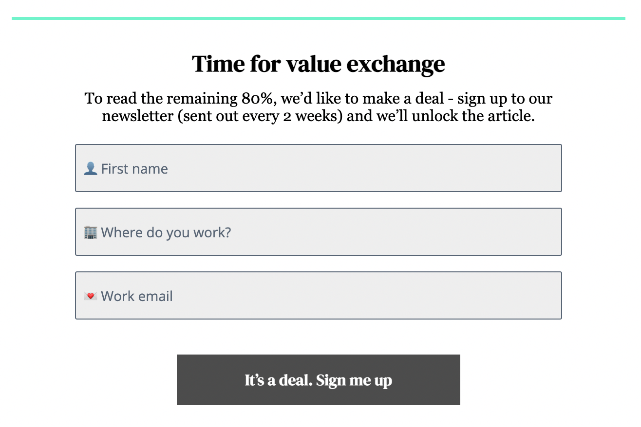
- Newsletter wall: ask your audience to sign up for your newsletter in exchange for access to content (this is our strategy at The Audiencers). In addition to collecting this valuable data point (email), you’ll also increase engagement through sending content to their inbox on a regular basis, forming a habit and increasing frequency of visits to your site
- Survey walls: ask your user to share their opinion in exchange for access to content
- Discovery pass or offered article: allow users to discover premium content for free to ensure that they see value in your product and want to subscribe when faced with the paywall
3. Paywall visibility rate
This often forgotten metric refers to the percentage of traffic on premium content who actually see the paywall. I.e. How high up on the page is your paywall?
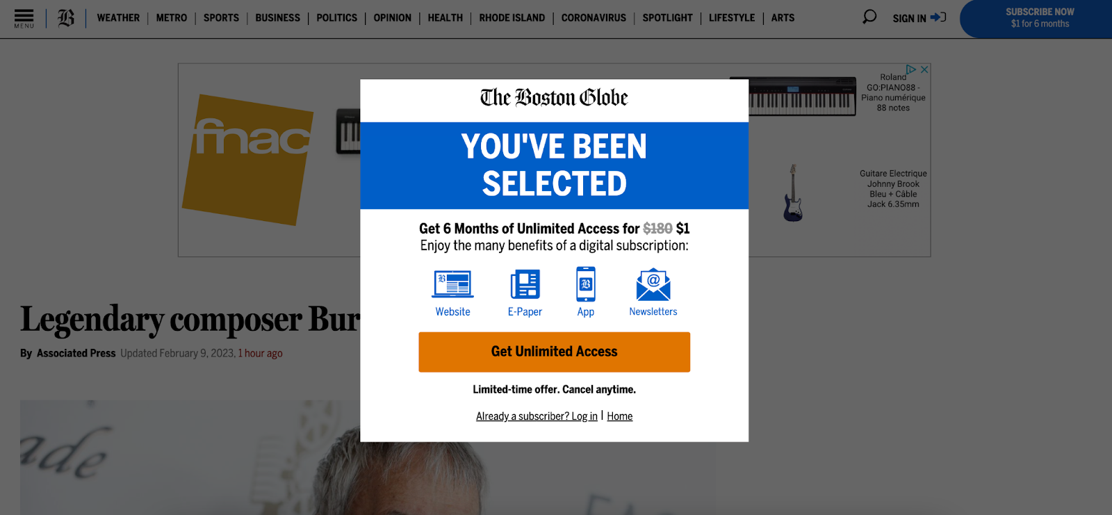
For instance, The Boston Globe employs a pop-up wall that can’t be closed meaning 100% paywall visibility – all visitors to premium content will see the paywall.
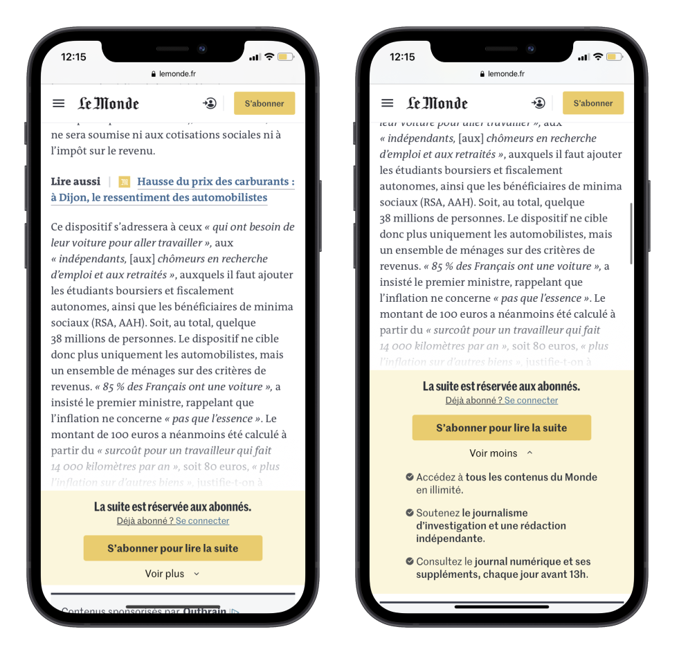
Whilst other publishers, such as Le Monde, place the wall a few scrolls down the page to allow the reader to become engaged in the content before being blocked.

However, this strategy may not be optimal for causing enough frustration to convert a user into a subscriber. As always, testing is therefore required to find the optimal visibility rate.
4. Transparency
Your goal, from the moment a user first visits your site, is to build a strong and lasting relationship, something that is particularly important in a reader revenue model.
And although audiences are starting to understand why publishers are blocking their content, it’s fair to say that paywalls aren’t hugely popular amongst online consumers. This is why being transparent can prove valuable, building a trusting relationship with your audience and educating them on exactly why you need to monetize your content.
Paywall copy is a great place to start:
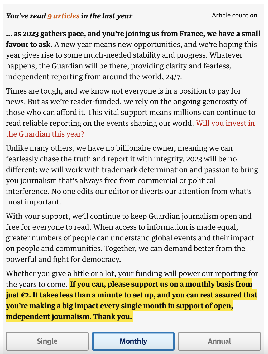
The Guardian is a great example. Although employing a donation model in the image below, the publisher is very clear on why they need support, what this money will go towards and what makes them different from others. They also write in a very down-to-earth, sincere way that feels very transparent and supports their goal of building trust with users.
You can also be transparent in communicating your paywall model:
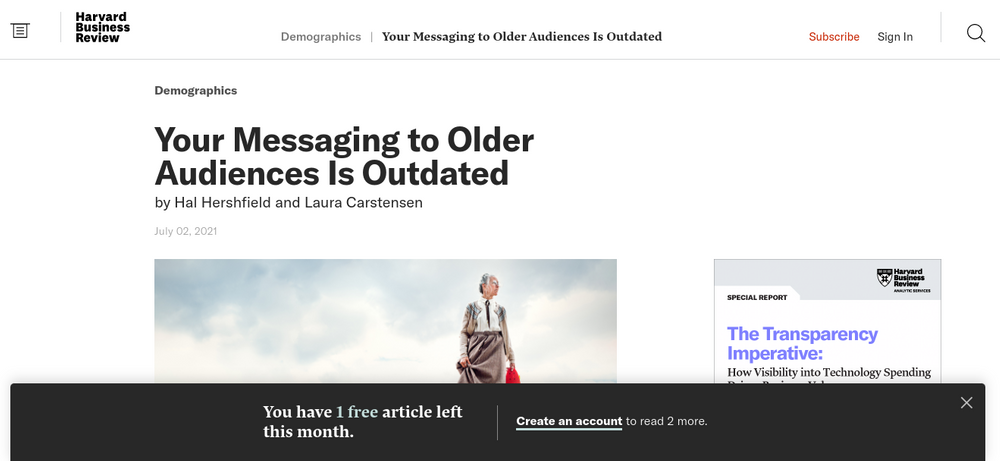
For instance, if you’re employing a metered approach, you should consider informing users of how many articles they have left, reducing the surprise and frustration when they reach the limit. This is the technique employed by Harvard Business Review and Medium for instance.

5. Effective wall copy
UX writing means choosing words that both serve a definite purpose and take the user’s context into account. Specifically, whilst you want to convince them to subscribe and improve your content monetization through conversions, you also seek to solve a user’s problems, understand their feelings and surpass their expectations. Effective writing that achieves these two aims will reduce frustration and increase conversion simultaneously.
Serving your marketing aim:
- Persuasive language that guides users to your CTAs without being harsh and direct (verbs that are friendlier than ‘Subscribe’, such as ‘Join’, ‘Select this offer’)
- Clear labels (including for form fields, e.g. what are your password requirements, such as needing to include capitals, numbers, etc)
- Focus on benefits rather than functionalities, price or supports (‘Unlimited access’)
- Highlight your mission and the value of what you do (‘Support the production of content’)
Serving your user’s needs, desires and feelings:
- Reassure (‘Cancel anytime’, ‘Secure payment’)
- Highlight value/benefits (‘Access all premium content’, ‘Exclusive newsletters’)
- Create a group belonging (‘Join our community’, ‘Become a member’)
- Write copy that matches your mission and encourages users to share your values (‘Support independent journalism’ appeals to users’ sense of comradery and responsibility to support you)
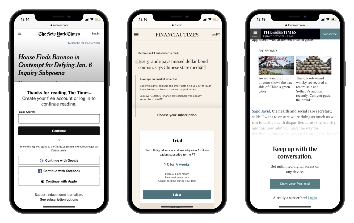
6. Mobile optimization
According to research, roughly 44.1% of traffic worldwide is on a mobile device and increasingly more people are using their phones to order goods and services. Therefore, not optimizing your site for access on mobile devices means you’re missing out on a significant number of potential subscribers who are turned away by a frustrating UX on their phones.
Below are some benchmark examples of paywalls optimized for mobile access and techniques to employ to reduce frustration and increase conversions:
- A single line at the top that communicates your value proposition, like The Times – user’s attention is even harder to grab on mobile
- Limit text – be brief – and consider colors or visual aids to aid quick comprehension
- Adapt the wall to the smaller screen size. Le Monde, for example, has a collapsible wall with the user being able to click ‘voir plus’ (see more) to read the benefits of subscription and more of Le Monde’s value proposition. However, even still, limit this list to 2 or 3 ideally
- If showing subscription offers on your paywall, make sure users have to scroll down to view all offers, rather than across (like the FT)
- If asking users to login or create an account on your wall, offer easy sign in options with an existing social account, such as Facebook and Apple (like the NYT)
- Big, bold CTA buttons and clear, short headings for the paywall