
Like most of the major platforms employing subscription models, Le Figaro has now developed a technology to block simultaneous sessions – two users accessing premium content under a single login. The main challenge, however, is to do this effectively without damaging the subscriber experience, particularly as these users need to be ‘pampered’ in order to support retention efforts.
For several years now, Le Figaro has been faced with the problem of subscribers sharing a single account.
“It’s important to remember that, as humans, we often wish to share services and experiences that we enjoy. It can even be considered a complement to our product. We do, however, want to limit this sharing, but we want to do so without requiring subscribers to perform tedious and counterproductive account verifications.
Our solution to this challenge involves a two-step plan that encourages subscribers to share their subscription rather than their personal account.
Step 1: offer an alternative sharing option
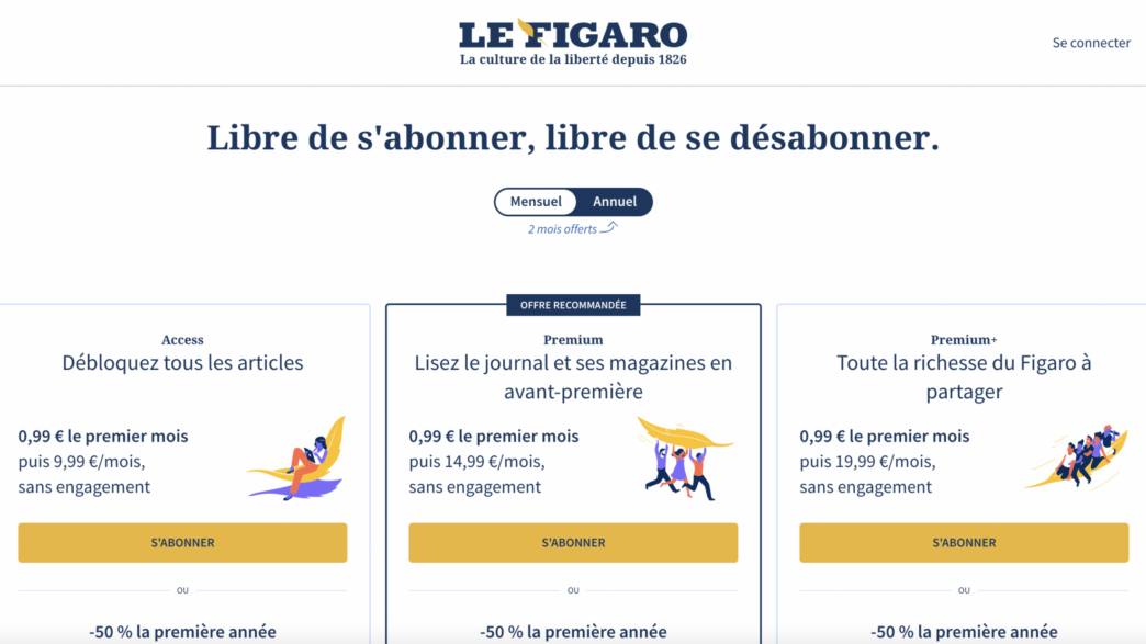
Our first action was to present subscribers with a different way to share the premium product. This started with a “Family Pack” on our most popular digital and paper subscription packages, namely “Premium” and “Premium+”. A subscriber to one of these two packages now has the possibility to link 2 to 4 user accounts to their subscription. Subscribers to the daily paper also have this feature.
2nd step: set session limits
Next, we were able to move on to limiting sessions. This involved setting up a system that prevents multiple users on a single subscriber account from viewing articles simultaneously on different browsers.
Only one user is authorized to consult the articles with a given account (ID/password pair). So, if a second user logs in with the same ID and consults an article at the same time, the first user is blocked by a pop-up suggesting that they either switch to a higher subscription package or register their relatives in the Family Pack with dedicated access details.

The user invited to a Family Pack can then have their own account ID, benefiting from the same access as their “sponsor” (depending on the chosen subscription) including premium articles, newsletters, etc… In particular, as comments are now a benefit reserved for subscribers only, we also wanted to allow each user to express their opinion under a unique pseudonym, rather than having multiple people writing under a single name.
Transitioning to this model smoothly
Our session limitation system has been designed with the user in mind, offering an adapted and non-constraining experience. Having said this, we do want to allow for a certain amount of constraint to be felt by users, enough to make them aware that solutions exist to limit password sharing.
To find this balance, we interrupt any 2 users on the same account by displaying a simple pop-up, informing them of our technology.
The UX designers and product owners at Figaro worked with highly visualized prototypes, testing possible scenarios to find the user contexts that occur the most frequently. Once the scenarios were chosen, they then worked in collaboration with customer service managers to build a user experience and messaging that finds this perfect amount of restrictiveness. The experience had to be easy to understand (with a well communicated reason for blocking) without giving a negative impression of our subscription offers to the user.
A lot of work was also done on the texts presented to users in order to remain understandable for the user, coherent with branding and in line with our marketing axes.
Since implementing our session limitation system, we’ve had very little negative feedback from subscribers. Thanks to this system, we’ve been able to measure with close precision exactly which accounts are shared the most and, in particular, identify accounts being shared by employees within a single company. This gives us prospective customers of our B2B offers.
The first results have been hugely positive, so we now want to extend this system to our apps and sub-domains whilst continuing to develop the fluidity of our customer experience.
A word from the tech team
Working alongside the product owner, we developed this session limiting technology with two major goals in mind:
- Simplicity of the API: the feature must be very simple to integrate for front-end tech teams and on mobile apps
- Resilience: the technology must be scalable, fault tolerant, and above all not be implemented at the expense of our subscribers
With this in mind, we developed a Node.JS API with only three REST endpoints to meet all scenarios, taking full advantage of Kubernetes and managed services in Cloud to make this API as resilient as possible with high fault tolerance and resistance to load growth. On top of this, the technology also allows us to manage these simultaneous connection attempts in near real-time without damaging the user experience.
Several months after launching this system, and despite the increasing number of subscribers, no incident has yet been reported.


