
Launched in 2015 by Nicolas Le Roux, La langue française is a publication specializing in French and literature. With content covering everything language-related, from spelling to expressions & proverbs and games, La langue française aims to help readers(re)discover the subtleties of French in a fun and educational way. The site boasts over 4 million unique visitors a month, and the team's current goal is to expand their premium subscription offers. In this article, Nicolas takes us behind the scenes of his new strategy, where they aim to offer readers "a little sweetness, against a little sour"...!
Our goal at La langue française was twofold: to better encourage visitors to create a free account before converting them into paying subscribers, responding to the falling advertising revenue by directly monetizing our audience, and secondly to increase resilience in the face of the digital giants by developing audience loyalty through a distribution channel that we could control from end to end – email.
Of course, the first step in building a successful conversion journey, with these goals in mind, is reader acquisition.
At La langue française, acquiring users was not our first priority. Indeed, like many independent online media, we preferred to provide free, unrestricted access to our articles in order to maximize traffic.
The only visitors who signed up did so to receive our weekly newsletter. And even this was only possible through a newsletter module within articles or a sign-up button in the header bar and footer.
The result was that, on average, out of the 150,000 daily visitors to the site, only around twenty created an account, i.e. a free account creation conversion rate of 0.01%…
Hence why we decided to take inspiration from The New York Times’ conversion model, and the email-first strategy employed by Semafor.
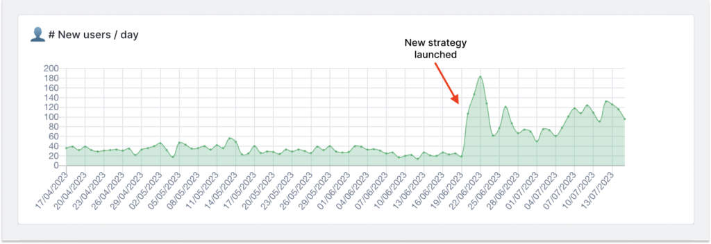
This strategy, that we named “bittersweet”, consists in giving more value to our subscribers (the sweet side), whilst forcing the most reluctant to create an account to read our content (the sour side). Within the first month of implementing this strategy, we were able to increase our acquisition of new subscribers by 450%.

Semafor’s email-first strategy: how to effectively convert your readership
Since its launch in October 2022, Semafor claims to have registered over 400,000 subscribers to its newsletter, with an open rate of over 60%, according to an interview with its founders.
Semafor’s strategy is simple. Make the registration process as easy as possible to maximize conversion rates. To achieve this, they have a single point of entry – email. Gone are the pseudonyms, passwords and other information that discourage visitors from finalizing account creation! Simplicity is key.
Even more audacious, Semafor doesn’t use double opt-in (email address confirmation). Instead, they likely use an email verification system and clean up their list as soon as a block is detected.
To encourage visitors to sign up, they “productize” their content by creating themed newsletters. Each category of the site is the subject of a dedicated mailing list, each with a unique value proposition to target visitors’ interests. The module is concise but attractive, detailing the title of each thematic newsletter, a snappy value proposition, frequency of distribution and a link to read it before signing up.
Thematic newsletters are promoted on article pages using two types of subscription modules:
- A banner that shows up when a reader tries to access an article:
- A promotional box at the top of the article
And a page dedicated to signing up to different newsletters:
Creating theme trails at La langue française
To improve our registration rates, we decided to follow Semafor’s strategy and use email as the only entry point. However, we decided to keep the double opt-in (email confirmation). When a user confirms their email, they finalize account creation by choosing a pseudonym and password.
We created a number of thematic paths according to the sections of the site: spelling, literature, figures of speech, etc.
To convert users, we’ve created three registration modules that display a unique value proposition depending on the section of the site and the corresponding pathway:
- A module within articles
- A module at the end of articles
- A banner that pops up when a reader is accessing an article
In short, we created themed newsletters to increase visitors’ propensity to subscribe (the sweet part of the “bittersweet” strategy) and integrated more sign up modules at various stages of a reader’s journey to increase conversion rates. What’s more, the single point of entry (via email) considerably reduces the number of readers who abandon the registration process as we only ask for additional information after they’ve confirmed their email address.
For the more reluctant: a dynamic wall
The fact remains that some visitors don’t convert immediately. For these visitors, we need to add a little sourness to our conversion strategy by restricting access to certain articles.
This strategy, inspired by the New York Times, involves setting up dynamic walls based on how much content a reader has consumed (a useful indicator for level of engagement). At La langue française, we’ve set up a dynamic wall using Poool, a tool that makes it easy to configure different scenarios.
The conversion journey:
- If the visitor has already read three articles in a week, a wall will block content and ask them to create a free account.
- If the visitor has completed a quiz, dictation or crossword puzzle during the week, they must register to continue playing.
Some independent publishers are reluctant to restrict access to content – producing articles and acquiring audiences is expensive, so it seems a shame to restrict the number of readers.
But it’s also important to value the quality of the content you publish, and fund our journalism. At La langue française, we pay specialists to publish cutting-edge articles on our themes. For readers, providing their email address in exchange for a quality article isn’t all that expensive after all, and visitors easily understand this.
All that’s needed is a little pressure (balancing frustration and engagement), something that you can do through Poool, configuring the pressure of our dynamic walls. At present, only 19% of La langue française’s traffic is exposed to restricted content.
A dedicated landing page for your newsletters
Newsletters are a type of content in their own right. It would be a shame to send it only to your subscribers.
So it’s important to publish it on your site too, so that you can share it on social networks and convert certain visitors by showing them an example of what they’re going to receive.
What’s more, it’s a way to improve internal linking by indexing pages that will redirect to your most recent articles.
On our newsletter page, we’ve added a sign-up module to enable visitors to subscribe with a single click.
Results and next steps

The result of this “bittersweet” strategy? Daily acquisition of new subscribers has increased by 4-5x (450%). After just one month, our thematic path newsletters count several thousand subscribers, contributing to a significantly increased share of email traffic.
Poool’s dynamic walls, although only appearing for 19% of traffic, are already responsible for 39% of new subscribers.
Next steps:
Several challenges remain. The first is to improve email confirmation rate, which currently stands at 62%. One solution would be to do away with double opt-in and use email verification technology. The disadvantage is that such technology has to be paid for, and isn’t 100% reliable. What’s more, double opt-in makes our list RGPD-compliant.
Another project to improve these results is to test other dynamic wall strategies. We aim to gradually increase the percentage of traffic exposed to a wall, to reach 40-50%. We’re also aware that we’ll need to regularly change wall design and messaging to increase conversion rates.


