
After 8 months of A/B testing and several iterations, Le Monde‘s marketing team has decided on (for now at least) the French publisher’s new subscription offers page. I met Virgile de Tassigny, Growth Marketing Manager at Le Monde, who told me all about this major project.
The original (or control)
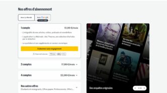
Launched in 2020, at the same time as their new conversion funnel, the “control” displays 3 offers, with one (the “Duo” offer, ideal for couples needing 2 accounts) centered and highlighted as “Recommended”:

But after 4 years of existence, this page needed a thorough refresh.
1. Too much text kills the message (and conversion)
The old page was dense, with repeated information and several scattered CTAs. The result was a high cognitive load and an unruly user experience.
The first priority of Le Monde‘s redesign was therefore to simplify the offering. From now on, each formula will highlight a maximum of two to three key benefits (instead of a long list) with the aim of speeding up decision-making.
They also decided to elimination the little-understood labels, such as “Essential” or “Family”.
The first iteration led to this version:


