
By converting readers into subscribers, you develop a predictable and recurring monetization stream that’s significantly more reliable that ad-only models.
One of the first steps in establishing this strategy is to integrate a paywall into your content. And, although this will lead to high conversion rates in the first few months as your most engaged users become subscribers, the majority of publishers see this number plateau after some time.
This is definitely a trend amongst publishers and entirely normal, but there are some techniques to employ to reignite conversion rates and optimize your paywall strategy:
- Increase paywall visibility rates
- A/B testing
- Regularly modify wall design
- Employ a dynamic strategy
- Soft conversion steps
- Integrate other steps in the funnel into the wall
Quick note:
Of course, although your paywall plays a key role in conversion rates, it is in fact engagement (prior to the paywall) that ultimately convinces a reader to subscribe.
We’d therefore recommend moving beyond simply tracking conversion rates alone ( a metric more suited to the e-commerce industry) and instead work on optimizing each step in the engagement funnel.
- Total number of users
- % of users exposed to the paywall
- % of users who see the paywall
- % of users who click on the paywall
- % of users who convert
How to optimize your paywall conversion rates
1) Increase paywall visibility rate
This refers to the visibility of your paywall on the content itself – i.e. the number of people who visit premium content and actually see the paywall.
The assumption is often that a high visibility rate will lead to more conversions (the more users who see the wall, the more subscribers, right?), but you actually need to find the balance between frustration and engagement.
Place the paywall too far down the page and user’s won’t be frustrated enough to click-through and subscribe. But a highly visible paywall may instead prevent content discovery and engagement, both of which are essential for conversion.
The difficulty lies in the fact that this balance is brand specific – it depends on your business model, audience and content. Hence why testing paywall visibility rate is the key here.
From a Poool study of 75 digital publishers, the benchmark paywall visibility rate was 30-60%, but we do see successful publishers at extreme ends of this scale.
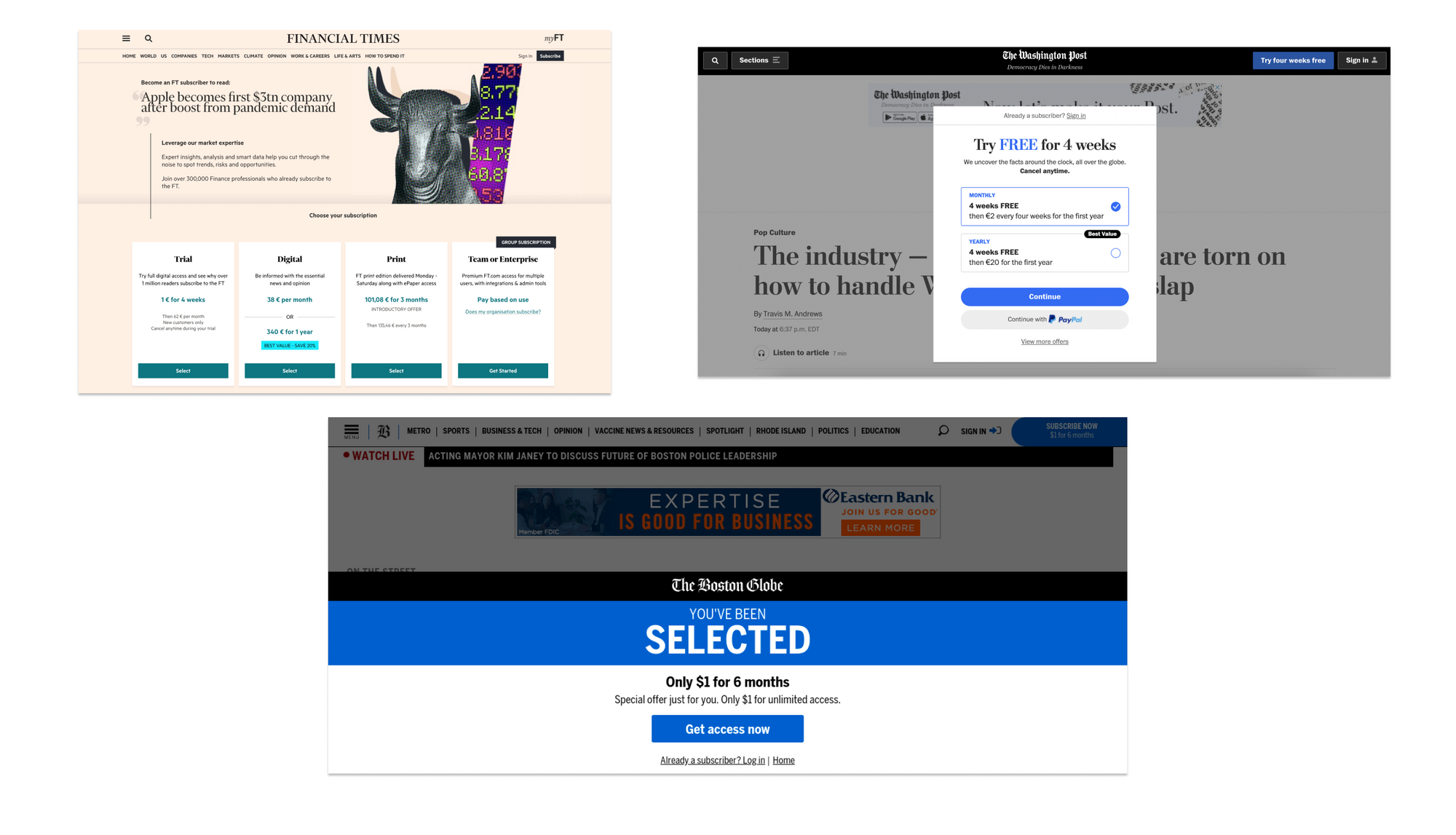
Some publishers, for instance, employ a paywall with 100% visibility rate, either with a full page wall (like Financial Times), a sticky wall (like The Boston Globe) or a pop-up (like The Washington Post).
We’d recommend aiming for 80% and testing from here.
🧮 KPI to measure = Paywall visibility rate (percentage) `
2) A/B testing
Every publisher is different, with their own content, audience and business model. So, although you can read endless tips and advice online about how to optimize conversion rates, testing is the only way to find the best strategy for your unique content.
There’s a variety of aspects of your paywall that can be tested:
- Wording: Including the heading, value proposition points, CTA button wording, etc.
- Design: Such as the colors (and which colors where), CTA button placement, font, etc.
- Scenario: The user journey prior to the paywall, such as integrating soft conversion steps, employing a metered strategy (allowing access to a quote of articles) or opening up more content before blocking users
- Paywall visibility: Blocking just underneath the title or after a paragraph
Case study example: Bio à la Une
This French health and well-being publisher, who only recently launched a premium strategy, wanted to learn more about their audience and what makes them convert. They therefore ran a series of tests, one of these varying the wording on the call-to-action button.
Hypothesis: Click-through rates (CTRs) will increase by using a more direct call-to-action phrase, “je m’abonne!” (Subscribe), one that is commonly employed by digital publishers in France.
Variable: Text on the CTA (call to action) button.
Goal: Increase CTRs and discover the focus that works best for each audience segment.
Control (version A): CTA button text “Discover our offers”, a more invitational, indirect phrase.
Treatment (version B): CTA button text “Subscribe” takes a very direct approach.
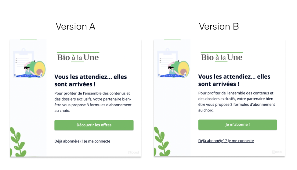
Results: Version B had a higher click-through rate amongst less engaged users, which suggests that these audiences respond better to a direct CTA phrase. Version A, which invites readers to discover subscription offers, performed better for more engaged users.
This was an interesting result, and one that highlights the importance of segmenting your audience before testing. In this instance, the publisher used Poool’s Dashboard to segment users based on level of engagement (Volatiles, Occasionals, Regulars and Fans) which gave insights into how these users respond differently to direct vs indirect wording on the paywall.
To further optimize your paywall performance and gain a deeper understanding of user behavior, you could also consider segmenting audiences based on location, device or even a user’s interests if you’re able to gather this information.
The takeaway: Just as the performance of a paywall will differ on your site compared to that of another publisher, this can also be said for one segment of your audience compared to another.
How to best determine the tests you need to run?
- Consider what makes a user convert
- Analyze data about content & wall impressions, including general analytics and more granular data
- But you can start with simple tests and learn as you go along
🧮 KPI = comparison of click-through and conversion rates between the two hypothesis (but, partly depends on what you’re testing)
3) Regularly modify wall design
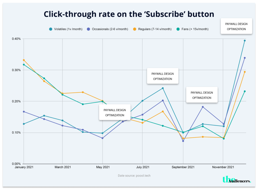
Poool research suggests that conversion rates plateau over time if no changes are made to your wall design. To reduce habituation, and reignite click-through and conversion rates, we recommend regularly modifying your wall design.
The graph below demonstrates this technique in action, where a publisher successfully increased CTR whenever they optimized or altered their paywall design.
Ideas of design changes:
- Adapt to seasons and national/international holidays, such as Easter, Christmas, etc.
- Alter design during sales
- Modify colors, CTA button placement, wording and key value proposition points
Above all – AB test!
🧮 KPI = Click-through rate
4) Employ a dynamic strategy
Personalization online has become an expectation for online consumers today, especially when market leaders such as Netflix take personalization to a whole new level (every user’s home screen, and even the poster image for each content, is adapted to their interests).
It’s therefore important to bear this in mind when building your user conversion journeys, and the best way to achieve this is through a dynamic wall strategy.
In short, this model involves segmenting audiences and building journeys that are adapted to the user’s profile or context.
For instance:
- Based on the user’s location
This could be in terms of language, promoting more ‘regional’ content in your premium value proposition or simply changing the currency.
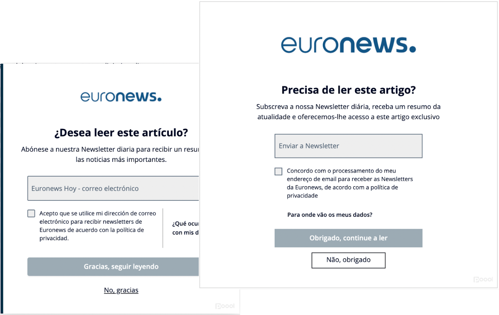
- Adapted to the content-type
This contextualizes the wall based on the specific content that a user is reading (e.g. sports), allowing you to attract this individual’s interests and adapt the value proposition points accordingly (e.g. watch live sports events).
- Based on device-used
The consumer experience differs greatly on desktop compared to mobile, so your conversion strategy should reflect this, employing different walls or journeys based on the device-used.
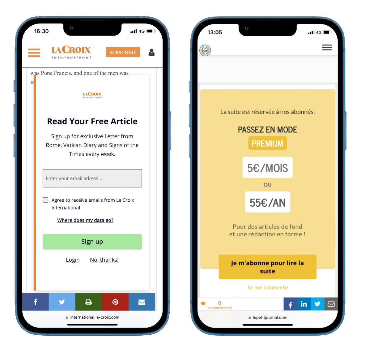
For instance, La Croix International understands that mobile conversion rates are significantly lower than on desktop, so the goal on mobile devices is simply to increase engagement and promote their premium offer, helping to increase propensity to subscribe on desktop in the future.
Whilst Le Petit Journal designed a paywall adapted to mobiles, using less text, a bigger CTA and placing the offers on the wall itself to reduce steps in the conversion funnel. Implementing this mobile-friendly design led to a 200% increase in conversion rates.
- Adapted to a user’s level of engagement
We’d recommend developing an engagement score that tracks recency, frequency and volume (RFV score) splitting your audience into 4 groups: Volatile, Occasionals, Regulars & Fans.
Volatiles are the least engaged and have a low propensity to subscribe, meaning your goal should be to increase engagement through soft conversion steps such as registration or newsletter sign-up (via a newsletter wall).
Fans on the other hand are highly more engaged in your content, meaning the frustration caused by your paywall will likely encourage them to convert rather than turn away.
This audience segmentation strategy is therefore hugely valuable to you – by adapting the journey to your user’s engagement level, you’ll be able to present the paywall at exactly the right moment, when you’ve found the perfect balance between frustration and engagement.
5) Soft conversion steps prior to the wall
Soft conversion steps, such as registration or newsletter sign-up, prior to a hard paywall can help optimize conversion rates through increasing user engagement (especially for your Volatile and Occassional audience segments).
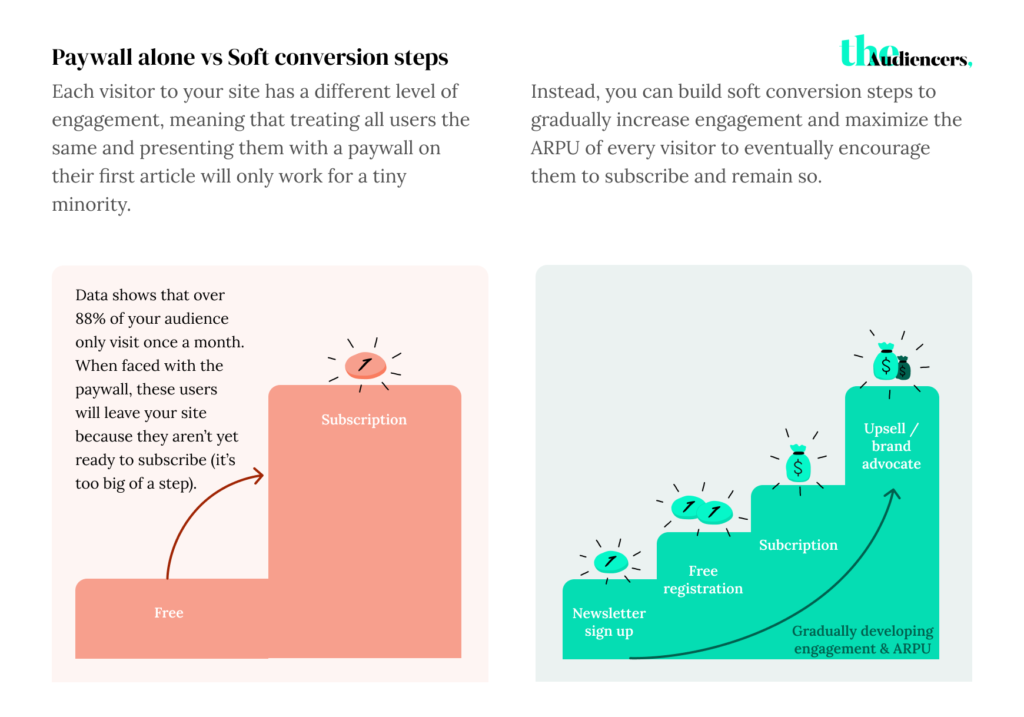
Instead of immediately asking for subscription, you lead users through an engagement journey to gradually increase their propensity to subscribe.
These soft steps, such as registration, also support your advertising model – by de-anonymizing your audience and collecting first-party data points, you can target ads and increase ARPU.
Registration:
Registered members who have created a free account on your website are 5-10+ times more likely to convert into a subscriber in the future, as proven by data from two of large French publishers below.
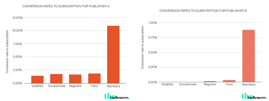
ELLE employed this strategy on their site to allow non-subscribers to discover premium content, helping to form habits around content consumption and increase engagement before presenting the paywall.
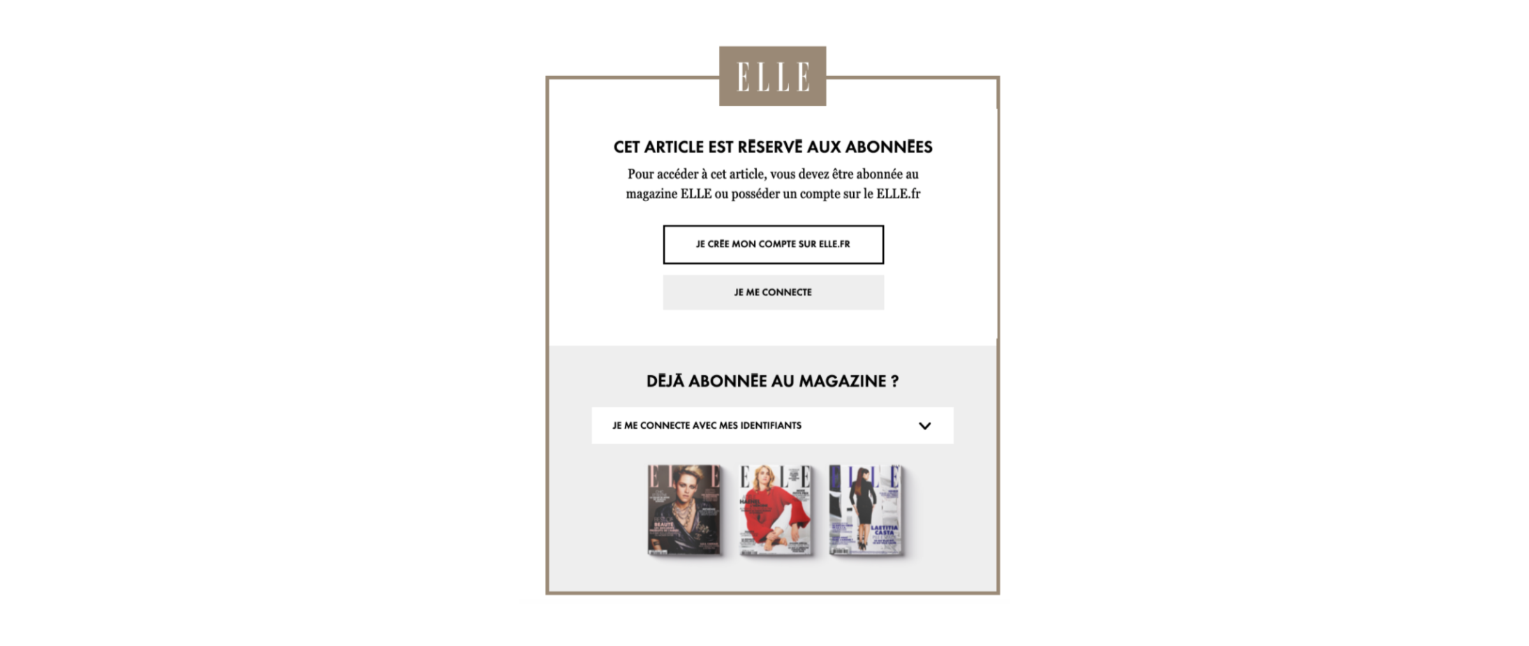
Registration also allows you to:
- Collect first party data
- Create custom reader IDs to gain a 360 view of your user
- Increase ad revenue through targeting
- Improve the user experience through additional value and personalization
Newsletter sign up wall:
This innovative strategy is hugely valuable for establishing content consumption habits, making sure that you become essential to their every-day life and increasing their propensity to subscribe.
It’s also a brilliant technique for lead generation, collecting important data points (including email address) whilst also boosting engagement through the newsletter. It’s even employed on the Poool blog, with a ‘no thank you’ option at the bottom to reduce the risk of frustrating users when faced with the wall.
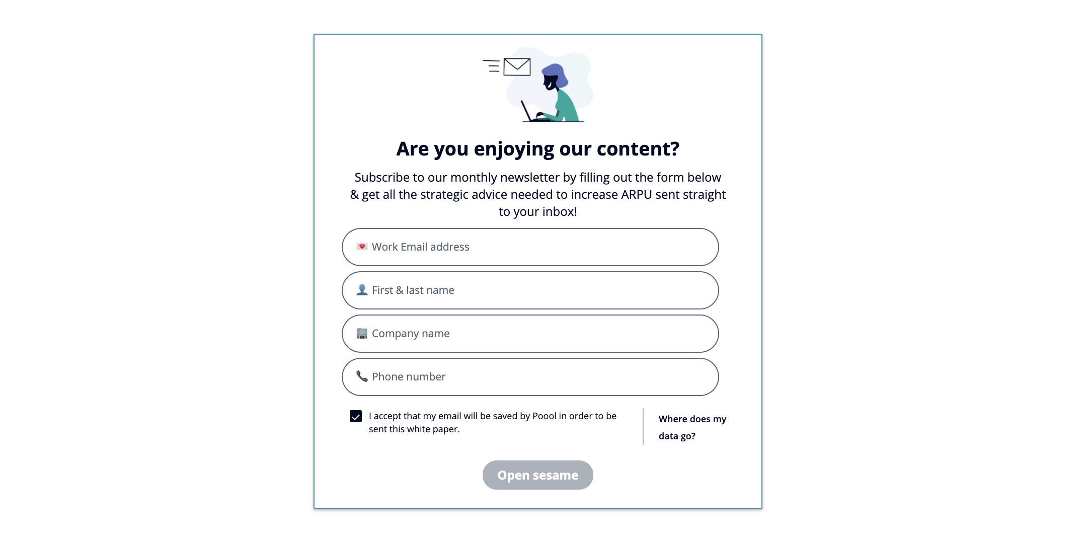
🧮 KPI = ARPU of paywall alone compared to soft conversion steps prior to the paywall.
However, note that leading users through an engagement journey is an investment and takes more time, but will pay off in the long run, including supporting retention/high CLV.
This is highlighted through ELLE’s A/B test:
The fashion and beauty magazine launched its digital premium strategy with a two-step conversion journey consisting of a registration wall followed by a hard paywall. This proved hugely valuable for increasing engagement and informing their audience of the concept of paying for access to content, but the team wanted to test a more direct approach to see if this led to higher conversion rates.
Hypothesis: A hard paywall will lead to higher conversion rates compared to a soft engagement journey.
Variable: User journey.
Goal: Increase conversion rates.
Control (version A): A two-step scenario with a soft conversion registration wall followed by a paywall.
Treatment (version B): A hard paywall alone.
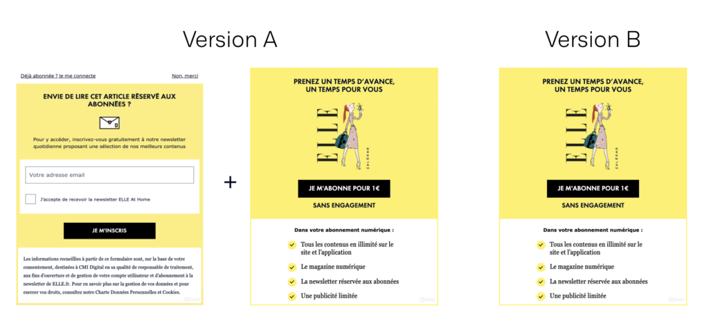
Results: Version B led to slightly higher conversion rates than version A. However, these results have to be taken with a pinch of salt…
Firstly, it is important to consider the stage of your subscription model. For ELLE, although version A worked extremely well for launching its strategy, collecting data and increasing engagement prior to subscription, version B performed better when this test took place, meaning their audience was perhaps more qualified and less likely to be frustrated by a hard paywall.
You also have to consider more than simply conversion rates as a KPI (key performance indicator) when altering your user’s journey, namely ARPU (average revenue per user). Considering engagement has a direct correlation with revenue, and that soft conversion steps such as registration walls increase user engagement, it is arguably more beneficial in the long term to employ a user journey such as version A, despite what these test results suggest.
Specifically, de-anonymizing a user through registration increases ad-based revenue thanks to targeting and also boosts propensity to subscribe (and increases the likelihood that this user will remain subscribed in the long run).
The takeaway: When looking at benchmarks, do not forget to consider the context surrounding them, take overall ARPU into account and remember that it is not only the paywall that influences conversion rates.
For instance, although ELLE did choose to employ journey B on all user segments, it also worked on increasing the visibility of premium content, reducing frustration by adding yellow tags on these subscriber-only articles as well as boosting engagement in other areas, such as by promoting their newsletter and membership offers. These efforts had a big impact on balancing frustration and engagement which ultimately support high conversion rates.
6) Integrate other steps of the funnel into the wall
With every step of the funnel, you risk users abandoning the process, especially when you lead them through multiple steps and require them to fill out numerous form fields.
To combat this and reduce the number of clicks/steps needed to subscribe, you can consider integrating some of these into the paywall itself.
Payment:
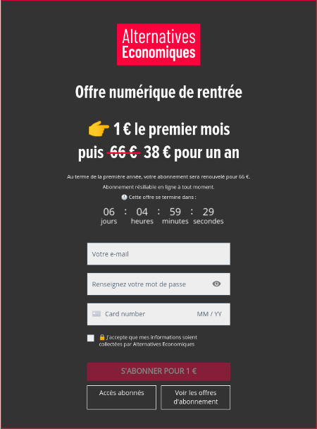
Alternatives Economiques collects payment directly in the paywall itself, making subscription easy and ensuring this vital step in the funnel is completed early on in the user journey. This led to a 40% increase in conversion rates.
Email collection/form fields:
Collect important data points in the paywall, such as email addresses. This way, any users who abandon the subscription process can be targeted by email to help convince them to convert (e.g. through special offers).
Offers:
Present your subscription offers in the paywall and allow users to select which offer to subscribe to, meaning you can remove a step from the funnel.
Hybrid wall:
Alternatively, take the approach of EBRA who employ a hybrid wall – promote subscription (with a subscription CTA button) whilst asking those who aren’t yet ready to subscribe to sign up to the newsletter (increasing engagement and propensity to subscribe).
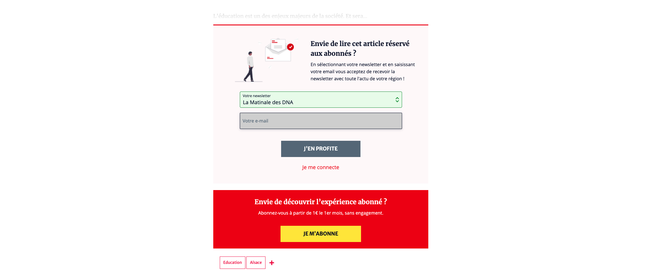
Another option you can consider is asking users to create a free account prior to the paywall, via a registration wall, in order to collect email address and name in advance. This progressive data collection makes for a smoother user experience and requires less effort from your audience.
🧮 KPI = click-through rate at each step of the funnel / drop-out rate at every step of the funnel.


