
Engagement, visibility and a touch of frustration; here’s a list of strategies to successfully convert your free registered members into paying subscribers.
1. Increase engagement
Successful conversions are all about balancing frustration and engagement. You can block members with a paywall all you’d like, but if they aren’t engaged, and if they don’t believe in your value proposition, they won’t convert.
Increasing engagement is therefore an essential part of moving free members down the funnel. Of course, this should be done through the classic techniques – quality content, a variety of formats (games, newsletters, app…) etc. – but you can also consider the below strategies, specifically for registered users.
Onboard new members
Just as you (hopefully) do for paying subscribers, you should lead new members through an on-site onboarding journey to deliver immediate value, increase engagement and personalize a user’s experience.
Importantly, they should be designed according to what a “valuable member” means to you.
The New York Times, for instance, recently implemented a new onboarding journey for registered users and it tells you exactly what’s valuable to their wider strategy.
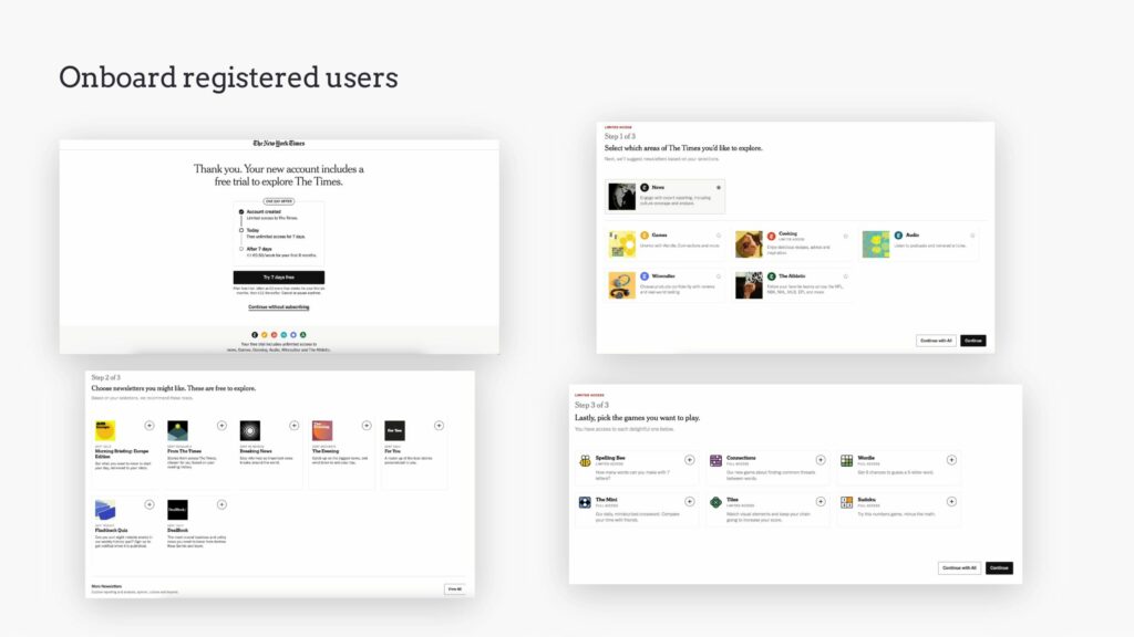
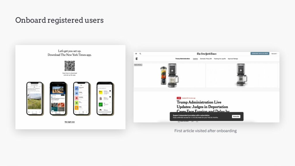
Based on this onboarding journey, it’s clear that for the NYT a valuable user:
- is engaged in multiple verticals – news, cooking, sport, audio, games, reviews
- is signed up to one or more of their newsletters, an important content format for building habits and bringing readers back to the site
- plays games, something proven to form habits and bring in new audiences (think of the Wordle trend, where those who didn’t play daily felt left out of conversations). Interestingly, they even added a “Go to games” link at the end
- downloads and uses the app
Plus, they’ve added a banner on-article to promote their paid offering directly after someone creates their account.
The lesson to remember: Onboarding is essential, but should be adapted to your audience – what features, content or benefits are the most valuable to you (often calculated based on engagement/retention)?
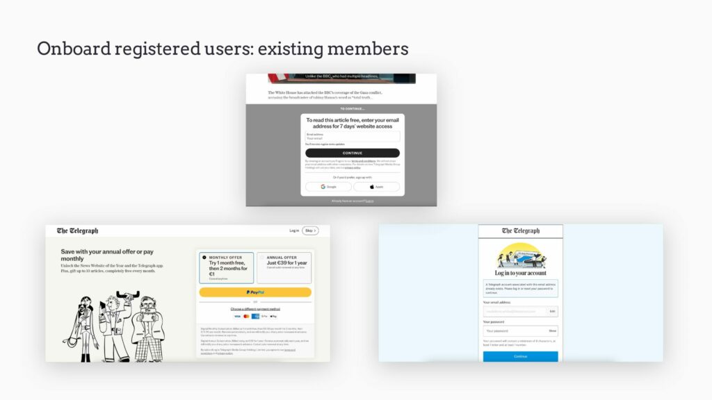
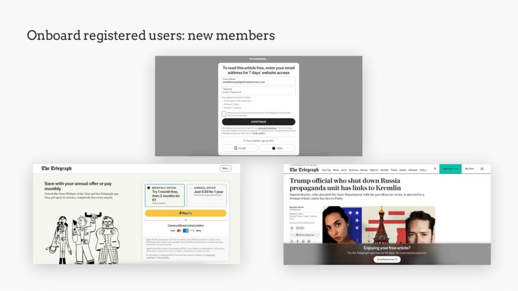
Ideally, you even have a different journey for existing members when they log in, vs. for new members, like The Telegraph.
Push highly engaging content and features
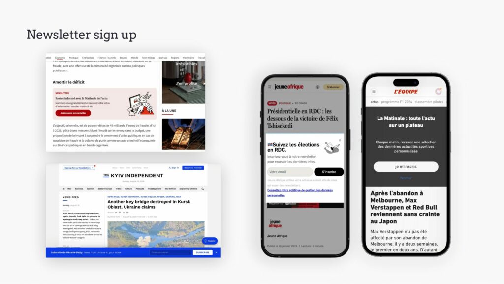
Banners, pop-ups, epics and content inserts can be used to promote products that increase engagement and retention amongst subscribers, such as thematic and habit-forming newsletters, content series, your app, audio, video, events, community spaces, etc.
For sleeper members, remind them about access
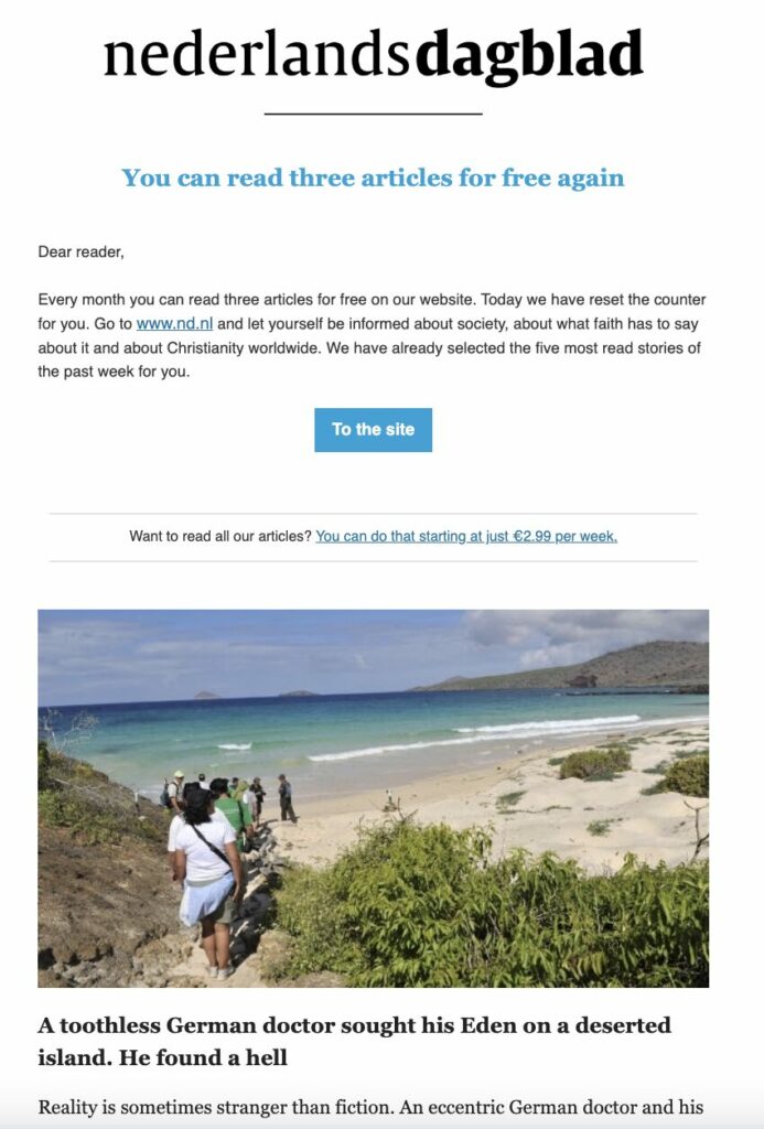
A month after creating an account on nederlands dagblad, members receive an email informing them that they have access to 3 articles again for free as part of their metered model. This strategy cleverly encourages less-engaged members to make use of their quota of articles for engagement.
2. Increase premium offer visibility
The decision to subscribe isn’t made in a day (as we well know!), it’s built up over time through continued value and engagement. But in order for this to successfully lead to conversion, you also need to educate users on the premium product itself – the fact it exists, the price, any special introductory offers you have, the product value, features and factors that reassure, such as “cancel anytime”.
These can of course be found on the subscriptions offers page, but this requires the user to come to you. Instead, you should gradually bring this information in front of the reader over time.
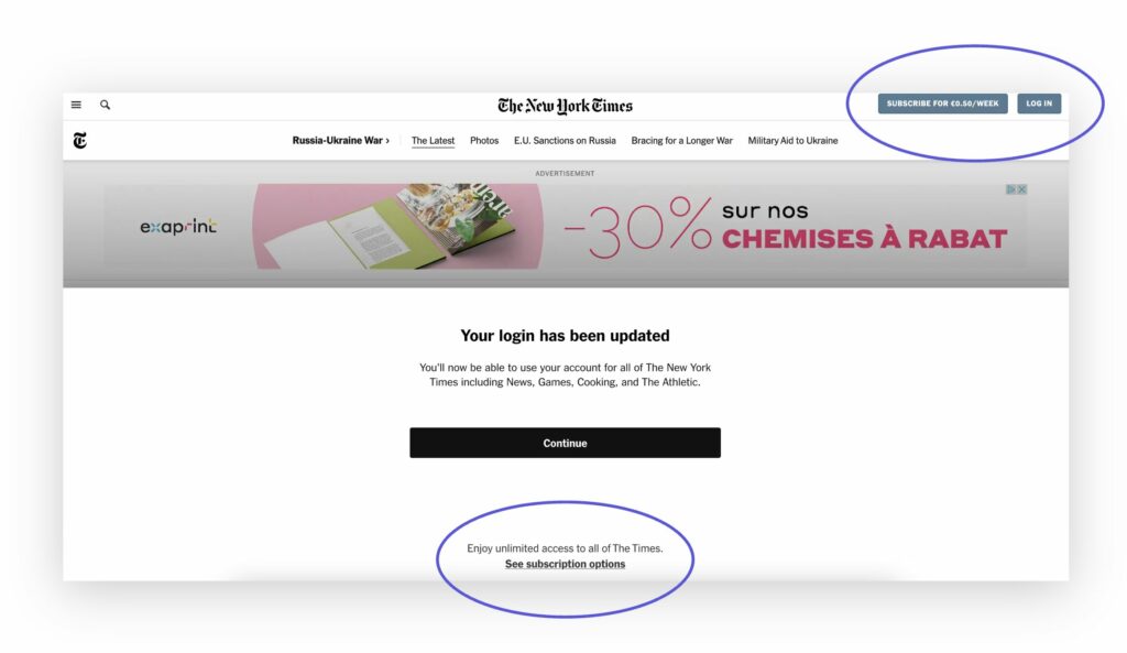
Promotional banners, pop-ups and paywalls can be included in this visibility strategy, but even simply having a “Subscribe” button in the header can play a role here.
The New York Times, for instance, even includes the price of subscription in the button. They’ve also added a short text and CTA in the registration journey, giving us easy access to discover their offers.
Employ a double wall – registration and paywall
Instead of a simple registration wall alone, many publishers have moved towards a double wall, promoting both subscription, for full access, or registration, for limited access. Again, the idea isn’t necessarily to convert readers into subscribers here, but to promote subscription and highlight the value of this product compared to the free one.
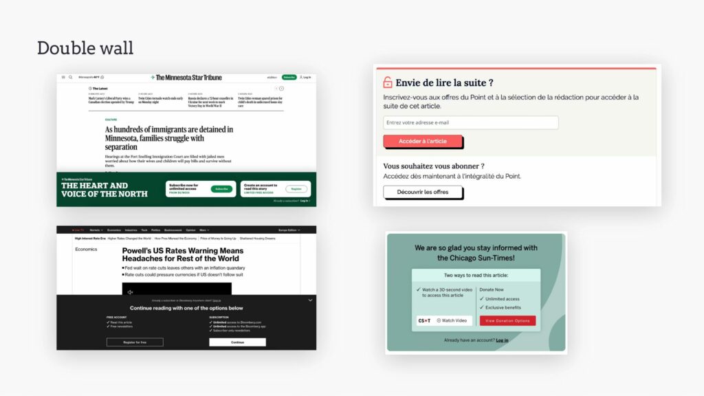
However, worth noting that one publisher we’ve spoken to found that putting these two options next to each other meant that there was too much choice for users.
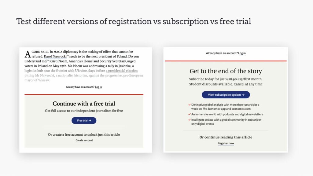
The Economist for instance has tested various options for this conversion moment, working out whether it’s best to promote registration, subscription or the free trial.
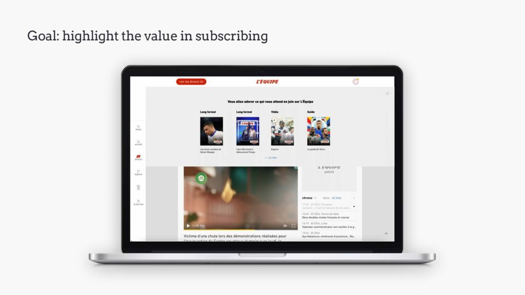
Highlight the value in subscribing
For instance during member onboarding, or whilst a reader is navigating the site.
The example below from L’Équipe, a banner showing what content is coming soon on the site, is displayed to subscribers for retention purposes, but could definitely be applied to the conversion strategy.
CTA on content
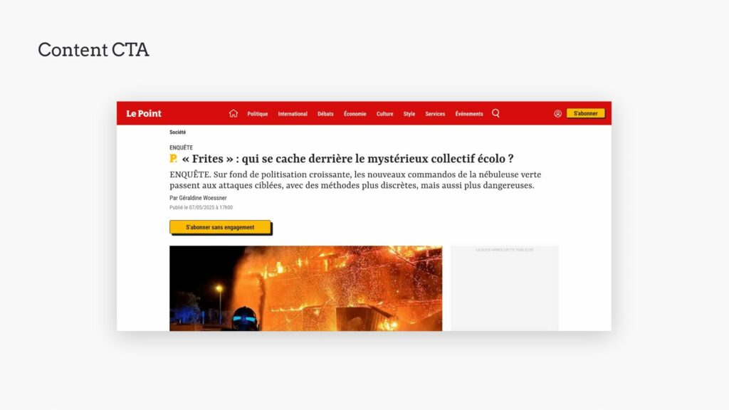
A less frustrating moment to convert is through a call-to-action above the fold on articles, like Le Point.
“Epic” at the end of articles
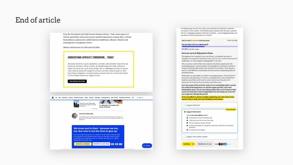
Learning from the likes of The Guardian, you could consider an end-of-article module to promote subscriptions at the end of free articles.
Homepage top banner
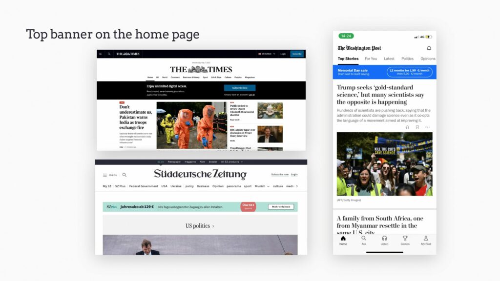
A classic for promoting subscriptions, but slightly less invasive than a bottom banner that needs to be closed.
Homepage bottom banner
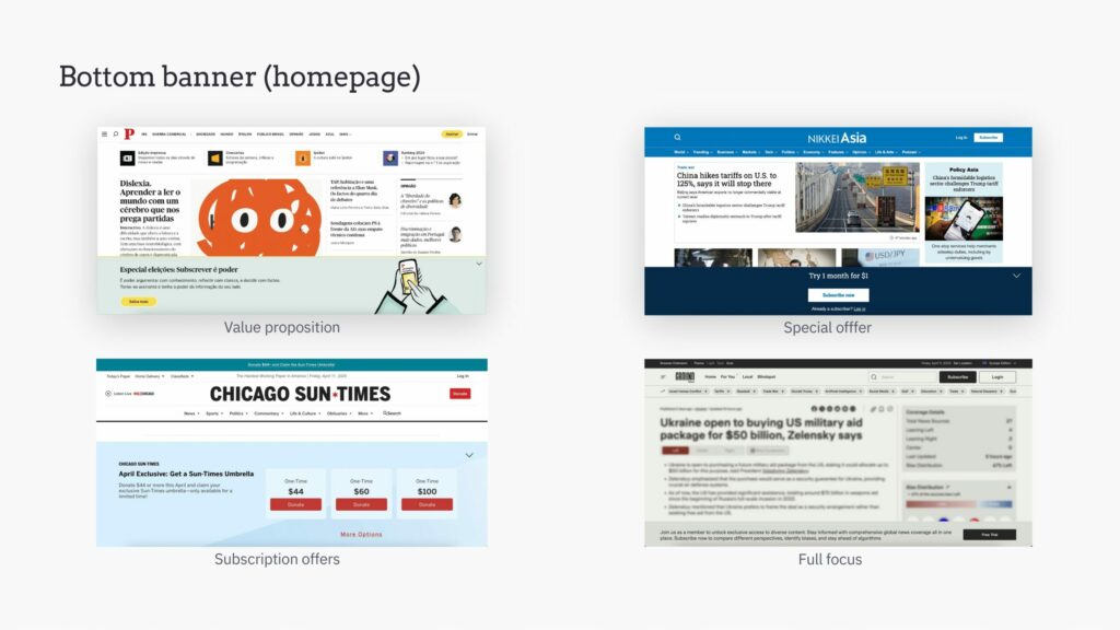
Foldable or closable banners are useful for promoting subscription, but should be timed and targeted to not frustrate the reader too much.
These modules often promote special offers or re-emphasize the value proposition, but for Chicago Sun Times this is a moment to present the subscription offers, reducing a step in the funnel and bringing the offers page to the reader.
Article bottom banner
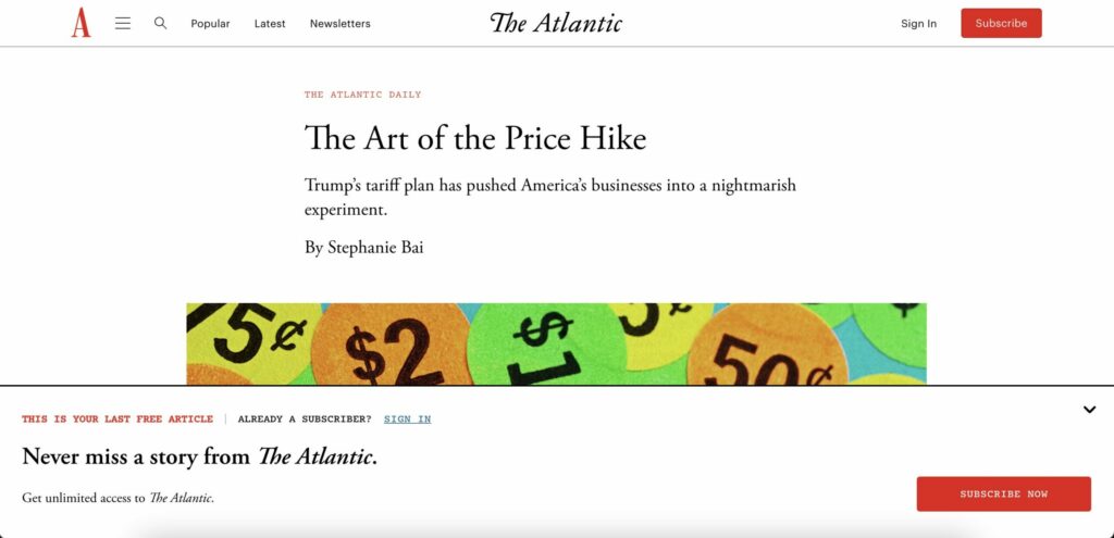
These banners can of course be placed on the article itself, especially for free content. Many publishers make use of this in a metered model to inform readers that they’re reaching the end of their quota of free articles.
Promotion in the menu
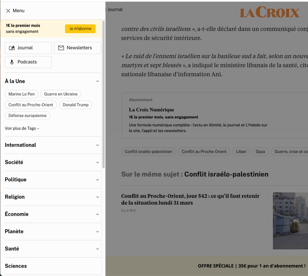
With a bit more space to add price, reassurance and maybe even a short value proposition point, the side menu bar can be a useful place to increase visibility of your premium product, like La Croix.
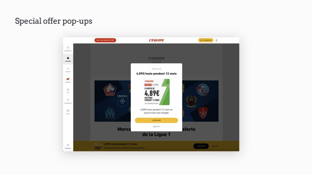
Special offer pop-ups
Alongside the classic pop-ups, consider special offers for registered members.
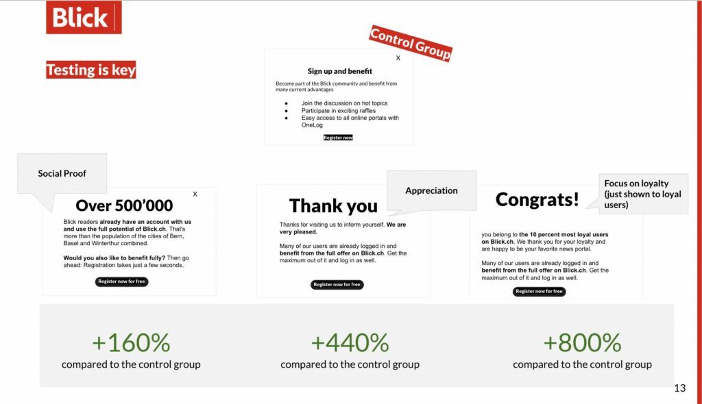
To go a step further, use targeted messaging for these readers. Despite being an example of converting anonymous readers into subscribers, Blick.ch showed how inventive and targeted you can be here, testing 3 different messages: one focusing on social proof, another saying thank you and a final version targeted to their most engaged readers, congratulating them on being in the top % of readers.
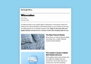
Link to premium content in free newsletters
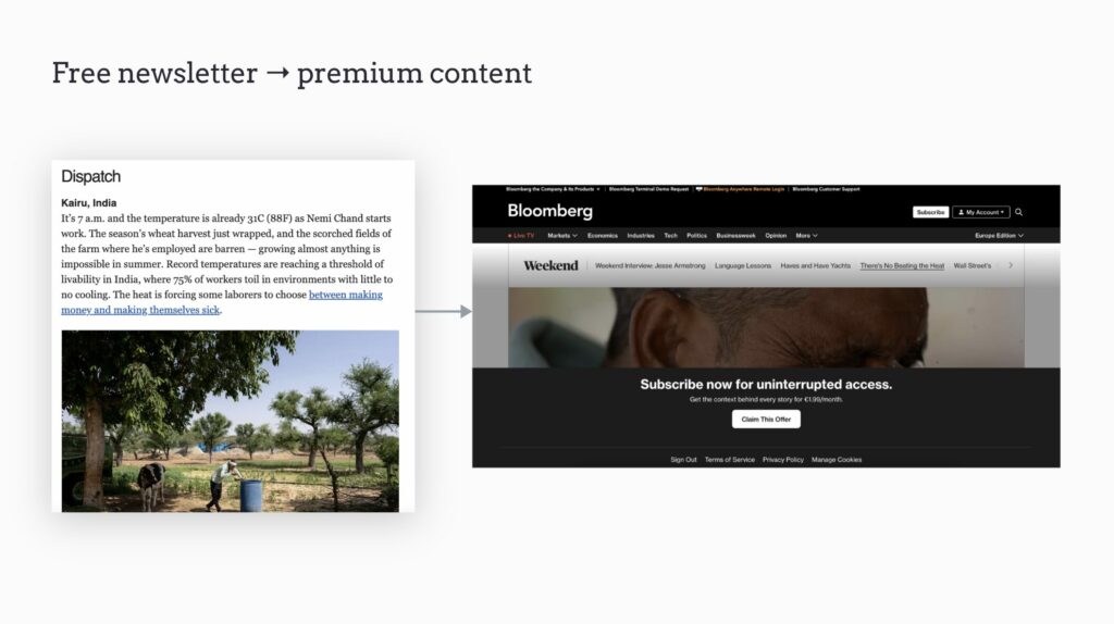
Free newsletters are a valuable way of engaging readers, building habits that bring them back to your site on a regular basis. It’s also a great opportunity to promote premium content.
Many publishers link premium content in the newsletter, providing a summary of the article without giving too much away. This provides a form of teaser, before the reader is blocked on the article on-site with a paywall.
Make premium features visible
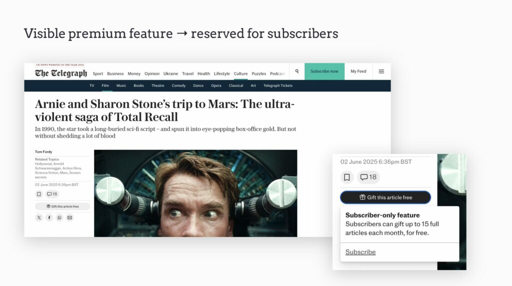
Whilst saving content for later, commenting, gifting articles or other UX features might be reserved for subscribers, you can keep these visible across the site to highlight the value of subscribing.
The Telegraph does this brilliantly, making use of the feature to promote its value to non-subscribers.
Offer trials and discovery passes for premium
Many popular e-learning and lifestyle apps, such as Strava and Duolingo, automatically move free members to the premium offer for a limited time, allowing them to discover the features and functionalities available to paying subscribers. After the trial ends, users have a better understanding of the advantages of subscribing.
3. Build relationships whilst frustrating slightly
Engagement is great, but it doesn’t pay the bills when the reader is browsing for free! Thanks to this engagement, you can frustrate the reader a little to convince them to subscribe. And, with all the data you have on this audience, you can build relationships through personalization and targeted experiences, making the subscription ask more convincing.
Promote subscriptions via a message from your team
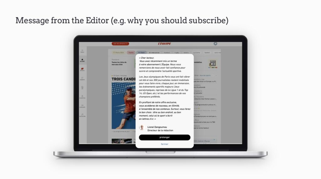
People connect with people, not brands, so putting your team at the forefront is vital for building during relationships with readers.
Although an example aimed at retaining subscribers who have cancelled their plans, this pop-up from L’Équipe’s Editor-in-chief could easily be applied to the conversion journey, explaining why someone should subscribe, what value is on offer and providing some insights into the journalists working behind-the-scenes to make their work possible.
Dynamic paywalls, personalized to a member
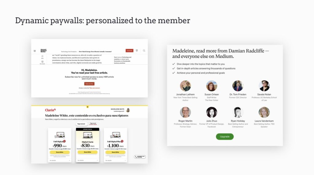
Targeting paywalls helps to directly address the reader and make them feel like the subscription is built for them. And this doesn’t even have to be anything too complicated – Harvard Business Review and Clarin for instance simply add the member’s name into the wall. Medium goes a step further by including the author of the article currently being read, as well as examples of similar authors.
Dynamic paywalls, adapted to level of engagement
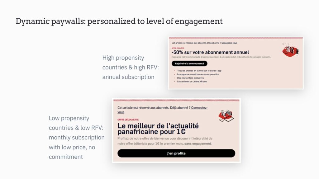
Paywalls can also be targeted to a readers level of engagement, something you’ll have plenty of information on thanks to the user being logged.
The example below is from Jeune Afrique, who tested various messaging and offers for each audience segment, finding that the optimal strategy was to group readers by location and engagement score.
Readers in low propensity to subscribe countries with a low engagement (Recency, Frequency & Volume) score were presented with a paywall that:
- Offered a €1 month trial offer
- Highlights the brand’s value proposition – who they are, what they stand for
- Aims to reassure the reader: “cancel anytime” “discovery offer”
- Includes the CTA “Make the most of this offer”
Readers in high propensity to subscribe countries, with a high engagement score were presented with a paywall that:
- Offered a 50% reduction on an annual subscription
- Includes the CTA “Join the community”
- Listed the benefits of subscribing (these readers likely already know the brand’s value proposition. They’re already engaged, and want to know what else they can have access to)
Dynamic paywalls, adapted to content type
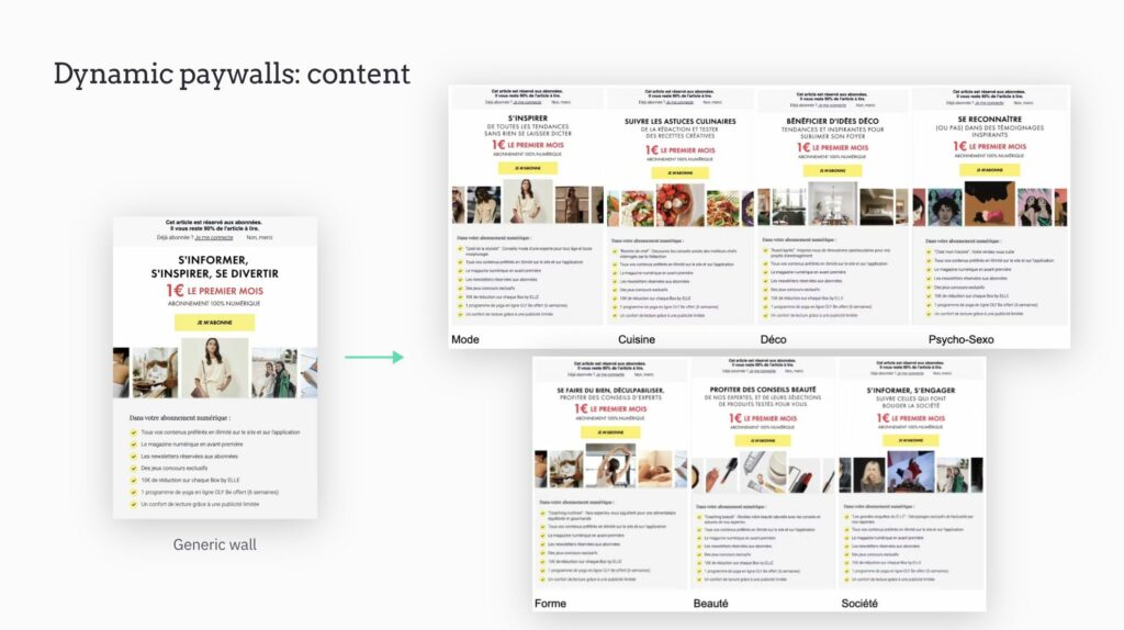
Adapt the messaging, images and first few benefits of subscribing to the content type, highlighting to the reader that your subscription product is adapted to their interests.
ELLE Magazine increased conversion rates by 20% with this contextual paywall strategy, building 7 targeted paywalls with Poool to cover cooking, fashion, design, psychology-relationships, sport, beauty and society.
Dynamic paywalls, adapted to user status (ex-subscriber)
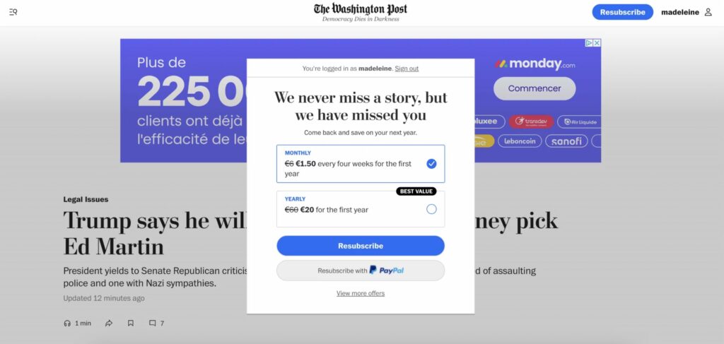
Ex-subscribers who are still logged can be easily targeted with dedicated messaging and offers. The Washington Post’s unique pop-up for ex-subscribers is an inspiring one!
Abandoned cart pop-up
A strategy that has been normalized in the e-commerce industry but not used enough by publishers is that of cart abandonment. Whether a user doesn’t finish the subscription process, or simply visits the offers page but doesn’t subscribe, you can consider a pop-up or email to bring them back.
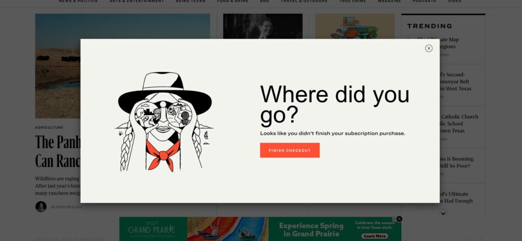
This example from Texas Monthly is great, but you can go further by highlighting the value proposition, a benefit of subscribing, reassuring the reader or offering a discount/trial.
Streamlined subscription process
An obvious one, but make sure subscribing is effortless! You can pre-fill form fields, and offer popular payment methods (e.g., PayPal or Apple Pay) based on the user’s location for instance.


