
France is the latest country to announce new “Click to cancel” provisions that are making it easier than ever for consumers to terminate unwanted subscription payment plans for everything from cosmetics to newspapers to gym memberships. Alongside tightening cookie regulations, these changes go a long way towards better protecting consumers and preventing deceptive business practices.
And, whilst many may assume that these regulations interfere with digital reader revenue efforts, there is increasingly more proof that making unsubscription easier won’t necessarily damage publishers’ revenue. In fact, on the contrary, some who have already moved in this direction have experienced an above industry average level of growth, including an increase in subscriber retention and customer satisfaction.
3 clicks to cancel: what’s changing in France?
A new regulation was recently introduced concerning the termination of contracts in France. Specifically, the “termination in 3-clicks” law requires that we should always be able to end a contract 1) online and 2) in 3-clicks or less. This applies to any business to consumer contract, including electricity, gas, mobile and internet providers, transport companies, gym memberships and subscriptions to any media or press brand.
The law outlines the user cancellation process, click-by-click:
1st click: “Firstly, the consumer clicks on the “Cancel my contract”. This button must be easy to find and understand. Any other wording used for this function mustn’t include any ambiguity.”
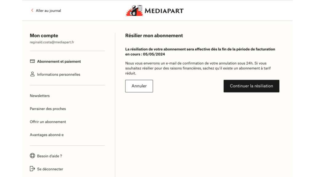
2nd click: “After this step, the consumer is taken to a page summarizing their terminated contract. They should be able to verify the information and, if needed, make any necessary changes.”
3rd click: “Finally, the consumer must be able to confirm the cancellation by clicking on a button or link “Confirm contract termination”… this must be directly accessible from the page summarizing the terminated contract.
The company should then confirm the reception of this cancellation and specify the date from which the contract is no longer valid.”
How have publishers in France been responding to this legislation?
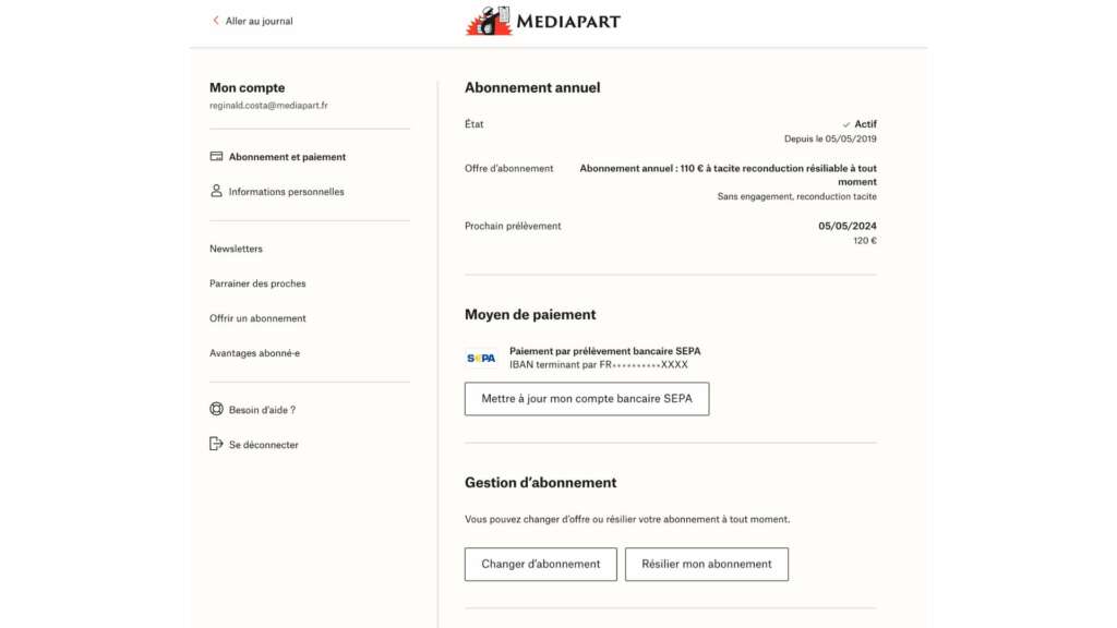
Reginald Costa, Product Manager at Mediapart, an independent French investigative online newspaper, kindly reached out to share their experience on building an unsubscription journey that both abides by the restrictions in France and supports high levels of retention:
We had proposed a simple unsubscription journey as early as the end of 2016, only to backtrack, thinking we weren’t equipped enough to proactively monitor cancellations. And also out of fear of uncontrollable waves of online cancellations.
At the start of 2019, when we redesigned our tunnels, we came back to this issue. Having greatly simplified and shortened our subscription path, we didn’t think it fair not to offer an equally simple and short cancellation path.
Especially since, during user tests, some non-subscribers cited the alleged complexity of unsubscribing as a reason for not subscribing.
We took the gamble that the user experience was paramount, and that a subscriber who can leave without friction and frustration will be more likely to return. This feature has been marketed to as strong, reassuring argument in the subscription process – we almost always write “cancel online at any time”.
And so far it’s been a winning bet at every level, including for our subscriber customer service lines, which used to receive numerous calls and emails asking how to cancel.
Reginald Costa, Product Manager at Mediapart
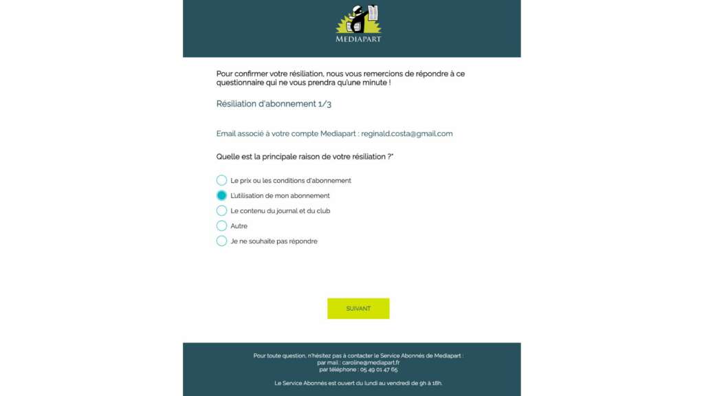
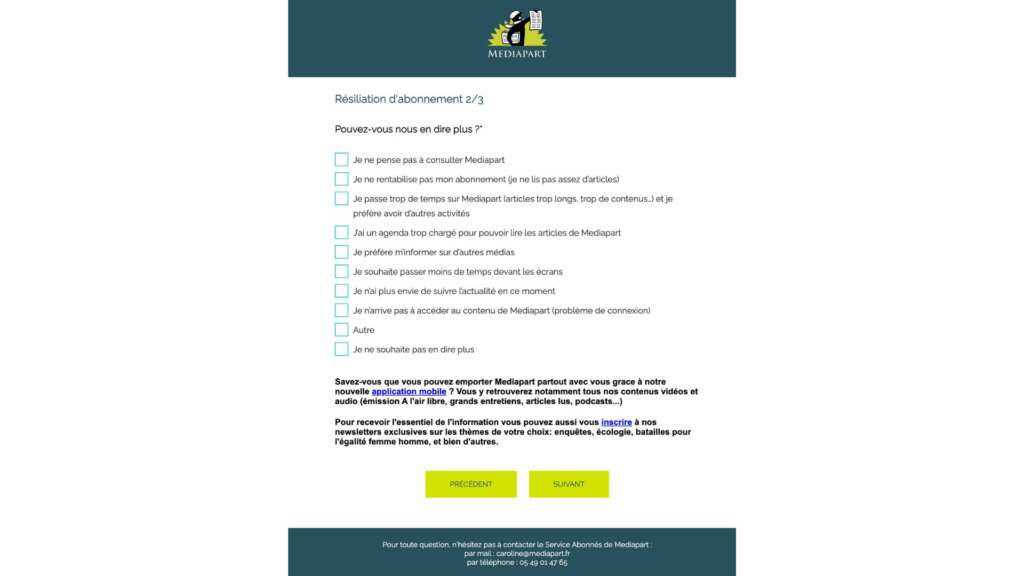
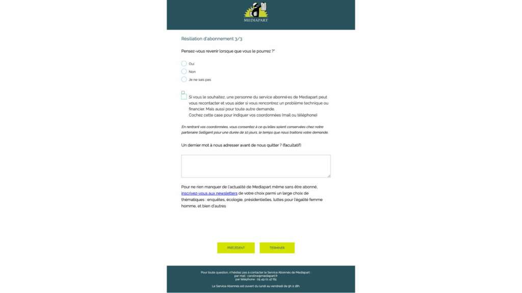
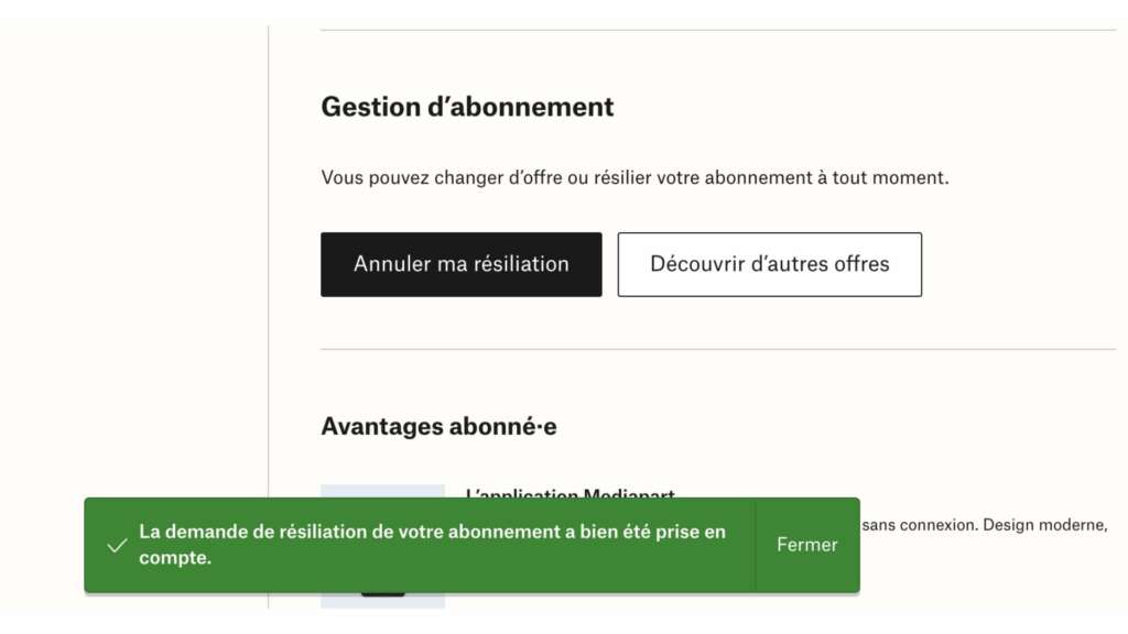
The user unsubscription flow on Mediapart:
Click-to-cancel in the United States
There’s been a lot of talk about “Click-to-cancel” in the states, with the Federal Trade Commission proposing a formal rule in March to offer straightforward self-service subscription cancellation:
Specifically, “if you can sign up online, you must be able to cancel on the same website, in the same number of steps,” according to the FTC. Sellers must also “take ‘no’ for an answer” instead of continuing to pitch new offers when customers call to cancel a subscription.
“These companies are betting that customers will be too impatient, busy, or confused to jump through every hoop,” FTC chair Lina Khan wrote about the proposed rule.
To cement their standing on the subject, the FTC recently sued Amazon, accusing them of using deceptive practices that make cancelling subscriptions intentionally difficult for consumers, enrolling consumers in Prime without consent. An FTC chair pointed to “manipulative, coercive or deceptive user-interface designs know as ‘dark patterns’ to trick consumers into enrolling in automatically renewing Prime subscriptions.”
Reuters has talked about these so-called “dark patterns” before:
“Dark patterns are manipulative or deceptive practices built into user interfaces by developers that have the effect, intentionally or unintentionally, of obscuring, subverting, or impairing consumer autonomy, decision-making, or choice. Dark patterns are often carefully designed to alter decision-making by users or trick users into actions they did not intend to take.”
Common examples of dark patterns include:
- Bait and switch: when information says one thing and a different action takes place upon clicking
- Hidden costs: the cost shown is different initially but increases as the buyer moves ahead with payment
- Triggering fear: when a user is asked not to opt-out of a subscription or feature as it can lead to negative consequences
Arguably, by making unsubscription more difficult than it needs to be, such as by adding in dark patterns or making it necessary to phone customer service in order to cancel, publishers are actually shooting themselves in the foot rather than increasing retention rates. Even if the reader may have been tempted by a reduced offer or month of subscription on-the-house, they’re so frustrated by the cancellation process that they’re put off the brand altogether.
For example, an ex-subscriber to The Arizona Republic told Nieman Lab:
“My wife wanted to go from twice a week to full seven days. Can’t do it by email with Republic. Told we have to call. Number to call seems to be regional phone center, constantly busy. Called Republic directly but were told to try to call earlier in the morning and maybe the call center wouldn’t be so busy. Always busy. Tried sending a letter to Republic, no answer. Tried sending letter to billing center, no answer. Finally went to bank and had auto withdrawal for monthly subscription canceled. Only response from Republic was that payment request was denied.”
Thomas Baekdal discussed this in his recent newsletter:
If you create an annoying canceling experience, like forcing people to ‘call us’ (which is now illegal in many places), you can turn an already bad situation much worse. For instance, if people are merely bored and you annoy them as they cancel, you push them into a “pissed off” mode instead.
You don’t want to ever do that. In fact, every single thing we know about churn indicates that the better the experience people have canceling, the more likely they are to either not churn if given the right incentive, or come back later.
So, you need to be incredibly helpful and respectful to mitigate churn.
To evidence this point, The Minneapolis Star Tribune found that allowing online cancellation, as it started doing in December 2021, hasn’t resulted in more cancellations. Instead, it may actually be helping the paper keep more of its subscribers who are on the fence. The Star Tribune’s “total online save rate” is 18.5%, while the “call center save rate” — where you have to talk to a person who tries to persuade you to stay — is only 8.8%.
Making it easier to leave convinced more people to stay in Norway
Norwegian Consumer Protection Authority determined that “it should be as easy to end a subscription as it was to subscribe in the first place”.
So, to adapt, the Norwegian newspaper Aftenposten made the unsubscription user journey shorter than ever – reducing the number of steps from 5 to 3, cutting all unnecessary steps and questions that might confuse subscribers and, contrary to all intuition, they made the cancel button available on subscribers’ “My page”, meaning it is visible to them at all times in their account.
The subscriber cancellation flow:
When initiating their cancellation, subscribers are first met with information that they’re sharing their subscription with a friend and that their friend will also lose access if they cancel. (This only applies to those subscribers who share their subscriptions.) We know from previous analysis that this is a strong incentive to stay.
In the next step they will immediately be exposed to the holdback offer: “Can we convince you to stay with us for a little while longer?” The offer we’ve seen the best results with, in terms of volume, retention, and income is three months for the price of one. They are then presented with two choices: stay or continue unsubscribing.
If they continue, they are asked to choose between four reasons for their cancellation, amongst them an unspecified option to reduce the mental load, and afterwards, they get a confirmation.
This has actually had an impressively positive impact on their revenues: in six months, over 5,000 subscribers have been convinced to change their mind after starting the cancellation process, accounting for an estimated €320,000 (or US$344,000) in yearly revenues.

