

Most paywall strategies focus on optimisation. But the real question is: what system are you asking users to join? 
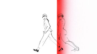
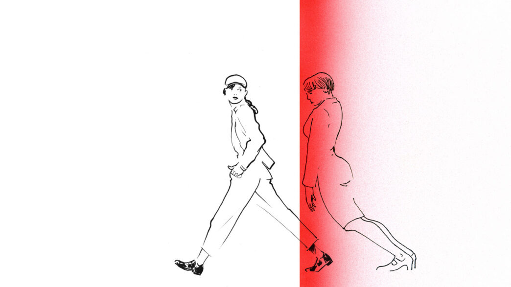
The wall doesn’t create value, it reflects whether it was there to begin with.
For over a decade, the paywall has been the most visible signal of value in digital publishing. It’s where revenue meets retention, where UX meets editorial judgment and where the funnel becomes measurable. Teams debate how high it should be, how wide, when to trigger it and what language best converts.
But in most cases, the wall is being asked to carry more weight than it can support. Not just tactically, but structurally.
It’s become a proxy for product definition. A boundary drawn before the shape of what’s inside has been fully designed. And that’s where the model starts to break down.
The structure underneath the paywall has collapsed
The original paywall logic was born in a world with linear journeys and repeat behaviours. People started at homepages, navigated by section and stayed long enough to feel tension when access was blocked.
A metered wall worked because it interrupted something familiar. The user had already seen enough to understand what they were being asked to join.
That world has eroded.
Modern audiences arrive sideways. From a headline in a WhatsApp chat, from a push alert, from a summary generated by an AI interface, from someone else’s feed.
They arrive mid-journey, sometimes mid-sentence, and exit before any continuity forms.
And yet the paywall still sits in the same place. It assumes orientation. It assumes memory. It assumes value has been seen, even when the structure behind it hasn’t been felt.
But here’s the deeper risk:
The wall doesn’t just block. It reveals. It shows whether the system behind it actually has weight.
What comes before the wall
Piano’s Subscription Performance Benchmarks 2024 report notes that users who visit via multiple referrer types (i.e., repeat visitors from several channels) show significantly higher conversion rates, emphasising the power of recurring engagement.
It’s a quiet but important signal: the more surfaces a product shows up on, the more likely a user is to feel it belongs in their routine.
When someone keeps returning through different doors, it’s not because of a headline or a prompt. It’s because something clicked. A tone, a rhythm, a feeling of presence. The product didn’t just appear. It registered.
This is what most paywall logic misses. Conversion isn’t sparked by urgency. It’s shaped by repetition. And not just repetition in timing, but in the kind of value that becomes recognisable, regardless of entry point.
The wall is often treated like a destination. But more often, it’s a reveal. And what it reveals is whether a structure already existed.

Orientation, not access, is what anchors modern subscription decisions
The idea that people subscribe to get more content is an increasingly fragile assumption.
Most users aren’t lacking access. They’re lacking shape.
They want a product that helps them stay in the loop without drowning. They’re scanning for cues of stability. For a voice they can come back to. For a pace that mirrors their day.
Common (but weak) paywall messages:
- “Support quality journalism”
- “Get unlimited access”
- “Subscribe for less than €1 a week”
These promise volume. But orientation isn’t about how much. It’s about how clearly the product tells you what it is. And that clarity doesn’t come from slogans. It comes from rhythm.
Subscription cues at The Guardian come after orientation, not before
The Guardian’s 2025 app redesign is one of the clearest examples of system-level thinking before gating.
Open the app, and before you’re asked to subscribe, you’re introduced to a sequence.
No wall. No pressure.
Each format scaffolds a rhythm. Each one reduces the cognitive load of returning. Each one subtly teaches what kind of experience this product delivers.
The daily rhythm becomes a low-friction orientation layer that reduces overwhelm before the user even decides what this product is to them.

Conversion is a reflection of product memory, not pricing friction
Many paywall strategies are built around a metaphor that the wall is a moat. It defends the castle. It controls what’s valuable and who gets access.
But a moat only works if the structure inside has gravity.
Most digital news subscribers pay because the experience is predictable and useful and not because the content is locked away.
If people bounce, it’s not because the price is too high. It’s because they don’t yet know what they’re being asked to join.
A weak product with a strong wall doesn’t convert. It confuses.

Some products teach value before they ever ask for it
Visit a typical local news site, and the journey often ends before it starts.
No onboarding. No repeat formats. No cues. A user arrives via Google, reads one article, scrolls and hits a wall. The ask is clear. But the experience isn’t.
And it leads to one outcome: exit.
Let’s contrast that with systems that teach value long before they charge for it.
The Athletic
Doesn’t just publish sports content. It sequences behaviour around matchdays. Previews. Live coverage. Post-game breakdowns. The cadence mirrors the fan lifecycle. The wall doesn’t introduce value. It simply confirms the structure that’s already in motion.
Substack
It’s not the paywall that convinces readers. It’s the voice, the regularity and the sense of presence. The subscription comes after the relationship, not before it.
Zeit Online
Zeit groups topic explainers into structured clusters under themed verticals. It’s not a scroll. It’s a sequence. Most articles are accessible without any subscription, but they include Z+ exclusives for when the reader wants to go deeper. Gating works because structure has already taught the logic.
What your paywall actually says about your product
When a user reaches your paywall, they aren’t simply deciding whether the price is fair. They’re asking:
- Do I know what this space does for me?
- Can I predict what I’ll get tomorrow, or next week?
- Do I trust that this fits how I consume?
- Is there something here I’ll miss if I leave?
If they haven’t been answered before the wall appears, no CTA will solve that. No prompt can patch absence.
Questions to take into your next paywall strategy session
- Where does rhythm begin in our product journey?
- What habits do we reinforce and how soon?
- What recognisable loops or formats are in place?
- What is the wall actually confirming and what is it exposing?
- Can we describe what a subscriber belongs to before they pay?
Signals to listen for inside your org
- Are standups focused more on paywall tweaks than product return paths?
- Can anyone describe the daily subscriber experience in two sentences?
- When we say “value,” are we talking about stories or systems?
Don’t optimise the gate until you understand the garden
The paywall is not your product. It never was.
At its best, it’s the outermost layer of a well-formed system. A system that builds rhythm, memory, identity and return.
If that system is strong, the wall becomes a moment of confirmation.
If it’s weak, the wall becomes the end of the journey not the beginning of one.
And no amount of testing can fix what the product never made clear in the first place.