
Mobiles bring a whole world of possibilities for your publication – it’s your opportunity to be with your reader at all times and potentially grab their attention whatever they’re doing. So how do you maximize this potential and increase reader engagement on mobile apps?
Here are 6 techniques with examples from some of the best in the business.
Choose your edition
Do you have readers in different continents? Or maybe articles in other languages? Let your readers choose which edition they’d like on their app.
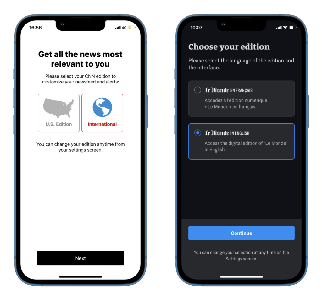
Le Monde, the French newspaper, has an English edition. Upon arriving on the app, we’re asked to choose between the two versions.
Whilst on CNN, in the U.S., we’re offered the option of a newsfeed focused on the U.S. or international stories.
Customized alerts
Push notifications and alerts are one of the best ways to keep readers coming back for more. Thanks to the app, your content is always available in their pocket, you just have to give them a reason to open the app.
However, you can frustrate readers if you notify them too much, and with alerts that don’t interest them.
The solution? Ensure alerts are personalized to the reader’s interests.
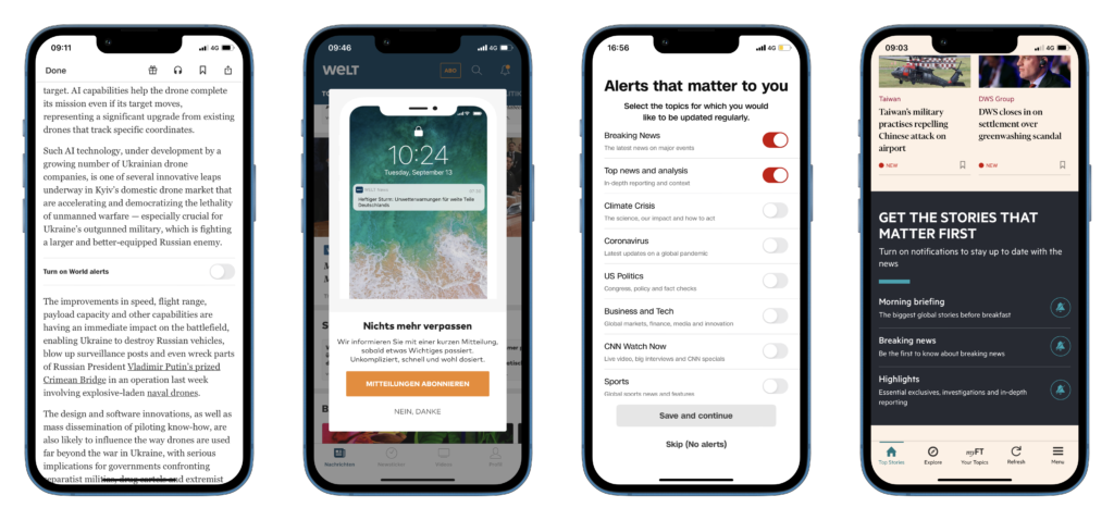
The New York Times integrates small modules into articles, offering readers the chance to activate alerts related to that specific topic. Here, “World” alerts. Activating these only requires a single click.
Welt displays a pop-up upon arriving on the app, asking us to activate alerts or pass, with a supporting image showing what “activating alerts” will look like.
CNN goes a step further with a pop-up that lists the various topic alerts that a reader could activate. “Breaking news” and “Top news and analysis” are automatically activated, but this can be undone in 2 clicks.
On the Financial Times app, they’ve integrated a module into the home page, allowing readers to activate notifications. This module is in a different color, dark grey with white text, to stand out from story blocks, with a value proposition that tells us why we should complete this action – to be the first to hear about the stories that matter – and bell icons to reflect the action of receiving notifications.
On-app onboarding
Just like SaaS product tours, you should introduce your reader to the app, it’s features and encourage them to activate anything that’s valuable for increasing engagement.
However, we’d recommend keeping the onboarding process short, interactive, and visually appealing, perhaps saving some personalization or onboarding steps for later in the user’s journey, such as when they try to access pages or activate features.
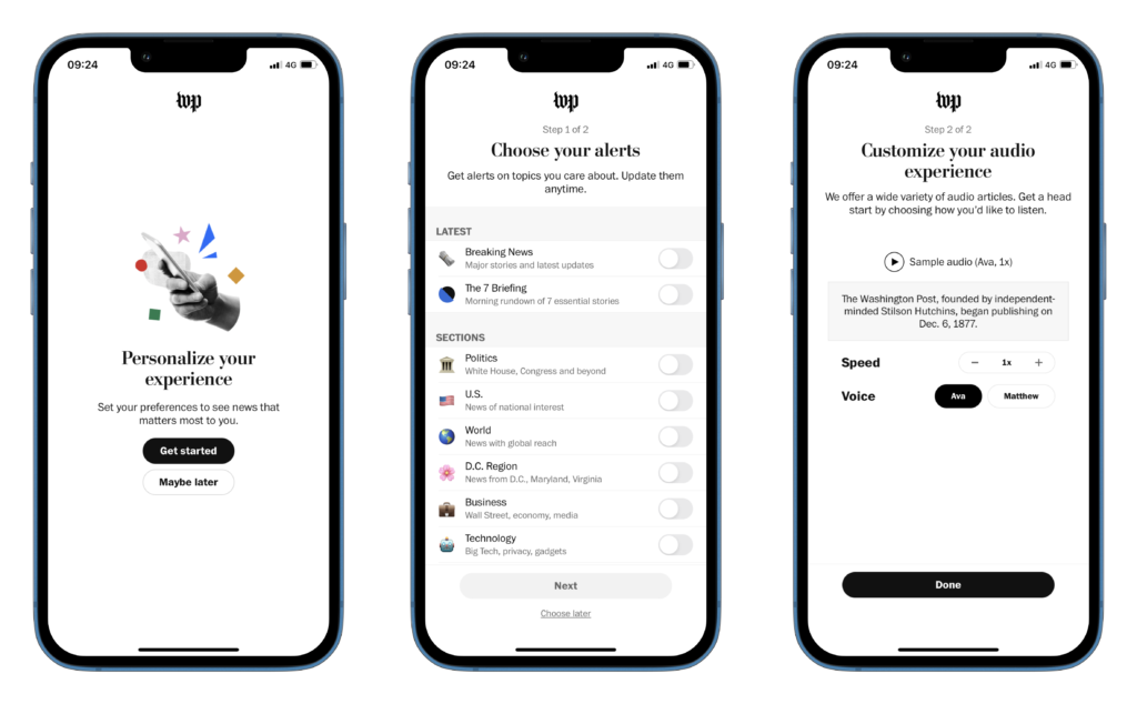
On The Washington Post app, we’re first offered the option to pass through the onboarding steps or not.
Step one allows us to choose our alerts, each with its own emoji, the perfect way to illustrate the different sections for mobile-readers who are used to these visuals. Alerts can be activated in a click and there are plenty of options to appeal to each reader’s interests.
Step two is a unique one, introducing us to their “audio article” feature and allowing us to adjust the speed and voice to our liking. Audio articles, often generated by AI, are a valuable way to increase engagement for a variety of reasons according to this article on FT’s Medium page:
- Embracing and building habits – “We found that the most popular reason why subscribers listen to audio articles is the ability to multitask. By enabling hands free content consumption and multi-tasking, audio articles allow users to consume content in situations where they don’t usually have the option to read”
- Responding to users’ time pressure – “The great thing about audio articles is that they don’t necessarily compete with other activities. By removing the need to look at a screen, users can listen to stories while they go on about their days. So without spending more time or compromising on existing routines, audio articles allow users to get more value from their subscriptions.” – this is perhaps even more prominent when it comes to consuming content on mobile
- Driving incremental content consumption – “Our data shows that allowing users to listen to articles does not cannibalise on reading. On the contrary, we found that it adds to their content consumption overall”
- Attracting young audiences – “Research findings suggest that audio (articles) can be a useful tool in building relationships and attracting young readers in particular.”
- Improving accessibility – “In the UK, there are over 2 million people who are living with sight loss, 340,000 of these are registered blind or partially sighted. Providing the ability to listen to articles will help visually impaired subscribers and allows us to reach and engage a larger audience overall.”
Some best practices for these onboarding steps:
- Reassure: “Update them anytime”
- Offer options: “choose later” link at the bottom of the page
- Communicate the onboarding journey: “Step 1 of 2”
- Consider which engagement actions are the most valuable to your business by analyzing existing, loyal app users with high frequency and volume of visits. Do they have push notifications turned on? Do they listen to their content rather then read? This will help you define the most valuable onboarding steps to prioritize
- On each page: a short, succinct title with a form of explanation or value proposition, explaining exactly what this step involves and why a reader should complete the action
- Minimal actions (clicks, scrolls, form fields) needed to complete this step
Download or queue content
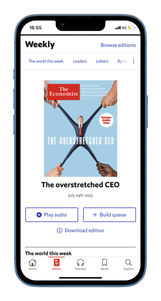
One of the 4 main reasons why people don’t pay for news (according to a study) is time. However, as readers pretty much always have their phone in their pocket, there’s a few ways in which you can ensure your content still gets consumed:
- Save content for later, building a queue or a reading list
- As mentioned above, audio content is a great way to allow readers to listen to your articles whilst completing another task
- Download content, whether that be audio or text. I’m not sure about elsewhere in the world, but this is vital for the UK where you can’t get signal whilst on the tube in London. By allowing app users to download your content, you’re filling time in their morning commute that they can’t fill with social media or messaging
Customizable homescreen and topics
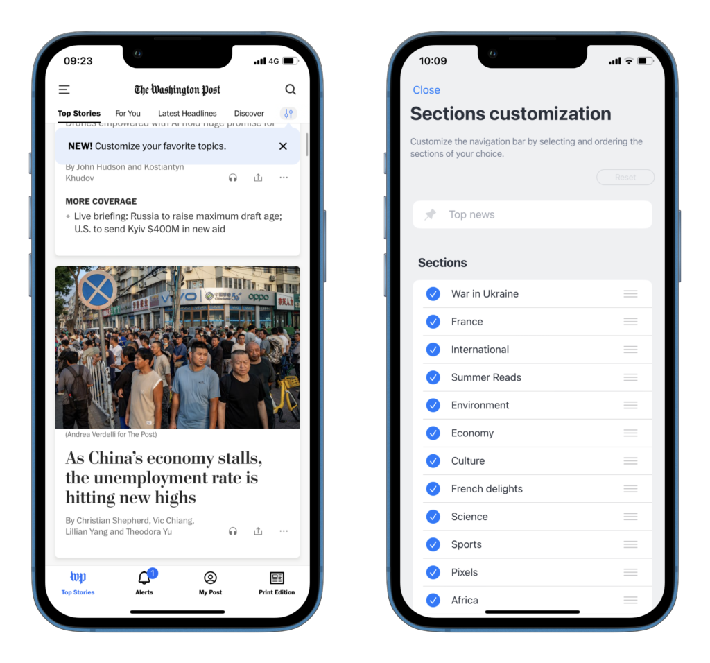
We all know that personalization is essential for high engagement. But it doesn’t have to involve a machine-learnt technology. Instead, let your readers customize their feed, selecting the topics that interest them.
To ensure readers know that this option is available, The Washington Post has a pop-up that displays on our first visit to the home page, letting us know we can customize this page.
I would add here that maybe an entirely customized feed has its limitations and could confine readers in a box of similar content, preventing them from seeing all the value that you can provide.
Perhaps a middle ground would be a customizable feed with “Recommendation” modules suggesting similar content to help expand their reading.
Live feed
Readers today have been conditioned by the mobile and social revolutions to spend a significant amount of time scrolling on their phones. The structure of live feeds mimic this same concept, keeping readers on your app for longer by constantly providing them with new content.
What’s more, these formats allow publishers to share not only text and images but also social media posts, graphics, videos… anything that can be embedded as an iFrame. Why does this matter? By seamlessly integrating a variety of mediums into one format, you can take digital storytelling to new heights by providing readers with a variety of captivating text and visual content.
All in all, these formats have proven to bring readers back and keep them on-app for longer, two metrics that directly contribute to higher subscription and retention rates.
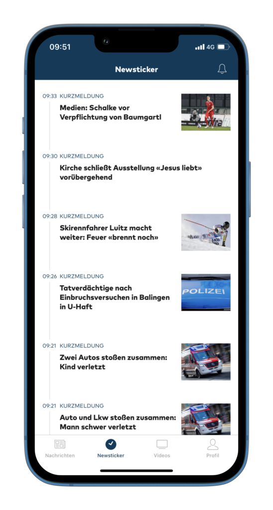
Welt makes the most of this engagement feature with a dedicated live feed tab.
