Getting users to buy into your subscription product is great, but sustainable growth isn’t achievable until you master retention, something that starts from the moment a reader finishes the conversion process. It’s at this point that a well-researched, continuously-tested onboarding journey, in the minutes, hours and weeks following subscription, is essential.
Not only is this journey about welcoming your new subscriber and making them feel valued, but about driving customer value, making sure they understand and make use of the potential value offered by your product. I.e. ensuring a high Customer Lifetime Value (CLTV).
To achieve this, the first step is to identify which actions separate retained customers from lost ones – “aha moments” as many tech companies have called it following Facebook’s famous “aha moment” of getting new users to add 7 friends in 10 days.
For digital publishers, these “aha moments” are often linked to newsletter sign up, app downloads, high frequency of visits to the website, activation of key ‘subscriber-only’ features, activating push notifications, etc. But, of course, this ultimately depends on the publisher’s unique context. Research, testing & learning is needed to find the highest value “moments” that increase CLTV.
To support you in building the optimal onboarding journey, both on and off site, we’ve analyzed 3 successful British digital publishers to share their chosen “aha moments” and inspire your own efforts:
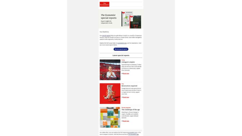
The Economist
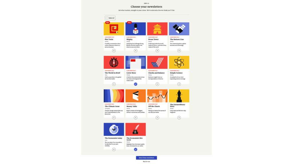
✅ Single-click activation
✅ Short value proposition for each newsletter
✅ “Subscriber only” tags prove the value of converting
✅ Newsletters form habits & increase frequency of content consumption
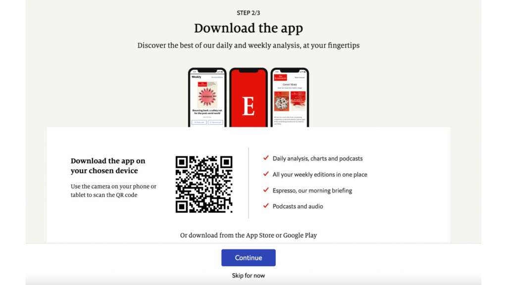
✅ Value proposition for the app
✅ Easy to activate onboarding step with QR code + explanation
✅ List of benefits included in the app
✅ Alternative download option provided
✅ Double goal to increase CLTV & help subscriber see value
✅ Market research has suggested that ‘lack of time’ is a key factor in causing churn, which may have influenced The Economist’s decision to add the “Short on time?” section here
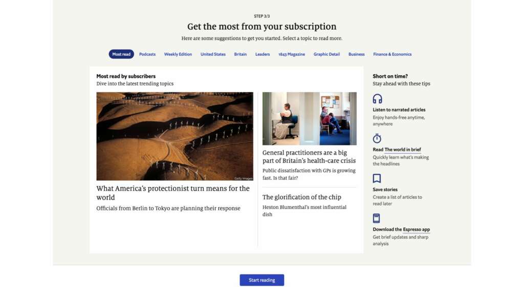
✅ “Start reading button” to lead a subscriber directly to the value
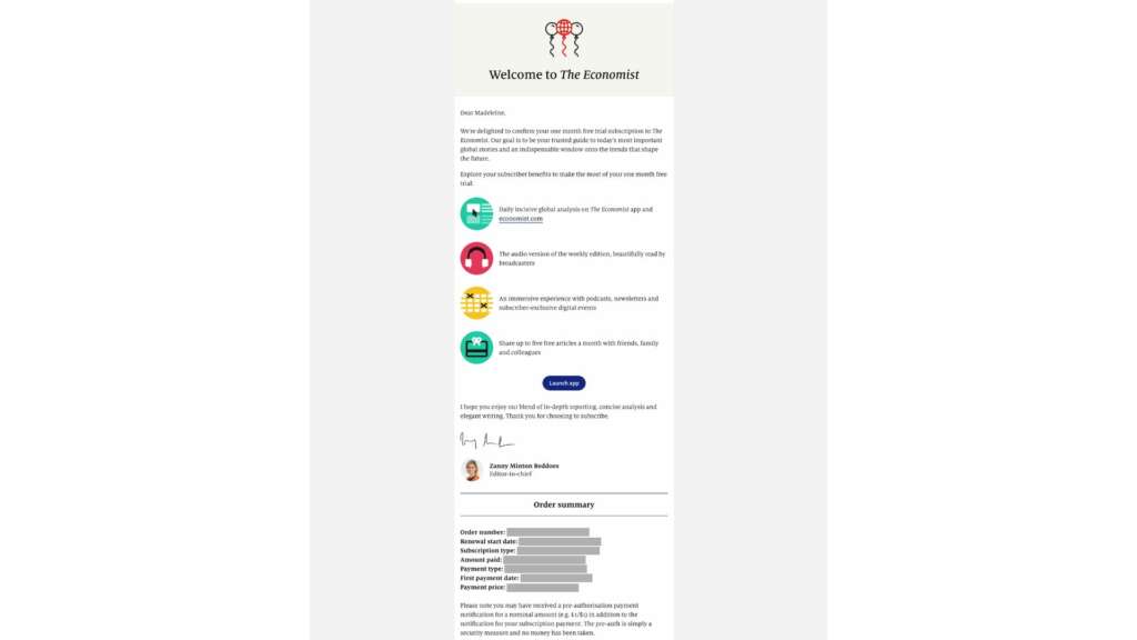
✅ Listed subscriber benefits with supporting visuals
✅ Signed by an editor to build a personal relationship
✅ Encouraging app download
✅ Reassurance & transparency with order summary
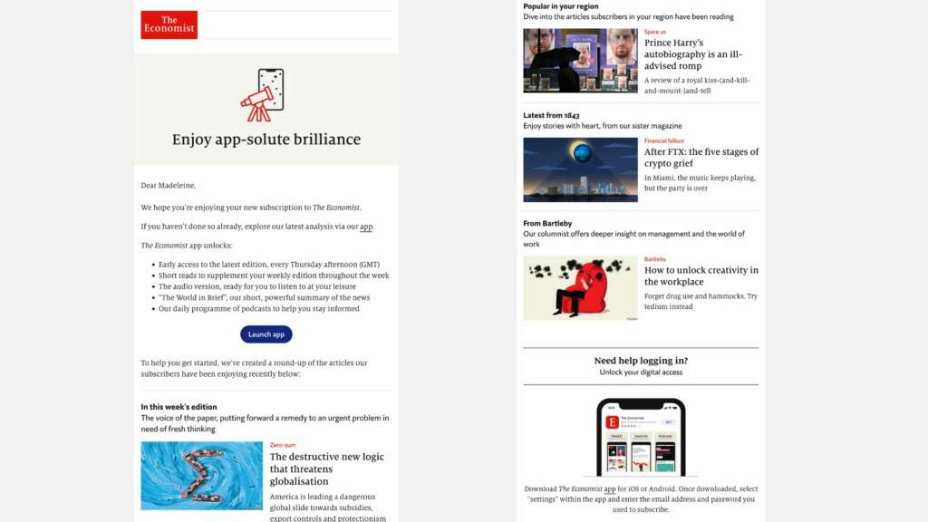
✅ More promo of the app (it’s clearly valuable for The Economist’s retention)
✅ List of popular content (useful if a user hasn’t yet signed up to a newsletter)
✅ “Need help logging in” customer support
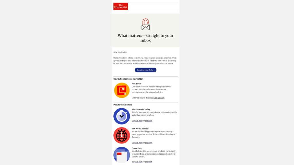
✅ Newsletter promotion to form a habit
✅ Easy sign up & possibility to “preview” newsletter
✅ Synopsis/value proposition for each newsletter
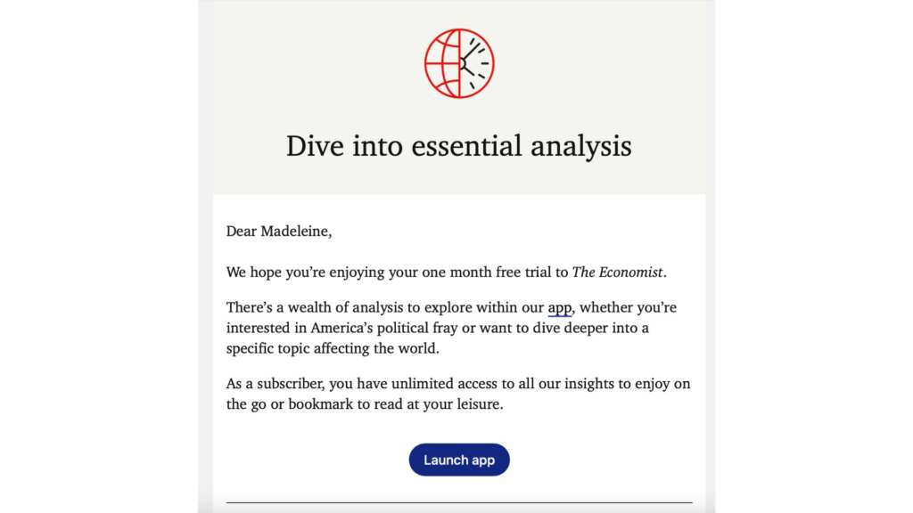
✅ More app promo & forefronting the value of being a subscriber
✅ Below this screenshot, recommended content from the most popular articles at the time
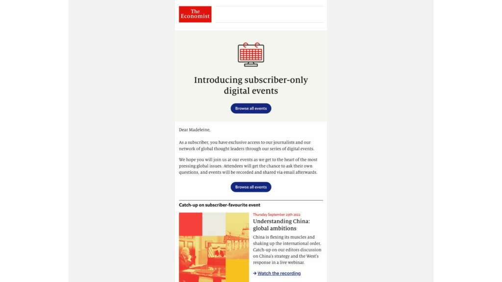
✅ Events are a clever way to build closer, more personal relationships with subscribers
✅ Supporting activation of all subscriber benefits
✅ Further subscriber-only value
✅ Example of the latest reports + links (easy activation)
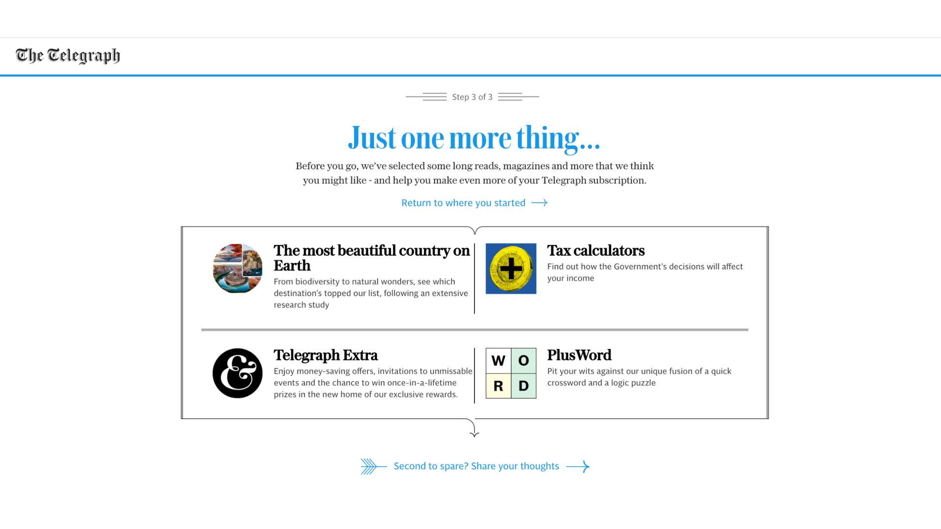
The Telegraph
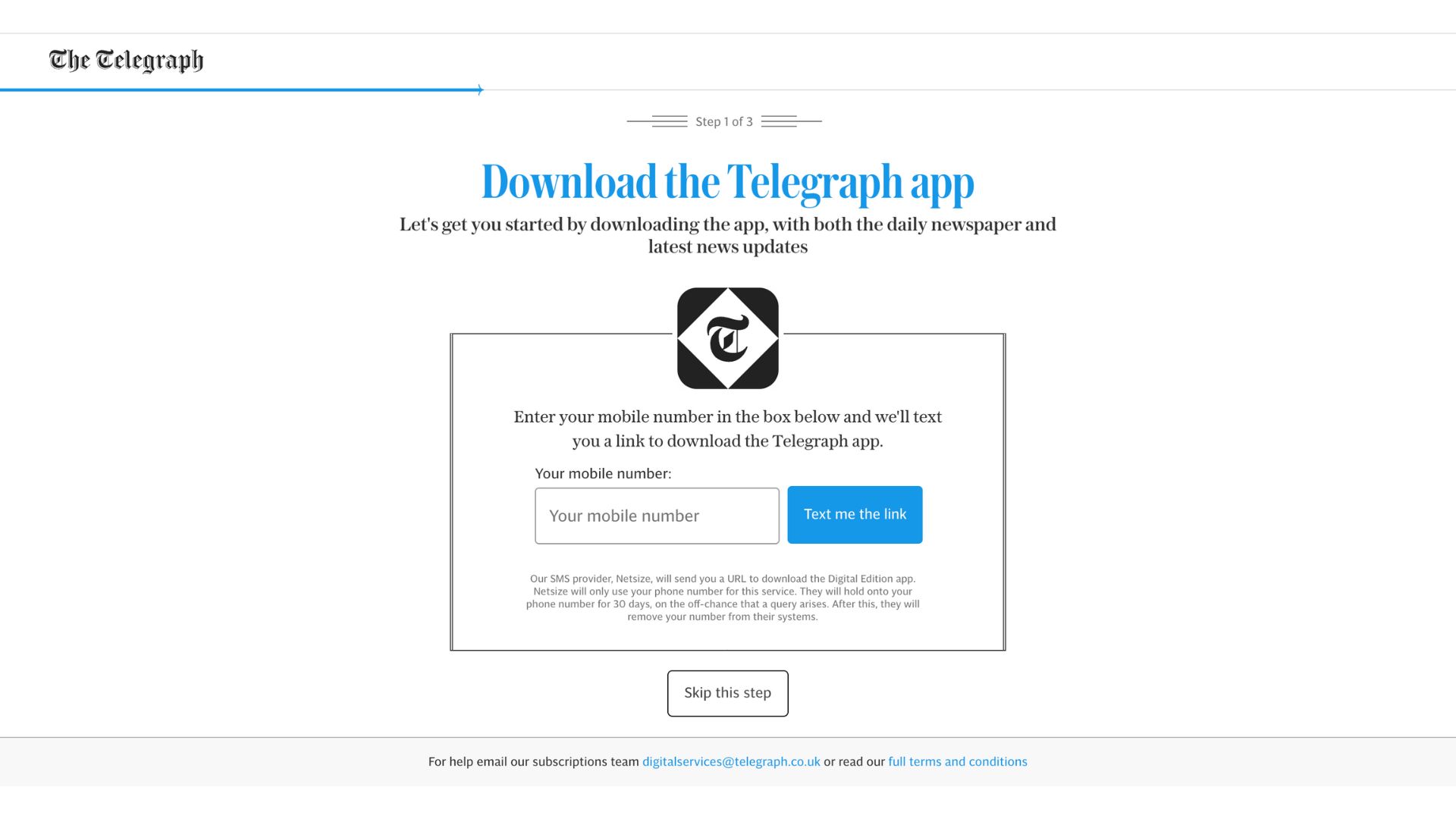
✅ “Text me the link” is simple for the user
✅ Data collection for the Telegraph (plus a little paragraph explaining what they’ll do with this information, building trust and being transparent with the user)
✅ Option to skip this step
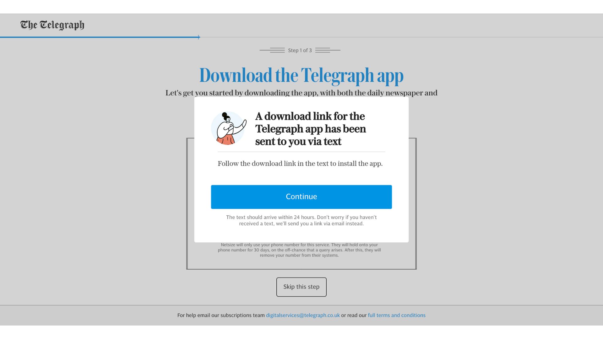
✅ Support in making the download simple
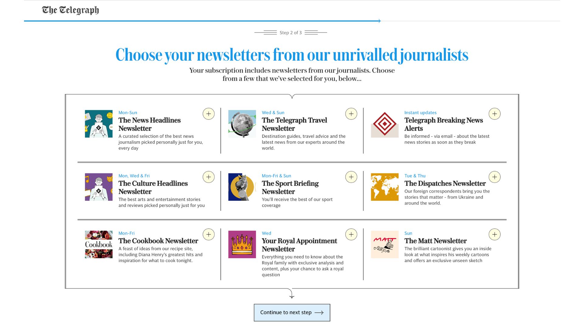
✅ One-click sign up
✅ Image and value proposition for each newsletter
✅ “Your subscription includes” – showing immediate value of subscription
✅ Form habits and increase engagement through the newsletter
✅ Bringing some of their more in-depth content to the reader to show immediate value
✅ Range of content to attract different types of readers
✅ Link to go back to the article we were trying to read before subscribing
✅ Link to share our thoughts in a survey (audience research)
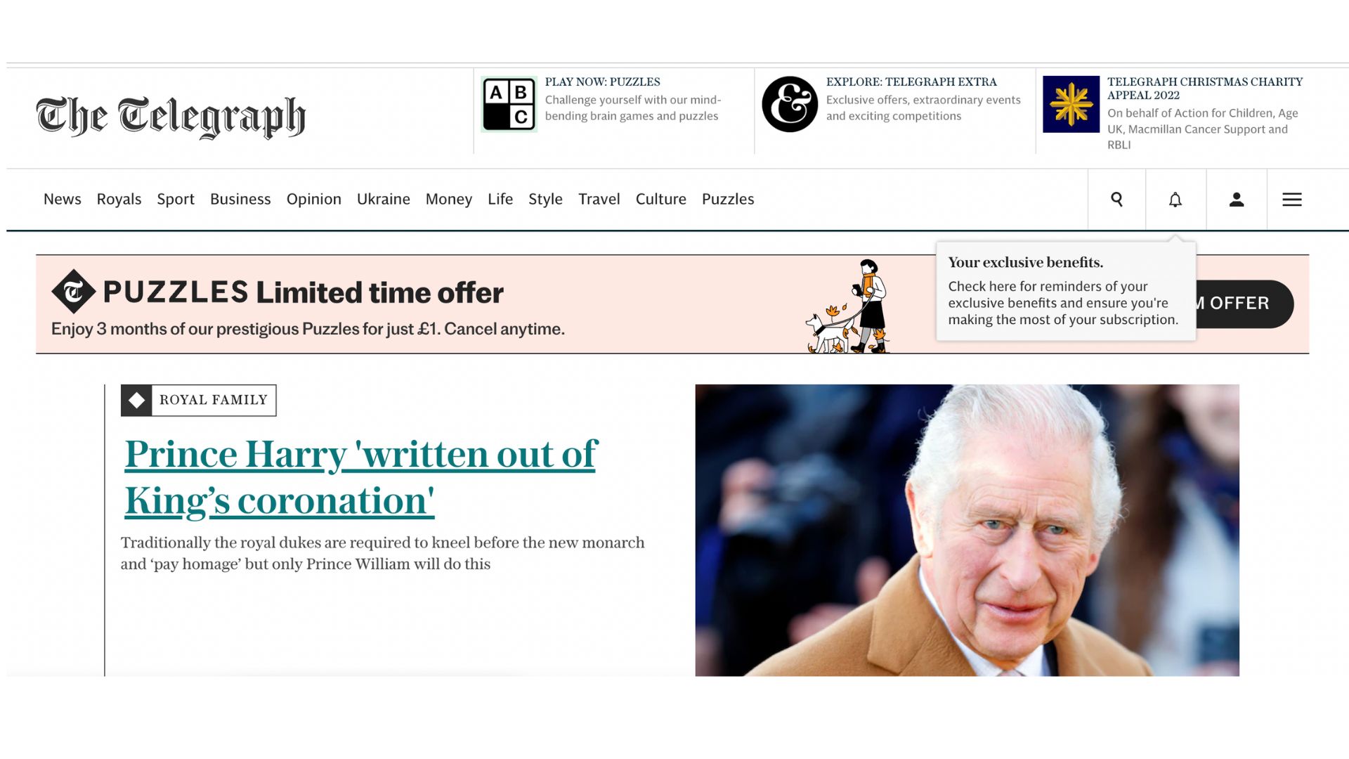
✅ Text boxes help us navigate the website and make use of subscriber-only features
✅ User-friendly, non-invasive UX
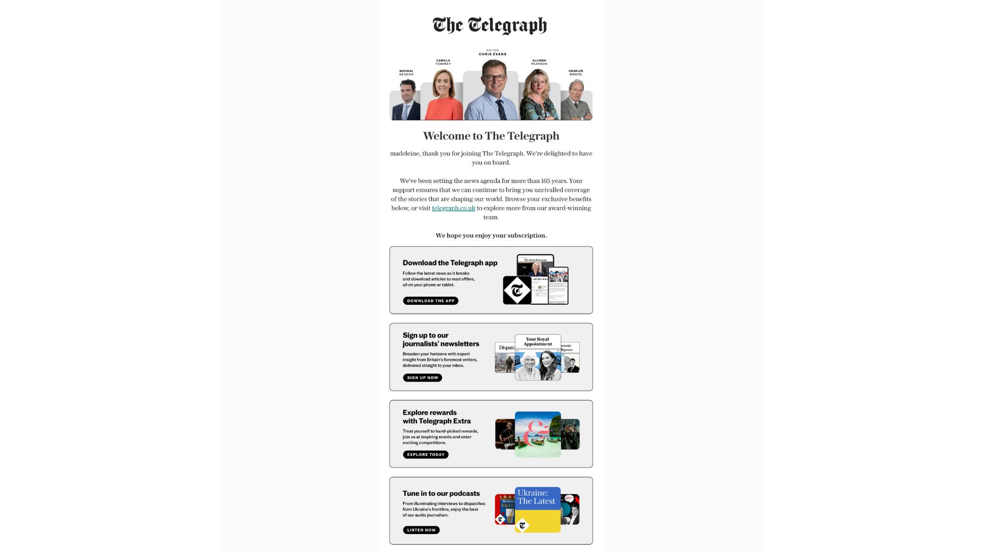
✅ Photos of journalists to add a human-touch to the publisher
✅ Making the reader feel valued & reinforce the Telegraph’s value proposition
✅ Links to subscriber-only benefits
✅ Personalized email that highlights that it’s a subscriber-only feature showing the value of subscription
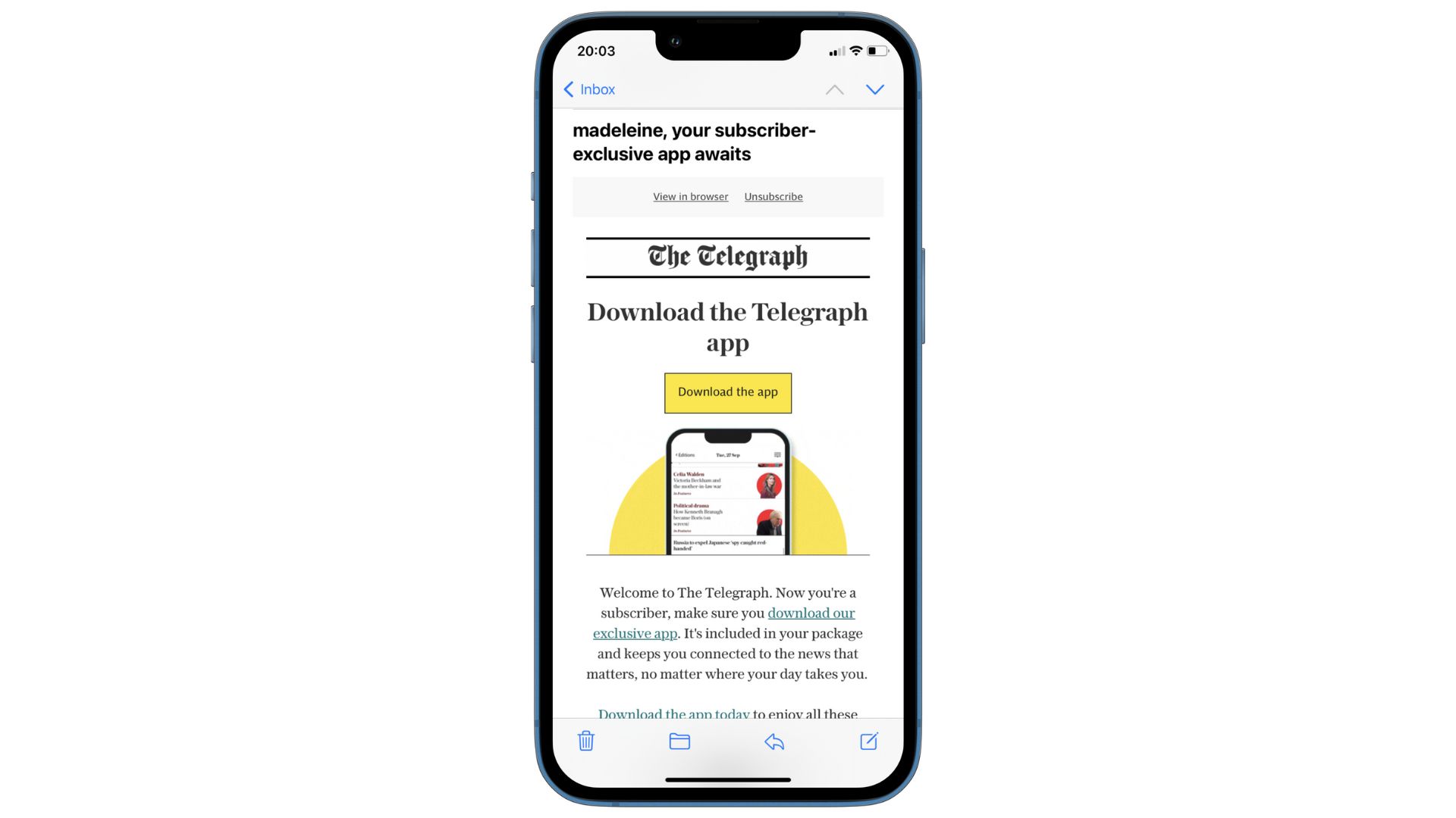
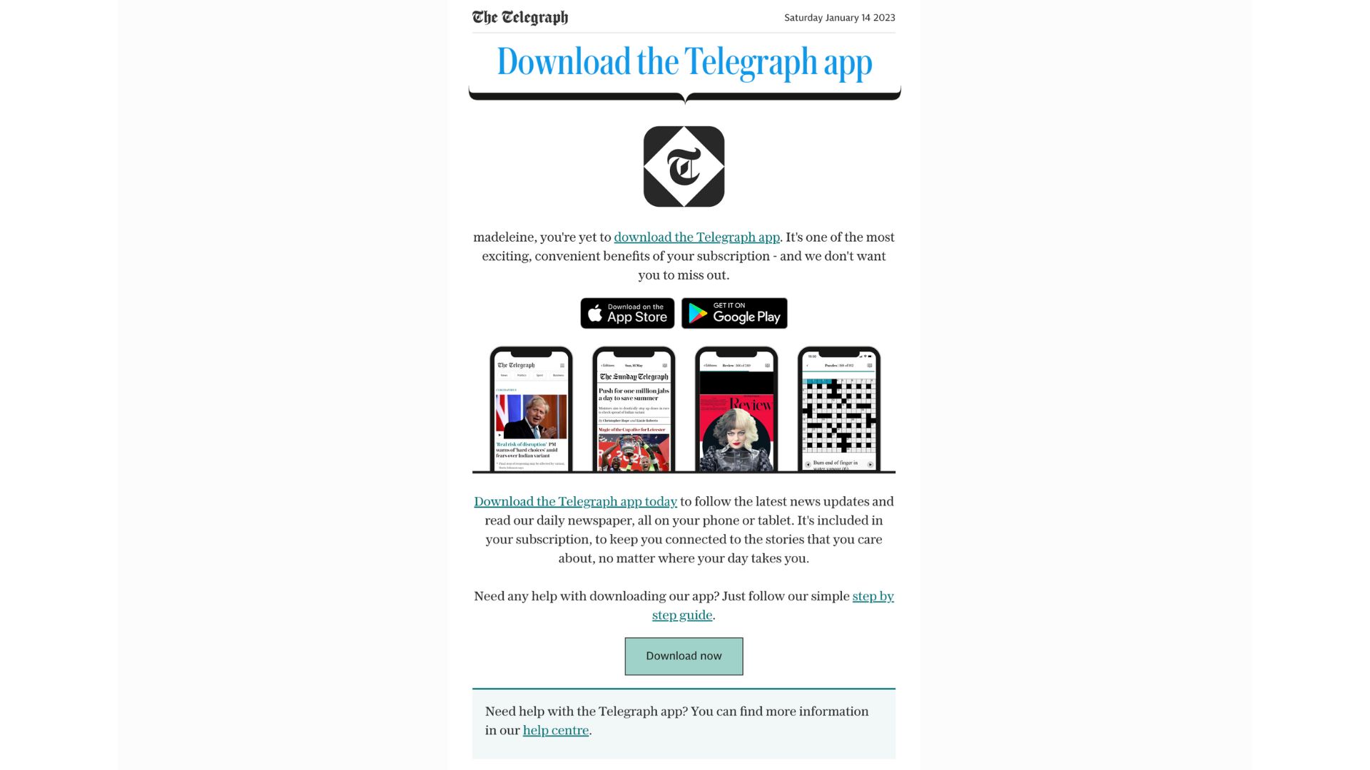
✅ Easy CTA to download the app with supporting image
✅ The app keeps The Telegraph’s content in the users pocket, with them at all times, and push notifications are a proven way to increase engagement
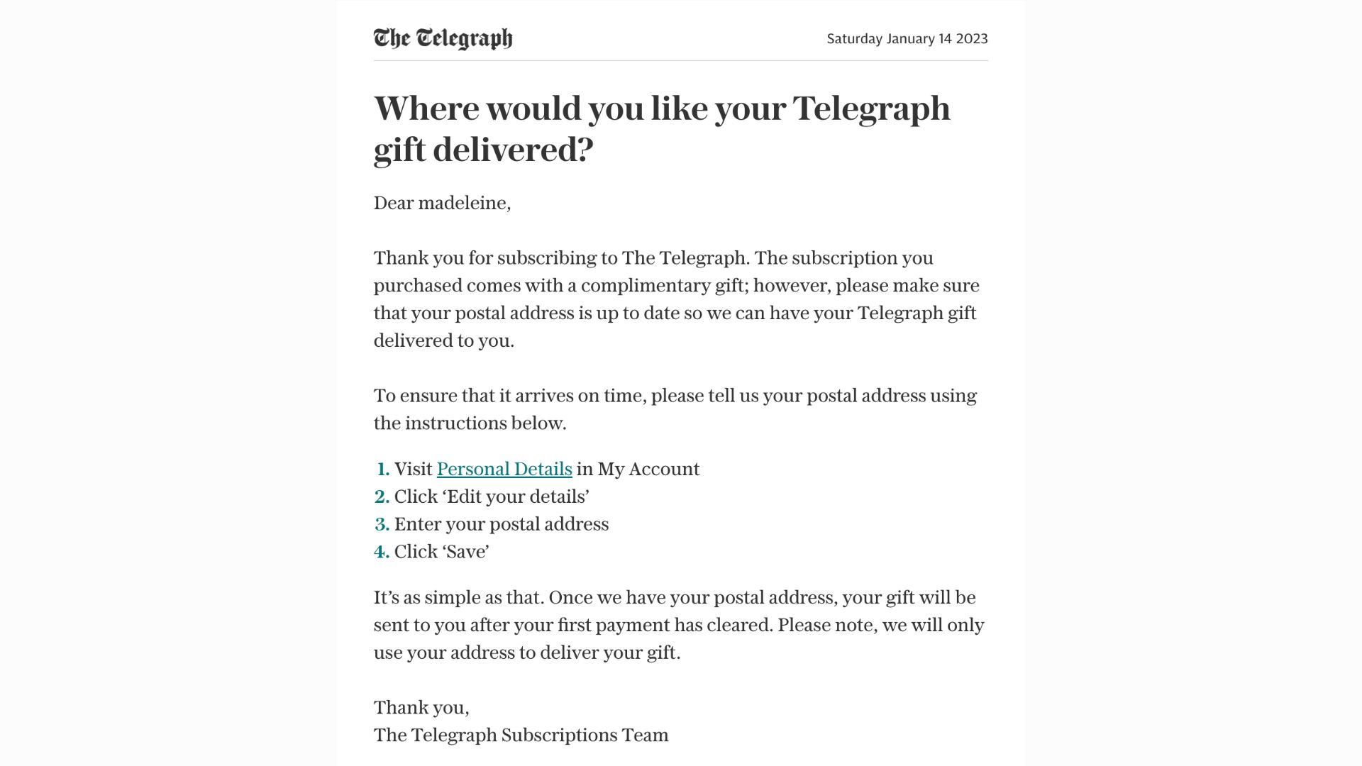
✅ A unique idea to increase retention & make the user feel valued
✅ The tote bag gift features The Telegraph’s logo, thus promoting the publisher
✅ Data collection on the user’s address
✅ The publisher has noticed that I am yet to download the app
✅ Fore-fronting the value for the reader
✅ Link to the help center within the email
The Times & Sunday Times
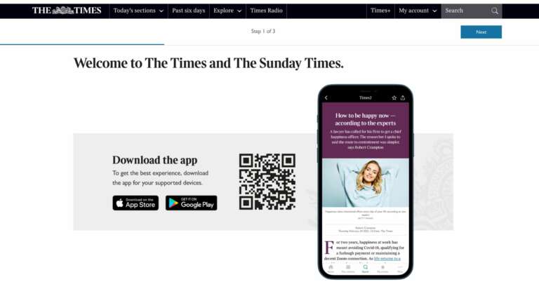
✅ QR to scan if the user’s on desktop, or links if they’re on mobile
✅ Welcome message combined with an engagement technique maximizes the value of this step
✅ Image to support comprehension (but no value proposition for the app)
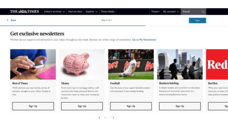
✅ Value proposition for newsletters and each individual edition
✅ Single-click sign up
✅ Link to the subscribers account space to manage newsletter subscriptions
✅ Images support comprehension of each unique newsletter
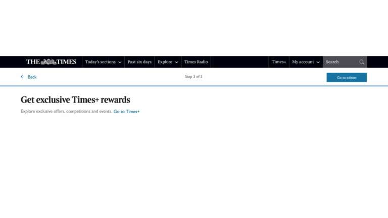
✅ Exclusive rewards are a unique part of The Times’ subscription
✅ Brief explanation of Times+
✅ Link to activate this step
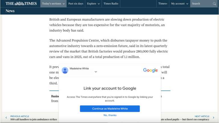
✅ Linking account to Google means the subscriber is logged in across devices, thus reducing friction
✅ Supports high retention
✅ Data collection for The Times as they can track the user whenever they’re on-site (and perhaps this allows for data sharing between Google & the publisher?)
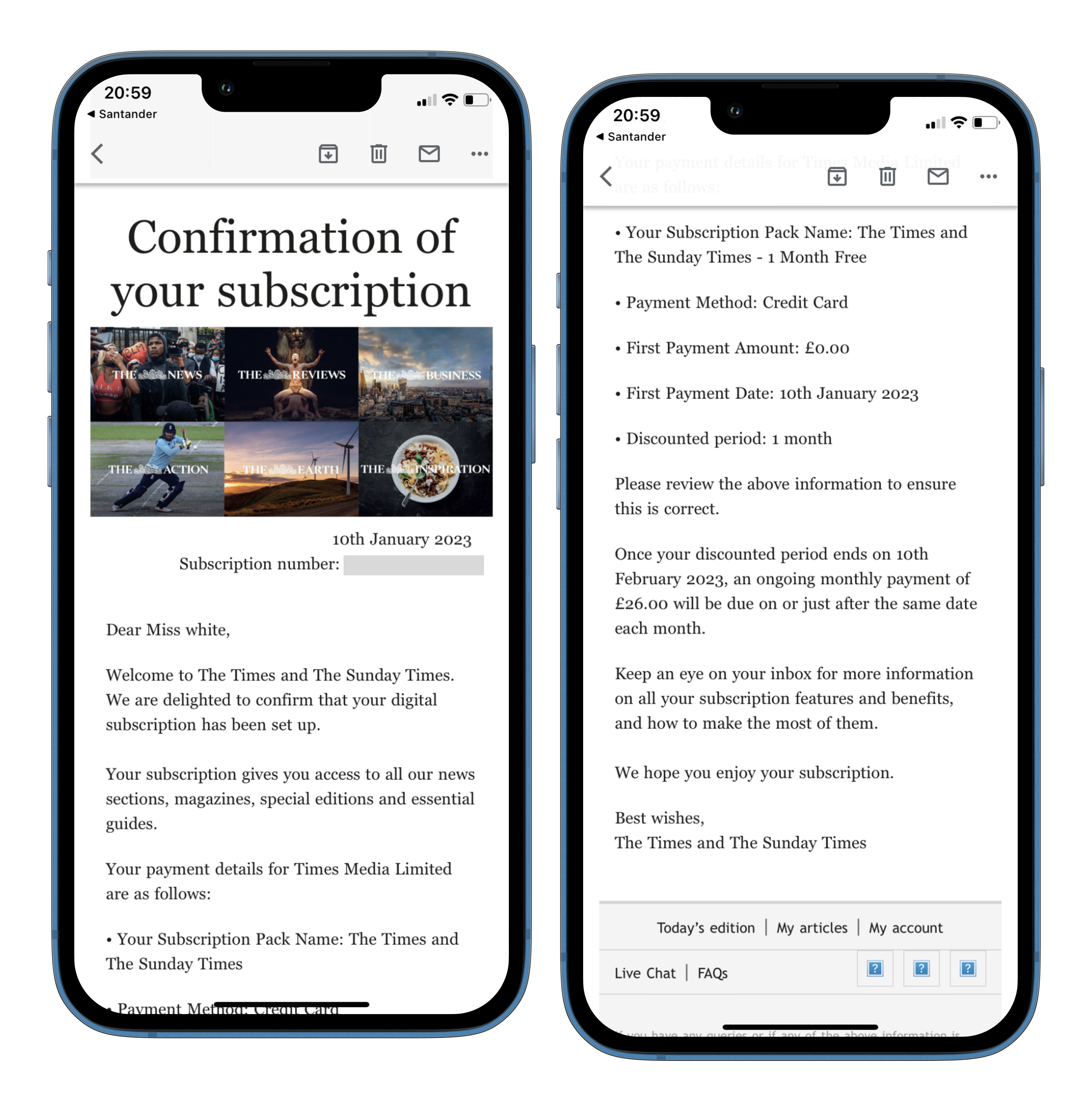
✅ Welcome to subscription
✅ Details of the subscription package and payment, with clear information about next payment
✅ Links to ‘Today’s edition”, “My articles & “My account”
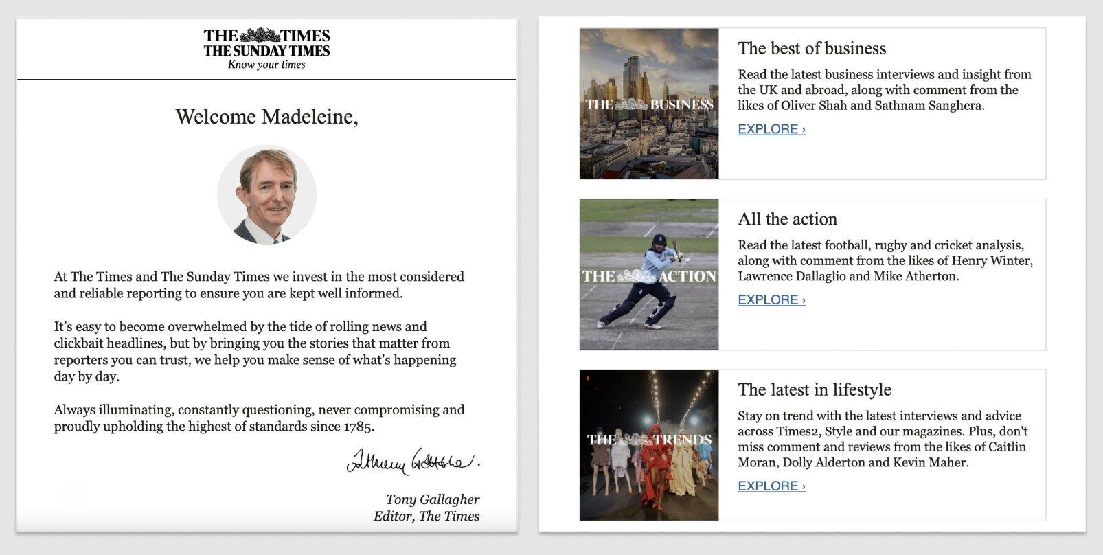
✅ Note from the editor with an image & signature to add a personal touch
✅ Images, value propositions and links to some of the most popular sections of The Times
✅ Further down the email they’ve also included links to their newsletters and app
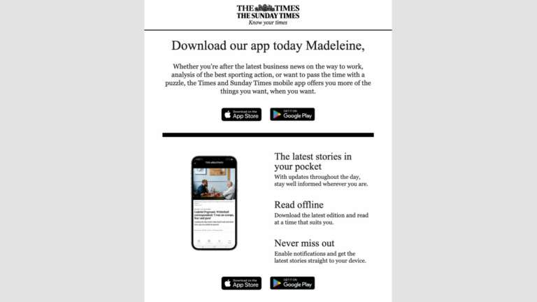
✅ Value proposition for the app with 3 clear benefits
✅ Links to Apple and Android app store
✅ Personalization (even just adding the subscriber’s name can positively impact activation rate)
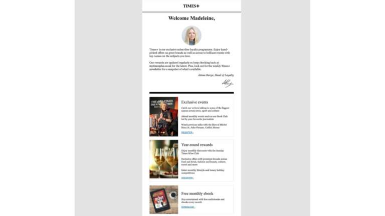
✅ We’re introduced to another member of the team – this time the Head of Loyalty
✅ Proof of concept as we’re introduced to the key benefits of The Times’ subscription
✅ The layout remains the same, with an image, value proposition and link – we’re beginning to become familiar with this style perhaps supporting activation rates
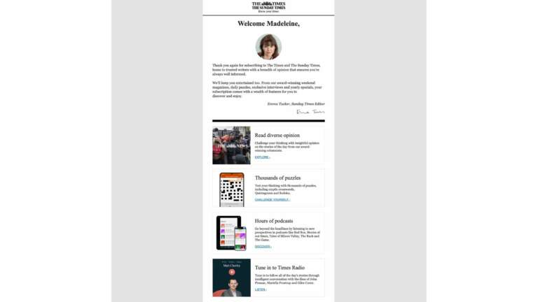
✅ Same format, different content (and signed by another member of the team)
✅ Promoting some alternative content formats, including games and podcasts to encourage the subscriber to engage in the publication in a range of ways
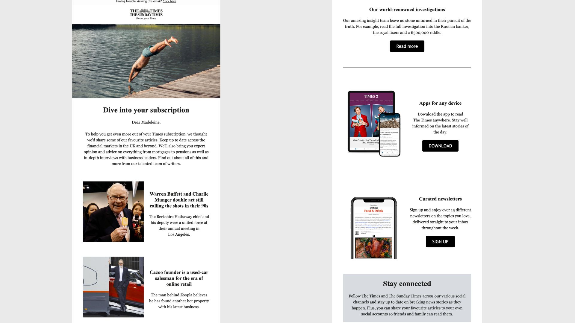
✅ Proving the value of The Times’ product by fore-fronting the content that we now have access to
✅ A mix of content, app and newsletters – it’s a lot for one email but promotes the key engagement features
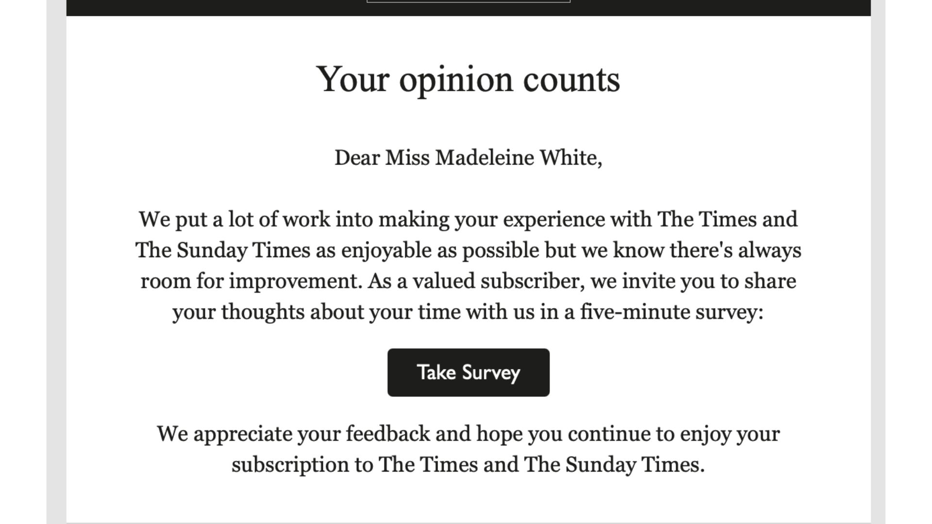
✅ Slightly different to the other examples, we’re asked to share our opinion
✅ Highlighted that the survey will only take 5 minutes
✅ Thanking the subscriber and making them feel valued even before they take the survey
General best practices that are common across the 3 examples:
- Communicate how many onboarding steps the user will be led through (“step 1 out of 3”)
- The trend here seems to be 3 steps on-site, followed by some guidance on how to navigate the new subscriber’s account space and an activation experience consisting of a collection of emails spread out across the following days and weeks
- The possibility to “Skip this step“. Leaving the user the freedom to choose whether to activate the onboarding step or not is essential
- “Newsletter sign up” step. Single-click subscription, variety of newsletter options (which not only increase engagement by allowing the user to select the editions that match their interest but also proves the value of your subscription product), value proposition for each edition, highlight when a reader will receive it (daily, weekly, etc)
- “App download” step. Clearly outline why the user should activate this step (what value do they gain?), consider how you can make this step simple for the subscriber – here we see examples of a QR code or being texted the link (although maybe phone number isn’t a data point that users are too willing to give away)
- Studying these onboarding journeys, it’s clear that a key ‘aha moment’ for high retention includes a subscriber downloading the app & signing up to newsletters. A lot of focus has been placed on this across the 3 examples.
- Consider the experience on desktop vs mobile. The app download step on The Times highlights this as the QR code is very useful if a reader is on desktop, but redundant if they’re already on their phone. Hence the need for the links too
- “Proof of concept” step: your chance to show and deliver the unique value that you offer in your subscription product
As Katja Trost, Teamlead Customer Retention at Die Presse recently said to me, “In the end it’s similar to building a long lasting relationship in real life. It’s about building trust, getting to know each other better, developing common habits and valuing each other.”
The Audiencers’ newsletter: from professionals to professionals
Sign up to our newsletter – real-life examples, expert points of view and inspirations from publishers around the world to help you do your job better. Sent every two weeks.