Max Moné is co-founder and CEO at Poool, the dynamic journey builder to boost subscription conversion, engagement, and loyalty.

This is the fourth in a 6-part series where I share what I learned from studying 100 subscription business models across 15+ industries.
> Episode one: 100 subscription business, 15 industries, 1 moodboard
> Episode two: What’s free, what’s paid, and why it’s really an engagement trade-off
> Episode three: Why the best subscription businesses don’t try to sell on day 1
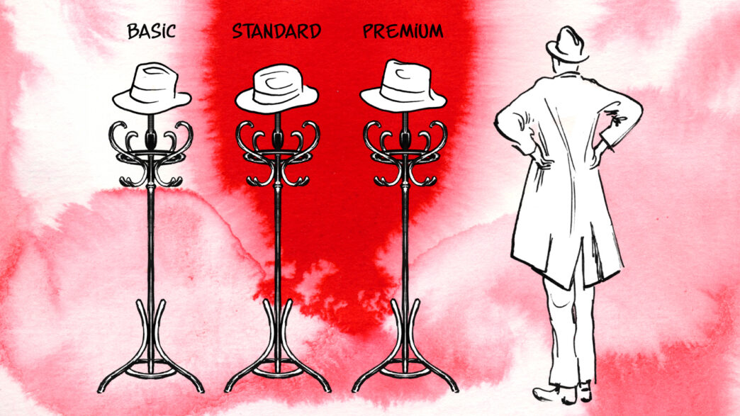
If you’ve ever worked on a subscription business, chances are the pricing page you’ve built looks a lot like the pricing pages I’ve seen across the industry. You know the one: three columns with a “recommended” plan in the middle, a monthly/annual toggle at the top, and a comparison table at the bottom with feature checkmarks. The kind of page where you end up spending weeks arguing about whether the middle plan should be the best offer, and A/B testing the color of the CTA button.
I’ve been there, I’ve built those pages too.
So I ran an experiment whilst working on this article.
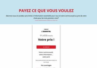
I asked Claude to design a “classic subscription landing page” for a publisher, just to see what it would come up with. Here’s what it gave me:
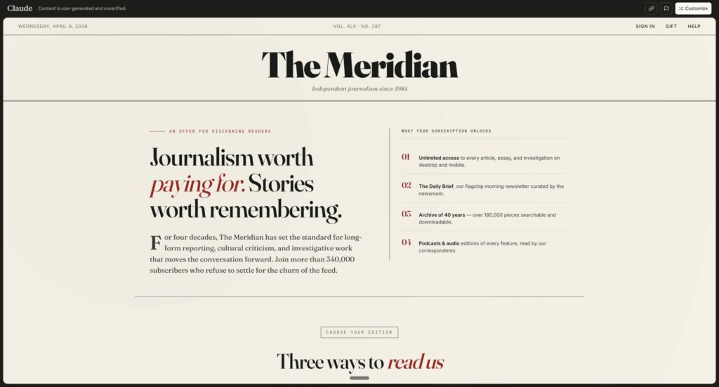
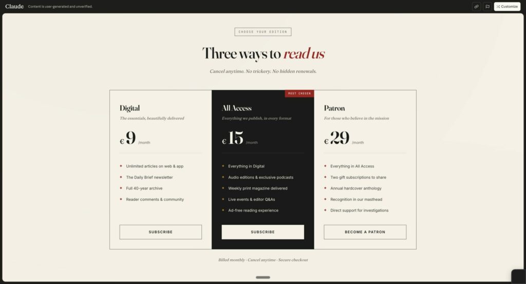
Three columns, a “MOST CHOSEN” label in the middle, Digital / All Access / Patron (whatever that means), monthly prices, bullet lists of features. Claude didn’t really invent anything here, it just reproduced what it had learned from crawling the entire web, which tells you something about how standardized the media pricing pages are.
What is interesting is that it means that there is so much potential for publishers.
Why? Because when we studied 100 subscription businesses, we noticed that the best performers don’t really do this anymore.
Forget “acquisition vs retention”, think micro-conversions
Before we get into the pricing side of things, we need to revisit something we talked about in episode 3:
When it comes to converting users into subscribers, the classic “attract → convert → retain” model doesn’t really hold up when you look at the best performers. Their customer journey is actually a series of micro-conversions, each one with its own goal and each one unlocking the next. The first micro-conversion might just be creating an account, then comes a cheap first subscription, then an upsell, then a bundle, then another upsell, and it goes on from there. It’s a long series of small steps that never really ends.
This matters for pricing, because the “acquisition price” and the “retention price” aren’t really two different things. They’re just two points in a longer sequence, each one adapted to what you know about the user at that specific moment.
I borrowed a sentence from INMA that captures this well: “Acquire with one simple offer, retain with many.”
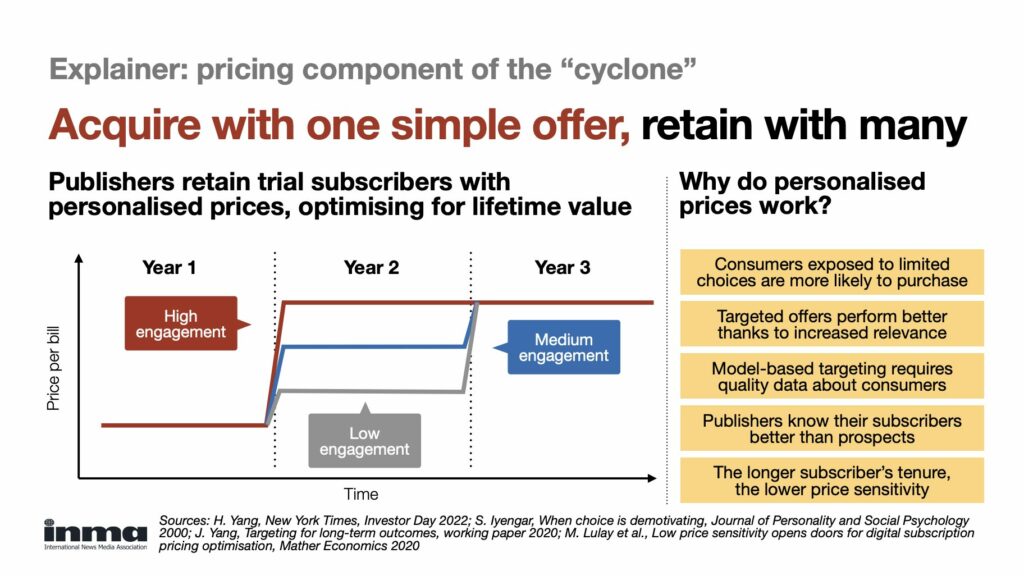
In our micro-conversion language, what this really means is one offer at a time, always.
And tailored to the user needs and interest (tailored to what you learn at each micro-conversions).
What are the best performers doing? One or many offers?
When you go through the first paid conversion step of Spotify, Headspace, Apple Music or most of the top subscription businesses we looked at, the pattern is pretty consistent. You see one offer clearly highlighted, sometimes with a secondary option tucked next to it, but always with a hierarchy that makes the decision essentially binary: you take it, or you don’t.
Spotify, for instance, still pushes “Premium, 1 month free” as the primary entry point on most of their pages. The other plans (Student, Duo, Family) are technically available somewhere, but they’re not what you see first: you only find them if you scroll or click around a bit.

Apple does this almost perfectly, I think. Whether it’s Apple Music, Apple TV+, or Apple One, the page pushes one offer prominently (usually the standard individual plan with a free trial), while the rest is deliberately tucked behind a small “See all plans” link. The whole layout is engineered around a single decision, and the other options only really exist for people who go looking for them.
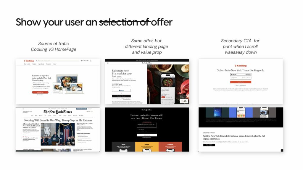
And if you look at the NYT, they are doing it too. Depending on the context you’re in (and I imagine the profile you have) they push one offer (the same offer) with different arguments and design. Then if you scroll down you can find the print offers, or the cooking offer
And this connects to something we already covered in episode 3, which applies just as much to pricing as it does to the rest of the journey: the goal isn’t really to make money at this moment. It’s to get the user inside the product long enough to start building a habit. That’s why these first offers tend to be cheap, sometimes free (trial), and almost always presented as one simple choice. At this step of the journey, the job is to get the user through the door, not to explain the full menu of everything your product can do.
The next micro-conversions: same logic, different offers
So where do all the other offers actually show up?
They show up later in the journey, once the user has made that first paid conversion, once they’ve spent enough time inside the product to see its value, and once you know something concrete about how they actually use it.
The New York Times is probably the clearest example of this playing out at scale. At their 2022 Investor Day, they explicitly framed their growth model as: push one offer, then upsell, then bundle, with the conclusion that ARPU is the end game, not conversion. That single sentence captures most of what we observed across the 100 businesses. With the NYT, you get the basic subscription first, and over the following months and years they progressively introduce you to Games, Cooking, The Athletic, Wirecutter, each one a potential upsell or bundle presented when the data suggests you might actually care about it.
Each of these is a different price and a different offer, but you never actually see them all at once on the same page. You see the one that fits where you are in your life right now.
Across all examples we’ve seen (Apple, Spotify, + 97 others), the underlying logic is the same: each micro-conversion comes with its own offer, and the complexity of the catalog lives in the sequence of steps rather than crammed onto a single landing page.
Ideal world vs real world: the “Jeune Afrique middle ground”
In an ideal world, you’d build this entire journey end to end. Every user would get their own path, and every offer would be personalized based on what they read, how often they visit, which device they use, and what they’ve already subscribed to. At any given moment, the user would see exactly one offer, and it would always be the right one for where they are in their relationship with your product.
(I would love to live in an ideal world, everything seems always so perfect)
The problem is that building this kind of journey is genuinely hard. Most publishers don’t have the tech stack, the data infrastructure, or the resources to orchestrate dozens of personalized micro-conversions in real time, and for most teams it’s still pretty far out of reach.
So there’s an interesting in-between approach worth considering: keep the classic pricing page with its multiple offers, but make that page itself dynamic.
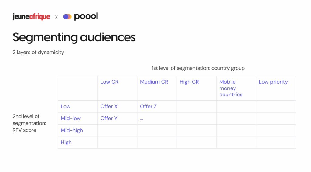
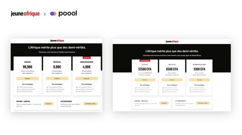
That’s exactly what Jeune Afrique did a couple of years ago (full disclosure: they’re a Poool client). Their situation was pretty specific, because their audience is spread across many different countries, with very different propensities to subscribe, different payment methods, and different engagement patterns. Pushing the same static pricing page to all of those audiences was clearly leaving money on the table.
So in 2024, they rebuilt their offer page around dynamic segmentation, combining two layers of logic: a user engagement score (an RFV calculation based on recency, frequency, and the number of articles read) and a country segmentation (5 groups based on propensity to subscribe, conversion rate, and dominant payment method, including “mobile money” countries where even the currency symbols and the payment icons adapt automatically).
The results speak for themselves: a 30% increase in conversion on the dynamic paywall, and a doubled conversion rate on the dynamic subscription offer page.
And there’s one detail from this story that I find particularly telling. When they started, the team had assumed that low-cost offers would work best for “mobile money” countries, because lower purchasing power should mean lower prices, right? But after running the tests, they actually discovered that these audiences preferred longer-term annual offers, contrary to assumptions. That kind of counterintuitive insight is pretty much impossible to uncover when you’re serving the same page to everyone.
It’s obviously not the fully personalized journey we described earlier, but it’s a meaningful step in the right direction compared to pushing the same static pricing page to every visitor regardless of who they are or where they come from.
What you can take away from this (and test tomorrow)
Do the Claude test. Ask Claude (or any other LLM) to design a classic subscription pricing page for a publisher, and compare the result with your own. If they look suspiciously similar, that’s a signal worth sitting with. Not a judgment, just a signal. The classic three-column model became the default for a reason, and it’s also become increasingly stale and predictable.
Think in micro-conversions rather than in acquisition vs retention. Next time you design a pricing step, ask yourself which single offer fits this exact moment of the user’s journey, given what you already know about them. The question isn’t really “what are all of our plans?”, it’s “what’s the right offer to show right now?”.
If you can’t build a fully personalized journey end to end, at least make your offer page dynamic. Jeune Afrique’s approach is a solid middle ground, with different offers for different segments based on engagement and profile. Doubling conversion on the offer page is really not a marginal win, and it’s within reach even if you haven’t rebuilt your entire customer journey yet.
And keep in mind what the NYT shared at their 2022 Investor Day (and still true): “ARPU is the end game, not conversion.” The first paid conversion is just the starting point. The real game is growing the user’s lifetime value over many small, well-timed steps.
Next week, episode 5: what happens after the first paid conversion, and why the first 100 days are basically your only window to shape the user’s long-term relationship with your product. Or I should say, almost the only window.
PS: After writing this article, I went back to Claude and asked it to redesign the landing page based on what we just discussed (one offer, micro-conversion logic, the whole thing). Here’s what it came up with. A bit more interesting than the first version, I’d say.