

You're reading The Audiencers' newsletter #32, sent out on February 20th, 2023. To receive future newsletters straight to your inbox every two weeks, sign up here.
Hola from Madrid
Yesterday marked our first Festival of 2024!
200 professionals in the digital publishing industry from across the Spanish-speaking world (Spain, Mexico, Venezuela…) joined our event in Madrid to not only hear from experts on stage about how to better engage, convert & retain their members & subscribers, but also discuss challenges & goals off stage, with others working in audience development. Thanks so much to everyone who came, and for dealing with my bad Spanish accent!

Articles from the event coming soon (in English & Spanish), and better photos!…
In today’s newsletter
- How The Atlantic introduced group subscriptions
- Account creation via your registration wall: learn from these benchmark examples to build the user account creation journey
- How POLITICO.eu revamped its website… in under 3 months
- Content to add to your reading list
How The Atlantic introduced group subscriptions
For years, The Atlantic has talked about developing a specific product for institutions. Others in the media industry have publicly reported successful metrics that show, to various degrees, how group subscriptions play a role in their revenue growth, and teams at The Atlantic often heard requests for this type of access.
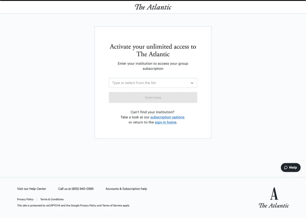
After research, problem-solving the challenge of giving access to the product at scale, building a seamless user journey and user testing, group subscription has now been available since summer 2023. So far, over 60 institutions from across the country have purchased group subscriptions to The Atlantic!
TL;DR
- The team conducted extensive market research to understand the needs and requirements of different sectors
- After exploring various options for offering group access, they ultimately decided on a single sign-on (SSO) approach, which allows academic users to access The Atlantic using their institution’s sign-on system. This approach allows for a seamless sign-on experience and enables users to manage their own settings and subscriptions
- The team also redesigned parts of the website to cater to the new academic audience while maintaining the familiar look and feel for existing individual subscribers
- The SSO approach, however, doesn’t retain personal data, so the team created an onsite onboarding experience to collect additional details and personalize The Atlantic experience for teachers and students.
> Full article to read on The Audiencers
Learn from audience development experts at our New York & Toronto Festivals
The Washington Post, The Globe and Mail, The Atlantic, The New York Times… A star lineup for our North American events happening this March. And you can be a part of them!
> Find all Festivals, agendas and request a spot here
Account creation via your registration: benchmarking the user journey
Our latest benchmarking article shares 5 examples of each step in the registration wall journey to ensure you maximize the value of your newly logged members.
One of these benchmarks is The Washington Post. Here are the steps we found particularly smart:
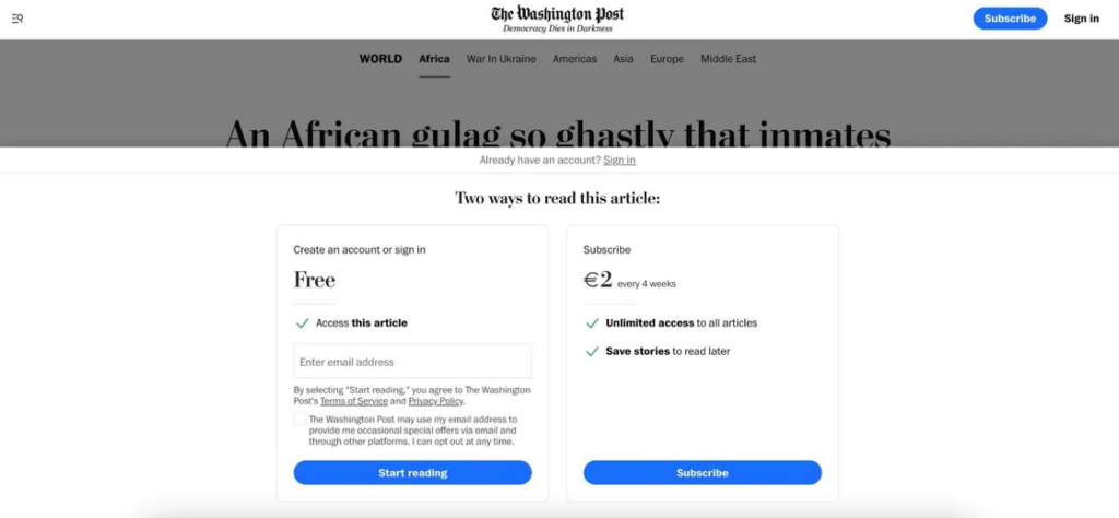
> Email collection within the wall
Reduce a step, click and redirection to limit friction by adding the email field directly into the wall. They only ask for password creation via email after the user has completed the onboarding steps.
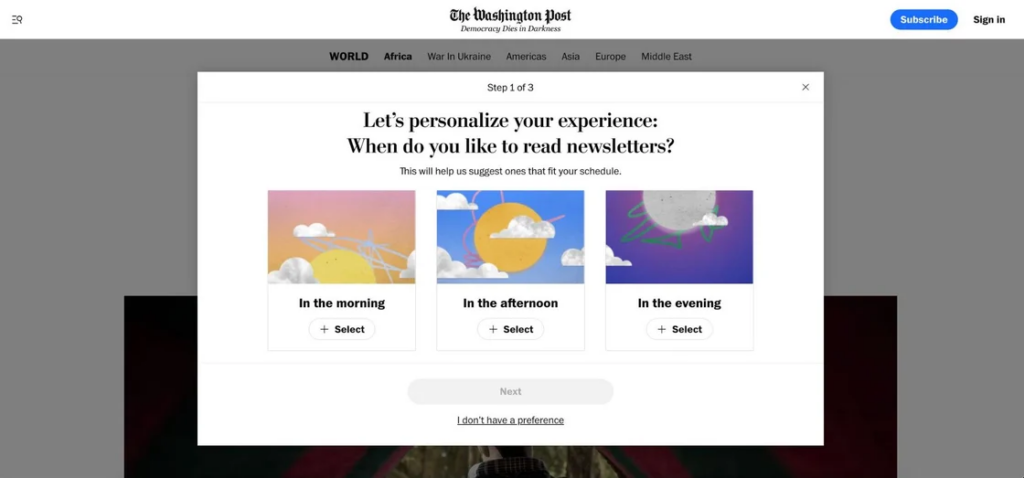
> Onboarding for personalization & engagement
Onboarding takes place on the same page, asking a user to select the time of day when they like to read a newsletter. This is a clever technique to fit WP’s content into an existing user habit rather than trying to create a new one from scratch.
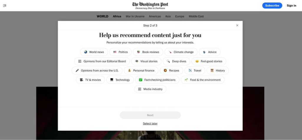
> Select our interests
The emojis support decision-making/comprehension at this step, where a click is all that’s needed to select any of the options. Note that we can skip any of these steps.
> Personalized newsletter recommendations
The sole goal of this onboarding process is to encourage newsletter sign up, and with the final step presenting personalized recommendations based on the previous two steps, the publisher is more likely to achieve this goal.
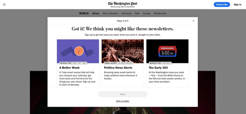
Newly registered members are also automatically signed up to “The Post Most” newsletter, but the welcome email provides a visible link to “Manage my newsletters”.
> Flick through our other account creation benchmarks
Product management: How POLITICO.eu revamped its website… in less than 3 months
POLITICO Europe is the European edition of the Axel Springer-owned news organization POLITICO, reporting on politics and policy in Europe and beyond.
After only 3 months of work, their team relaunched its POLITICO.eu site, preparing for the EU, UK, and US elections later this year. We met Max Leroy, POLITICO’s Vice President for Product and Design, who told us how this huge project was handled in less than 3 months…
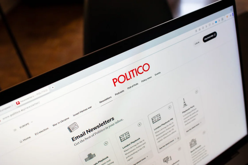
Why did its website need a redesign?
“The first reason for this relaunch is because of internal needs. We expanded to the UK five years ago, France 3 years ago and now we’re expanding to Germany, with a Berlin playbook, which launched yesterday! We therefore needed to rethink our website to properly support this geographic expansion, with 3 editions, each with their own language and products.
The second reason is external. Even if POLITICO is in a better spot than most publishers, we’re all seeing our social traffic decline. We did very well to optimize our Search traffic in English, so we can rank well in the UK or in the US. But because we don’t have pages with content only in French or German, when it comes to countries where Google prioritizes the local language (like in France or Germany), it’s more difficult for us to compete against national newspapers.”
Which KPIs did you choose to evaluate the success of this redesign?
“Because we believe that the site now gives more visibility to all the content that we produce, we could easily think that our main KPI should be page views, like many other news publications. But it’s our exceptional journalism that is primarily responsible for page views, not the redesign.
The most interesting KPIs for me are relative metrics:
- Share of search traffic in France and Germany
- Time spent on a page, specifically on the article page
- And what do readers do after they visit the homepage or read a story?
My main concern is: Are we improving the quality of the sessions overall? I want more page views per session, more time spent on the articles, etc.
The only measure that counts is the quality of the session itself and all the metrics we can use to measure that.”
> Find the full interview with Max on The Audiencers
Content to add to your reading list:
- 8 tips for acing your subscription pricing strategy: price is the biggest lever for any subscription company, but most companies don’t have a pricing strategy…
- 6-level data maturity pyramid offers strategic growth blueprint for media, from Mather Economics
- Our friends over at Blick diving deeper into their subscription model, Blick+, and how registration played a key role in their success
- For Spanish speakers: Hacia el final de la web abierta, tendencias 2024, por Pepe Cerezo
The Audiencers’ newsletter: from professionals to professionals
Sign up to our newsletter – real-life examples, expert points of view and inspirations from publishers around the world to help you do your job better. Sent every two weeks.


