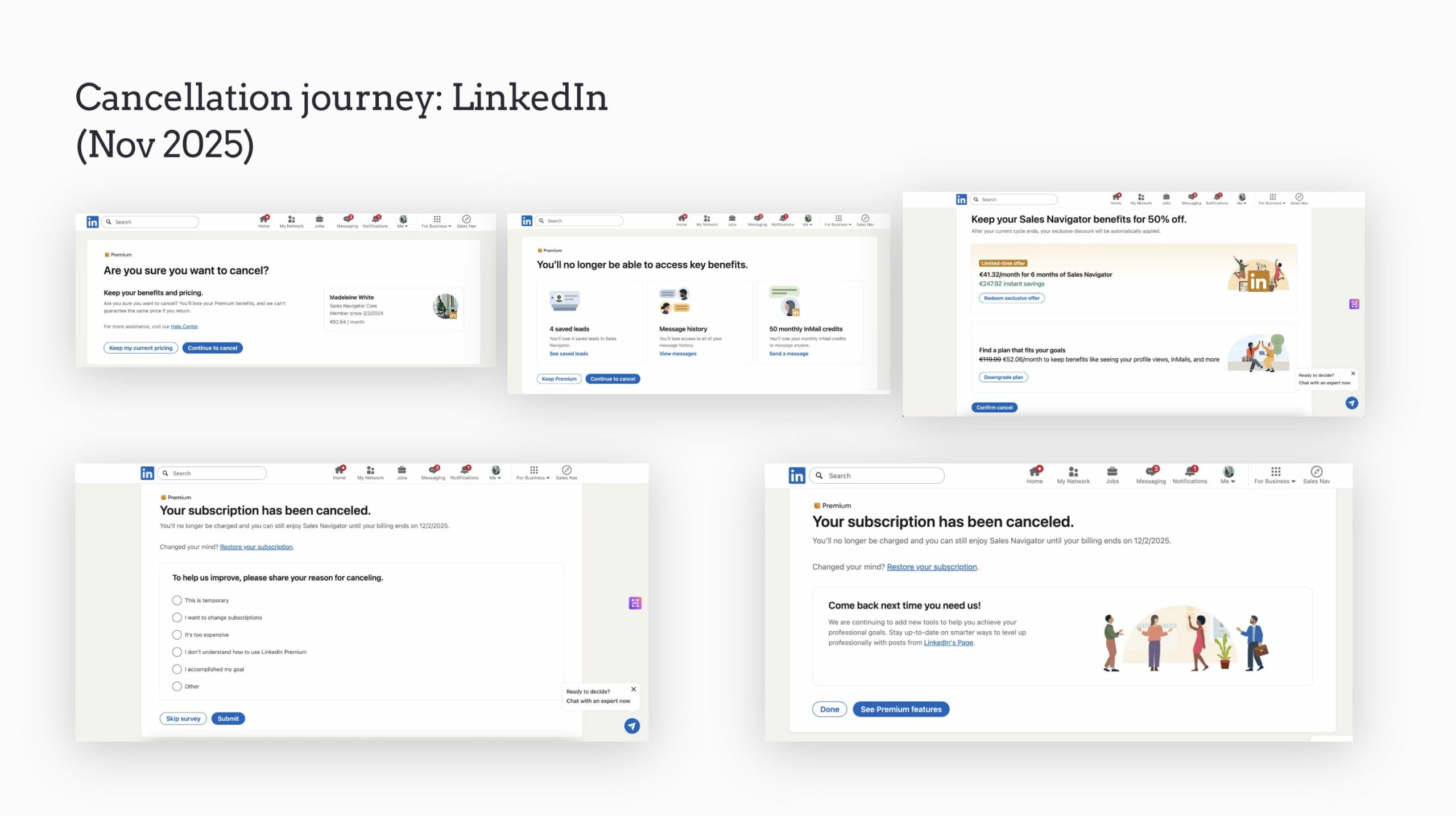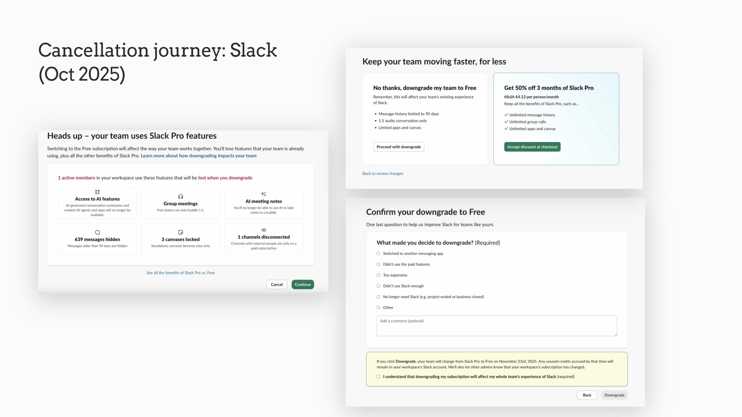

- Create a fair amount of friction to prompt reconsideration
- Not be too obstructive to cause frustration
- Highlight the value loss
- Understand why they’re leaving to be able to…
- …offer relevant alternatives
- Encourage them to commit for a longer duration
- Ensure they’re confident in the fact that they’ve cancelled but can come back if they want to
Starting the cancellation process
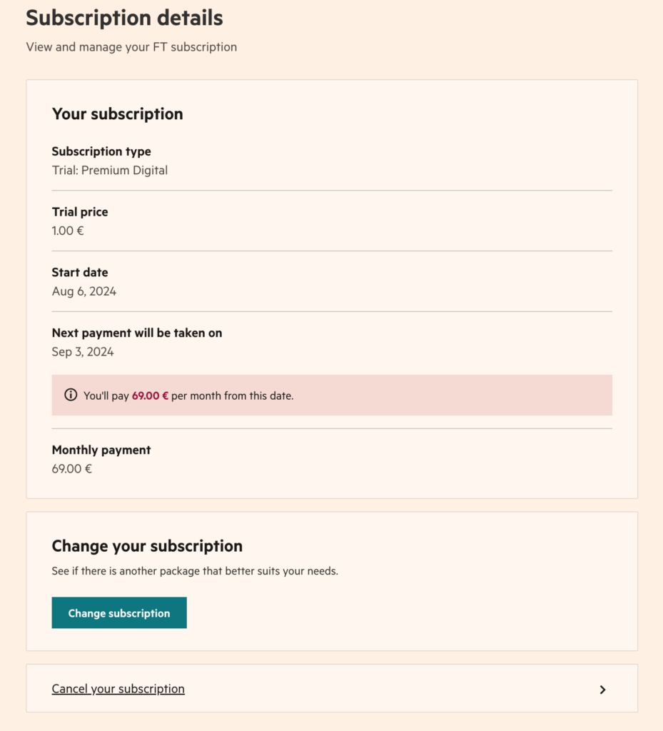
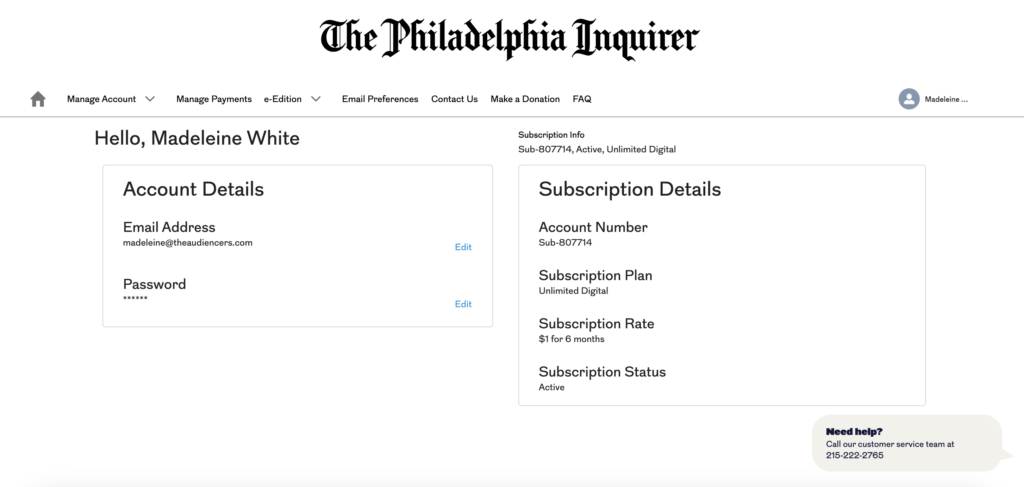
- Don’t hide the “Cancel” button – the publishers benchmarked here all included this button in the subscriber account page, often in a “Manage subscription” tab

- Make use of this moment to provide alternative options to cancelling, such as changing to a different subscription offer or pausing subscription
Understand why the subscriber wishes to cancel
This step is only necessary if you’re going to do something with this information – either internally to improve your subscription product or to personalize the subsequent steps in the unsubscription journey, perhaps with offers adapted to the reason why the reader wants to leave.
For instance, The Economist adapts the messaging based on why someone wishes to cancel:

Loss aversion
Encourage your reader to reconsider and question whether they want to lose out on these benefits. This can be within the on-site journey but also in the period when the subscriber has cancelled but still has access, like the example from Amazon Prime who sent this in an email a few days after cancelling.

- Financial Times personalizes this page based on articles saved by the subscriber in their account

- Continue to push your value proposition, considering why the reader may have subscribed in the first place
- Create a sense of FOMO with messaging such as “lose” or “miss out”
- Provide a “Keep my subscription” button, perhaps making this bolder and more visible than the other
- Ensure help is easily accessed, perhaps with a call center number or link to a FAQ
Offer alternative options to cancelling
- The New York Times / The Athletic is very clear and direct, laying out what the subscriber currently has and what they could get, helping to build trust

- The Telegraph frame this page as if it were the subscriptions offers page, offering monthly or annual payment options

- Le Monde offer the option to pause subscription instead of fully cancelling

- Consider mutually beneficial offers – low cost for the subscriber, long term length to support your retention strategy
- Note that this step is the final one before confirming cancellation and often follows the step highlighting the value included in the subscription package, making the low offers seem even better value for money
Confirm cancellation on- and off-site
The cancellation has now been made. Although all is not lost (win-back campaigns can be highly effective), now is the time to reassure the reader that they will no longer be billed.
- Confirm cancellation on-site and via email
- Reassure them that they’ll no longer be billed
- Make it clear when they’ll lose access
- Offer the chance to speak to support
- Provide a button to reactivate their subscription if they change their mind
- The Altlantic remind the user of the benefits of subscription:

- Financial Times promotes their lighter subscription offer, FT Edit, below the fold on this page:

What not to do in the unsubscription journey
- Make it hard to find the unsubscribe button
- Not provide easy-to-find information related to cancellation
- No possibility to cancel online
- Lack of written confirmation post-cancellation
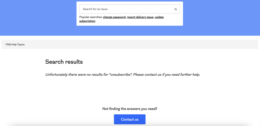
> To read next: 3 clicks to cancel, the new legislations that are forcing publishers to rethink their unsubscription journey
Case study: making cancellation possible online at The Financial Times
The Financial Times shared 5 goals for online cancellation:
- To allow Customer Service to focus on increasing engagement and complex queries
- To allow subscribers to transition between products, especially at trial or discount end points
- Before considering Customer Service time saved, cannot be a revenue loss
- Improve NPS / customer feedback
- Reduce GDPR risk
The online cancellation flow:
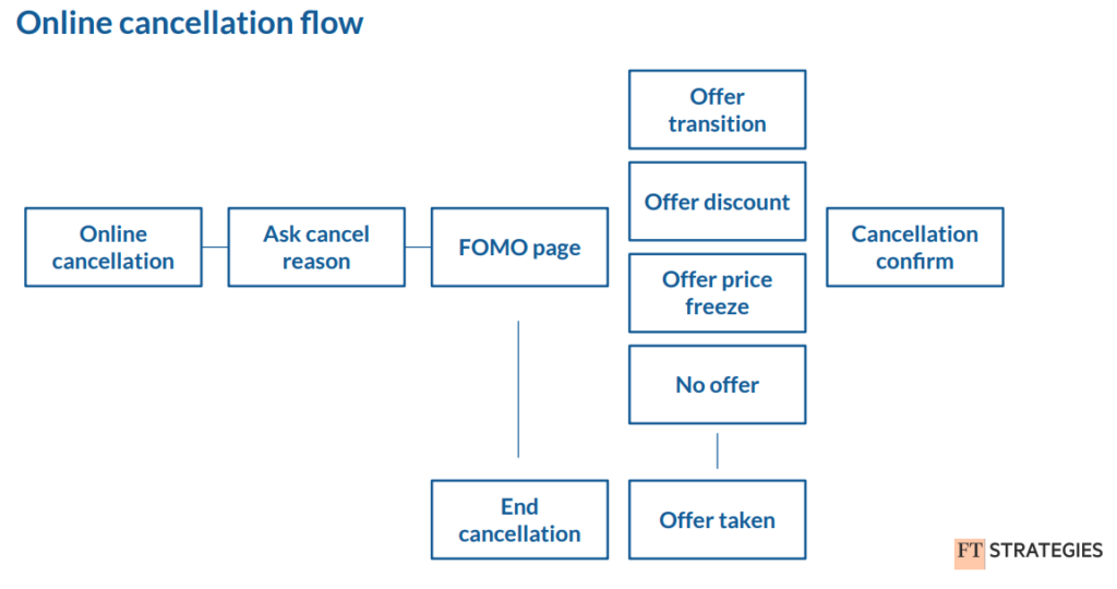
Depending on the subscriber’s current state, there are 3 offer strategies:
Offer transition: offer a lower price product instead of cancellation. For example, Standard Monthly instead of Premium Monthly.
Offer discount: keep the same product but have the next X renewals at Y% off
Offer price freeze: your current discount would have expired after your next renewal, but you can keep it for another X renewals
Importantly, they measure the performance of these offer campaigns, and the value of online cancel vs Customer Service cancellations using the LTV adjusted save rate. If you only measure save or churn rate, campaigns will bias towards larger discounts.

As this data shows, save rate is slightly lower than Customer Service calls but the average discount given is smaller, so price adjusted save rate is higher.
Benchmarking


