
User needs, personalization, dynamic experiences… The move to being more audience-centric is (finally) happening! But what about the article itself? Despite so many innovations across publishing products, articles still tend to look the same as they always have – very text-heavy and focused on form-over-function.
What we really should be doing is flipping this on it’s head, considering first and foremost the function of the article, and adapting the form accordingly.
It means asking ourselves how we can make the content even more useful to our readers, helping them to fulfill a certain need, through the form as well as the content itself.
And in doing so, we often help ourselves too, in the form of higher user engagement and propensity to subscribe.
To give you some ideas of what this looks like, and inspire your newsroom to do the same, here are 5 examples of articles where form follows function.
Interactive map at LA Times
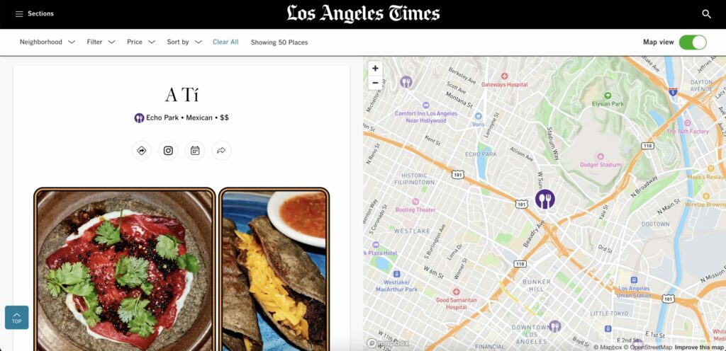
One of my favorite examples is from LA Times who have built interactive “places” lists, providing an excellent demonstration of Integrated Utility Design – the interactive features eliminate friction and deliver immediate value to a local audience.
Instead of a static list of top restaurants, this interactive map format transforms the article into a powerful, real-time decision-making tool.
- Eliminate user pain points
The interactive map that moves as you scroll eliminates the most common pain points of a list: location and proximity. As the user reads about Restaurant X, the map instantly highlights its location. This allows the user to judge factors like neighborhood, parking, or proximity to their current location without opening a new tab.
- Provide as much usable information as possible
For food writing, the menu description and the geographical reality are equally important. The synchronized map connects the author’s text (the food) with the real-world utility (the location), making the entire proposition easier to visualize, share, and act upon.
- Make it actionable
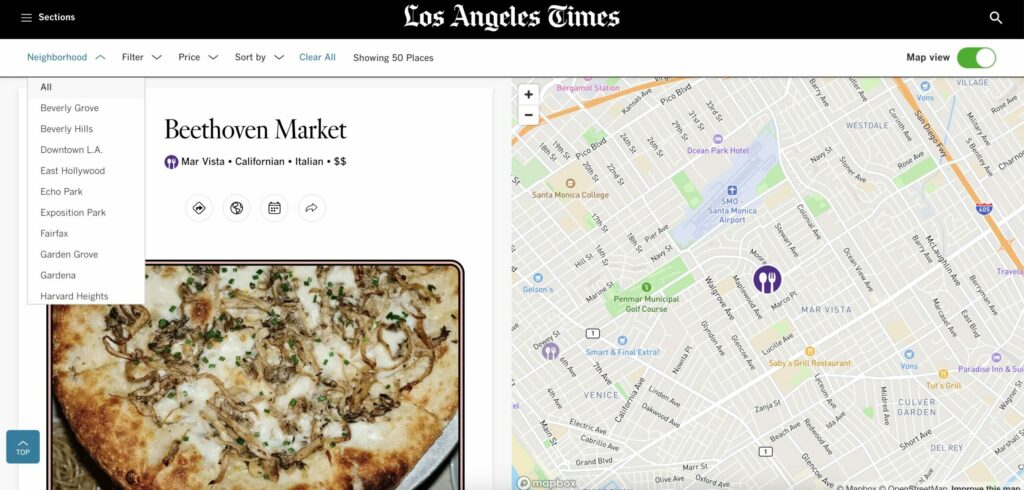
The design often includes action buttons—like “Visit Website,” “Call,” or “Make Reservation”—embedded directly next to the map marker. This design respects the user’s intent: they aren’t just reading, they’re planning a meal, and the article facilitates that action immediately.
- Allow for personalized browsing
Instead of forcing a linear read (top to bottom), the user can toggle between the list and the map. A user can find a restaurant on the map first (e.g., “I need a place in Santa Monica”) and then click the marker to jump directly to the editorial review in the list, catering to different planning habits.
- Data collection
The publisher can track which areas on the map are being viewed and clicked the most. If users consistently interact with restaurants in, say, Koreatown, the editorial team gains valuable data for covering future food and neighborhood trends.
Check out the article on LA Times
Debating at DER SPIEGEL
Commenting on articles is a well-recognized way of engaging readers. But ultimately the value of conversations are diluted across the many articles discussing a single topic.
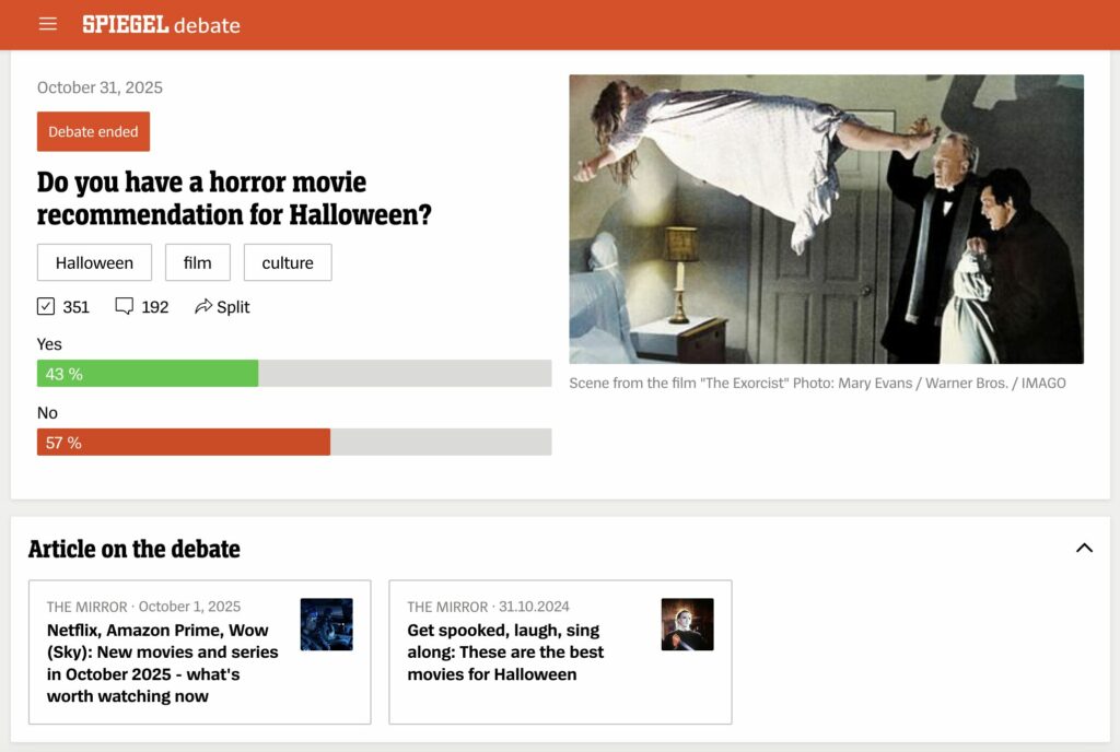
At Der Spiegel, they built a new format of content that brings value to both readers and the publisher – debating. The debate format offers users a structured and respectful platform for co-creating content, making participation feel more meaningful than a typical comment thread.
- Structured dialogue
By separating the Debatte section from regular article comments, Der Spiegel established a clear “safe space” for discussion. Strict moderation ensures the conversation is constructive, focusing on the content (E.g. horror film recommendations) and not descending into trolling or hate speech.
- Ritualized interaction
Users can vote, share their views and discover articles discussing the same topic. By creating a weekly or regular “Debatte”, the publisher creates a ritualized interaction. Loyal users return to the site not just for news, but to actively participate in the ongoing conversation, leading to high visit frequency and sustained loyalty
- User Generated Content (UGC)
For a question like “Which horror film do you recommend?”, the audience provides the content itself. This crowdsourcing approach leverages the collective expertise of thousands of readers to create a dynamic, useful, and diverse list of recommendations that a single author couldn’t replicate
Check out the debates on DER SPIEGEL
> Read more on how they built this unique format
Sub-categories at Wired
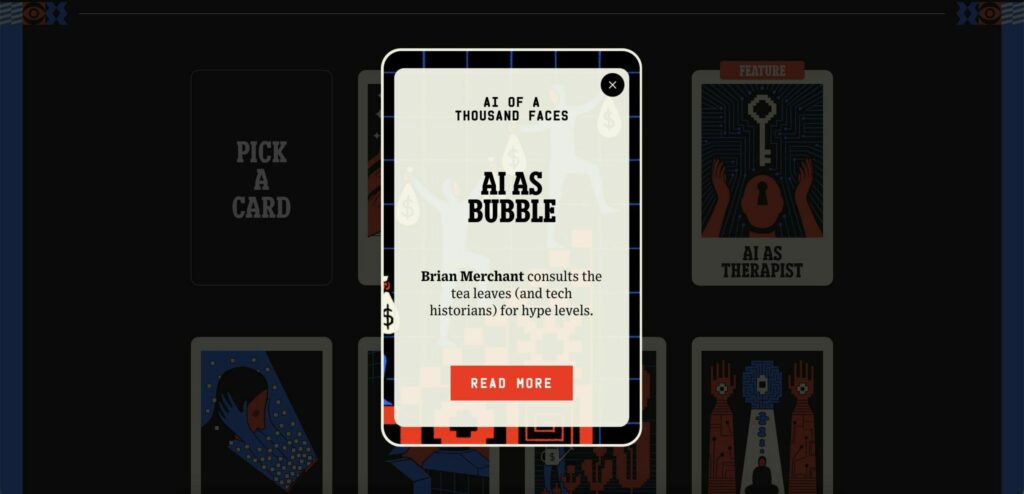
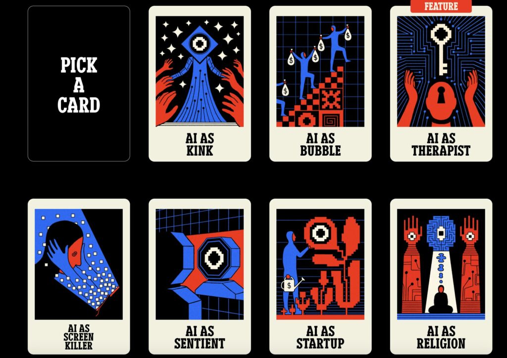
Wired’s “AI of a thousand faces” article is fantastic example of a content strategy known as Layered Storytelling. This dual “bitesize” and “full article” format is highly effective, especially for complex topics like AI, and provides distinct value to both the casual and the deeply engaged audience.
- Adaptable discovery
Each card shares a brief introduction to this ‘possible reality’, linking to an article diving deeper into the topic, accommodating the skim-reader and deep-reader equally. Skimmers can quickly browse the entire issue to see what interests them, while divers can transition to the comprehensive text with a single click, fulfilling their curiosity.
- Low barrier to entry
Complex topics, especially in tech and science, can be intimidating. The creative, interactive wrapper and bitesize snippets lower the barrier to entry. The user isn’t faced with a massive wall of text; they get an accessible, visually engaging appetizer before committing to the main course.
- Can be controlled by the user
It’s almost like a tool that the reader can control – it respects the their time and attention span by allowing them to choose their level of commitment.
Check out the article on Wired
Interactive check list at The New York Times
The NYT’s interactive checklist format is a prime example of how digital design can transform content utility into a powerful driver of audience engagement.
- Personalized utility
Any list is useful in itself, but a checklist instantly transforms the static text into a form of ‘progress’ bar (“I’ve seen 75 of 100 films”) shifting the ownership to make the content instantly more valuable and relevant to a user’s life
- Gamification
The gamification element builds a sense of accomplishment as well as a challenge to go try to watch more of the listed films. Think Duolingo and the value of their ‘goal setting’ element.
- Optimized for engagement
For the publisher, this is priceless for engagement – unlike a static article where a user scrolls once and leaves, the checklist requires multiple actions (reading, clicking, checking, scrolling, filtering), increasing the amount of time spent on page.
- Social sharing potential
The team have also made sure to build a personalized list summary at the end that readers can download and share. It makes me think of Spotify Wrapped and how users are proud of their ‘performance’.
Check out the article on The New York Times
Interactive health quiz at The Telegraph
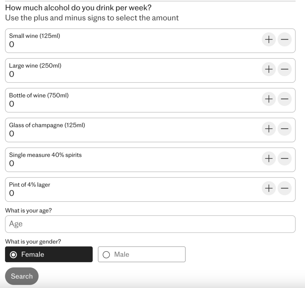
This article from The Telegraph uses an Assessment Calculator format, one of the most effective types of interactive content for health and lifestyle publications. This structure is designed to transform complex, sometimes intimidating, health metrics into a simple, personalized, and actionable score.
- Instant personalized self-assessment
Users input personal data (age, diet, exercise, habits) and receive an immediate, unique result. This moves the experience from reading a generic article (e.g., “7 Ways to Get Healthier”) to getting an assessment score (“Your health age is X years old”), creating a powerful, personal “hook.”
- Actionable insights (not just information)
The interactive element forces the user to actively consider their habits one by one. By showing the input directly affecting the output, the quiz implicitly educates the user on which behaviors have the largest impact on their health, making the advice feel more tangible and relevant.
- Conversion potential
Not in this case, but health calculators are also prime candidates for strategic gating. The publisher can ask for an email address to “receive your full, personalized health report” or “save your score and track your progress.” This turns a casual visitor into a valuable, qualified lead at a high conversion rate.

Check out the article on The Telegraph


