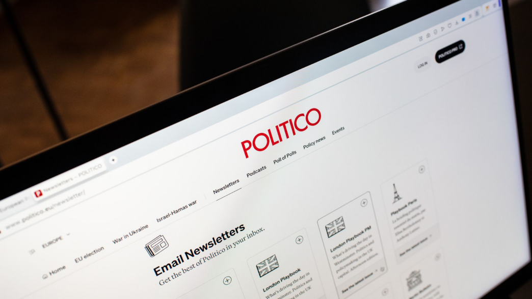
POLITICO Europe is the European edition of the Axel Springer-owned news organization POLITICO, reporting on politics and policy in Europe and beyond. After only 3 months of work, their team relaunched its POLITICO.eu site, preparing for the EU, UK, and US elections later this year. We met Max Leroy, POLITICO’s Vice President for Product and Design, who told us how this huge project was handled in less than 3 months…
Hi Max! So, POLITICO.eu is 9 years old. Why did its website need a redesign?

When I joined a year ago, POLITICO Europe still largely had a single website. That website was all in English, except for a few articles in French that were on a page mixed with other articles about France in English. The team had just created a UK homepage, when we announced that we were expanding to Germany…
So the first reason for this relaunch is because of internal needs. We expanded to the UK five years ago, France 3 years ago and now we’re expanding to Germany, with a Berlin playbook, which launched yesterday!. Therefore, we needed to rethink our website to properly support this geographic expansion, with 3 editions, each with their own language and products.
The second reason is external. Even if POLITICO is in a better spot than most publishers, we’re all seeing our social traffic decline. We did very well to optimize our Search traffic in English, so we can rank well in the UK or in the US. But because we don’t have pages with content only in French or German, when it comes to countries where Google prioritizes the local language (like in France or Germany), it’s more difficult for us to compete against national newspapers.
> Le Parisien’s new homepage: optimizing editorial and conversion simultaneously
When did you start working on this relaunch, which teams were involved, and how did you start it?
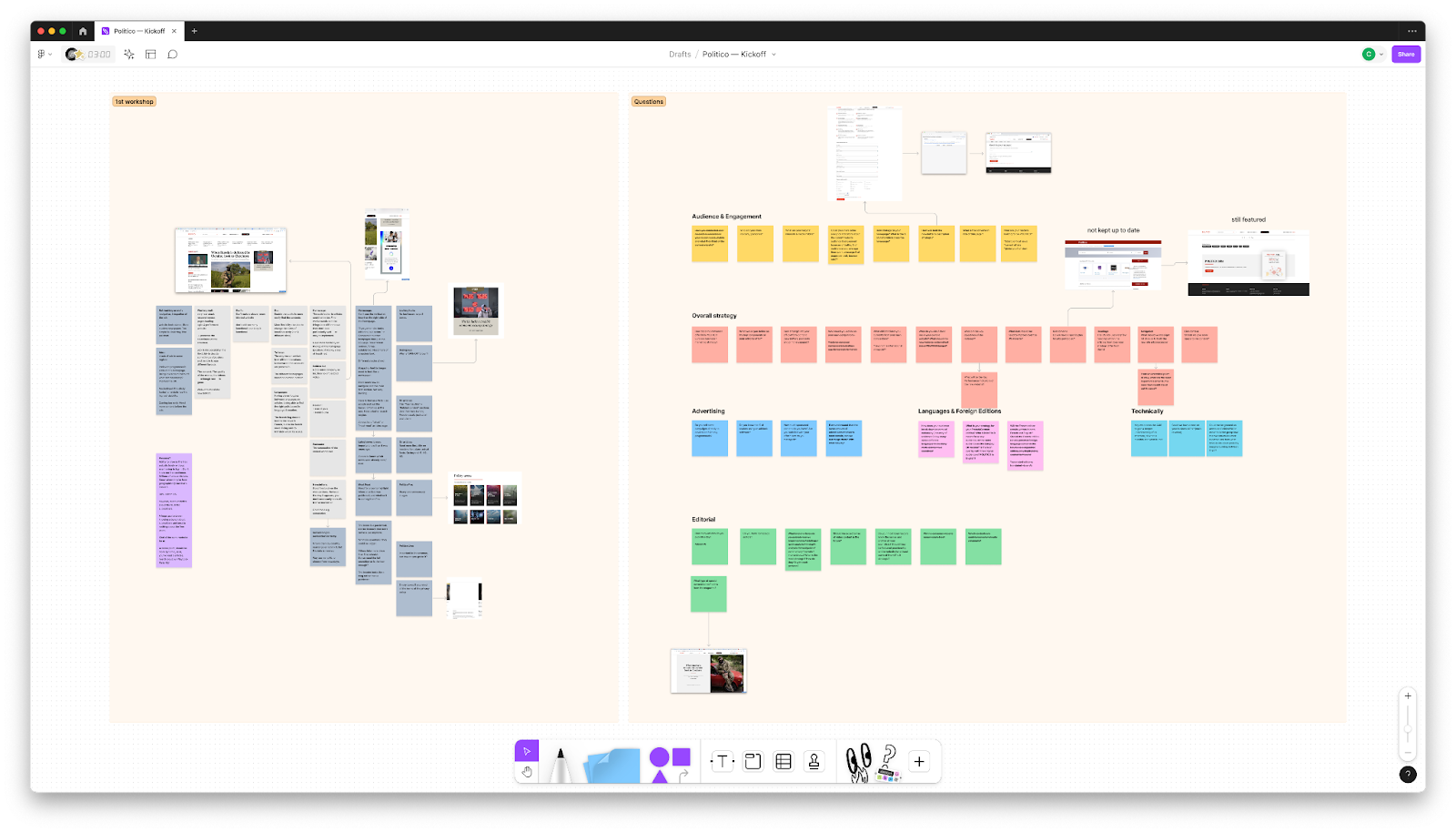
We started in June 2023 with two months of workshops. The goal here was to be able to share feedback on the current site’s wants, needs, hopes, and everything that people at POLITICO didn’t like about our current version. We decided to work with the agency Médianes which was a very precious neutral voice. Having them also allowed me to share my feedback rather than make people feel that I already had an idea of what we wanted to do.
Before the workshop, I worked with them on a two pages brief document where we just laid down our 3 objectives:
- Support multiple audiences in different countries
- Improve the experience of audiences that come to our site several times a day or people who don’t know about POLITICO yet. The homepage is not always the the best vehicle for those two audiences
- Increase our internal and search traffic to own more of our traffic engage high-intent audiences, looking for a specific story
So I set these three objectives to frame our work… and then I shut up.
We had four workshops in total. We started with two workshops where we shared open feedback. Followed by a third workshop during which the Médianes team presented an extensive benchmark on many aspects that came up in the first two workshops, to solicit our reactions. Finally, we had a last workshop, where Médianes presented some initial screens. They didn’t have a mock-up for every page, but rather rough ideas for the key pages.
Who was present at those workshops?
Our super simple rule was that we had one person from each department in all four workshops. The feedback I had gotten from the previous redesign is that a few teams felt involved a bit too late in the process, whether it was the advertising team or others. So this time, I said: “There are four workshops. The first workshop is called workshop #1. So if you’re in it, you know you’re in the first workshop. You’re not starting this project later than anyone else.”
How did the people at POLITICO find this preliminary work?
They loved the workshops with Médianes! I remember there were two “Wow” moments:
The first two workshops, I would say, were pretty neutral. None of them could say whether Médianes was doing a great job or not, yet. But the benchmark was really impressive and useful: we all thought “OK, they know their niche!” Their benchmark was like being in a dedicated WhatsApp group with tons of experts, but just for our company. It was like getting links and examples of just the questions we were asking. I’m a big believer in not reinventing the wheel. It was really important for us because, for example, very few publishers have multiple editions in different languages. So we had a lot of things where the benchmark became crucial.
The second “wow” moment was the presentation of the first screens. Obviously, a lot has changed from these first screens to the website we just launched, becauseMédianes couldn’t know that the newsroom produces stories in this way or another, etc, but overall many of the concepts that they introduced are represented in what we have today in big part.
After the workshops, the design phase began…
We worked with Anagram Studio, a design studio I’ve trusted for the last 10 years, to produce the final mockups for all pages.
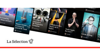
We collaborated with them actively mostly from August to October. Very quickly, we got to the 20 templates that we needed for this first relaunch. We redesigned the homepage, the article page, the newsletters and podcast landing pages, etc. All these pages represent the majority of our traffic. The rest is split across many pages that we will redesign throughout 2024.
How was Anagram Studio briefed?
Anagram was already in our preliminary workshops by Médianes, so they knew everything we were doing. When they heard the feedback from our team on the four or six screens from Médiane’s last workshop, it became super easy for them to start creating the mockups for the first 20 templates.
What are the main features that you updated?
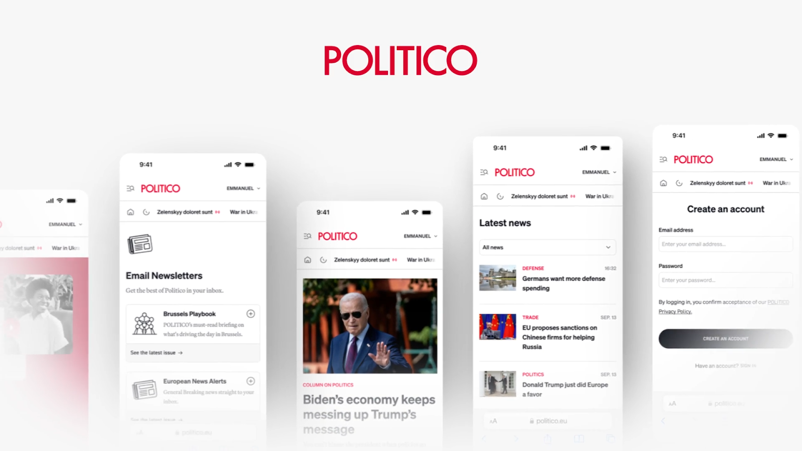
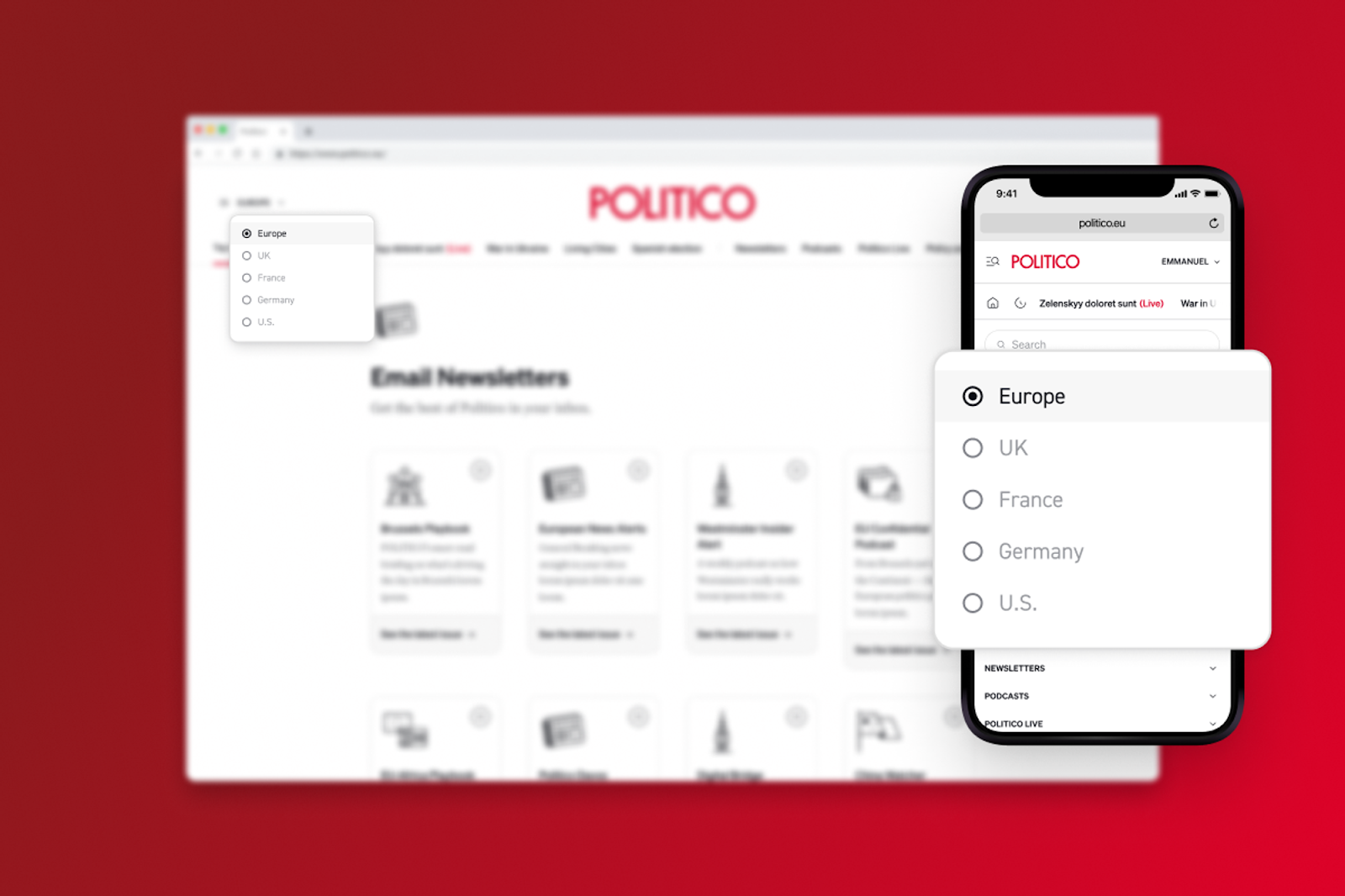
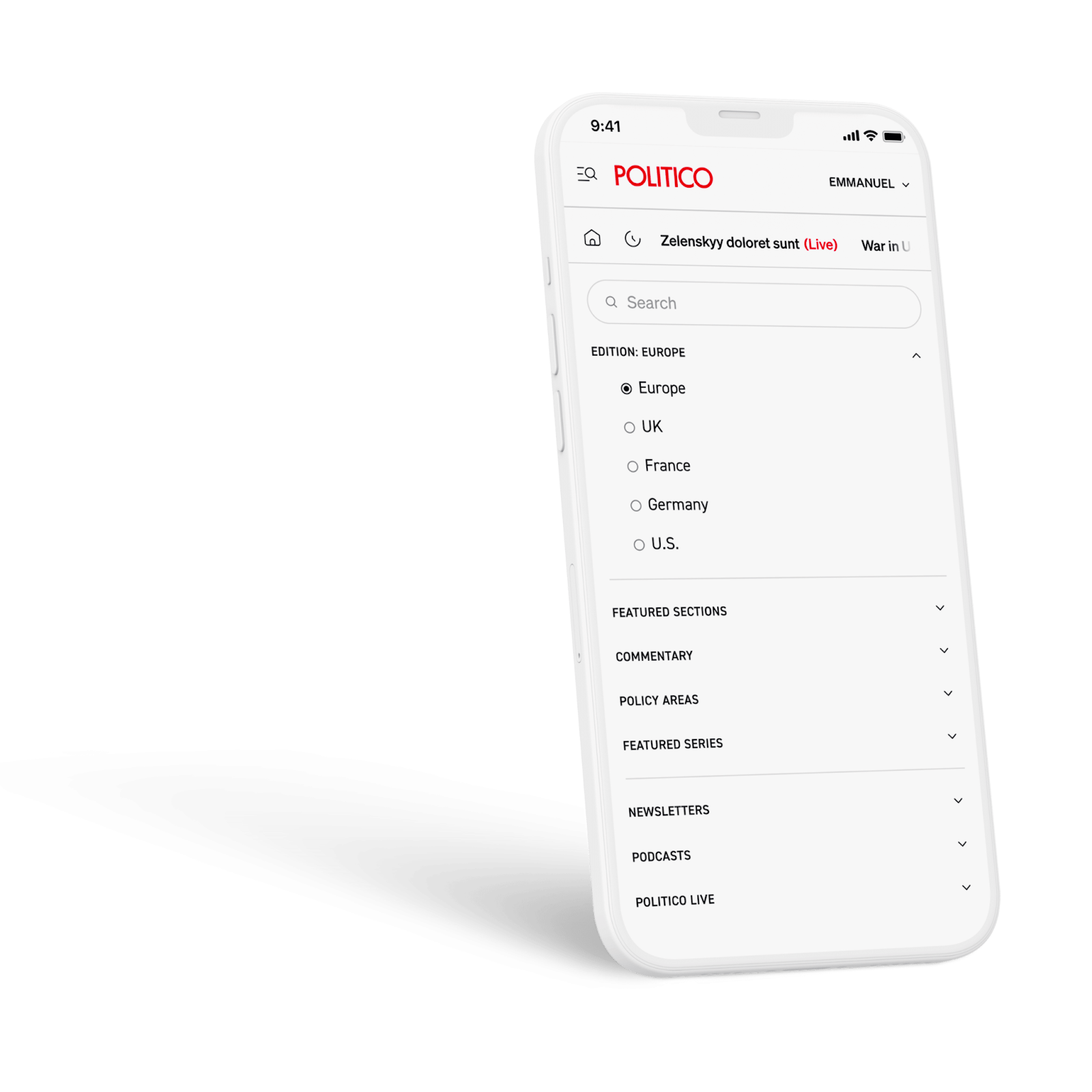
The new navigation navbar was a big one. It’s a single navigation with a menu to switch from one edition to another.
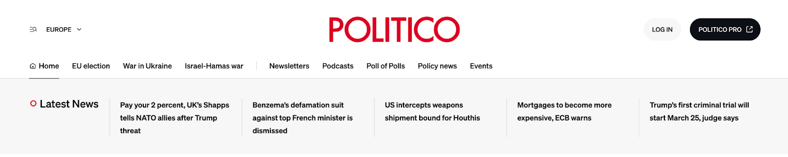
It also allows us to have shortcuts to our most important journalism. At the moment, it’s the War in Ukraine, the Israel-Hamas war, and the EU elections.
There are also permanent shortcuts to newsletters, podcasts, events, polling, and policy areas on the navbar, presenting the full breadth of what POLITICO has to offer, which was previously hidden in multiple menus and submenus on the homepage. Now it’s available directly in the navigation!
We also spent a lot of time and effort rethinking the article page. Now, if you visit an article, you should enjoy a significantly improved reading experience. Previously, ads were both less visible and more distracting, floating next to the contentNow, we’ve repositioned them to flow naturally within the article. We’ve also reduced the number of recirculation blocks encouraging readers to click elsewhere, before getting through the first few paragraphs of a story, shifting them later in the article, and to the bottom, to minimize disruptions.
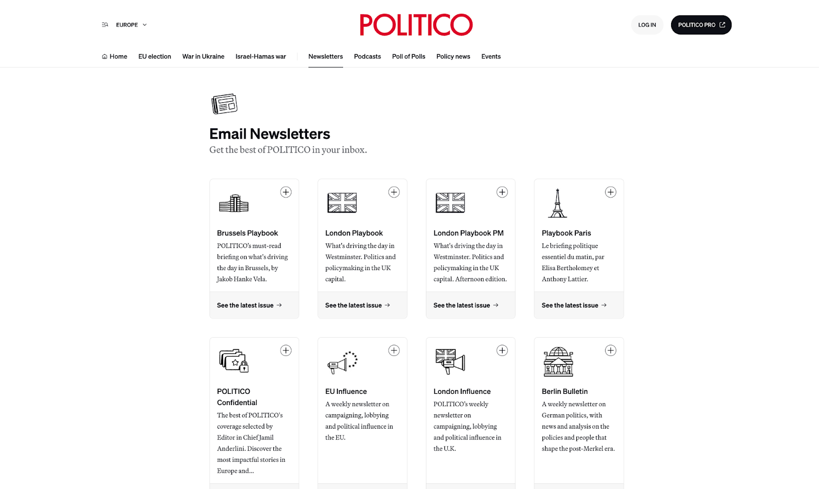
Another big change is how we are presenting all our newsletters and podcasts. Previously, we listed all the latest issues or latest episodes on a single page, resulting in a cumbersome experience, especially with our daily newsletters filling up the first page every morning very quickly. Now, we’ve revamped these pages to showcase all our offerings in an organized manner, making it easier for users to explore our content.
All these changes combined aim to provide readers with a seamless and enjoyable experience, reducing the need for ad blockers or alternative platforms. We’ve worked hard to make POLITICO a go-to destination for politics and policy news.
How much time did this design phase last?
Anagram finished the final mockups by the end of September. Then the front-end development, done by the agency 10up, took 3 months. With the workshop, the full project lasted six months.Nevertheless, from when Anagram starting producing final mocks to when10up started implementing them, our website’s redesign only took one quarter. That was amazing!
Did this redesign require a lot of work on the backend?
Almost none. POLITICO.eu runs on WordPress, with Gutenberg blocks (which I love). We did introduce a few things that were good for SEO, like breadcrumbs, and clearer connections between episodes and podcasts, for example.
There’s a story behind the fonts that you chose…
Yes! Throughout this project, one of the outcomes was to have the beginning of a design system, which we hadn’t officially created before. And so, as part of this, we selected two new font families from Klim Foundry, which is a highly respected foundry.
The new serif typeface, Martina Plantijn, is a reinterpretation of the font Plantin which itself is based on the work of a Franco-Belgian publisher and family in the 17th century, whose daughter was… Martina Plantin. The second sans-serif typeface, Söhne, takes its root from the Akzidenz-Grotesk typeface, which has German roots. So that’s a super cool story considering where POLITICO bureaus are based today in Europe!
What are your links with the US POLITICO website? Is there any?
Right now, it’s still two separate websites. If you go on the POLITICO.com website and click on certain headlines, you will be redirected to the POLITICO.eu website and vice-versa. We didn’t try to make our site identical to the US site because we also wanted to introduce new features But there are indeed a few places (the header, the collections, etc) where we have tried to show people that the two are part of the same family now and not two different companies…
Am I right when I say that the US edition is “just” another local edition you can now link to from the EU website?
Exactly. With the edition switch now, the goal is to give the readers the ability to switch between editions very easily. For the moment, going to the US edition implies going to another site instead of staying on the same site, but who knows, this might change.
Are you happy so far with the redesign?
Of course, as a product manager and designer, I’m seeing stuff every day where I’m like, “this is not exactly what we had in the mocks!” Let’s just say I’m in the glass half-empty, glass half-full phase of just seeing everything that we haven’t shipped yet.
Yet I’m extremely happy about the feedback we have received so far. And I will say, although I care a lot about the external feedback from our readers, the feedback from people at POLITICO has been heartwarming. As I told you, one person from each team participated in the initial workshops. So you have about 15 people in the task force, but we’re 350 in the company. So you still have 335 people who could have felt like they weren’t involved. And that was a big concern for me. I’m grateful to the people who participated in the workshop because I feel like they’ve done the work of constantly sharing the information with their team about what we were doing, changing, why, when, etc.
Are you collecting feedback from your readers?
That’s something we’re implementing with Médianes these days, it’s one of the few things we couldn’t finalize on time. So right now, it’s just my email address at the bottom of the press release that announced that we redesigned our website! Readers can reach out, and I’ve started receiving a few emails already. But I would love to collect feedback in a more modern way, while people are visiting the site.
We also have a very strong relationship with our readers because the vast majority of them are subscribed to one of our daily newsletters. So we also know that in a couple of weeks, when people have started to see the website, we can also ask them directly in the newsletter as a call to action.
> Audience research at The Atlantic: The questions that data can’t answer
At the beginning of our discussion, you spoke about the paywall, saying that you redesigned 90% of what is “in front of the paywall”, what were you referring to? Because I think you don’t have any walls on POLITICO, do you?
No, indeed. When we say “in front of the paywall”, it’s actually all of POLITICO EU as opposed to POLITICO Pro, which is our suite or professional services you can subscribe to.
POLITICO Pro has all the policy newsletters, data, events, etc, that you can’t fully see on the public website . It’s a full, separate platform for intelligence. And this is where more than half of our revenue comes before advertising.
Technical question. Is there an automatic choice of the edition depending on your readers’ location?
There is one just for the UK because the edition is now big enough, with impressive journalism to elevate, every day.. But overall, for France and Germany, because there will be less content in French or German, and we can’t assume that people want content only in those languages, we’ll likely not set up a hard redirect and rather a banner.
Which KPIs did you choose to evaluate the success of this redesign?
Because we believe that the site now gives more visibility to all the content that we produce, we could easily think that our main KPI should be page views, like many other news publications. But it’s our exceptional journalism that is primarily responsible for page views, not the redesign.
The most interesting KPIs for me are relative metrics:
- Share of search traffic in France and Germany
- Time spent on a page, specifically on the article page
- And what do readers do after they visit the homepage or read a story?
My main concern is: Are we improving the quality of the sessions overall? I want more page views per session, more time spent on the articles, etc.
“The only measure that counts is the quality of the session itself and all the metrics we can use to measure that.
Do you measure the depth of scrolling that your readers do on a website?
We have a slightly different system, but similar, to have an idea of engagement. What is important is to get a better idea of the performance of an article. Because if you have an article that’s super long, people might stay longer on it organically. It doesn’t tell you much. What’s more important is to look at the time spent proportionally to the length of the article.
“Basically, as a product person, I’m obsessed with relative metrics. And that’s how we’re setting up our analytics.
What are your next steps?
We still have a lot that we want to do! And I’m not just talking about things that already exist that we want to redesign. I’m also talking about new things we want to introduce…
The ones that is not confidential is that we’re going to go big on EU, UK, and US elections! We want to do a really good job of helping our readers navigate this seismic year for democracies.